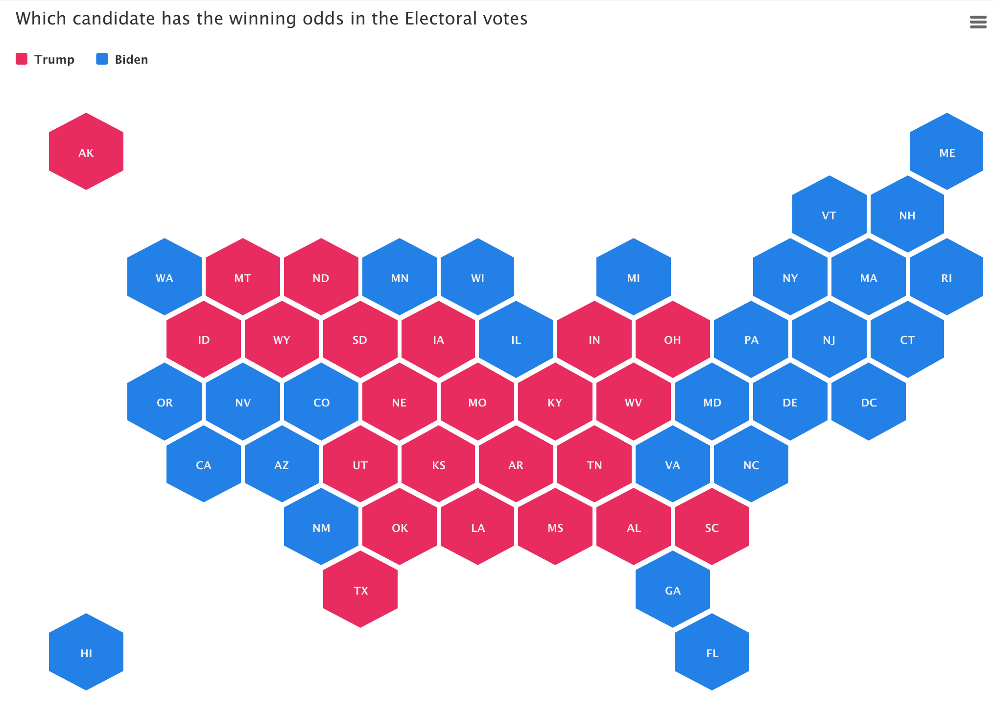
Visualize election data with election packages
During election times, readers want more than just good writing, they want great graphics and interactive charts and maps. We believe the time is ripe
During election times, readers want more than just good writing, they want great graphics and interactive charts and maps. We believe the time is ripe

We strongly believe that telling stories with visuals makes the message easier to understand and act upon. Visuals created with everviz are Interactive, responsive and
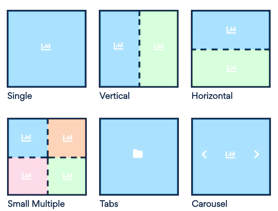
With Layouts you can combine multiple visualizations into split views, tabs or carousels to create even more engaging stories. This allows the readers to dig
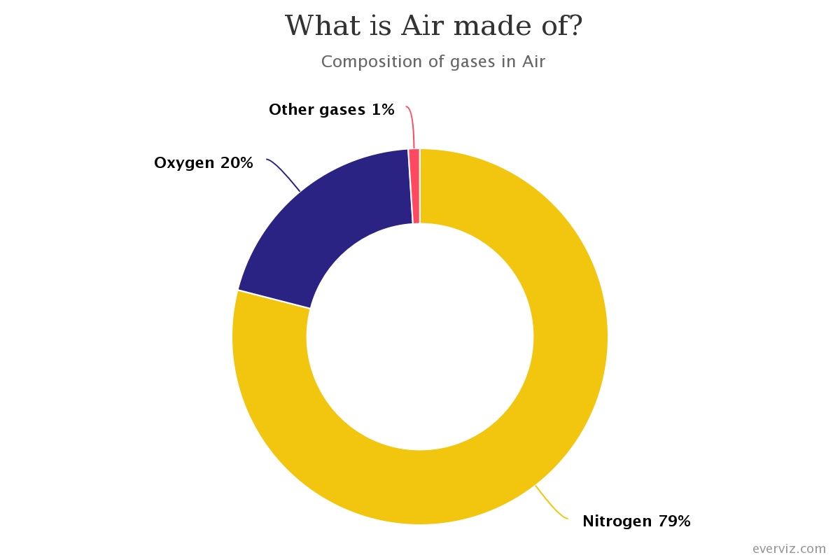
A donut chart is a variation of a Pie Chart with a round hole in the center which makes it look like a donut. This
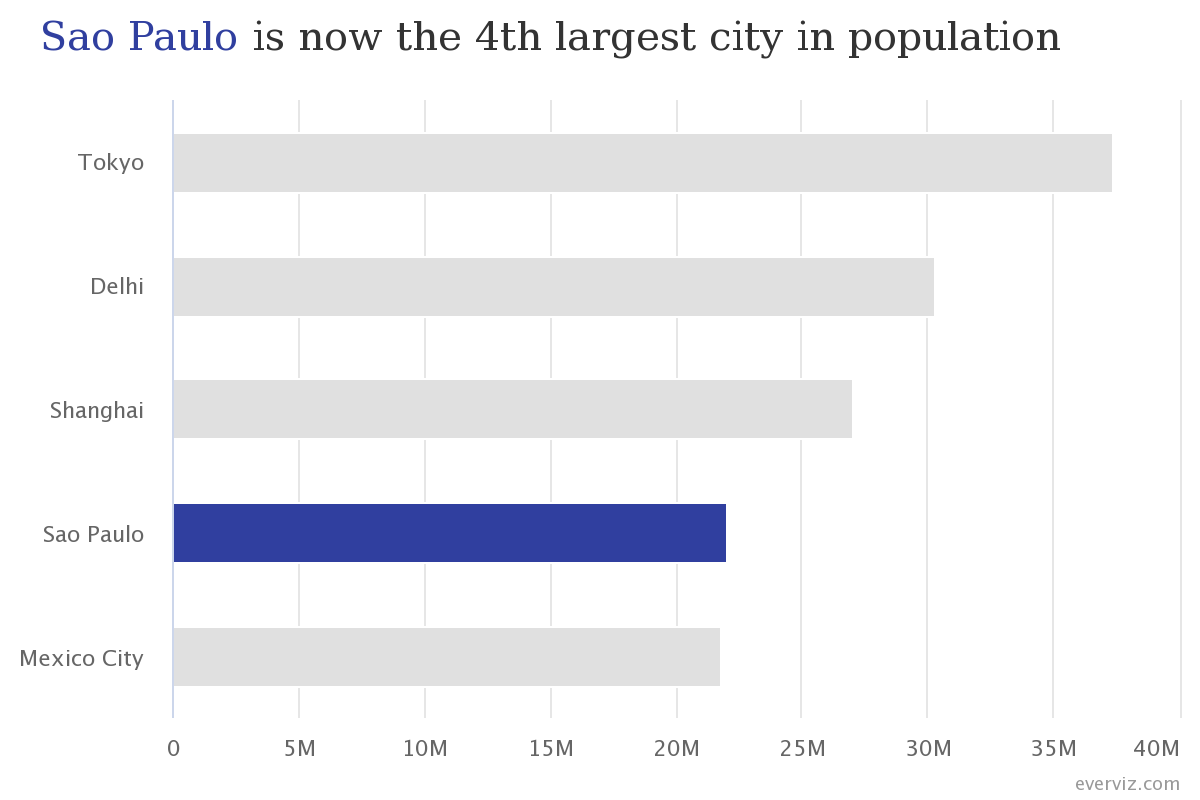
Bar charts are one of the most commonly used visualization types because they are simple to create and easy to understand.
In this article you will learn how to create a Bar chart in everviz and some good practices.
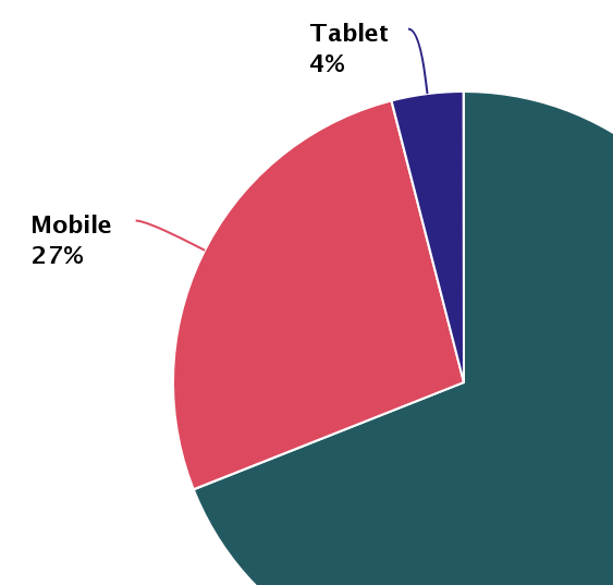
Pie charts have been under assault, probably as long as they have existed. Even though, they remain as a very commonly seen chart type. In
Virtually every website, app or news outlet use interactive charts to make data easier to understand. everviz is a service that makes it easy for
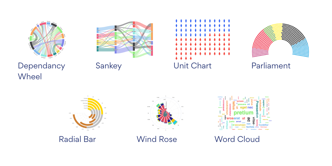
We have just added more chart types to everviz. Parliament chart, Word Cloud, Unit Chart, Sankey, Dependency Wheel, Radial Bar chart. Check it out! Check out some samples
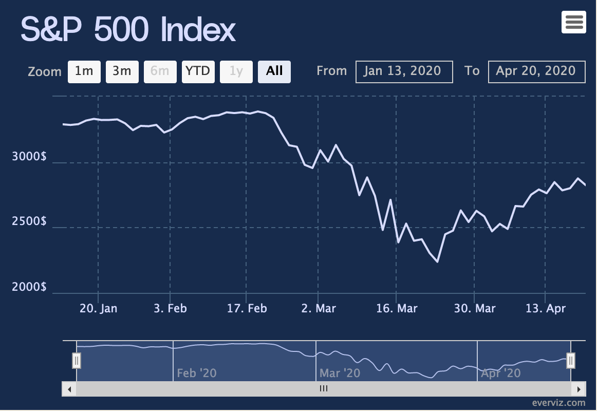
In this post we play around with stock market data in order to explore how everviz can help you take your visualizations to the next
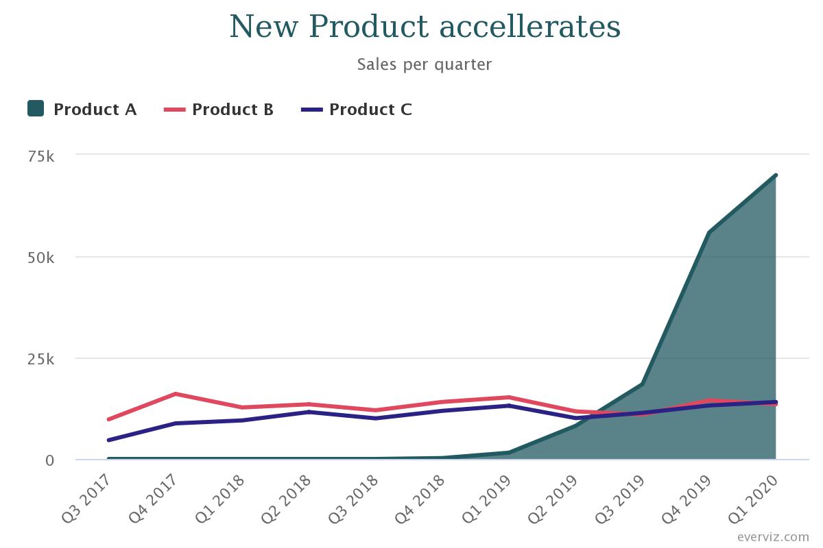
Visualizations play an important part in making data digestible and turned into actionable insights. We are working day and night to enhance our service to
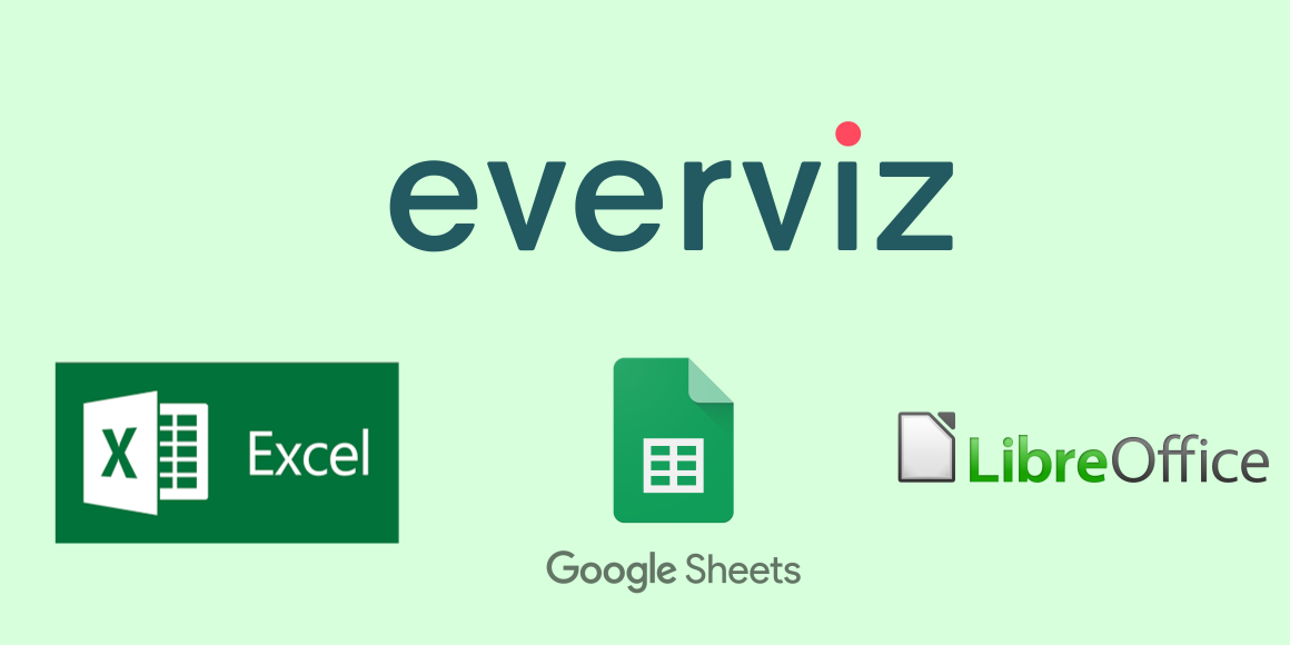
For visualization, spreadsheet tools such as Excel, Google Sheets, LibreOffice, etc. are often used to enter, organize and sort data. Then, one may look for ways to visualize the data using built-in charts’ functionality or his/her favorite 3rd party tool. In this guide, I will show you how to use any spreadsheet tool together with everviz to create a chart that communicates your data most effectively.

This post was originally published on the Highcharts blog, and was transferred as part of the rebrand from Highcharts Cloud to everviz. Have you ever
