Pie charts have been under assault, probably as long as they have existed. Even though, they remain as a very commonly seen chart type. In this article you will learn how to create a Pie chart in everviz and what to look out for.
What is a Pie chart?
A Pie chart, often refered to as Circle Chart, is displaying data in the shape of a circle. Each section in the chart resembles a slice of a pie and they all add up to 100%. Any individual slice will display its portion of the whole.
The primary objective with a pie chart should be to compare each groups contribution to a whole.
While Pie charts can be harder to read than column charts, they remain a popular choice for small datasets.
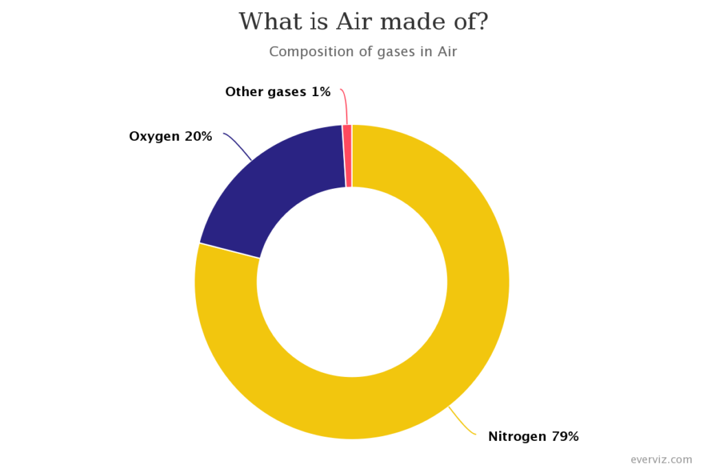
Here is an example an interactive Pie chart created with everviz.
How to create a Pie chart?
Check out this quick intro video showing how to create an interactive Pie Chart. Steps highlighted below

- Create a new chart
- Choose Pie chart
- Import data file, or choose to insert data manually
- Customize
Best use of the Pie chart
Keep the number of slices to a minimum
Our brain finds it hard to interpret and compare the triangular shape of the slices. Especially when there are many slices or not next to each other. There are loads of discussions around the maximum number of slices. Our general recommendation is max 4 to make it easier for your audience to understand the message.
To illustrate the point, take a look at the following Pie. Which is largest of Chrome and Safari?
This leaves us to our next point:
Use bar/column chart when data points are close in value
Comparing the values in the previous bad example is really hard. When using a bar chart or column chart, our eyes can compare values much easier:
Read more on how to create a bar chart in everviz here
Use data labels (when exporting to image)
Make it easier for your audience to read and interpret your chart by adding the category name and value next to the slice.
Going back to our first pie chart, you can add data values as part of the label. This will be specifically important if you are sharing a static (image) version of your chart. Here is a modified example where the data values in percentage is showing in the data labels