Bar charts are one of the most commonly used visualization types because they are simple to create and easy to understand.
In this article you will learn how to create a Bar chart in everviz and some good practices.
What is a Bar chart?
A Bar chart is a type of visualization used to display and compare the number, frequency or other measure for different categories of data.
The beauty of a bar chart is that your readers already know how to read them, so the bar chart is a very powerful type to explain your story efficiently.
Here is an example of an interactive Bar chart created with everviz
When the bars are presented vertically, we refer to this visualization as a Column chart
How to create a Bar chart?
Check out this quick intro video showing how to create an interactive bar chart. Steps highlighted below
Six steps:
1) Select project type
2) Choose chart type
3) Import data
4) Choose your branding
5) Edit text
6) Publish
Best use of the Bar chart
Consider ordering
When creating a bar chart you should consider the ordering of the bars. A typical convention is to sort the bars from longest to shortest. This makes it easy for your reader to compare the value. There could be exceptions where your categories are inherently ordered.
Take this example where it’s natural to order the categories by time.
It is easier to read this chart on a with vertical bars:
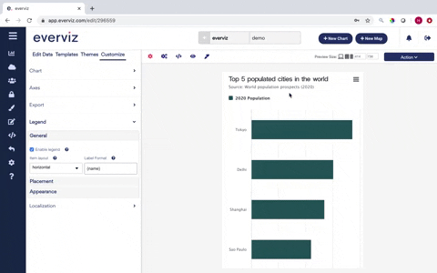
Skip Legend when only one category
If there is only one category plotted on your chart, you can skip the legend and put the information in the title. See this animated gif for how you can remove the legend in everviz.
Use consistent colours
Pick one color for all bars with same category in the chart. One unique color per bar may distract the reader, and give an impression that there is an additional meaning to the data.
One exception here is highlighting specific bars with a separate color to make a point in the storytelling.
To illustrate the point. Don’t do this:
Try something like this instead:
Avoid many bars
Many bars create the impression of a trend line rather than highlight discrete values. More than 10 bars looks very cluttered.


