A donut chart is a variation of a Pie Chart with a round hole in the center which makes it look like a donut. This article explains how to create a Donut chart in everviz and gives some tips on best practices.
What is a Donut chart?
A Donut Chart (also known as Doughnut chart) is a variation of a Pie Chart, except it has a round hole in the center which makes it look like a donut.
Pie charts have been under assault, probably as long as they have existed because our brains find it hard to compare the shapes of the slices. A donut somewhat remedies this problem since readers focus on reading the length of the arcs instead of the size of the slices.
Here is an example an interactive Donut chart created with everviz
How to create a Donut chart?
Check out this quick intro video showing how to create an interactive Donut Chart. Note that the video describes Pie Chart, but it’s also applicable to a Donut Chart. Steps highlighted below

- Create a new chart
- Choose Donut chart
- Import data file, or choose to insert data manually
- Customize
Best use of the Donut chart
Keep the number of categories to a minimum
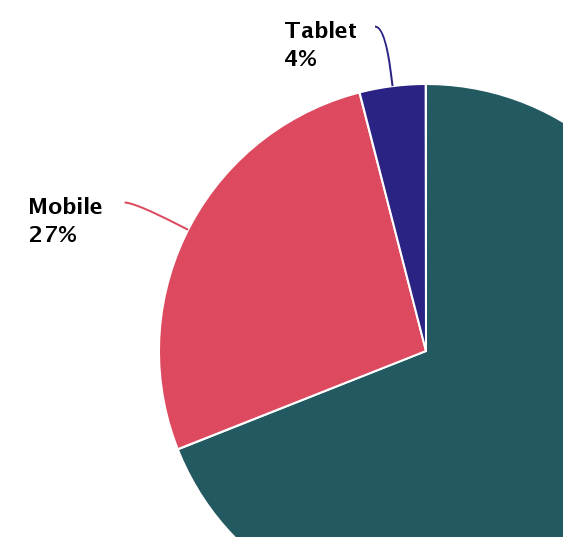
Donuts, like Pie charts work best when there are four categories or fewer. More than four categories makes your donut cluttered and hard to read. Help your reader to focus on what’s important by identifying the 3 or four largest segments and group the remaining values into a generic category.
We created a generic category (other gases) in the above example. If we did this again with diving deep into all gases Air consists of it would not be readable:
This leads us to our next point:
Don’t use Donuts for comparing data
Comparing the values in the previous bad example is really hard. Consider using a bar chart or column chart if you want to make a point on comparisons.
Read more on how to create a bar chart in everviz here
Use data labels (when exporting to image)
Make it easier for your audience to read and interpret your chart by adding the category name and value next to the category.
In the previous examples we have shown the actual percentage value next to the category name.
Order your data
A Donut chart is naturally read from a 12 o’clock position. To make it easier for your audience to compare the values, start with the largest value, then display the other categories from second largest to smallest clockwise around the donut.