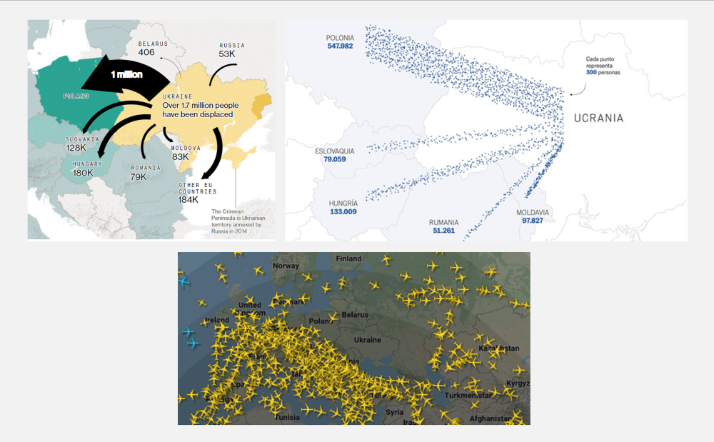
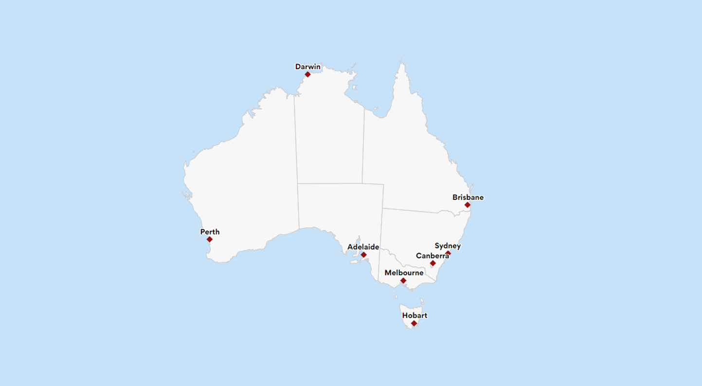
everviz blog.

Explanatory Data Visualization with everviz

Explanatory data visualization with everviz

What is the difference between exploratory and explanatory data Visualization? Exploratory Data Visualizations are charts or graphs that are usually created during the data analysis

Are-Interactive-Graphs-Here-to-Stay

Are interactive graphs here to stay?

Explained is one of my favorite Netflix shows. It’s a docuseries created in partnership with Vox that brings attention to critical issues that impact people’s lives. The episodes are short, ranging from 15 to 20 minutes in length. To date, some of my favorite episodes have covered topics such as Money, The Mind, and The Racial Wealth Gap. You might be wondering what data visualization has to do with a Netflix show. Well, a lot…Each Explained episode includes simple, animated graphs that are key to explaining topics in an accessible manner. For example, the episode on Money starts with a unit chart showing how student loan debt compares to auto loan and credit card debt. By incorporating an animated and engaging graph, the producers truly drive the point home.

Screenshot of an everviz overlay video in Final Cut Pro

New: Animated charts in video

We’re excited to share with you a new feature in beta: Download project as video Our mission is to make it easy for anyone to

Inspector screenshot

Meet the Inspector

At everviz, we aim to keep things simple, yet powerful. These are two orthogonal (independent) adjectives, and almost like describing something that is red, yet