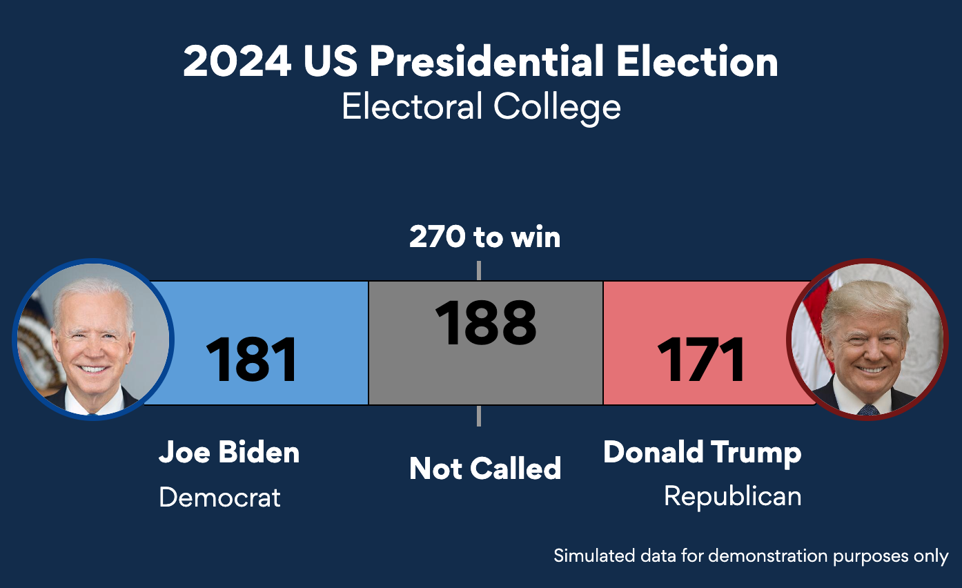
We have just added more chart types to everviz. Check out some samples below
Parliament Chart
Use the Parliament Chart to visualize the current composition of a Parliament or a Senate
Word Cloud
Word Cloud is a visual representation of how frequently words appear in a text.
The data in this Word Cloud is taken from Samuel L. Jackson’s bedtime story in regards to the Corona situation. Hopefully the message is clear: Stay the F*ck home. See the video here
Unit Chart
Use the Unit Chart to create a visual representation of data using symbols or icons.
Sankey
Sankey is a specific type of flow diagram, helpful in identifying dominant contributions to an overall flow.
Dependency Wheel
Dependency Wheel is a twist on the Sankey. Visualizes the flow between the nodes as a wheel.
Radial Bar Chart
Radial Bar is simply a Bar Chart plotted in a polar coordinate system.
Wind Rose
Wind Rose is typically used when visualizing how wind speed and direction are distributed at a specific location.


