Virtually every website, app or news outlet use interactive charts to make data easier to understand. everviz is a service that makes it easy for non-technical users to create and publish interactive and responsive charts and maps.
Whether you are a Journalist, Content Creator, Researcher or Business executive, sharing your data through attractive, interactive charts is now simpler than ever.
everviz offers:
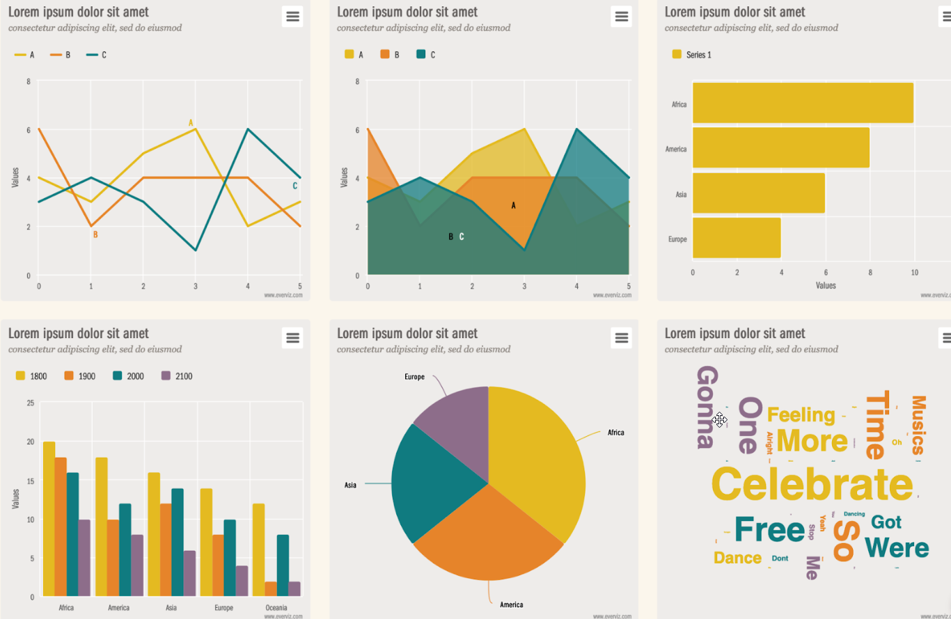
- A variety of chart and map types, layouts and colors for customizing your charts
- Optimized layout for both desktops to mobile devices.
- Live data import via Google Spreadsheet or other external sources
- Online storage and serving of your charts, so you don’t have to worry about your upgrading your site (or even having a site).
- Team collaboration functionality
- Easy branding
- Inexpensive plans for individuals and businesses.
Creating a chart in a few minutes
This video shows you the process of creating a chart in six simple steps.

Videos are great, but practice is better! Let’s create a chart from scratch. (set aside 3-4 minutes since this is your first time).
Let’s make a chart
For this tutorial, we will use some random sales numbers to create a chart. When we are done, it will look like this:
Creating a chart is done in these steps through our wizard:
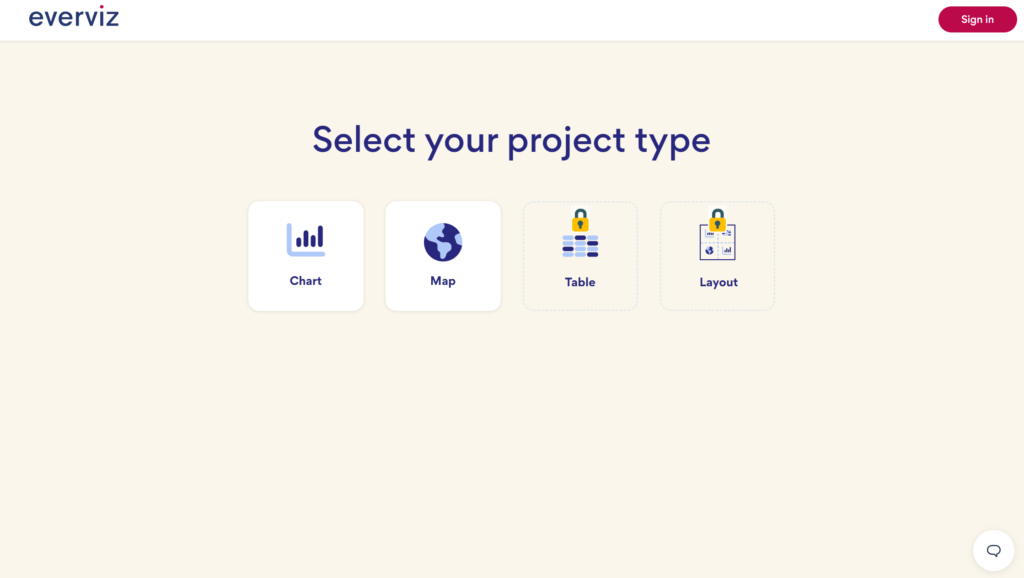
1) Select project type
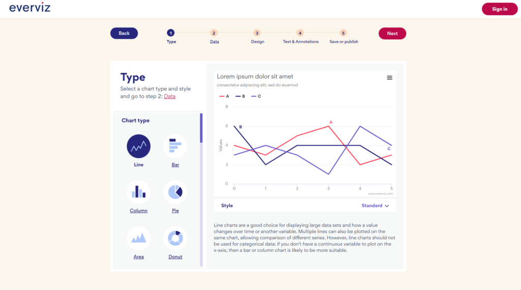
2) Choose chart type
3) Import data
4) Choose your branding
5) Edit text
6) Save or publish
1. Select project type
In the first step, choose Project Type, New Chart
2. Choose chart type
Start with choosing the template that suits your need for the storytelling. For our time based sales data, we are choosing a Line chart.
3. Import data
There are multiple ways to get data into your visualization such as CSV import, Google Sheet connection, Connect to a live data source or simply copy/paste.
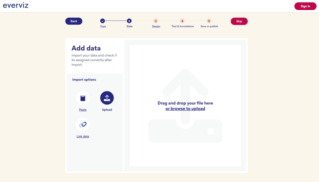
Since we have our data by hand, we will use the copy/paste function. Copy/paste the table below.
| Quarter | Product A | Product B | Product C |
| Q3 2017 | 0 | 9764 | 4638 |
| Q4 2017 | 0 | 16047 | 8774 |
| Q1 2018 | 0 | 12700 | 9500 |
| Q2 2018 | 0 | 13481 | 11570 |
| Q3 2018 | 0 | 12010 | 10010 |
| Q4 2018 | 220 | 14065 | 11865 |
| Q1 2019 | 1550 | 15200 | 13120 |
| Q2 2019 | 8180 | 11730 | 10070 |
| Q3 2019 | 18440 | 10930 | 11370 |
| Q4 2019 | 55840 | 14470 | 13190 |
| Q1 2020 | 70000 | 13500 | 14050 |
4. Choose your design
Select one of the existing design themes, or click the Next button to proceed or if you do not have any own Themes setup yet.
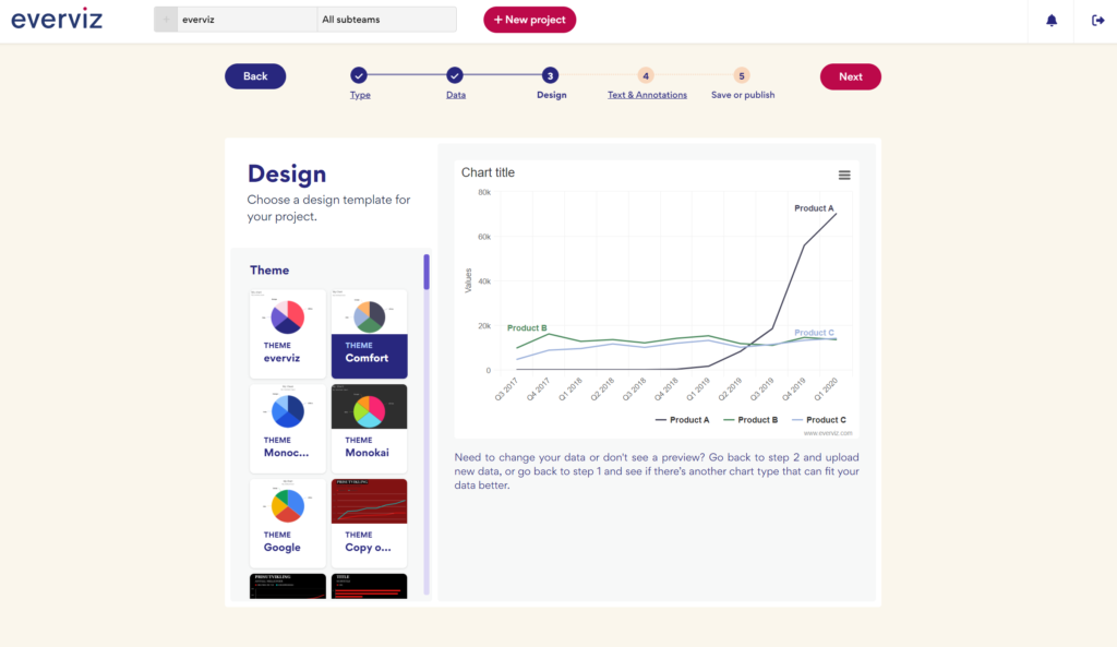
You can learn more about the powerful Themes concept in everviz here
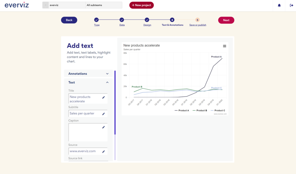
5. Edit text
Add text, text labels, highlight content and lines to your chart.
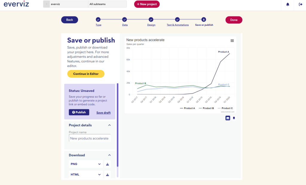
6. Save or publish
Save, publish or download your project. For more adjustments and advanced features, click “Continue in Editor”.
If you choose “Publish”, everviz allows you to share your chart in many formats such as interactive (HTML & javascript) and static PNG, PDF, SVG, etc.
The recommended way to publish a chart on your website is by choosing “Embed to your page:” and “Script”.
Here is how you may decide on which format is right for you.
- Do you need an interactive chart on your website/blog?
Click on the Publish button, then copy/paste the IFrame Code or the Inject code to your CMS such as WordPress, Drupal, Joomla, etc. For more details about how to add your chart to a CMS, check this guide. - Do you need a static image (for a printed report, etc.)?
Go to the lower right part of the dialog and choose format and click the download button - Do you want to share the chart online without embedding it in a blog/website (e.g, sharing a link to the chart via email)?
Copy/paste the Direct Link URL and share with your audience.
If you are still with us, congratulations are in order: You have made a chart and published it!
Using Google Spreadsheets?
Using Google Spreadsheets, and need a simple way to create stunning interactive and responsive charts?
Get the everviz add-on from the G Suite Marketplace
For further details, feel free to check the everviz knowledge base here.
Using WordPress?
Using the everviz WordPress plugin to embed visualizations from everviz directly into blog posts and pages, without having to leave the WP interface.
Read more about it here in our help section or download it directly at the WordPress Plugin Page!