This post was originally published on the Highcharts blog, and was transferred as part of the rebrand from Highcharts Cloud to everviz.
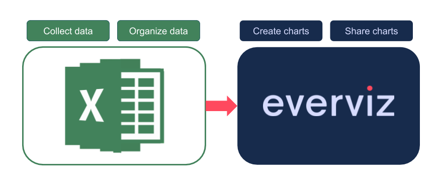
For visualization, spreadsheet tools such as Excel, Google Sheets, LibreOffice, etc. are often used to enter, organize and sort data. Then, one may look for ways to visualize the data using built-in charts’ functionality or his/her favorite 3rd party tool. In this guide, I will show you how to use any spreadsheet tool together with everviz to create a chart that communicates your data most effectively.
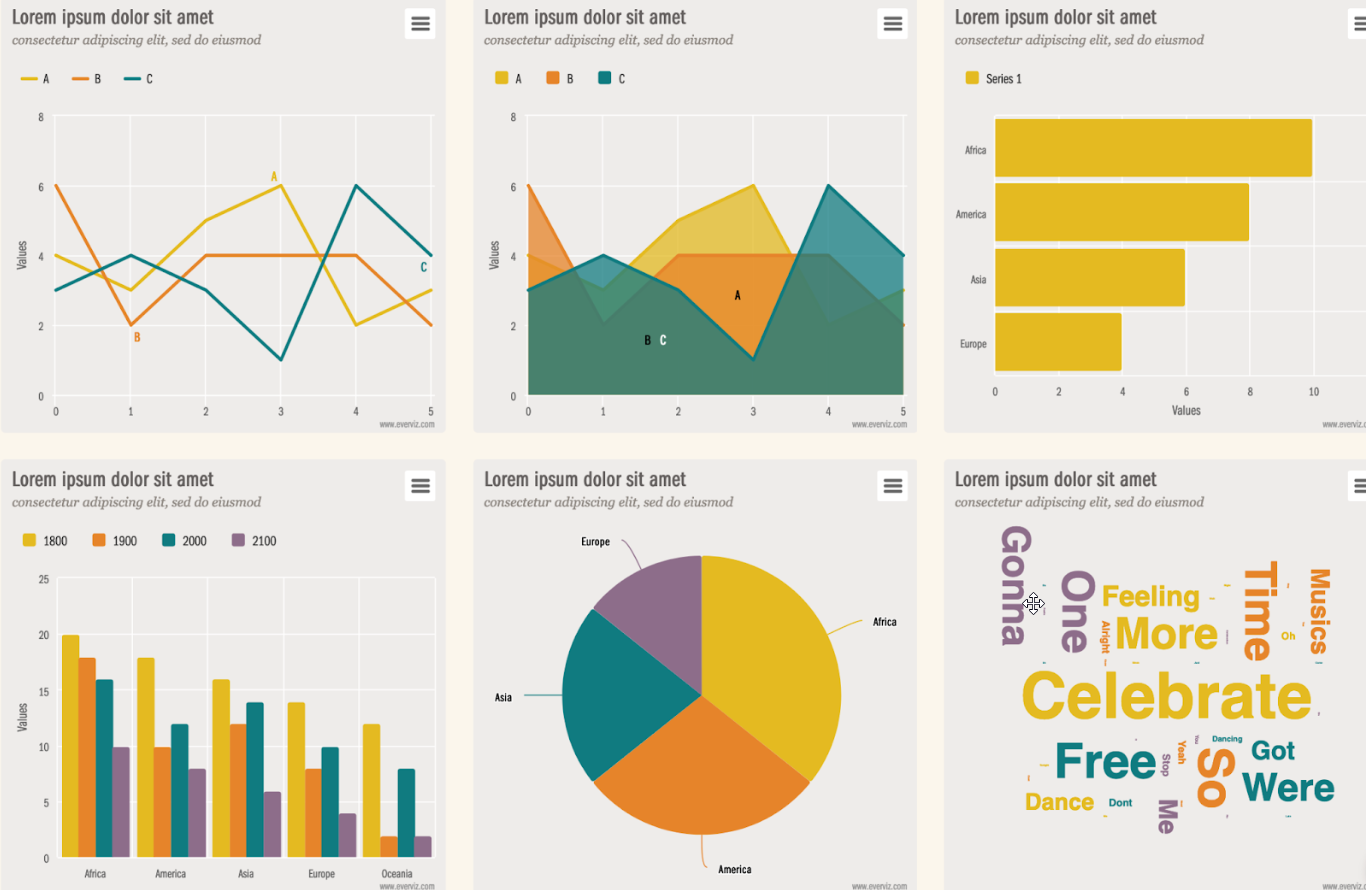
In this article, I am going to use everviz, as it is not only simple to use, but it also creates interactive charts that will look and perform great online on your blog or website, as well as your static reports or presentations.
Let’s get started!
In this tutorial, I will use Google Sheets, as it is easy to use and provides a familiar interface to users of Excel, LibreOffice, Numbers, etc.
I am personally curious about the economic growth of Indonesia, as many economists refer to it as the “third sleeping giant”. So I decided to visualize the growth of the Indonesian economy over the past four decades. The first thing to do is to get some data. I happened to come across a great source from the Groningen Growth and Development Centre (GGDC).
I divided this tutorial into two sections:
- Data processing
- Data visualization
1. Data processing
After some browsing on the GGDC center website, I found and downloaded the data from the following link in an xls format. Once the file is downloaded, it is then imported into my Google Sheet.
The file contained data collected from different countries and sectors over many years. Using the filter option, I isolated Indonesia-related data, then copied them into a new sheet in order to keep things clean. (Check the Filtered Datasheet below):

The table gathers the Indonesian value added in current prices in local currency from 1966 to 2012. For the sake of simplicity, I will visualize the first four categories: Agriculture, Mining, Manufacturing, and Utilities. Feel free to select any categories you would like to display on the chart.
Before moving to the visualization phase, there is one important step to do, and it is to remove the commas from the data. This is because, like many data processing and visualization tools, everviz treats commas as value separators. E.g., everviz would interpret the number 1,234,567.8 as the three numbers 1 and 234 and 567.8. In some regions, commas are used to separate numbers in the hundreds and thousands, and this splitting up would, therefore, be wrong. In order for this to be treated as one number, it has to be formatted in the following way: 1234567.8.
The fix is easy. In Google Sheets, select all cells with numbers, go to Format-> Number- More Format -> custom number format, then remove the comma and the zero or write ####, and press the button Apply.
Then the data should be ready to be copied/pasted into Highcharts Cloud.
2. Data visualization
Everything is now ready to visualize the data using everviz.
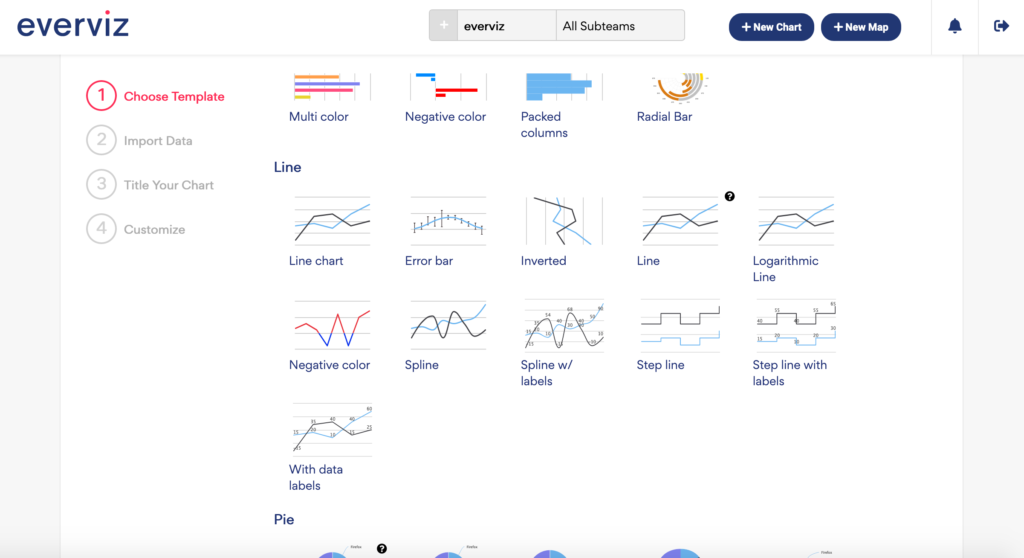
Go to the main everviz webpage, either log in to your account or click on the Create chart button
In the Templates section to choose your preferred template, I used the spline chart option, under the Line category, as it displays the change of a variable over time, and this is exactly what I am trying to illustrate with this chart.
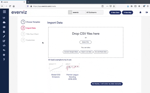
In the Import Data step, copy/paste the data from the google Spreadsheet.
The next step is to customize the chart such as changing series colors, titles etc. Unleash your creativity.
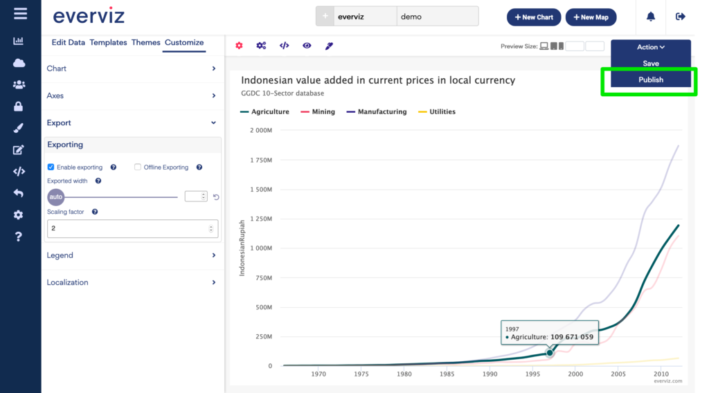
To save the chart you have made, click on the button save (at the top right). You can always come back and edit further at a later stage.
To publish the chart, go to the Publish section.
There are four different options for making your chart visible to others:
- Iframe or inject code
- Share URL
- Facebook or Twitter
- Pictures
Iframe and Inject codes are used to copy/paste into your CMS to get an interactive chart.
You can also choose to share the URL (find it in the Share URL box) to your friends and colleagues, or share the chart on social media such as Facebook and Twitter by clicking on the icons below the Publish button.
If you need some static images of your chart, locate the export button ( the upper right corner in the chart) where you may select to download the picture as PNG, JPG, SVG, or PDF.
In this article, I have pasted the Inject code, and it looks as follows:
Note that if you do not have a website of your own to embed the chart into, every chart automatically gets its own public page on the everviz website. The URL to this page is what you get when you select “URL” as your sharing option.
Let’s step back to review the end result. As you can see, charts make data patterns easier to understand: Just by looking at this chart, it is easy to glean that the Indonesian economy has been growing exponentially since 2004. The manufacturing sector is the main and leading sector, followed by agriculture and mining. The utilities sector is lagging behind for some reason! A journalist, economist, or simply a lay person, can easily see a story being told by this data, and like many good stories, inspire further exploration.