Mining for stories
Data expert Diana Guerrero offers tips and tricks on how to mine data sets for insights and outliers.
Data expert Diana Guerrero offers tips and tricks on how to mine data sets for insights and outliers.
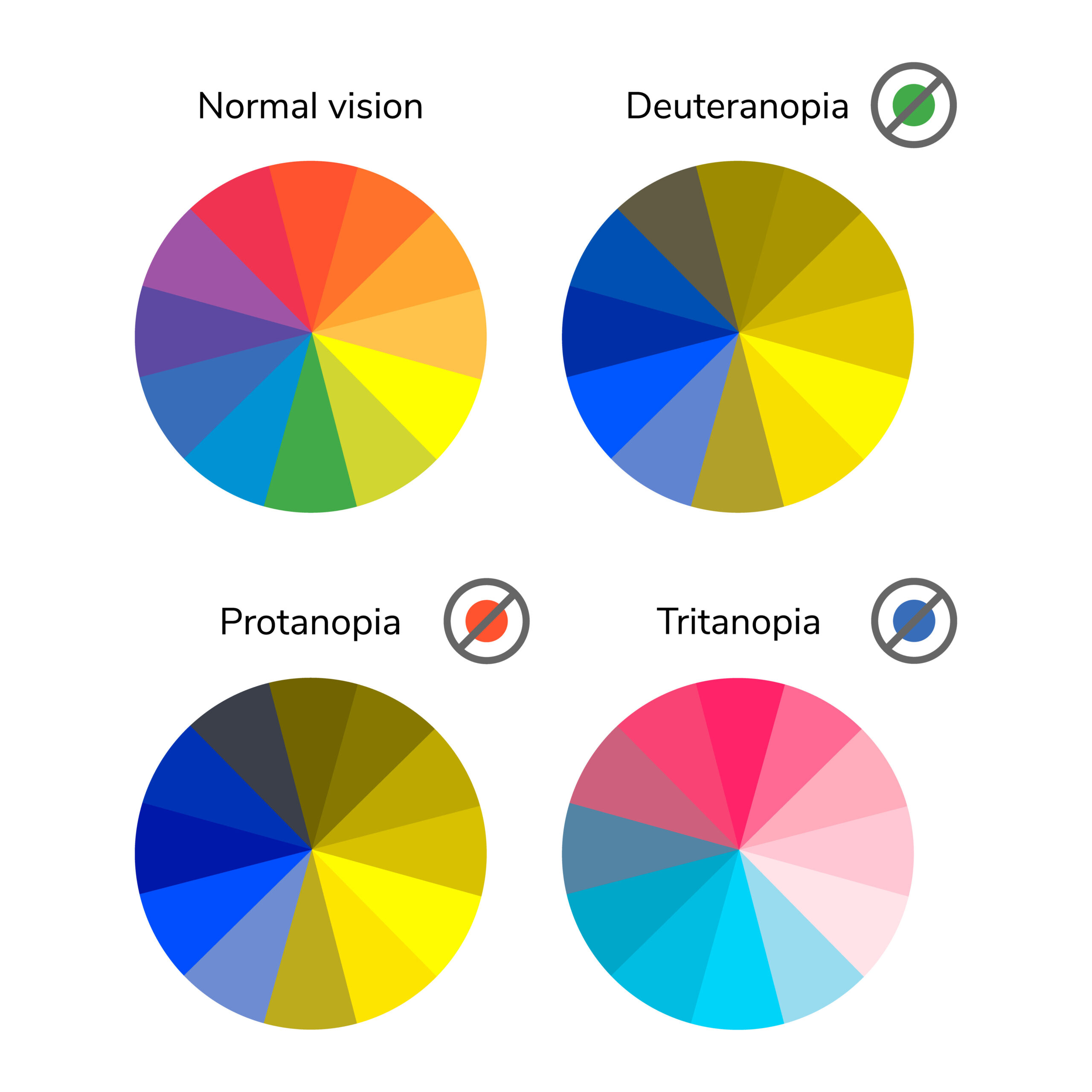
In this post we’ll take a closer look at low vision and how it relates to visualizations with everviz.
“Low vision” refers to visual impairments other than blindness. Other terms, like “partially sighted” and “sight impaired,” have different meanings depending on the context.
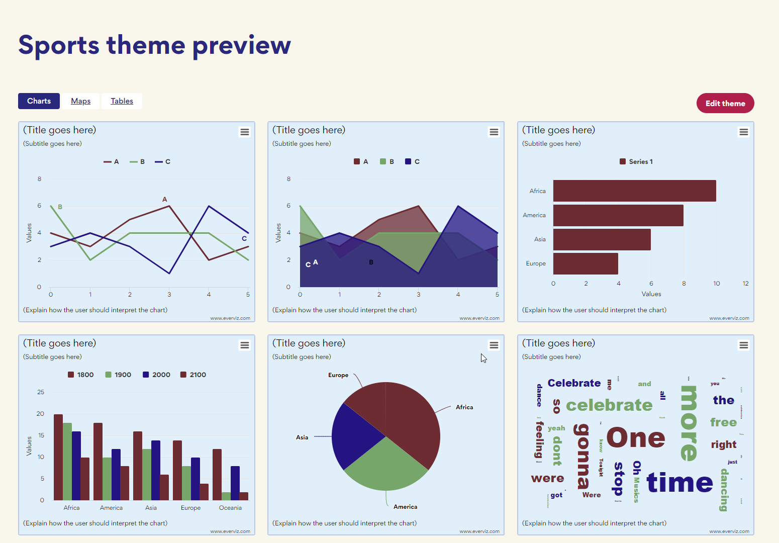
Themes is an easy way to ensure all your charts load with your organisation’s branding.

This article will focus on all the benefits you will be rewarded with a solid accessibility strategy for your website. Without going too deep into the technical aspects, we are going to discuss how you can make an impact for the people that are most important to your business: your customers and visitors. On top of that you’re contributing positively to society.

Another year of global turmoil is coming to an end. Just when we felt hopeful in the beginning of the year, after two years of

The FIFA World Cup Cup is one of the greatest sporting events in existence. That’s why we decided to to put together some world cup
‘With a chart, clients instantly see the highs and the lows and the differences in the data’ Turner & Townsend is a global professional services
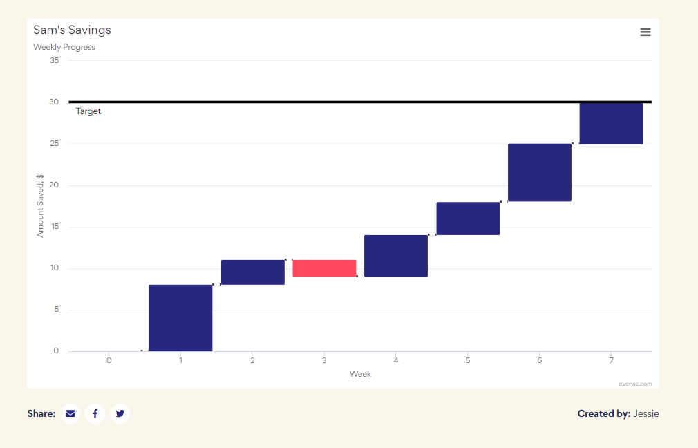
Waterfall charts are used to visualize cumulative values, where each data point contributes to a running total. The data points are displayed as floating columns, often connected by a line to illustrate the sequential relationship.

If you are thinking about buying a house, you may have developed a sudden interest in mortgage rates. This may be particularly true for mortgage
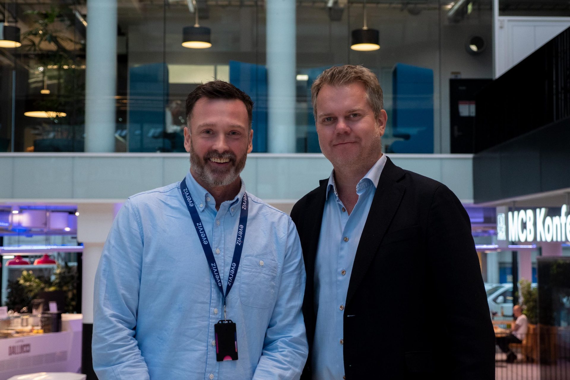
Together, we will empower customers with solutions that help improve every step of the media content lifecycle. Today we’re excited to announce a major milestone
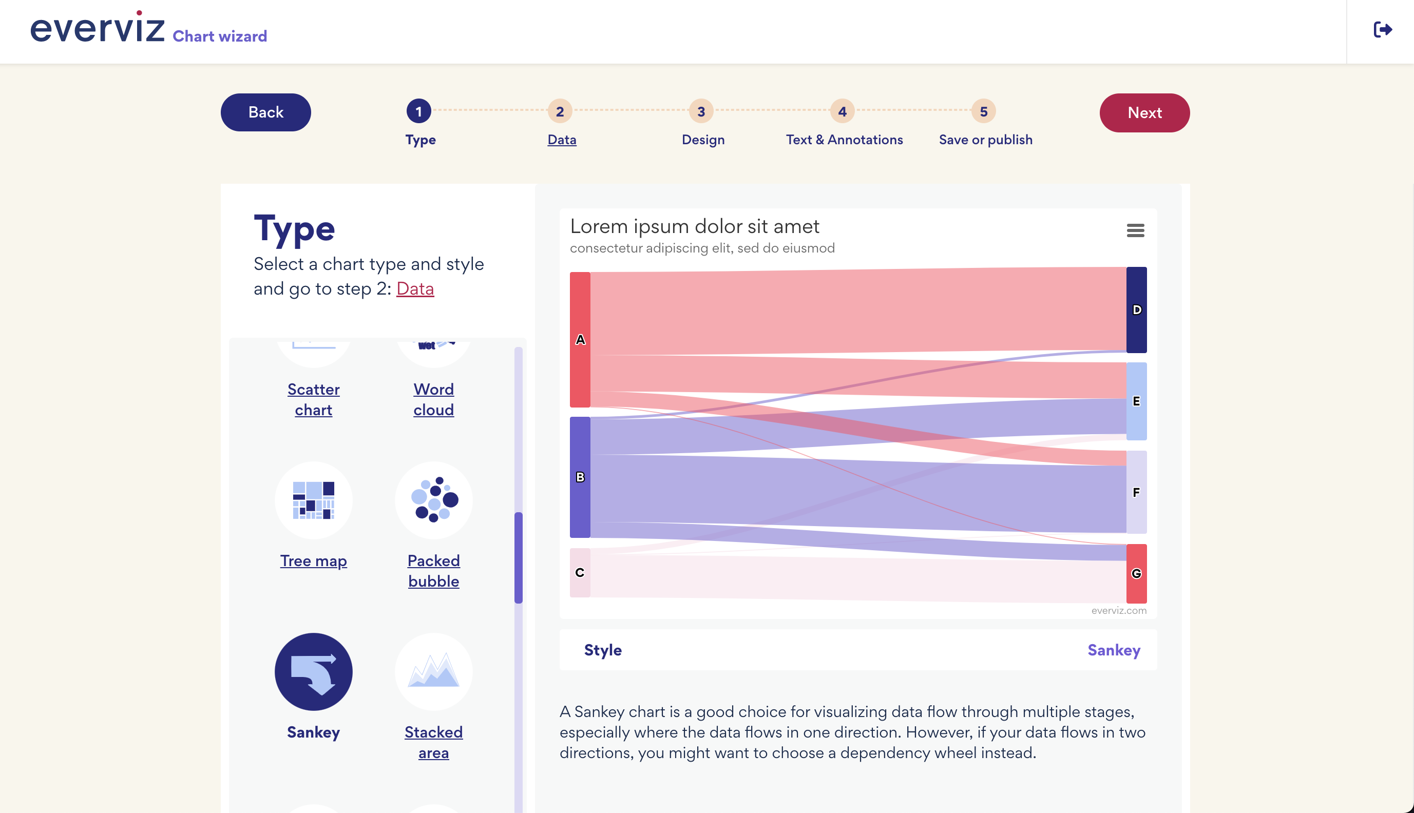
Over the last couple of months, we have made some massive improvements to the editing experience in everviz. This article dives a bit deeper into the improvements and explains how you can use them.
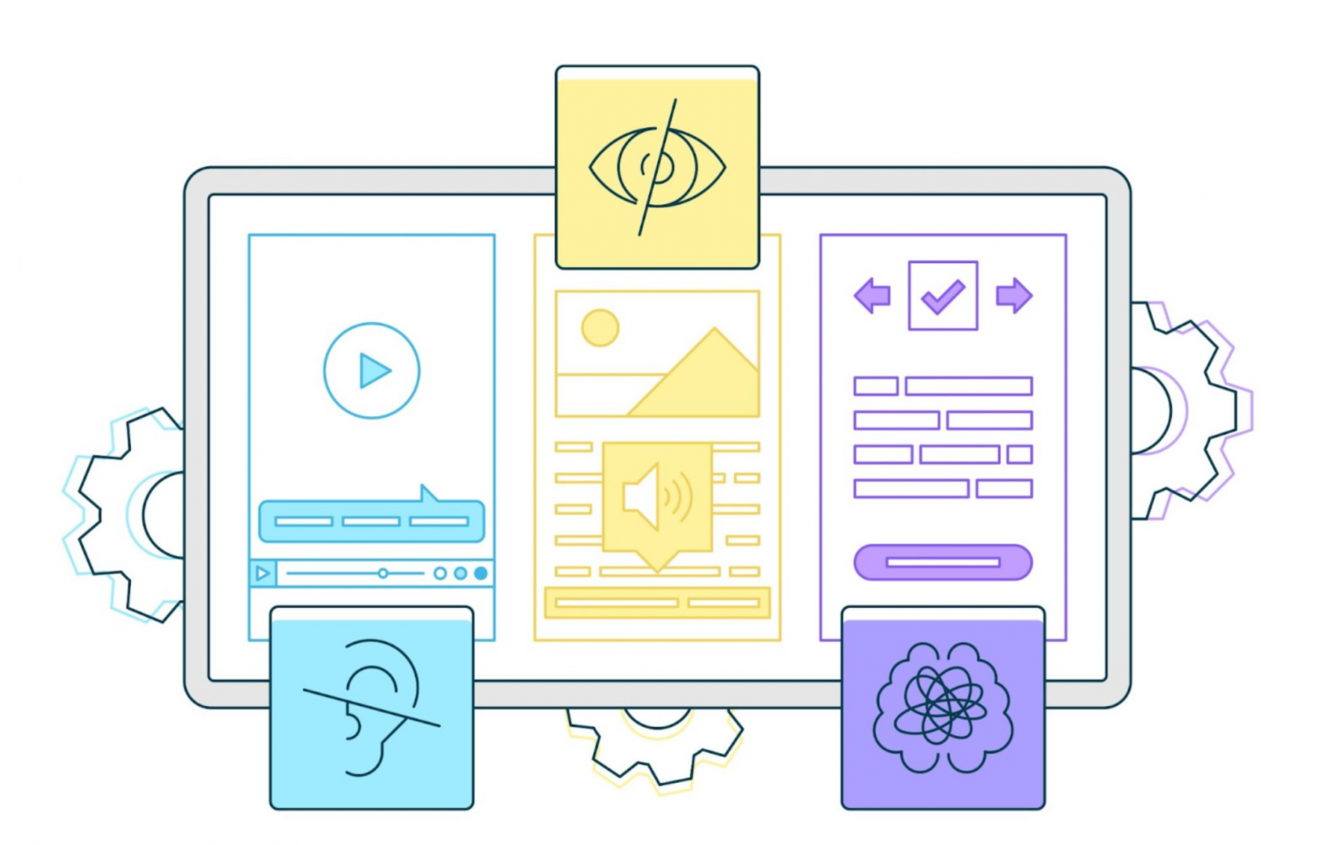
Accessibility is crucial to our visualization platform, as it enables our customers to reach out with content, news and insights to the largest possible audience.