This is a short introduction on how to make a waterfall chart in everviz. To get more in-depth insights and learn about advanced customization, we recommend visiting our knowledge base here.
What is a waterfall chart?
Waterfall charts are used to visualize cumulative values, where each data point contributes to a running total. The data points are displayed as floating columns, often connected by a line to illustrate the sequential relationship. Alternative names include cascade charts and bridge charts. Sometimes they are even known as Mario charts due to their resemblance to the floating platforms in the Super Mario game.
When should you use a waterfall chart?
Waterfall charts are ideal for illustrating how a starting value changes across a succession of increases or decreases. They can be used to show how an initial value is affected by a series of positive and negative changes: for example, to display how a bank balance fluctuates with income and spending.
Waterfall charts offer an eye-catching alternative to the more traditional bar charts and line charts. For the right audience, they can offer an interesting and engaging way to share data.
Waterfall chart types
Time series waterfall charts are used to show how a value changes over a period of time. The x-axis is used to show the timescale which can be linear or categorized. For example, a time series waterfall chart might be used to show how a cash balance fluctuates month by month over a year. Alternatively, it could be used to show how a team’s league position changes each time they play a match.
Category waterfall charts show how a value can be broken down into components. In this case, the x-axis consists of categories representing the different components that make up the whole. For example, a waterfall chart could be used to show how a total expenditure can be attributed to different departments or purchase types.
Common issues with waterfall charts
Waterfall charts can be difficult to understand for people who are not familiar with them. It is a good idea to include some labels or other description that provides guidance on how to interpret the graph. For example, you might choose to use labels to draw attention to the figures and to highlight where this represents an increase or decrease.
It can also be difficult to accommodate more than about ten data points on a waterfall chart without it becoming overcrowded and difficult to read. Sometimes the same data could be displayed more clearly in a simple bar or line chart.
How to create a waterfall chart in everviz
We will demonstrate how to create a waterfall chart with this simple example. Sam is saving up his pocket money to buy a computer game costing $30. He records how much money he saves each week.
In our example, Sam starts with $0 in Week 0, saves $8 in Week 1 and another $3 in Week 2 (so he has $11 in total at this point). In Week 3 he spends $2 so his running total decreases to $9. He continues saving until he finally reaches his target in Week 7.
Preparing your data
You can prepare your data in a spreadsheet format ready to import or paste into the everviz wizard.
| Week | Cash |
| 0 | 0 |
| 1 | 8 |
| 2 | 3 |
| 3 | -2 |
| 4 | 5 |
| 5 | 4 |
| 6 | 7 |
| 7 | 5 |
Your data should be arranged into two columns.
- Column A (x-axis, Week) should contain your time series or categories. In our example, our x-axis will show the week number.
- Column B (y-axis, Cash) should contain the change in value. Note that this is not the overall total value, but it is the change from the previous entry.
The first row of your data should contain your column headings so that your values start on the second row.
Using the waterfall chart wizard
1. Type: Launch the everviz chart wizard by clicking here (new browser tab) and select chart type: Waterfall.
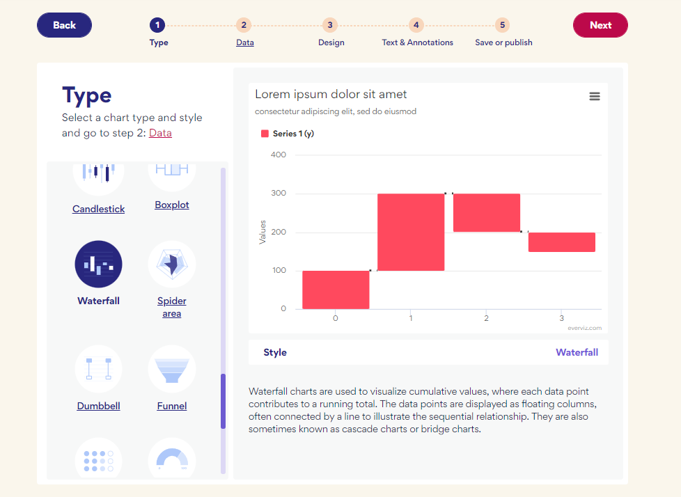
Select ‘Next’ to proceed to step 2.
2. Data: First ensure it is laid out in the correct rows and columns as described above. You can either copy and paste it directly from your spreadsheet into the chart wizard or you can upload it as a csv file.
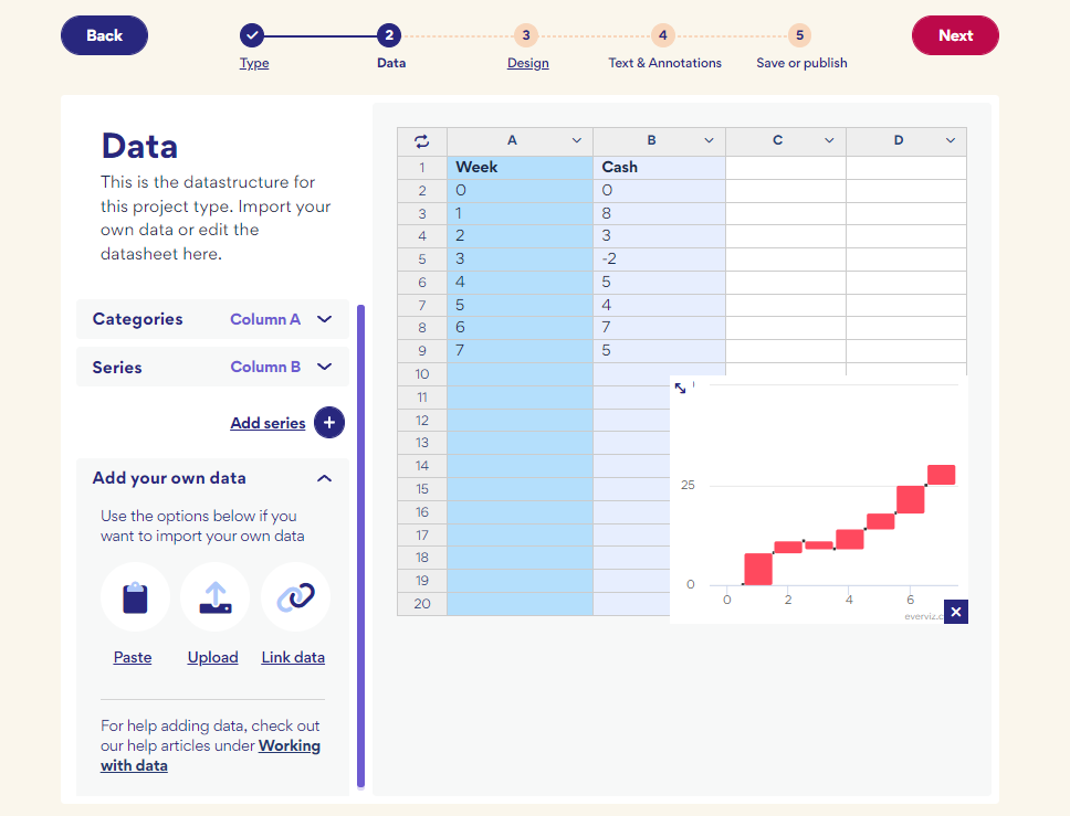
You can check the preview to ensure your data appears as expected and make any necessary changes by editing the data directly in the chart wizard.
When you are happy, select ‘Next’ to continue.
3. Design: You can select from one of the available design templates. Don’t worry if you don’t see one that meets your requirements, you will be able to adjust the design later.
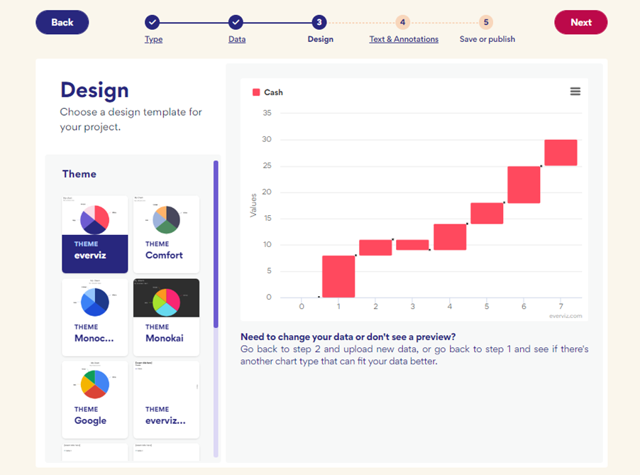
Select ‘Next’ to continue.
4. Add text & Annotations: You can add your chart and axis titles here or you can wait and add them later if you prefer.
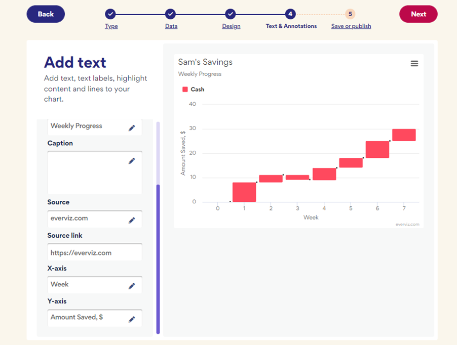
In our example, we added a title and labeled the axes. Leave any settings blank if they are not required. Select ‘Next’ to continue.
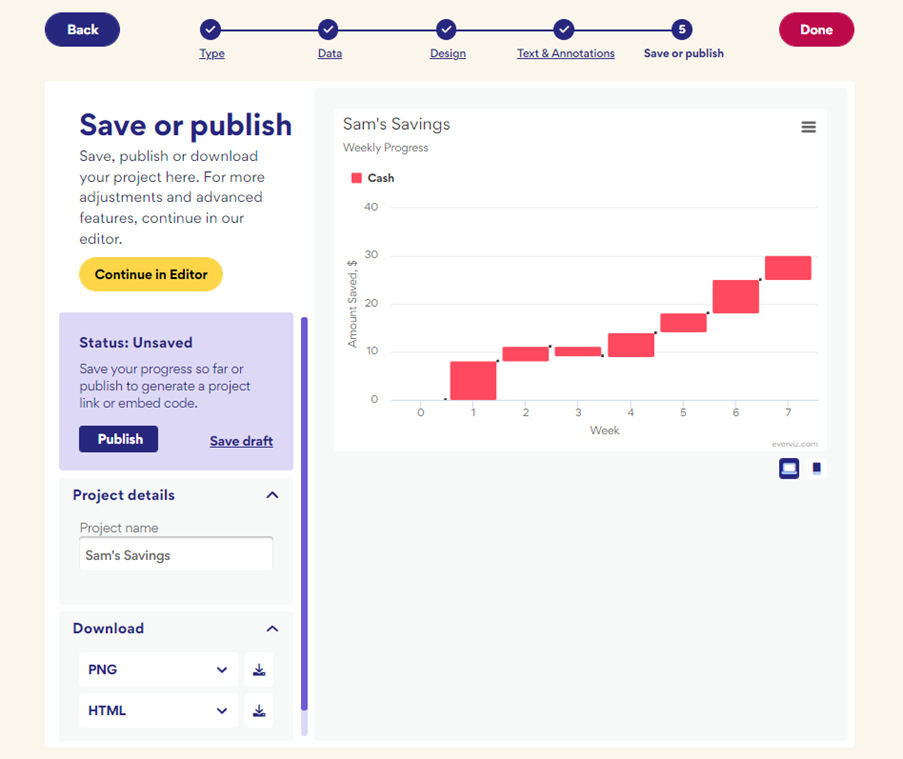
5. Save or Publish: At this point, you can save, publish or download your chart if you are happy with how it looks. Alternatively, select ‘Continue in Editor’ to make further changes.
Customizing your waterfall chart
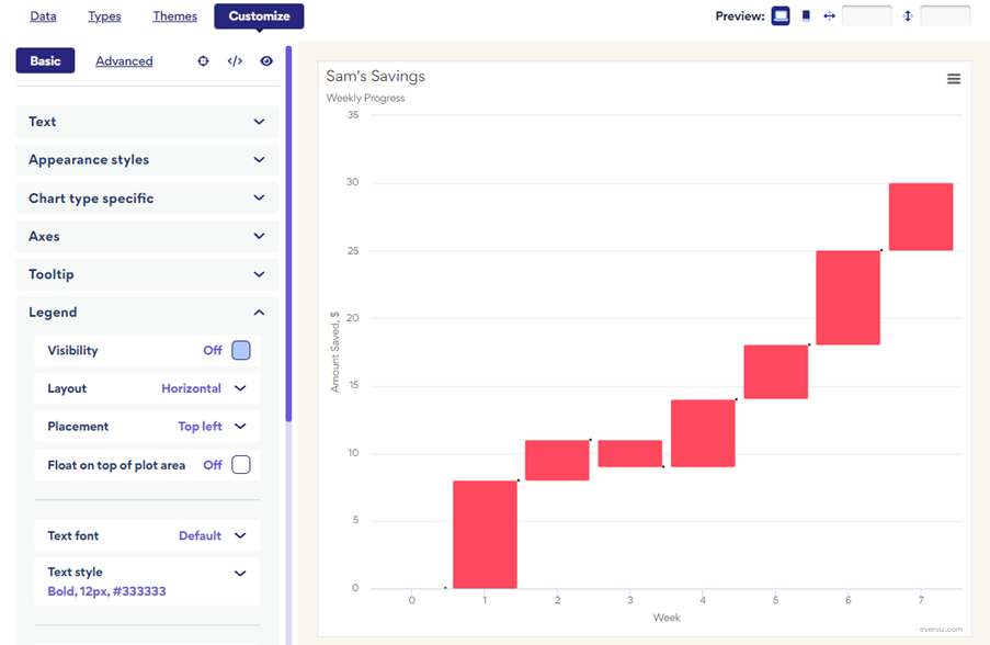
By selecting ‘Continue in Editor’ you have access to lots of different options that allow you to customize your waterfall chart to appear exactly as you want it.
We decided to remove the legend by changing the visibility option to “off”.
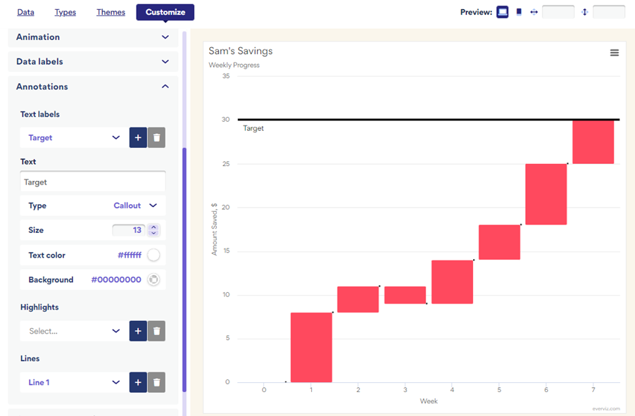
We also used the everviz annotations feature to add a line and some text to indicate Sam’s saving target of $30.
Everviz is packed with features that you can use to customize your chart so feel free to get stuck in and explore!
Frequently Asked Questions
How do I add data labels to my waterfall chart?
In the everviz Chart Editor, you have access to customize all aspects of your waterfall chart.
You can add labels based on your existing data or you can add a new column containing any information you choose. Just select your preferred column under the “Data” tab.

Returning to the “Customize” tab, you can now change the Data Label Visibility to “On” to display the text. This section also allows you to customise the content and appearance of your labels to suit your needs.
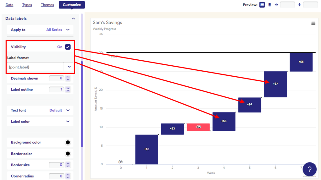
Labeling the individual points in your waterfall chart is a good way of explaining your data to readers who might not be familiar with this chart type. You can use labels to highlight the key information and to get your point across clearly.
How do I change the color of individual points on my waterfall chart?
If you want to highlight specific data points to your audience, you can adjust the colors to draw attention to key information.
Firstly, under the “Chart type specific” heading, select the “Color by point” option.
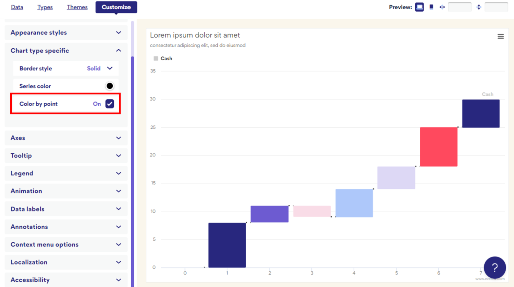
In the preview, you should be able to see that your chart changes so that every point is assigned a different color. You can customize these colors under the “Appearance styles” heading.
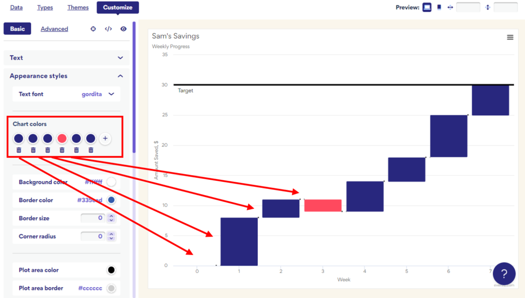
We used a red color to indicate the negative value in Week 3 (Sam spent more than he saved that week). We allocated a dark blue shade to all the other points so that the negative value stands out.
How do I add an interactive waterfall chart to my website?
It is very easy to add your everviz interactive waterfall chart to your website and no coding knowledge is required. Once you have created and customized your chart you should select “Publish”.
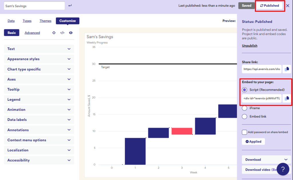
Under the heading “Embed to your page” you will find a line of code that you can copy and paste directly into your website or blog. This will ensure your chart displays perfectly, adjusting according to the device of every user who visits your page.
Alternatively, you can access a link to share your chart directly or you can download a static image version.