‘Creativity is key when working with data,’ says Diana Guerrero, Assistant Professor of Practice in Data Journalism at the University of Bergen. In this interview with everviz, she shares best practice for finding insights and outliers hidden in all datasets.

Q: ‘Data’ has become something of a buzzword these days. Organizations of all kinds are collecting it on a huge scale. The media is reporting on it. What exactly is data?
A: Data are all the attributes around an entity – a person, place or thing. For a picture, the attributes are things like author, size, date it was captured. The data help characterise something and help us identify what it is. We humans put tags or identifiers on everything. By giving things characteristics we classify them in order to communicate effectively. Data identifies things.
‘To gain insight from data, you must visualise it. Often it’s only when you visualise the data that you can see a trend or the outlier and really compare the data.’
– Diana Guerrero
Q: Do you have any tips for people who are new to working with data?
A: Many people when they start working with data are concerned about learning the tools. So they go online and start learning the ins and outs of, for example spreadsheet software. The main goal should be learning the key aspects to understand data, only then people will understand how to effectively use the tool. And by understanding the dataset that you can find the answers you hope to find within it. Understanding a dataset involves studying what each record (row) represents, and then studying its attributes (columns). It means going column by column to understand what we know about each of the records, and clear column titles can help with this understanding. Determine whether the data is summarised, as is often the case with datasets from national statistics bureaus. Data aggregated on a country basis may not be useful for the local journalist looking for city data.
Also, look out for duplicates in the data, and skim the data for blank cells. It is important to understand what a blank cell means in the context of a dataset. As for the duplicates, focus on what identifies each record in a unique way. If there is nothing that makes the record unique, then perhaps a combination of attributes makes it unique. For example, two people who share the same first name and last name, but have a different birthday. Creating a new attribute with a combination of these would help. What you are trying to do when you first approach the dataset is make it workable.
‘A great Norwegian journalist once told me, ‘Within all datasets are stories to tell’ and I agree with him. It’s all about understanding the possibilities of what you can do with the dataset. Approach the data without preconceived questions and really explore the dataset in its entirety and you will always find something interesting.’
– Diana Guerrero
Datasets have layers, and you can expose information as you peel back these layers. It is often said that you need to drill down a data set to get some insights. This involves playing with the variables (attributes) and using them to look at the data from different angles. A first layer can be an overview using two variables in a pivot table. As you add more variables you remove a layer and expose the next one. Use the dataset as a playground where each variable offers something different. This exercise can lead you to a specific subset to focus and create hypotheses around your findings.
Q: Early in your career, you worked as a data analyst in your home country of Colombia before moving on to working at Hasbro in Montreal, Canada (with a brief stopover to earn a Master’s degree in the US). What was it about those experiences that peaked your interest in data?
A: After graduating university, I worked on projects to migrate data between software programs, acting as a liaison between the users and the software developers. I had to really understand how the users wanted to use the databases we were migrating. That experience really helped me understand best practice around structuring data and the characteristics of a database. The user requests were sometimes far outside of what was possible for the developers to create. Balancing those interests was an interesting challenge!
‘Analysing data requires a high level of creativity. It’s about problem solving to find answers. The answers are these nuggets of information contained in the dataset.’
– Diana Guerrero
Later on at Hasbro in Montreal, with my interest in data already established, I worked as a data analyst. Hasbro is a very creative company, it’s a pillar of the culture there. What I learned is you don’t have to be an artist or graphic designer to be creative. Analysing data requires a high level of creativity. It’s about problem solving to find answers. The answers are these nuggets of information contained in the dataset. You’re basically squeezing every drop of information out of the datasheet, and that requires a great deal of creativity to do effectively.
Q: How can someone without a background in data get better at extracting stories from datasets?
A: A great Norwegian journalist once told me, ‘Within all datasets are stories to tell’. And I agree with him. But that story is not always so easy to extract. A student came to me with her data and told me she was struggling to find the story in the numbers.
She had five data sets that were five small tables with five rows and four columns. So 20 data points in each data set. Each table was a category within a larger theme of infrastructure. The first thing we did was to combine the datasets into a single data set. In the end we could see the data in one view, on one screen. We discovered her data contained categories and subcategories, and each of these had time and money attributes. Soon we were able to see which infrastructure projects cost the most and least over time. It took just playing around with two attributes – time and money – and she was quickly able to spot the outlier in the data.

At that point, the journalist is able to create a hypothesis around the outlier. What conditions led to it and so on. The lesson is when you have categories you must compare them. If your data contains a time element you must look at the trend. If you have dates you must look at duration.
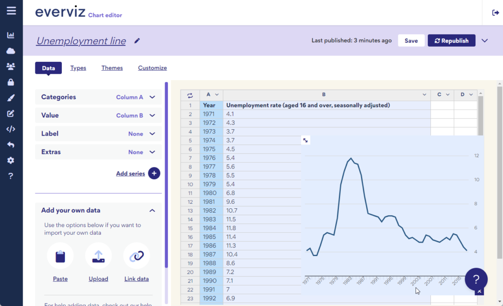
A line chart is great for comparing values over time.
Q: Data visualisation is part of the data analysis process. What role does visualisation play when working with data?
A: Data visualisations serve different purposes. One use case is journalists and other content creators visualising data to add depth to their stories. The other use case is for example researchers, economists and data analysts using visualisations to better understand the data. Either way, to gain insight from data, you must visualise it. Often it’s only when you visualise the data that you can see a trend or the outlier and really compare the data.
Try it yourself!
Visualizing data is a walk in the park with everviz. Check out this guided beginners exercise to see how it’s done.
How do you find the story in the data?
We would love to know how you find insights and outliers in datasets. Drop us a line at [email protected] or simply use the form below.


