Another year of global turmoil is coming to an end. Just when we felt hopeful in the beginning of the year, after two years of a global pandemic, war broke out in Europe. It’s not always easy to stay positive in these times, but all the great feedback from our clients certainly helps.
Here’s a quick look back at what we’ve been up to this year and the progress we’ve been able to make for our users all over the world.
Improved Project Wizard
We kicked the year with a major upgrade to the Project Wizard, based on feedback from our users. This article explains the improvements and how you can use them.
The Wizard helps you easily create engaging projects in the most efficient way possible. It loads every time you click the ‘New Project’ button.
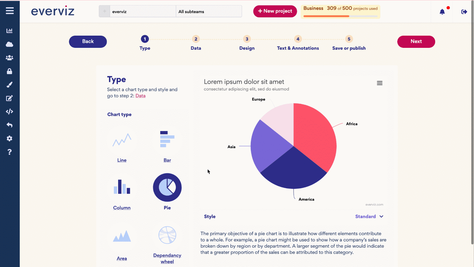
Read all about it in this blog post.
United Robots partnership
In May we signed an agreement with Swedish market leading news automation experts United Robots. Our powerful data visualization tools will be combined with their platform into a cutting edge automated editorial product with great relevance to local readers.

United Robots’ automated content packages work as a valuable complement to the journalism produced by reporters in local newsrooms, providing coverage on topics like local sports, real estate sales and company registrations. Through our partnership, everviz will add further value to the automated content they generate.
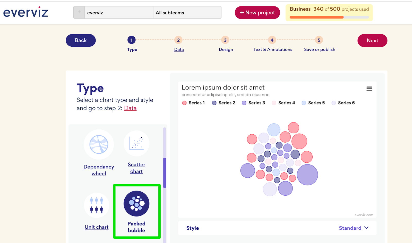
Packed Bubble chart
With everviz, you will have a variety of different choices for visualizations. In June, we added another simple yet detailed and insightful visualization to your toolbox: Packed Bubble chart
Packed Bubble, also known as Circular Tree Map or Circle Packing, is great for visualizing hierarchical data as nested circles of different sizes and colors. Each circle represents a level in the data hierarchy, with the color of the circle corresponding to an attribute and the size determined by a metric value.
Learn more here.
Data visualization glossary
If you’re new to this whole data visualization thing and get confused when people are talking about “logarithmic”, “CSV” or “legend” , then stick around, because we’ve been compiling a list of some of the most common words and phrases related to visualization.
Of course, learning the specifics of each of the topics we’ll be describing will take considerably more time, but hopefully this list will give you a good introduction.
New Chart Type: Treemap
A Treemap displays data as a set of nested rectangles. Each group is represented by a rectangle where the area is proportional to its value.
Treemaps are used to show how the whole is divided. It is easy to understand which entity is the most important and how the whole is distributed among entities. The current Treemap in everviz supports one level (i.e not hierarchical data), just to show the value of several entities like in a barplot.
Treemaps have the advantage of making efficient use of space, which makes them useful to represent a big amount of data.
Learn more about the new addition to chart types here.
Simplified data visualization
In September we released some massive improvements to the editing experience in everviz. This article dives a bit deeper into the improvements and explains how you can use them.
Fonn Group invests in everviz
In October a major milestone in the everviz journey was announced, as Fonn Group came aboard as a key investor in our company.
Fonn Group is a technology group based in Norway. The group invests in companies delivering production and journalist tools for the media and entertainment industry. The Fonn Group portfolio includes software companies Mjoll and 7Mountains, cloud workflows and integration partner Kunnusta and Mediability, a professional equipment reseller and systems integrator serving the Nordic countries. The Fonn Group majority owner is the family-owned investment company Rieber & Søn.
Read the full press release here.
everviz joining “Nansen 2022” to the South Pole
The two Norwegian explorers AK Glück-Teigland and Kjartan Bergsvåg are on a everviz sponsored expedition to reach the South Pole between November 2022 – January 2023.