This is a short introduction on how to make an interactive map in everviz. To get more in-depth insights and learn about advanced customization, we recommend visiting our knowledge base here.
What is an interactive map?
An interactive map allows users to explore and engage with data plotted on geographical coordinates. Many interactive maps will allow users to pan or zoom in on a location of interest. Some may allow users to see more detailed information by selecting features on the map. Maps can be used as visualization tools to display data associated with geographical locations in different ways.
When should you use an interactive map?
Maps are ideal for displaying geographical data. They can be used to simply plot locations, or they can be used to illustrate different data attributes relating to a point or area.
Maps offer an eye-catching method of displaying geographical information and they can encourage users to explore the data. They also allow the reader to observe patterns that may not be obvious from a table or other types of chart.
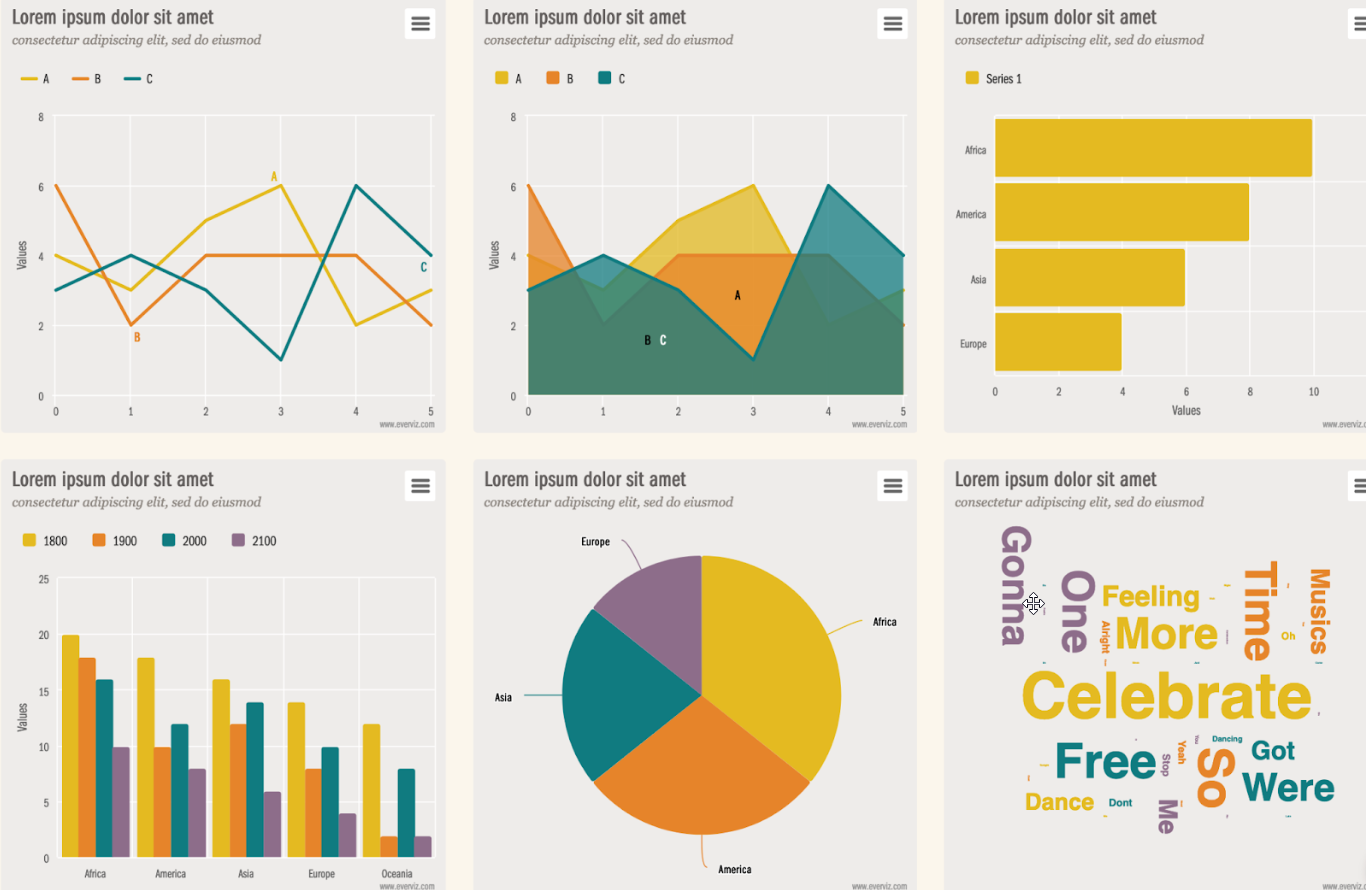
Types of maps for data visualization
There are lots of different types of data visualization map including the following common ones.
Point maps are used to show specific geographical locations such as the center of a city or the position of an amenity. The points can be customized to provide additional information (e.g. using a different color or shape to represent different location types).
Bubble maps are a variation on the point map where the size of the point is scaled according to the magnitude of a data variable. For example, a bubble map could be used to illustrate the population of a city with larger bubbles indicating higher populations.
Choropleth maps display data relating to geographical regions. The area is colored or patterned according to the magnitude of a variable. For example, a choropleth might be used to illustrate how the population density varies between different countries or states.
Common issues with maps
Maps can become difficult to interpret if the data is packed too closely together or where smaller regions are not easily seen because they are overshadowed by their geographical neighbors. Interactive maps help to minimize the impact of this by allowing the user to zoom in on an area of interest. Maps created with everviz will automatically rescale the data points according to the new view.
Maps can be difficult to interpret for people with visual impairments, so you might want to consider taking steps to improve the accessibility of your creations. For example, it is not advisable to rely solely on color to illustrate data patterns as those with color vision deficiencies may not see the distinction. Instead, you might consider using patterns or shapes to represent different data series.
How to create an interactive map in everviz
We will demonstrate how to create an interactive map with this simple example: a point map showing the location of the state and territory capital cities of Australia.
| Latitude | State/Territory | City | State/Territory |
| -33.865 | 151.2094 | Sydney | New South Wales |
| -37.8136 | 144.9631 | Melbourne | Victoria |
| -27.4678 | 153.0281 | Brisbane | Queensland |
| -31.9522 | 115.8589 | Perth | Western Australia |
| -34.9289 | 138.6011 | Adelaide | South Australia |
| -35.2931 | 149.1269 | Canberra | Australian Capital Territory |
| -42.8806 | 147.325 | Hobart | Tasmania |
| -12.4381 | 130.8411 | Darwin | Northern Territory |
Preparing your data
You can prepare your data in a spreadsheet format ready to import or paste into the everviz wizard.
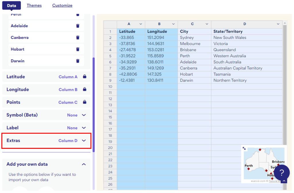
Your data should be arranged into three or more columns.
- Column A and Column B should contain the latitude and longitude of your data points.
- Column C should contain the text to be displayed. In our case, this is the city name.
- Additional columns can be used to contain any other information you may wish to use when creating your graph. In our example, we decided to include the state or territory name.
The first row of your data should contain your column headings so that your values start on the second row.
Using the map wizard
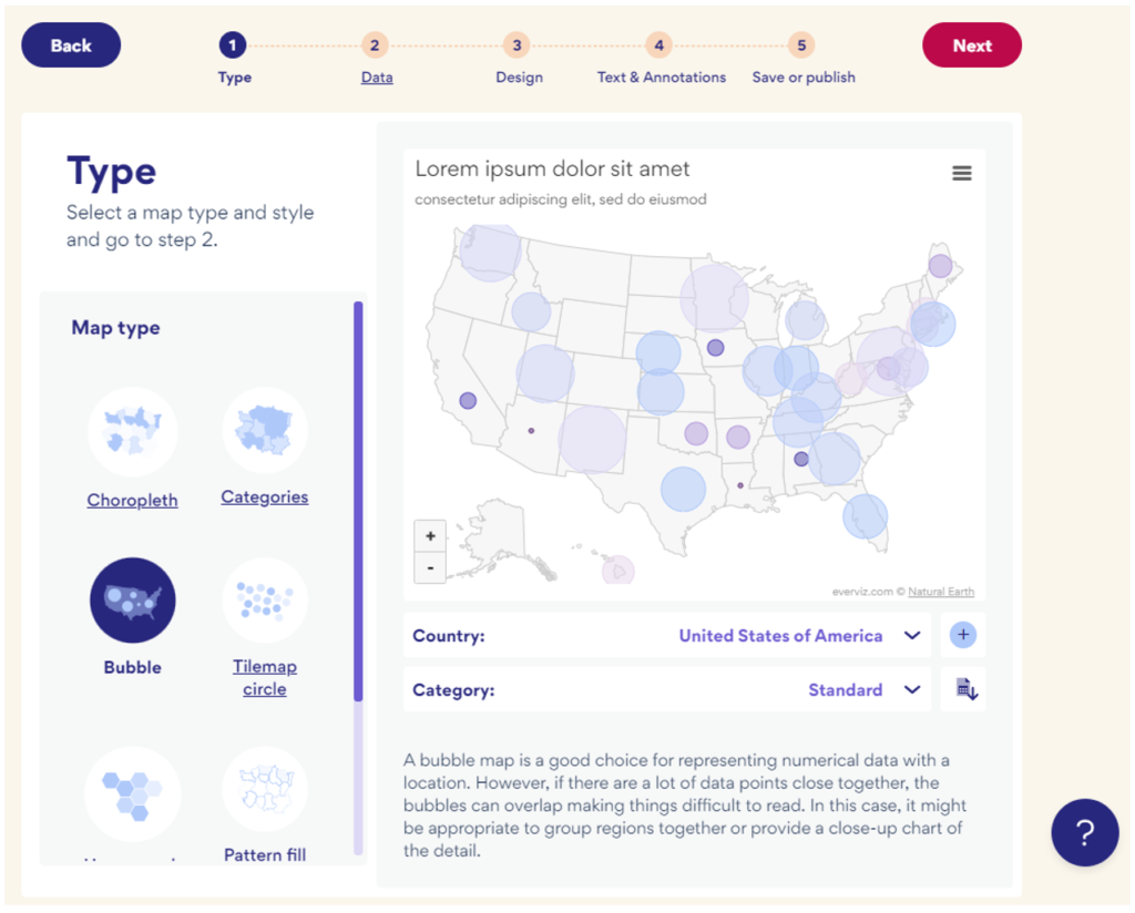
1. Type: Launch the everviz map wizard by starting a new project and selecting the project type: Map. Next select the map type: Point map. (or simply click here to open a new tab with a new point map).
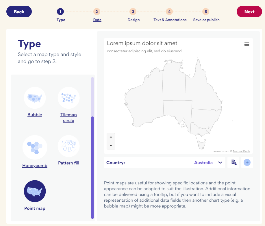
Select your country or region of choice using the drop-down box indicated. We have selected ‘Australia’.
Select ‘Next’ to proceed to step 2.
2. Data: First ensure it is laid out in the correct rows and columns as described above.
You can either copy and paste it directly from your spreadsheet into the map wizard or you can upload it as a csv file.
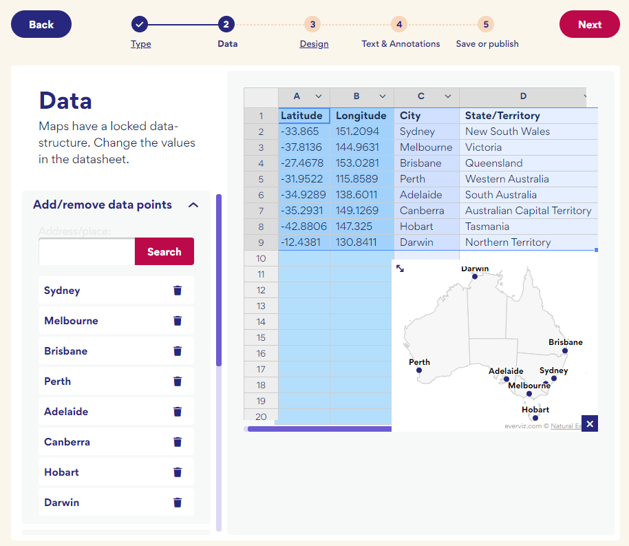
You can check the preview to ensure your data appears as expected and make any necessary changes by editing the data directly in the map wizard.
When you are happy, select ‘Next’ to continue.
3. Design: You can select from one of the available design templates. Don’t worry if you don’t see one that meets your requirements, you will be able to adjust the design later.
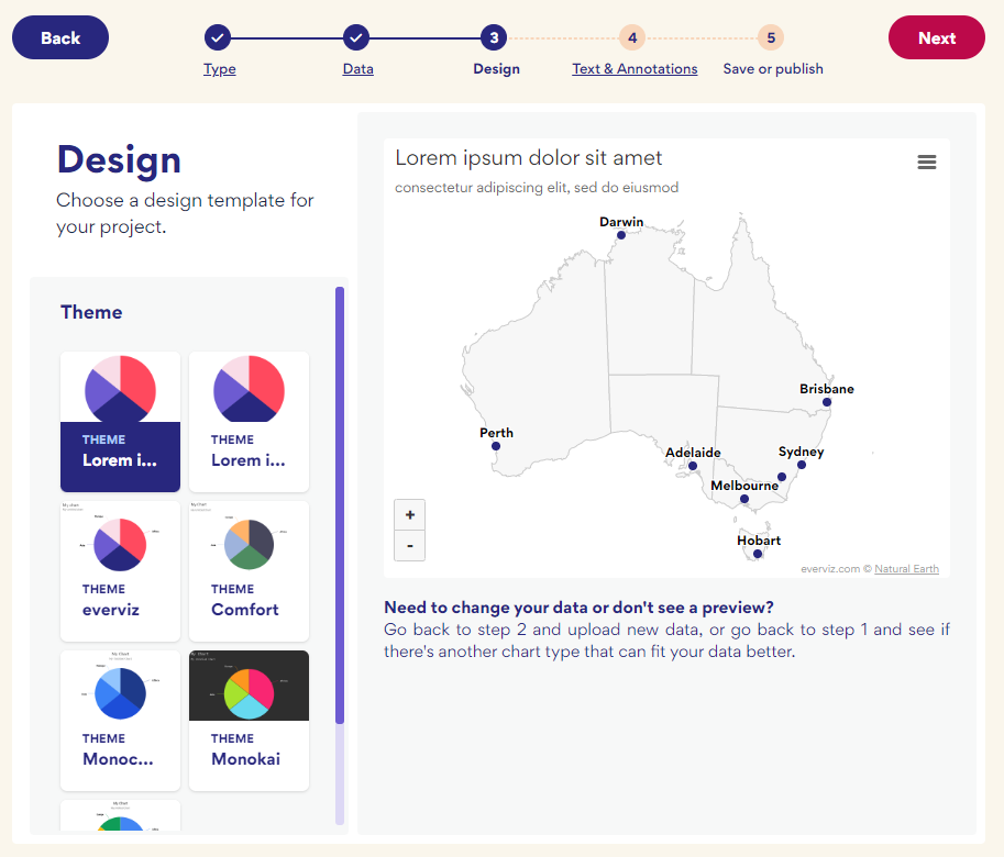
Select ‘Next’ to continue
4. Add text: You can add your titles and captions here or you can wait and add them later if you prefer.
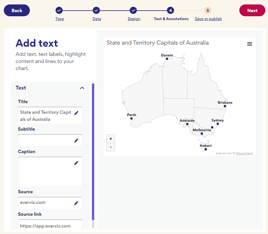
In our example, we added a title and removed the subtitle placeholder text. Leave any settings blank if they are not required. Select ‘Next’ to continue.
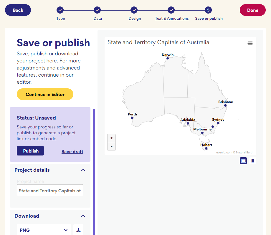
5. Save or Publish: At this point, you can save, publish or download your map if you are happy with how it looks. Alternatively, select ‘Continue in Editor’ to make further changes.
Customizing your interactive map
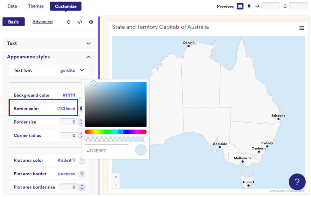
By selecting ‘Continue in Editor’ you have access to lots of different options that allow you to customize your point map to appear exactly as you want it.
We decided to adjust the colors. Under the ‘Appearance styles’ heading, we changed the ‘Plot area color’ to a light blue shade to better represent the sea.
We also changed the shape and color of the point markers by adjusting the settings under the heading ‘Chart type specific’:
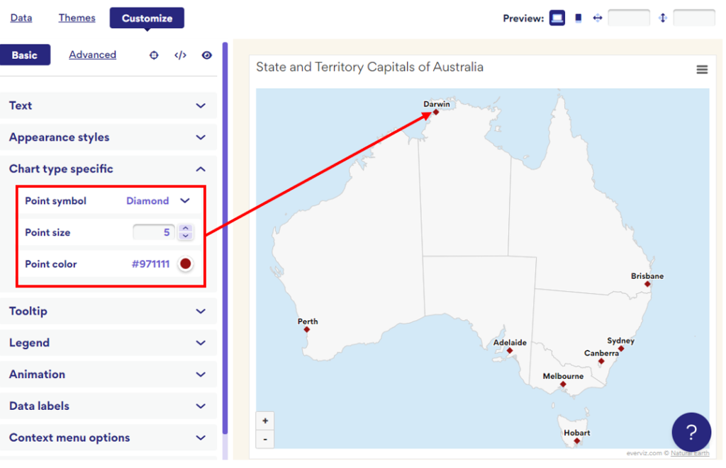
everviz is packed with features that you can use to customize your map so feel free to get stuck in and explore!
Frequently Asked Questions
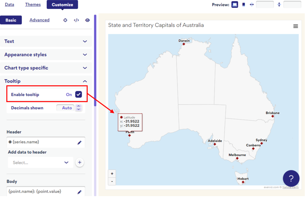
How do I add a tooltip to my map?
A tooltip is a box or message that appears when your mouse hovers over a specific part of your visualization. It is a great way to include more information without cluttering the appearance of your map.
To add a tooltip, simply locate the ‘Tooltip’ heading and check the ‘Enable tooltip’ box. This will automatically generate a tooltip that appears whenever your cursor passes over one of your data points.
You can change the content of the tooltip to display the information you require.
We wanted to display the state or territory name included in Column D of our data. Firstly, under the ‘Data’ tab, locate the ‘Extras’ dropdown menu and choose the column of interest.
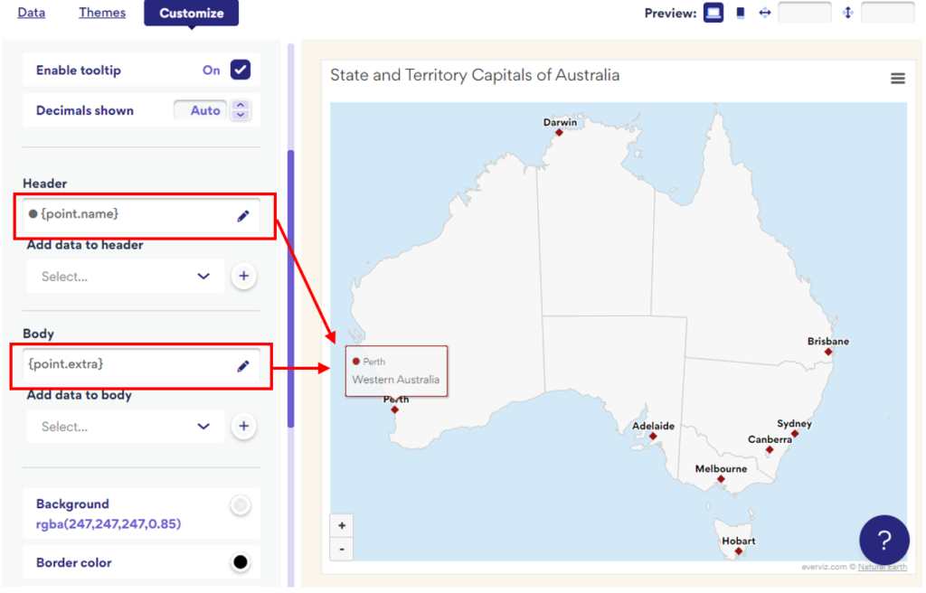
Returning to the ‘Customize’ tab, you can now assign the additional information to your tooltip using by inserting the {point.extra} data.
How do I vary the size of the data points according to a data variable?
A map where the size of a data point is dependent on a variable is known as a bubble map. To create a bubble map with everviz, you should launch the map wizard and select the Map type: ‘Bubble’.
You can then proceed to create your map in the same way as a Point map, taking care to assign the relevant variable to the ‘Bubbles’ attribute.
Alternatively, try out one of the many other interactive map types offered by everviz.
How do I add an interactive map to my website?
It is a simple process to add your everviz map to your website or blog. Once you have created and customized your map you simply select “Publish”.
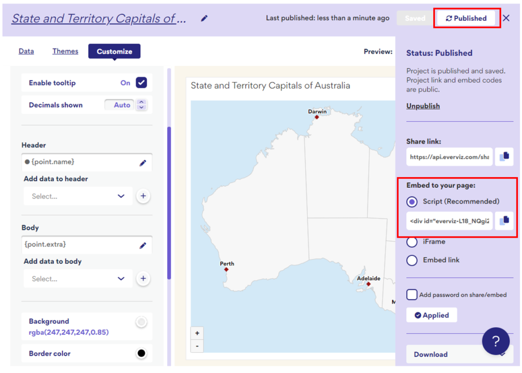
Under the heading “Embed to your page” you will find a line of code that you can copy and paste directly into your webpage or article. This will ensure your map displays perfectly, adjusting according to fit the screen size of every reader.