Data tables can be a great way of summarizing information and sharing it with your audience. Tables can break up sections of text and encourage your readers to look up the information that is of interest to them.
While tables might not always be as eye-catching as charts, they can be a better choice in certain situations. You might choose to use a table because it allows you to convey specific information more accurately than a chart. This is useful where precise figures are important or if you want to include descriptive information that cannot easily be plotted on a graph.
In this example, the table allows a user to look up the exact cost of a subscription depending on the number of users they have. Note how the table also makes it clear that Tier 4 allows an unlimited number of users (this information is difficult to display on the chart).
With everviz, you can easily produce a mixture of tables and charts with consistent styling to suit your needs. You can create interactive tables that are sortable, searchable, and responsive and you can even incorporate small visualizations within the table itself.
Advantages of tables
- Tables allow you to show precise numbers. This can be particularly useful for data that cannot easily be compared on a chart (for example, when you need to accommodate different units or different orders of magnitude)
- Tables allow and encourage readers to look up the information that is of interest to them.
- Table rows can be ordered as needed to convey your message. For example, you might want to rank rows by the size of a particular variable.
- Interactive tables can be sortable and searchable by the user, making them more engaging and accessible.
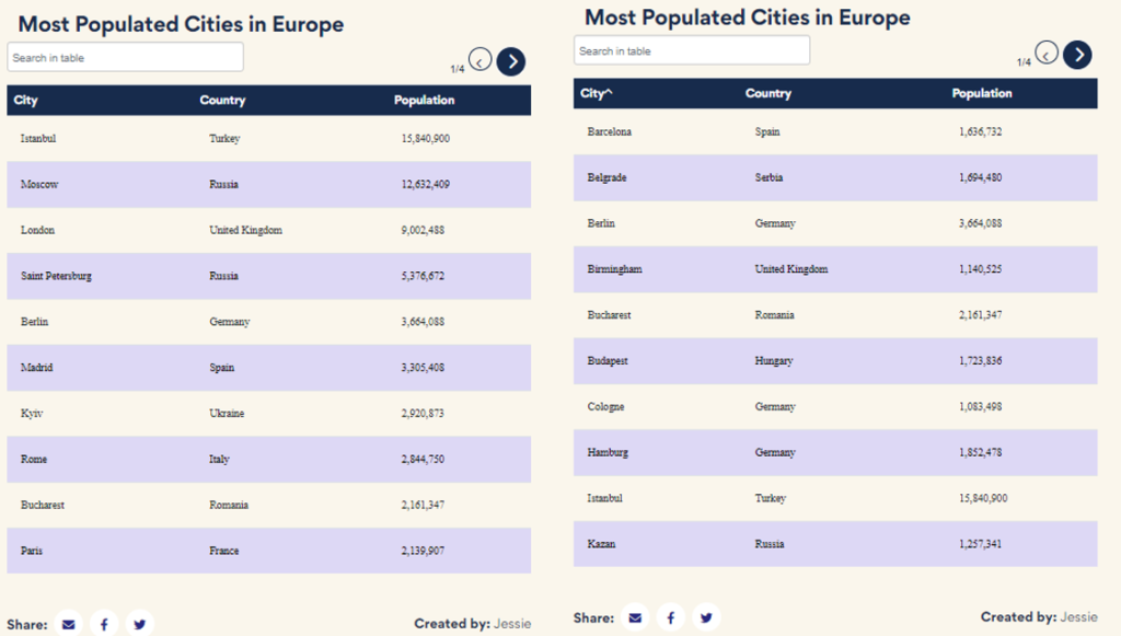
(IMAGE) everviz tables allow the reader to sort the data by simply clicking the column header. In the first example, the table has been sorted alphabetically by city; the second example is sorted in order of population size.
everviz also allows you to add a search bar which the reader can use to filter the data or to find specific information they are looking for (in this case, the population size of the largest German cities)
Disadvantages of tables
- Tables often require the user to read and interpret the data themselves. Unlike charts, they don’t provide a visual aid to help the reader to appreciate the different in magnitude between data points.
- It can be more difficult to convey trends and patterns in the data with a table.
- Tables are not as visually engaging as charts.
everviz tables: the best of both worlds
With everviz, you can actually incorporate miniature charts within your tables! By adding some visualizations to your table, you can highlight any patterns in the data, while still providing any precise numbers or descriptive data that is important to your readers.
You can enrich your tables with individual visualizations for each row. This could be a bar to illustrate the magnitude of a data point or a small line chart to show trends.
Interactive everviz tables are visually engaging, sortable, searchable, and responsive.
In this example, the table has been enhanced with a chart which illustrates how sales figures have fluctuated over the months. The table has also been customized, applying a red color to highlight those regions that have not achieved their sales targets.
How to produce an interactive data table
Design tips
- Keep it simple. When designing a table, there is often the temptation to cram in as much data as possible. But this will only result in a cluttered table that is difficult to read and unpleasant to look at. It is better to select only the necessary data and to keep the number of columns to a minimum for a clean look.
In this example, the first table contains a lot of data which makes it quite cluttered and uninviting to read. In the second table, the key data has been summarised and numbers have been rounded to make the information clearer and more accessible.
- Keep it readable. Simplify any text (move any repetitive description to the header row or key). Consider using common abbreviations where appropriate but ensure this doesn’t make it more difficult to read or interpret the data.
The first table delivers data in a mixture of formats and units which makes it more difficult to compare information. In the second table, the format has been made consistent. Not only does this mean that the table is easier to read, but it can also be sorted by column making it easy for the reader to see which travel options are the cheapest or quickest.
- Ensure data is comparable. Apply rounding or adjust the units to make numbers easy to read and compare.
In this example, the units have been rounded and displayed as millions. You should choose a format that is suitable for your data and will be easily understood by your target audience.
- Use styling to improve readability. Consider striped rows for ease of look up on wider tables with multiple columns. Consider pagination for long tables with multiple rows. Use padding and align text to ensure the table is readable and attractive.
Striped rows make it easy to look up specific data points, particularly on wider tables where it might be necessary to read across many columns.
Delivering your message
- Identify the main message you want to convey with your table
- Consider how you can draw attention to the key data, trends, or patterns you wish to convey. For example, you might order your rows according to your key data series, or you might use color to highlight specific information.
In this example, a specific row has been highlighted by applying a different background color. This draws the reader’s attention to the key message that is being delivered.
- Consider enhancing your table with mini charts to display the data visually. This can help you to highlight patterns and trends or the magnitude of a difference.
In this example, line charts have been added to each row. This shows how each student’s relative score has varied across the different tests. This is a good way of showing individual trends (for example, you can see whether there has been consistent improvement, or if everyone found a specific test more difficult). However, you should remember that each line chart is scaled individually so they are not directly comparable to each other.
How everviz can help you create the perfect interactive table
With everviz, you can easily create a fully interactive table to suit your needs:
- Fully customizable. You change the style of many different aspects of the table to suit your needs. You can add your own logos and change the fonts, colors, and styles to match your brand requirements.
- Use everviz ‘themes’ to create a reusable template that allows you to replicate your style decisions across different tables and charts to create a consistent appearance. You can even share this with other members of your team.
- Create a table that updates with live data. With everviz, you can link your table to a Google Sheet or other live data source, so that your user will always see the latest data in the table.
- Easily publish, share, or download your data. Once you’ve created your table, you can easily embed it into your website or generate a link to share it directly.
- Accessible and Responsive. Accessibility features are included as standard. All everviz tables and visualizations are designed to automatically adjust to suit the screen size of the user. You can preview how your table will look across desktop, tablet, and mobile screens when you are designing your table.
Try creating your first everviz table today for free!


