2023 was a turbulent year on the international stage. Conflicts in Europe and the Middle east dominated the news, as did reports of tension between China and the US over Taiwan. The cost of living skyrocketed, pushing more people into poverty. We can only hope for a peaceful resolution to these issues in 2024.
There were bright moments, too. Norwegians celebrated as Jon Fosse was awarded the Nobel Prize in Literature. At the end of the year, the COP28 climate conference resulted in an agreement to transition away from fossil fuels, in an effort to keep global temps from exceeding 1.5C. Some stories put a smile on our face, like this snake on a plane story from South Africa where, happily, everyone left unscathed (even the snake, apparently).
As the year unfolded we continued improving our app and working with our great customers. Interesting developments unfolded as a result. We courted the live video and digital publishing sector. We integrated with some great partners. And we made new friends at IBC in Amsterdam. Here is a round-up of our highlights from 2023.
Viz Flowics partnership
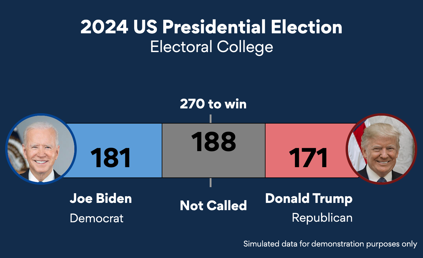
everviz entered the world of broadcasting in 2023. We introduced support for including data graphics in live video TV shows. This year, we partnered with Viz Flowics, a tool for creating HTML graphics made by Vizrt. Viz Flowics is mostly used by broadcasters. It is also used for playout, as a way for broadcasters to send content to air.
Data graphics from everviz are seamlessly inserted into Viz Flowics templates to supplement coverage of sports, elections, general news, financial news and more. We are excited to keep expanding in this space and continue discussions with broadcasters to provide data graphics for big events in 2024.
everviz at IBC
The city of canals beckoned and we heeded the call. IBC is a major broadcasting conference held annually in Amsterdam. This year we joined our sister companies at the Fonn Group stand. We had great discussions with broadcasters, who seemed curious about our solutions for data graphics for news. The discussions continued throughout the fall. Thank you to everyone who popped by our stand, and we look forward to seeing you at NAB 2024 in Las Vegas.
Multiplatform publishing
You spoke, we listened. We revamped the publishing panel in everviz to include support for exporting charts in different formats, including web, video and print, to name a few. Scott Burch, senior designer at Thornburg, put it well: “The new publishing platform allows us to easily export visualizations to whatever dimensions that we need.” Building on this functionality, this fall we released dynamic font scaling, ensuring readability and accessibility across publication destinations.
Polygon partnership
The end of the year brought some happy news. We were pleased to announce our integration with Polygon, a financial news provider. This allows everviz users to access Polygon data related to currencies, stock prices, indices and more directly in everviz. A cool thing here is all charts created with Polygon data remain updated in real time. We are excited to see how our customers use this integration next year.
Amy Cesal joins the team
This year, we welcomed a new member to the team. Amy Cesal is a leading data viz expert based in Chicago.
Amy joined everviz as our Product Evangelist. Amy contributed blog articles designed to help you produce the best possible charts and maps. Look out for more thought leadership from Amy on our blog in 2024.
Celebrating our customers
everviz customers created some amazing charts in 2023
Here are some examples:
- Pulse Labs shares highlights from their research in the IQ report, which is jammed packed with amazing data viz created by the talented designer Tara Connelly
- Crisp data viz designs peppered sharp analyses from the Morning Consult team on their Pro platform.
- Chris Bicker, chief designer at Turner & Townsend, turned to everviz to create beautiful, interactive charts to highlight trends and findings for their annual international construction market survey
We are excited to see what our customers create next year.
2024 sneak peak
We always strive to improve everviz. We will continue this focus in 2024.

This fall our talented development team has been investigating ways to expand options for visualizing geographic data. Look out for an announcement related to everviz maps soon. We have been hard at work improving usability in everviz. Keep an eye out for small improvements here and there (hint: quick publishing from the project homepage coming soon).
We also have bigger projects in the works. It’s too soon to share details but rest assured, new and innovative ways to visualize data are coming to everviz in 2024.
Happy holidays and we wish everyone a happy and prosperous New Year 🥳


