The US election this November promises to be one of the biggest stories of the year.
A data-driven event, where visualization of vote tallies stands central, visualizing the insights in a new and innovative way was a natural challenge for our team.
Time for a change
We believe the time is ripe in the media industry for a shift in how election graphics are created and published.
Our media clients wanted an easy way to make and publish election data graphs. They want a journalist-friendly tool. Building election graphics today requires specialist tools and expertise. Months of work is often required.
Here’s where we can help, we thought. So, together with our clients in media, our team of developers and data viz experts started brainstorming.
US Election Package
The result is the US election package which we are pleased to release today.
Contained in the package are beautiful charts and maps designed for media outlets to clearly communicate the votes as they tick in on 5th of November.
Interactivity driving engagement
Here’s an example – a map of the US showing called states. Try clicking a state to view the county-level vote breakdown in the interactive tooltip.
Key highlights of the election package:
- Multiplatform-friendly
- Pre-loaded with real-time data from top data providers
- Easily branded and published
So how does this work?
The election graphics are directly connected to top election data providers such as the AP, the authoritative election data source for the US election.
We configure the chart using your data provider license.
How do you access the charts?
The package of charts will be accessible in the everviz platform. Users can access each chart’s embed code and insert on all platforms.
Data graphics on all platforms
Viewers will follow the election on a plethora of platforms and devices.
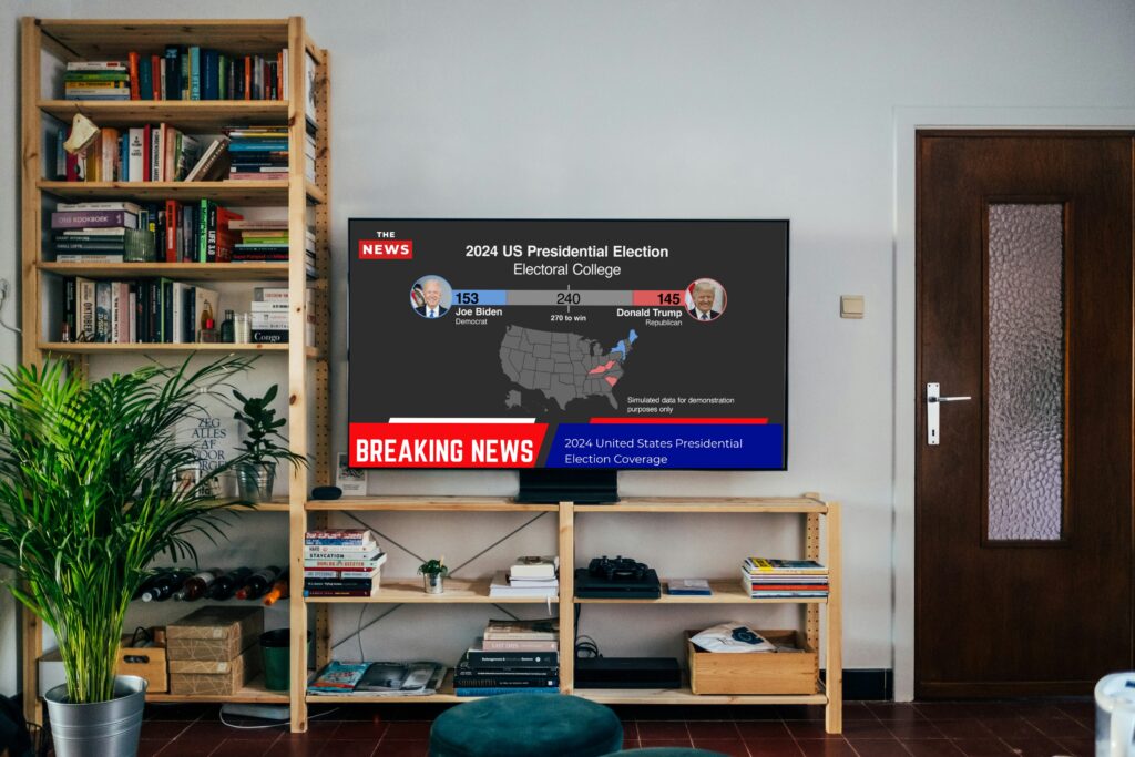
That’s why we made it possible to publish these charts online or as graphic elements in linear TV feeds using our Viz Flowics integration.
All charts auto adapt to the screen size, ensuring optimal viewing on everything from mobile to large TV screens.

Easy to access, easy to publish
The election package was developed in tight collaboration with our media clients.
Not all media outlets have the luxury of big design teams to work on elaborate election charts. No design resources are required to build these charts. They are pre-made and pre-configured with election data. Neither are data teams required to configure the data.
Plug and play
Most importantly, they are informative, helping your audience understand the election as it unfolds. And the charts are beautiful, interactive and accessible.
Find out more here, and note packages are available for any election.
Get in touch!
