everviz is a multiplatform visualization solution that lets you create interactive charts and maps online for publishing on your website, social media or through your cloud-based newsroom system. It only takes a minute to create your first visualization. Publish where you meet your audience. Why not try it yourself? It only takes a minute to create your first chart.
Charts are key to marketing efforts at Thornburg, a US-based Investment firm. Their thought leadership content is found on multiple platforms, including their website, social media and YouTube. In this case study, Senior Designer Scott Burch unpacks Thornburg’s approach to data viz, which carefully considers branding, accessibility, formats, content platforms, audience expectations and more.
“With everviz, our visualizations are more consistent, accessible and interactive with great loading animations straight out of the box. They now take less time to create, locate and update, and we can easily export visualizations to whatever dimensions that we need.”
Scott Burch, Senior Designer at Thornburg
Scott Burch, Senior Designer at Thornburg.
The challenge
What challenges were you facing prior to using interactive data visualizations?
We were creating multiple instances of the same visualization for different types of media (web, print and video), repeating effort with inconsistent results in both style and execution.
How do you use data visualizations?
Visualizations are integral to our marketing efforts. We use them when promoting our products as well as in our thought leadership Insights section of our website, as interactive charts in web articles and animated charts in videos.
We often promote our thought leadership “Insights” using a stand-alone visualization on social media.
When do you consider a data visualization a success?
When it reflects the brand in a positive way. Also, when it’s easily understood and validates or enhances a statement made in a broader piece in which the visualization appears.
If it’s a stand-alone chart, success means that the user takes action, either by clicking to learn more on our website and ultimately purchasing one of our products.
The solution
Why everviz?
We chose everviz because we were familiar with the Highcharts library and knew of its capabilities on the interactive side, as well as the accessibility benefits that come along with presenting charts in this manner.
The SVG exporting out of everviz is also a critical factor because we use those vectors for print and video.
Lastly, having charts hosted on everviz, in the cloud, in a centralized, searchable location. Thanks to tagging in the Projects menu of the app, we now have a repository of charts that we can easily track down to refresh and re-use.
How do you handle chart branding?
We have excellent teams further upstream, generating and editing content, and providing us with current data.
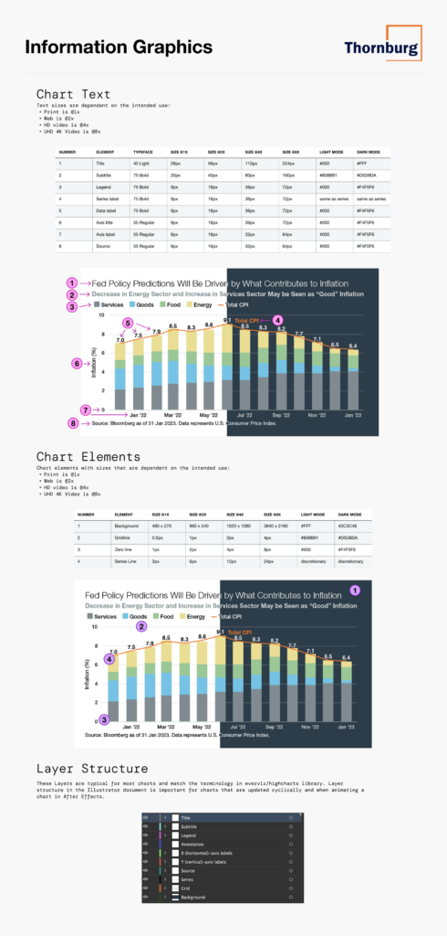
All graphics that appear on our website and in printed promotional materials flow through my team, the Creative Services team. Our style guide and design system specifies our chart text and elements in light and dark modes, using language aligned with everviz and the highcharts library.
How was the experience creating accessible data visualizations?
It’s an ongoing process, learning and applying those learnings as we advance. We have a great digital marketing team that brings lots of experience and support to the effort.
Some color combinations in our brand styles can be problematic when used together, we make it a point to document and communicate the issue to those who create visualizations so that we collectively steer clear of those pairings when creating graphics.
With everviz, our visualizations are more consistent, accessible and interactive with great loading animations straight out of the box. They now take less time to create, locate and update, and we can easily export visualizations to whatever dimensions that we need.
Has the goal been achieved?
Yes, we have had great success using everviz over the past 3+ years, it has been an essential tool with regards to reaching that goal and is the tool of choice when creating visualizations.
How have people reacted?
Reactions have been positive.
Visualizations are used so much in this industry (finance). Having a reliable tool with a broad library of chart types and the flexibility to display and output those visualizations as needed is a positive benefit for the business.
What tips do you have for other chart designers?
I would say that every element on a chart should have a purpose. Its purpose should be easily understood visually, with minimal language (there’s only so much room on a chart.)
I also recommend making a game out of looking at raw data and figuring out in what ways that data can be expressed visually. Then, weigh the pros and cons of displaying the data each way—everviz is a great tool for the iteration phase of that exercise. With it, you can easily preview your data in different ways.
Would love to hear your thoughts, please get in touch!
everviz is a multiplatform visualization solution that lets you create interactive charts and maps online for publishing on your website, social media or through your cloud-based newsroom system.
It only takes a minute to create your first visualization.