This is a featured blog post by Amy Cesal, Product Evangelist at everviz. A three-time winner of the Information is Beautiful awards, Amy is an instructor at Maryland Institute College of Art and co-founder of the Data Visualization Society.
I’ve been carrying a post-it around for almost five years. Inspired by a talk by someone I can’t remember who talked about how they start their visualizations. I scrawled this note to myself about the components of a great visualization. It has moved from desk to desk with me as I’ve transitioned jobs, moved across the country, and bought a house. The post it says:
Over time, I’ve now come to think of this as “the hook” (the why), “the meat” (the subject) and “the package” (the visual format). You need these 3 components to work together to create something truly outstanding. This is the framework I had in mind when working on my projects that won IIB awards in the “unique” category.
When working on a new project, it helps me to start with any of the 3 pieces, and figure out the other two along the way. Let me share examples of visualizations I created (using play-doh!) with all 3 methods.
The hook
The hook is probably my favorite way to start a visualization. It’s the question that the visualization answers. The ‘so what’. With a good hook, even a less interesting format can entice an audience.
The birthday weather visualization I did as part of my DayDohVis project was really about the hook. My mother has often said to me that it “always” rains on my birthday. Was this really true? I decided to find out. So I created a visualization to answer the question: “how often does it rain on my birthday.” That was my hook. It’s actually a more common question than I would have thought, and I see semi-significant traffic to my website from people googling this exact question.
Starting a visual with the hook often means you have to build a data set to answer your question. This makes for a really compelling piece because no one has visualized this custom data set before; it’s completely unique to your story.
The meat
Sometimes you just have information that the world needs to know. In this case, I was listening to a podcast interview with Steve Dolinsky talking about his book on different types of pizza in Chicago. Obviously the world needed to know this — we in Chicago (my hometown) are about more than just Deep Dish style pizza!
While I knew this information needed to be categorized and visualized, there wasn’t a major hook to this visualization, I didn’t answer a question, I took more of an exploratory approach. However, the information is interesting enough that I think it carries the visualization.
I’ll admit, while for me this visualization started with the meat, I think the package works well too, because who doesn’t find tiny little playdoh pizzas adorable?
The package
Sometimes you are inspired by a visual style, interaction, or format and use this as a catalyst to find a data set that works for the visualization you want to create
Before there was the WEB Dubois challenge, I was inspired by his work, specifically this serpentine bar chart where the bar wraps back several times to convey the measure is much larger than the others.
I wanted to use this format and layer in other data elements, like Georgia Lupi does so well. I found a data set of roller coasters that would serve this format well and would be interesting. My hook, admittedly, wasn’t great. I wanted to look into the longest roller coasters, and see what they had in common. I displayed the length of the roller coasters using the DuBois serpentine bar style, and added the other data elements with easily interpretable annotated icons.
Some more examples
To get more of a sense of what I mean, let’s look at some more iconic visualizations mapped according to these three elements in a ternary plot.
A great example of a chart that’s all about a really interesting visual format. The way the wind is animated across the map is visually compelling and memorable. However, it doesn’t really answer a question — I know there’s wind in the US. In my view, there isn’t a lot of “meat,” ; there’s no way to dig into it to learn more. It’s one level of map with 5 different wind densities. The incredible presentation and visual format make it a stand out visualization: this one is all package.
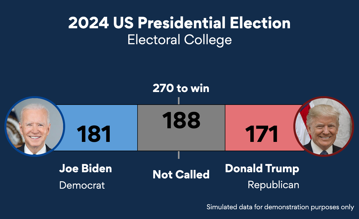
I think this chart hits on all three components. It has a clear hook: who will win the presidency and how. The subject is compelling, at least during the election cycle. And the visual format is both intriguing and clear in a way other presidential election tracking is not. I love this visualization.
This visualization put the creators, Periscopic, on the map. And for good reason. It won an Information is Beautiful award in 2013. The animation of the visual style highlights the years cut short of people’s lives from gun violence. It puts into perspective the amount of time lost, which is a compelling and heartbreaking hook data that is often visualized in other ways. Again, like the wind map, this visualization presents its data (extremely well), but doesn’t allow us to dig in and explore, there isn’t additional meat beyond the hook.
Climate stripes have made their way into mainstream media in many formats including apparel, an economist cover, and art installations. It’s a compelling and iconic visual format. It has a clear hook too. The world is getting warmer. However, it’s quite abstracted from the data, there is not a lot more we can learn from it. Because it is so strong in hook and package, it works really well as an icon of a movement.
Another icon of a time. This chart works really well to answer the question why we should quarantine. The hook is there. I don’t think there is much meat here, because it’s not directly tied to data, but rather abstracted. It is more of a schematic, rather than a data viz. Finally, there is nothing special about the package here. It is simple and understandable. It is effective, as it needs to be. But the package isn’t what makes this a memorable figure, it’s iconic because of the message, not the visual format.
Here’s a voronoi treemap of global GDP by the Visual Capitalist from 2021 (repeated in 2022 and 2023). It’s really the subject that’s interesting here. There’s not a clear hook; it doesn’t answer a single question. It also changes visual styles in the subsequent years. The thing that’s the most interesting about this chart is data and the visual relationship of the pieces and it shows it off well and in a way you can dig deeper and zoom in. That’s why I think this visualization is mostly about the meat, but the voronoi looks kind of cool and the colors pop so it’s doing OK in terms of packaging.
Stock charts are really commonly used by investors, and feature heavily in things like the Bloomberg Terminal. Here, we are talking about a category of charts, rather than a particular iconic visualization. These graphs are not meant to answer a question, but rather let the user filter and dive deeper into the information. They’re not visually compelling, and change format and style depending on the news source. However, they are meant to convey data in a simpler and more useful format than a table. They work really well for what they do — and what they do is present the meat.
The whole thing
Connecting these three elements can lead to some amazing charts. Specifically with these examples, the Path to the Presidency sticks out to me as having all the elements.
When I am looking for inspiration, or trying to figure out how to tackle my next project I find it really helpful to think in these terms.
What do you think? Where do other charts land on this framework and how can you make more memorable visuals by connecting these elements?


