
The Telegraph’s inclusive approach to visualizing the news
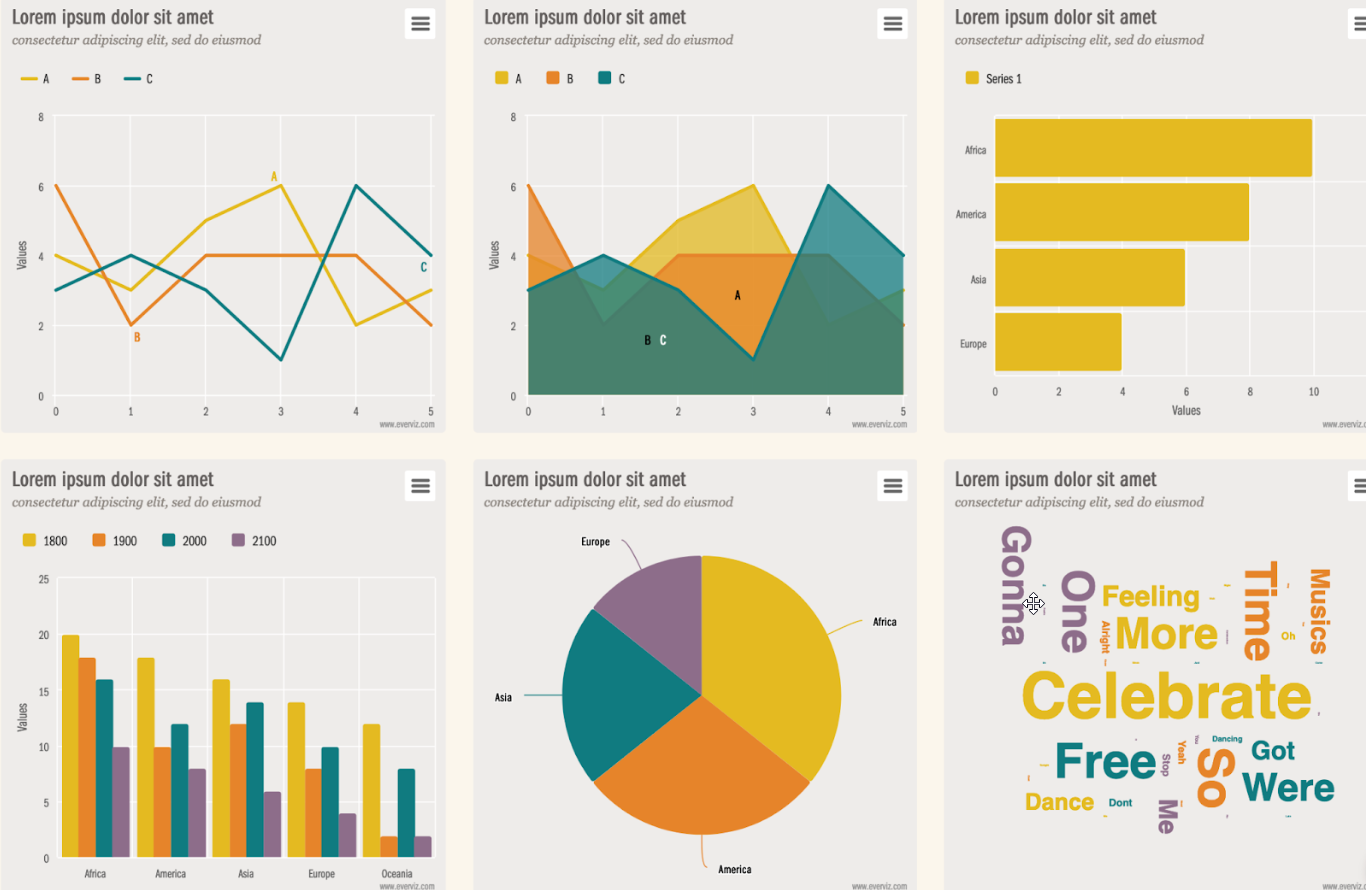
Simplifying complex information in news stories is key to reader engagement at The Telegraph. Charts and maps from everviz help readers understand at a glance
Simplifying complex information in news stories is key to reader engagement at The Telegraph. Charts and maps from everviz help readers understand at a glance

This is a featured blog post by Amy Cesal, Product Evangelist at everviz. A three-time winner of the Information is Beautiful awards, Amy is an

2023 was a turbulent year on the international stage. Conflicts in Europe and the Middle east dominated the news, as did reports of tension between
This is a featured blog post by Amy Cesal, Product Evangelist at everviz. A three-time winner of the Information is Beautiful awards, Amy is an
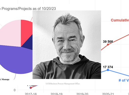
The University of California, Berkeley places high standards on their data visualizations. Charts must update in real time, satisfy web accessibility requirements, feature university colors
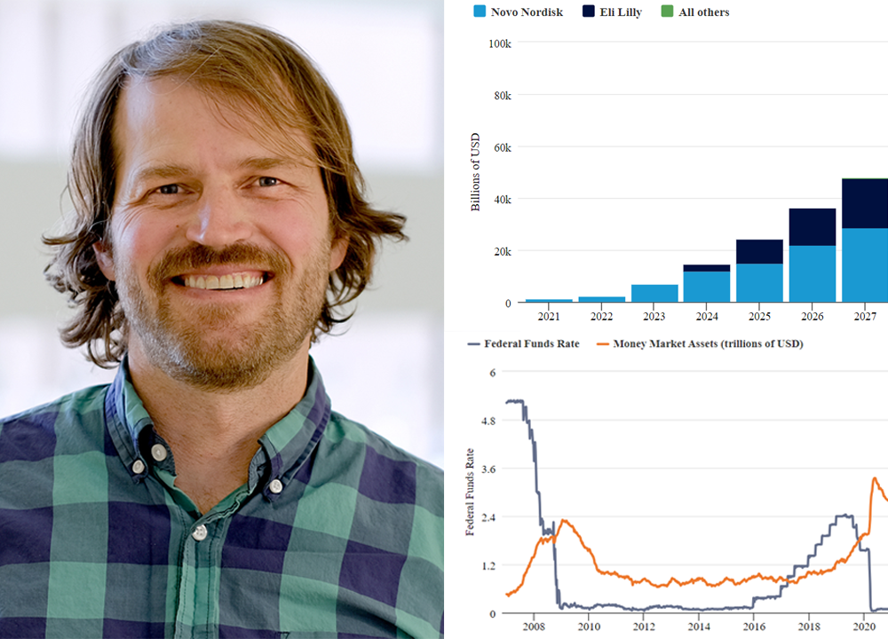
Charts are key to marketing efforts at Thornburg, a US-based Investment firm. Their thought leadership content is found on multiple platforms, including their website, social
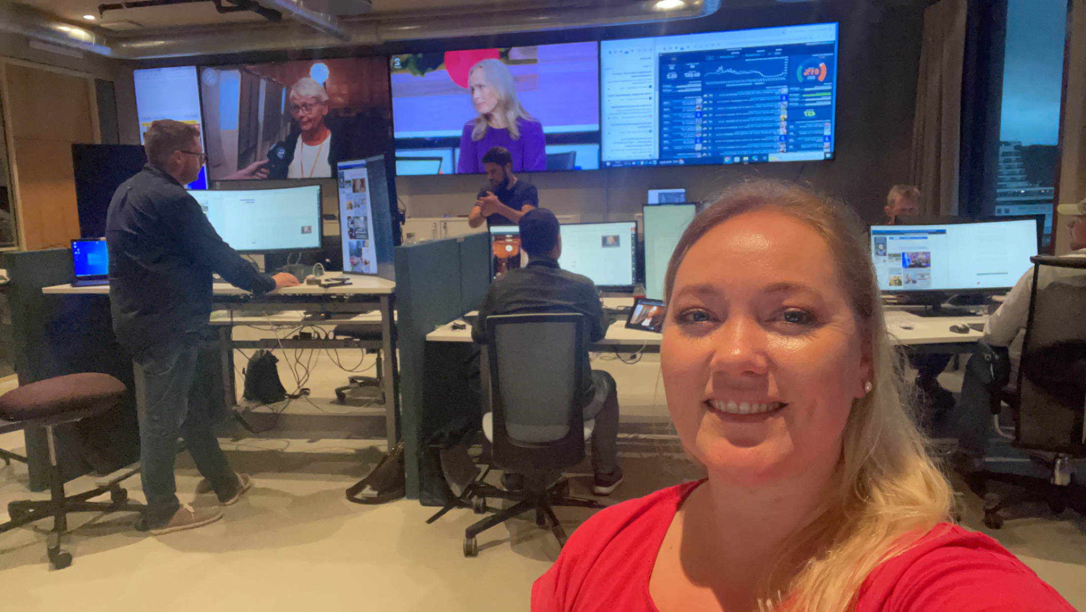
Something extraordinary marked this year’s election coverage at Sunnmørsposten (SMP) newspaper. For the very first time, data graphics enriched the live election night stream. Liv-Jorunn Håker,
This is a featured blog post by Amy Cesal, Product Evangelist at everviz. A three-time winner of the Information is Beautiful awards, Amy is an

Based in São Paulo, Riza specializes in asset management services. Riza helps clients achieve their financial objectives while managing risk effectively. In this post, Riza

Introduction Morning Consult analysts work with millions of data points that reflect public sentiment on various topics. Their reports are packed with data, posing the

In recent years, Airbnb has grown to become one of the most popular websites for holiday homes and other short-term rentals. It allows property owners to gain income from their accommodation, and it provides travellers with a wide range of rental choices.

Data expert Diana Guerrero offers tips and tricks on how to mine data sets for insights and outliers.
In this post we’ll take a closer look at low vision and how it relates to visualizations with everviz.
“Low vision” refers to visual impairments other than blindness. Other terms, like “partially sighted” and “sight impaired,” have different meanings depending on the context.

If you are thinking about buying a house, you may have developed a sudden interest in mortgage rates. This may be particularly true for mortgage

If you’re new to this whole data visualization thing and get confused when people are talking about “logarithmic”, “CSV” or “legend” , then stick around,
Sometimes the right chart type isn’t one that you’ve used in the past, but rather a chart type that you’ve come across online.
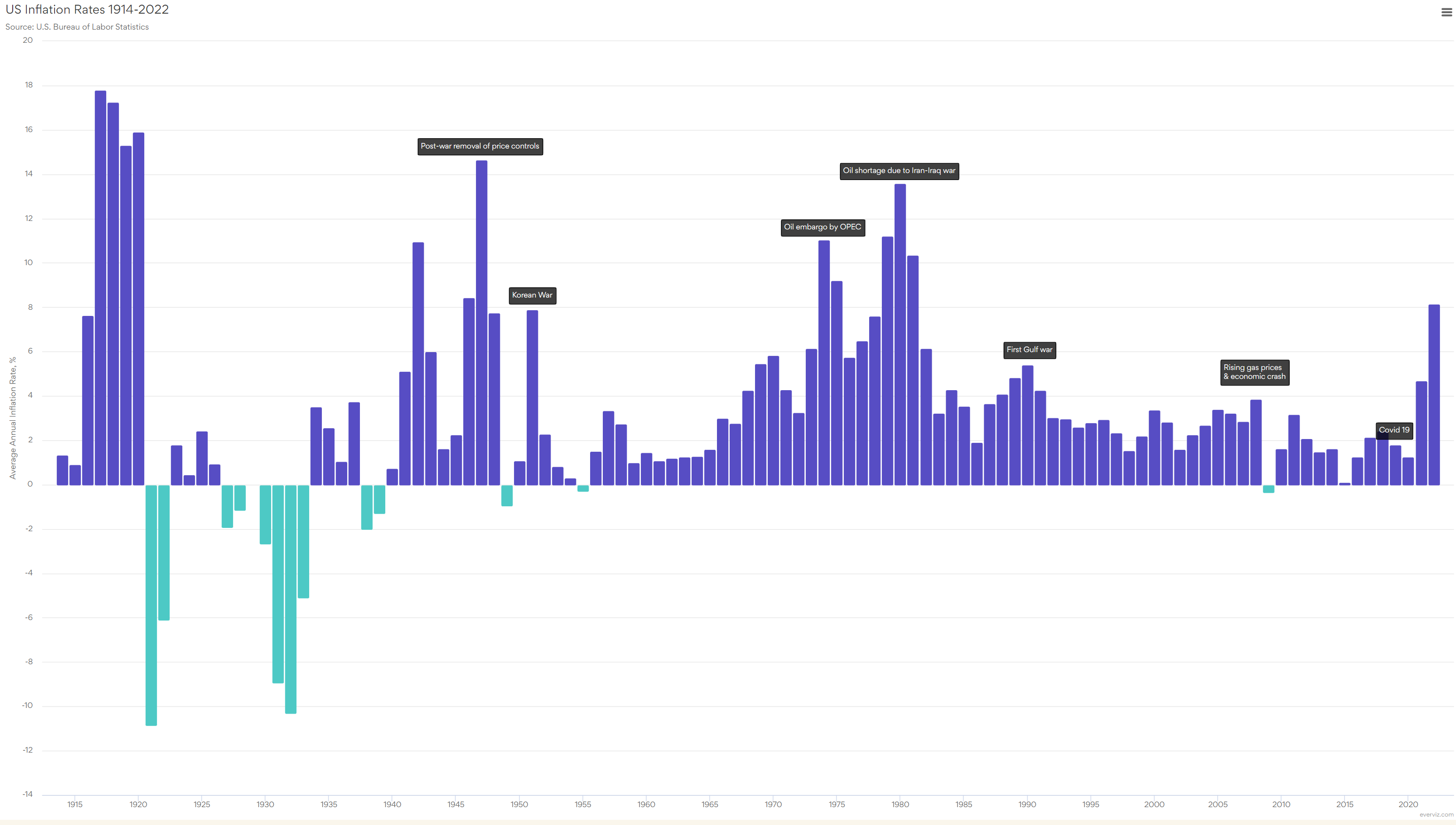
Like us, you might have noticed a few changes if you paid for anything in the previous six months. The cost of meat has increased.

At everviz, we think a lot about interactivity. We write about it. We build it into the program. Our latest chart type, the packed bubble
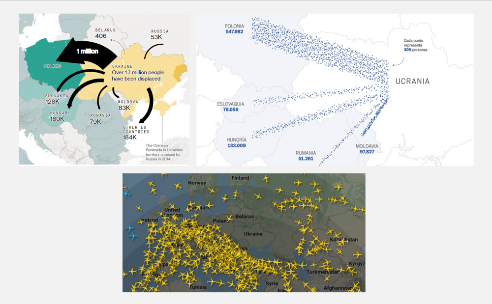
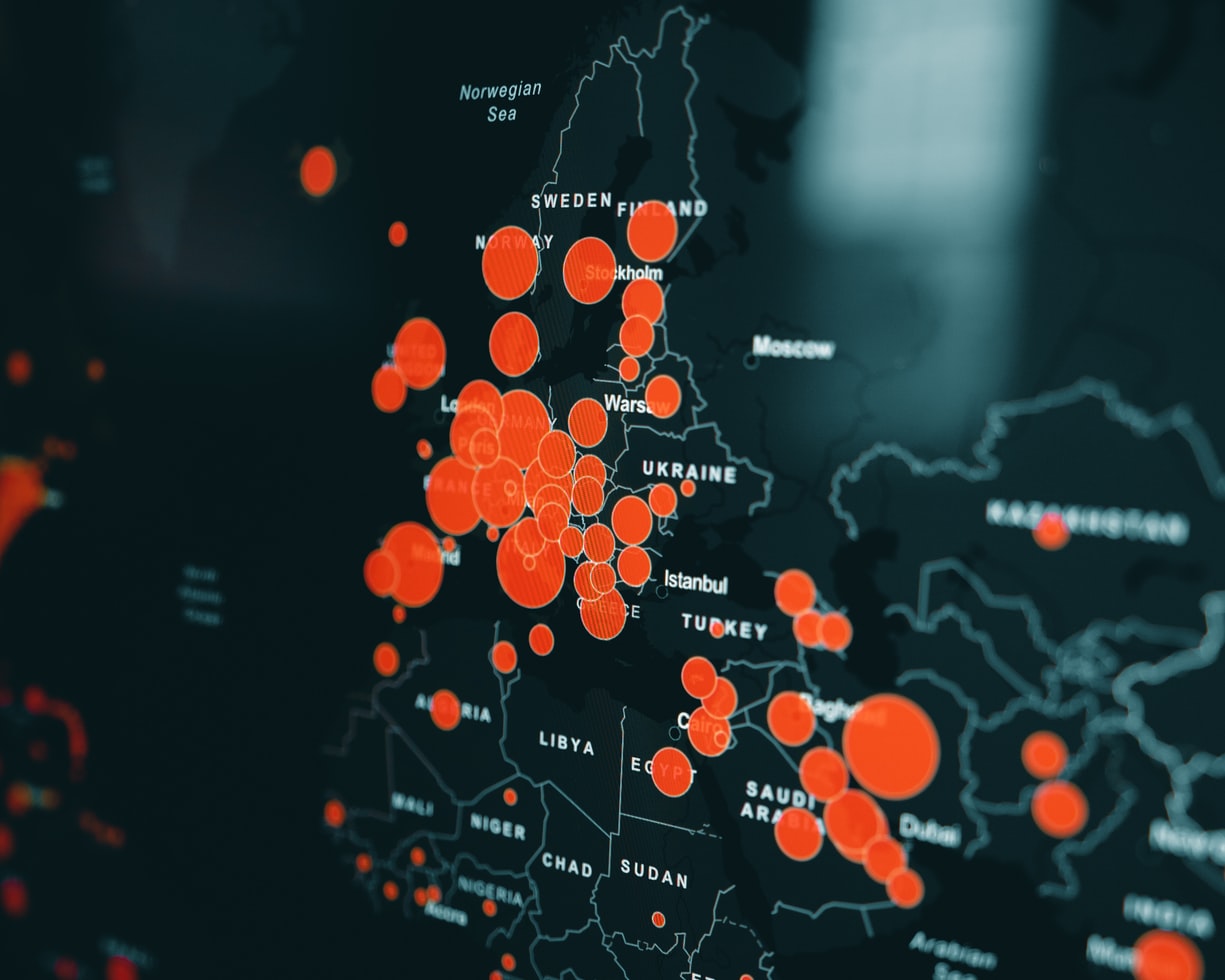
Shortly after Russia invaded Ukraine at the end of February, media publications started sharing maps of Ukraine and its neighbouring countries.
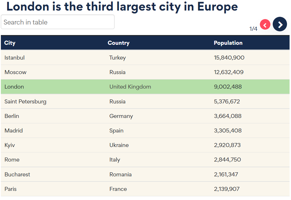
Data tables can be a great way of summarizing information and sharing it with your audience. Tables can break up sections of text and encourage
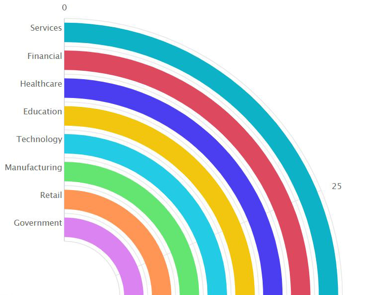
Let’s start with a few key statistics. Healthcare takes more than 10% of the GDP of most developed countries. In fact, in 2020, 21% of the US GDP was spent on healthcare. That is more than any other US program. Healthcare amounted to 12.8% of the GDP in the UK and 11.3% of the GDP in Norway.
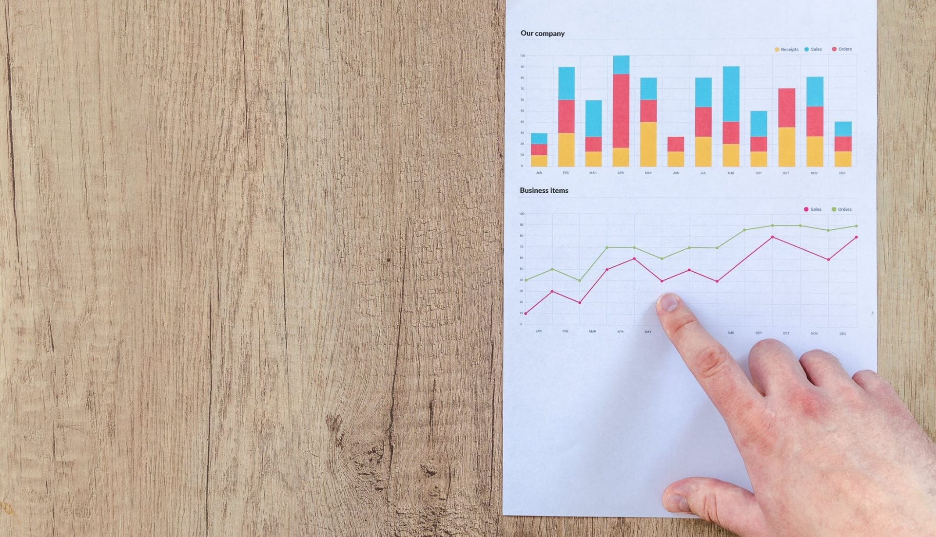
Graphs can be a wonderful tool to make data clear, engaging, and accessible to your audience. However, picking the right data visualization to communicate your story can be hard.
Data visualizations are an excellent marketing tool with a wide range of potential uses. Visuals can be a powerful addition to a marketing campaign. They
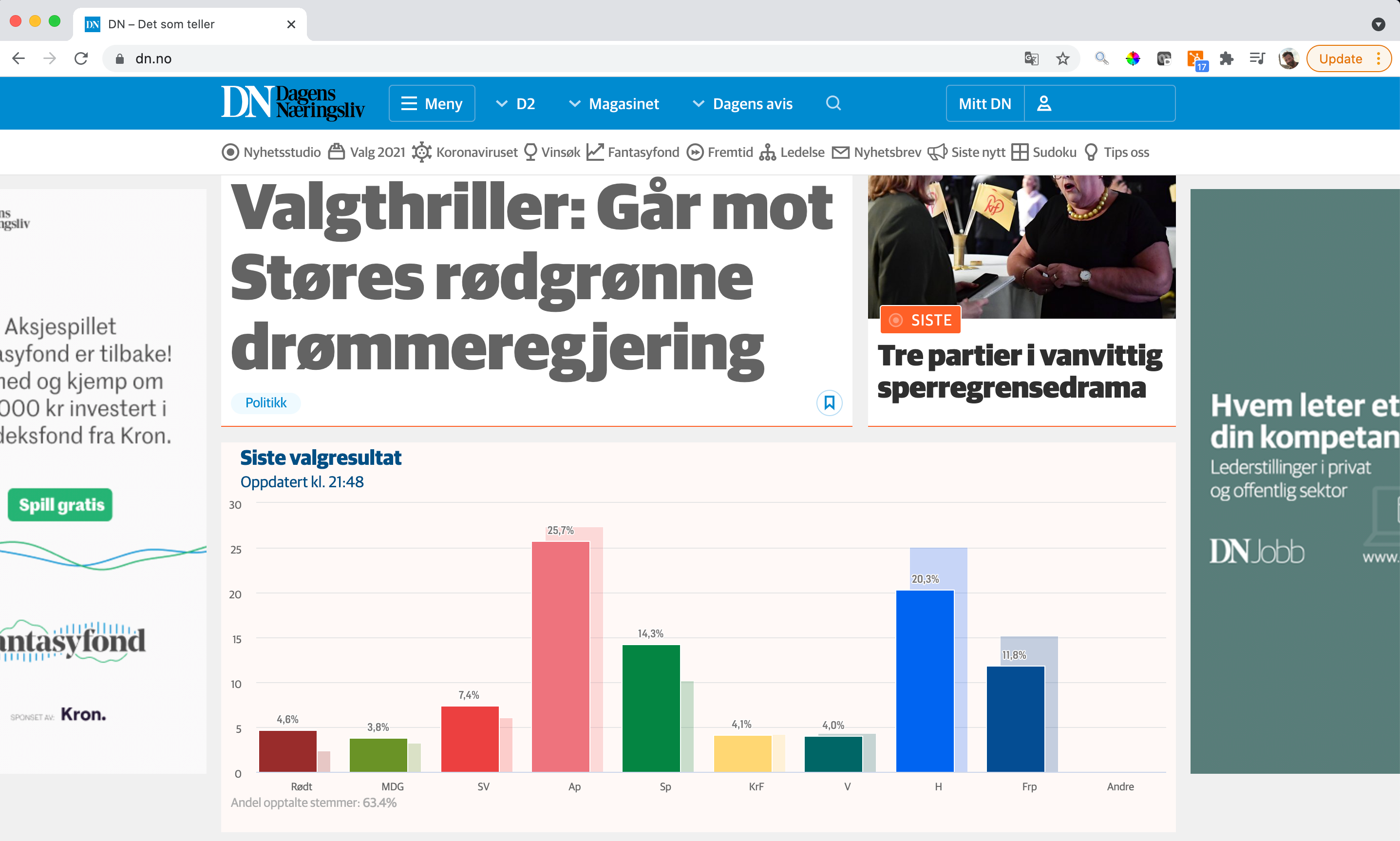
Dagens Næringsliv (DN), The Norwegian Business Daily, a leading business newspaper in Norway used everviz to convert live election data into beautiful visualizations to engage their readers
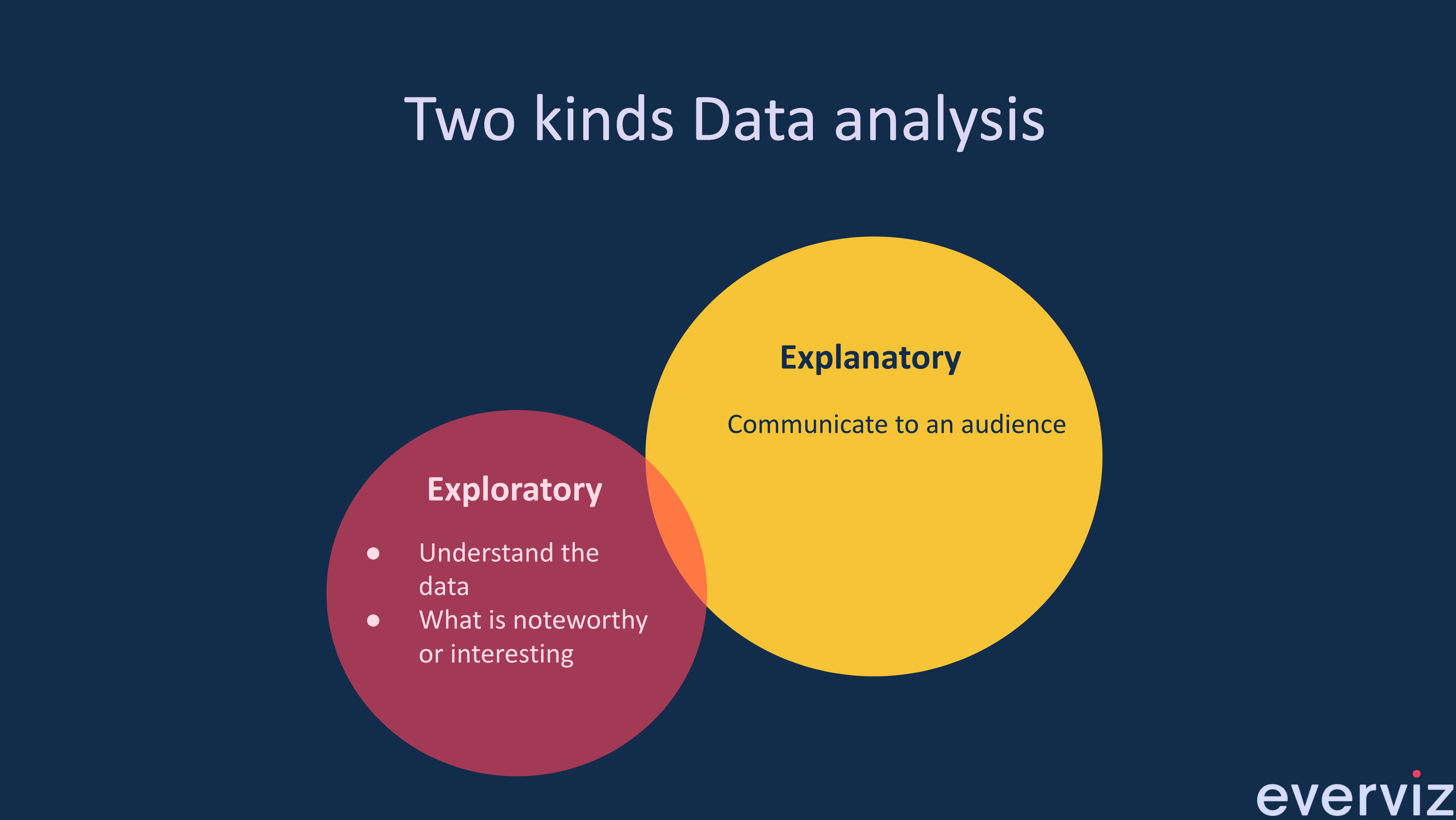
What is the difference between exploratory and explanatory data Visualization? Exploratory Data Visualizations are charts or graphs that are usually created during the data analysis
This is a guest blog post by Rebeca Pop, founder of Vizlogue, a Data Visualization and Storytelling Lab that offers workshops and consulting services. You
The COVID-19 pandemic triggered a funding crisis for non-government organizations (NGOs) and advocacies worldwide — right when they are needed the most. The World Economic
Imagine this scenario. Alex is an analyst working for a biotech company. He joined the organization two weeks ago. His manager calls him into her office and asks him to prepare a presentation for a few executives.

Let me ask you this: Do you recall the first time you created a graph? I still have a vivid memory of the first time that I designed one. I was in my first year of college and had to visualize data for my Statistics class.
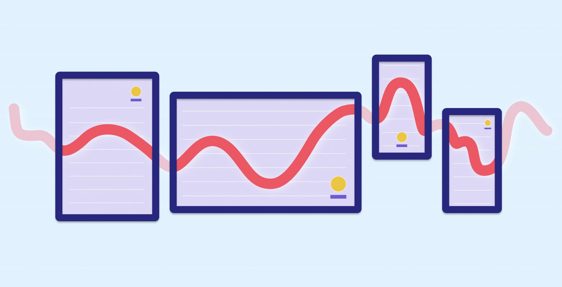
You may not be a web designer, but if your bread and butter is offering services to your audience through a website, “responsive” versus “static”

While I am not arguing that you should forget altogether about pie charts, bar charts, and line charts, there are situations in which a more innovative chart type could work better.
So you want to make a chart? Do you have data? I’m assuming that’s a “No,” if you’re reading this article. Well let me tell
Here at everviz, we strongly believe in the power of branding. That’s why we’ve built in full customization capabilities, so that you can align your

If you’re trying to distinguish your brand and get readers to easily retain information and take action, one of the best things you can do
It can be difficult to communicate financial information to different audiences, but a well-designed graph or chart can help you to get your message across.

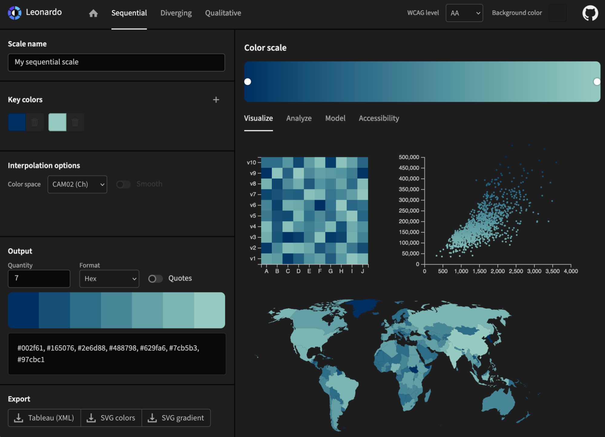
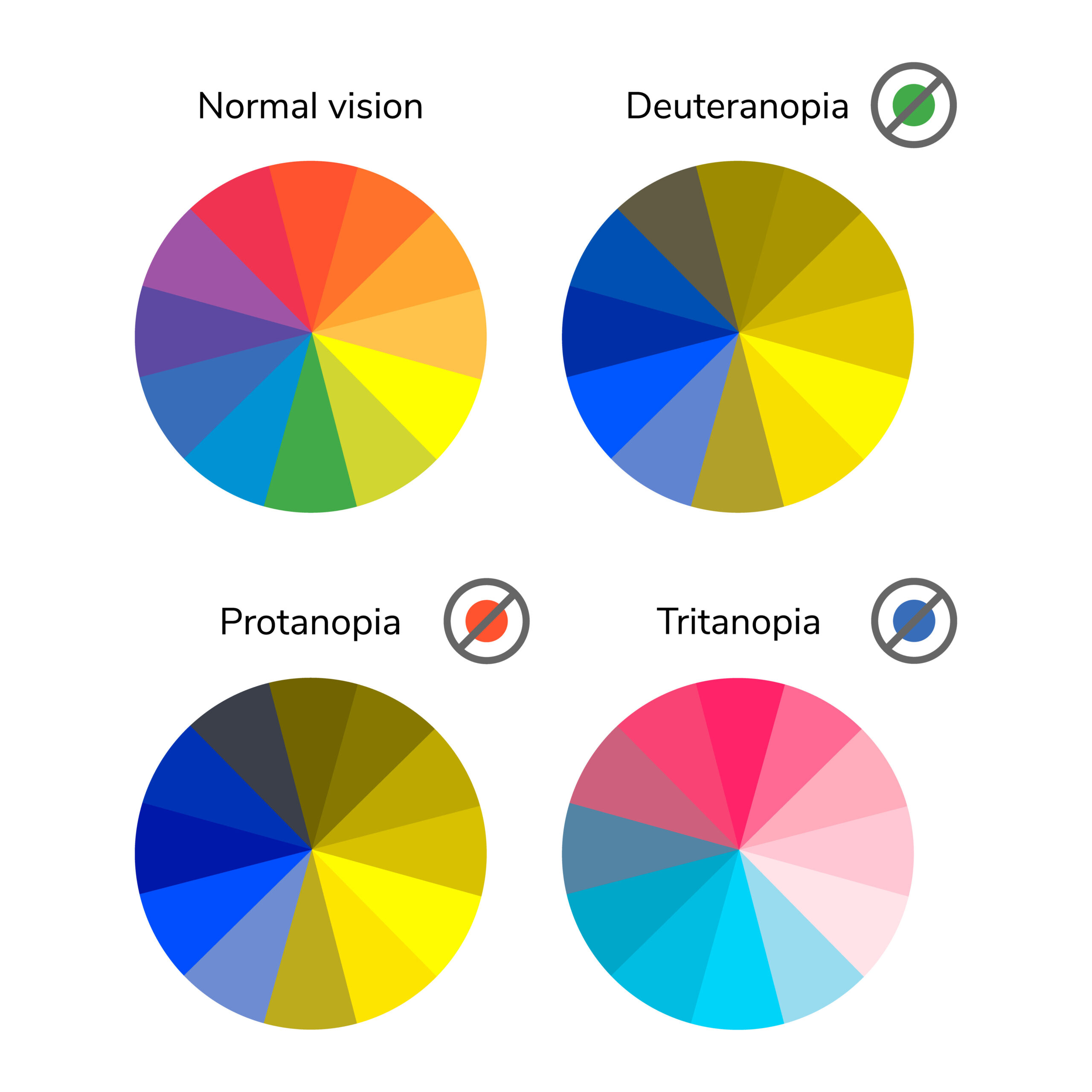
Pick the right color, make thoughtful chart choices, consider color-blindness, avoid clutter – you dive deep into each of these topics, master them, and, done! You are ready to start creating informative and effective data visualizations.
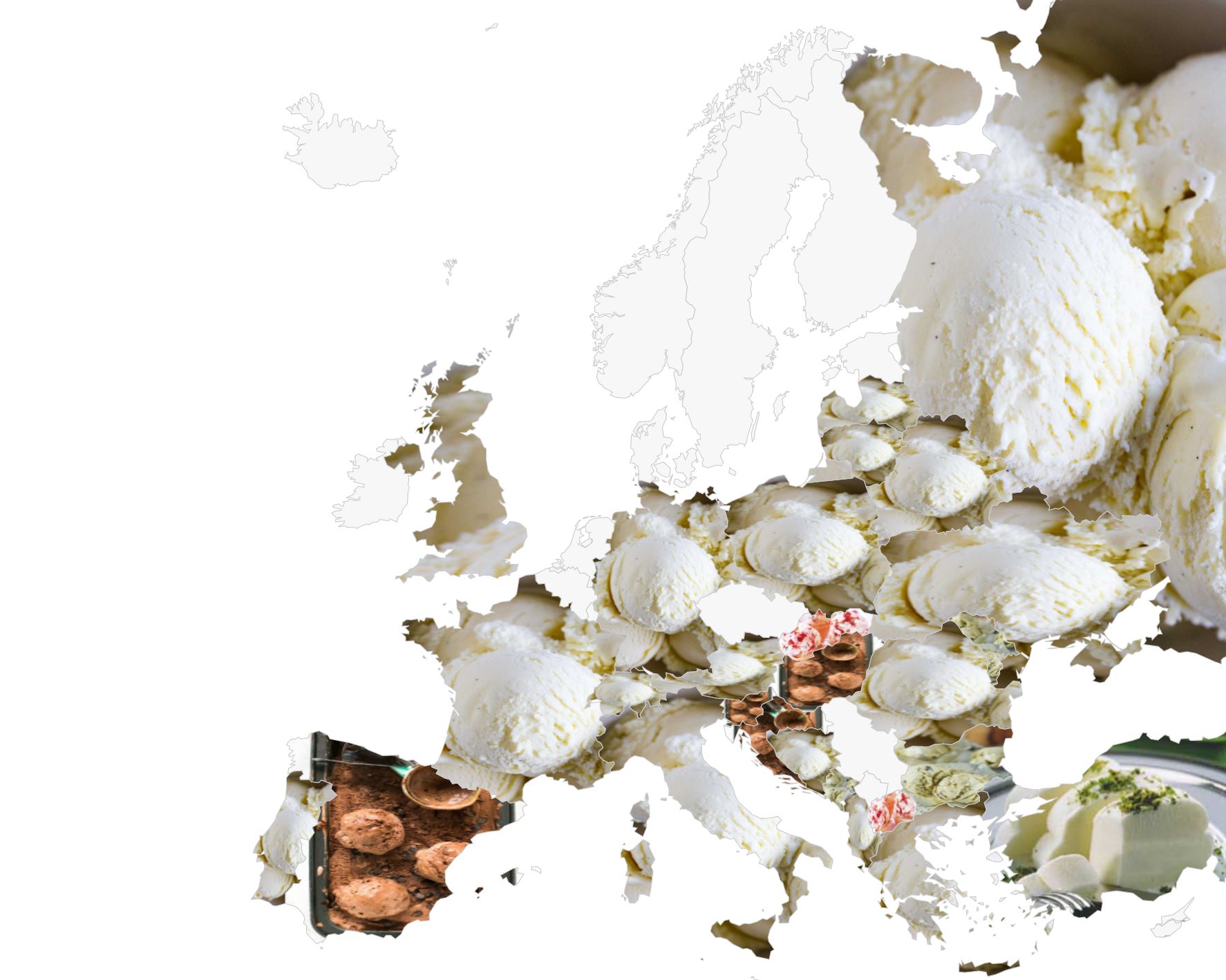
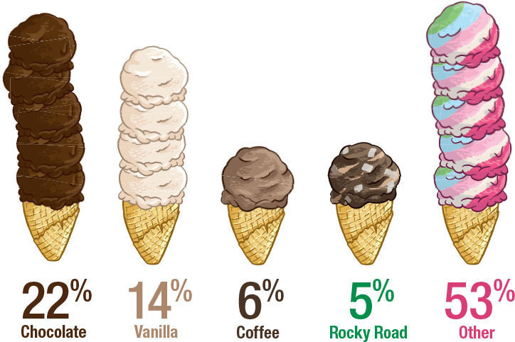
Jessica, our contributer from Cape Town, South Africa, has been playing around with the map features of everviz. Read her entertaining ice cream adventure! People
If you are a researcher or academic, the growth of the internet has brought many opportunities for sharing your achievements with the world! However, journal

This post was originally published on the Highcharts blog, and was transferred as part of the rebrand from Highcharts Cloud to everviz. More than 3,000
This post was originally published on the Highcharts blog, and was transferred as part of the rebrand from Highcharts Cloud to everviz. Our brains process
At everviz, we want to help everyone easily visualize and communicate with data. That’s why we handpicked some of our favorite data visualization resources to
