
The Telegraph’s inclusive approach to visualizing the news
Simplifying complex information in news stories is key to reader engagement at The Telegraph. Charts and maps from everviz help readers understand at a glance
Simplifying complex information in news stories is key to reader engagement at The Telegraph. Charts and maps from everviz help readers understand at a glance

The US election this November promises to be one of the biggest stories of the year. A data-driven event, where visualization of vote tallies stands

This is a featured blog post by Amy Cesal, Product Evangelist at everviz. A three-time winner of the Information is Beautiful awards, Amy is an
This is a featured blog post by Amy Cesal, Product Evangelist at everviz. A three-time winner of the Information is Beautiful awards, Amy is an
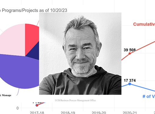
The University of California, Berkeley places high standards on their data visualizations. Charts must update in real time, satisfy web accessibility requirements, feature university colors
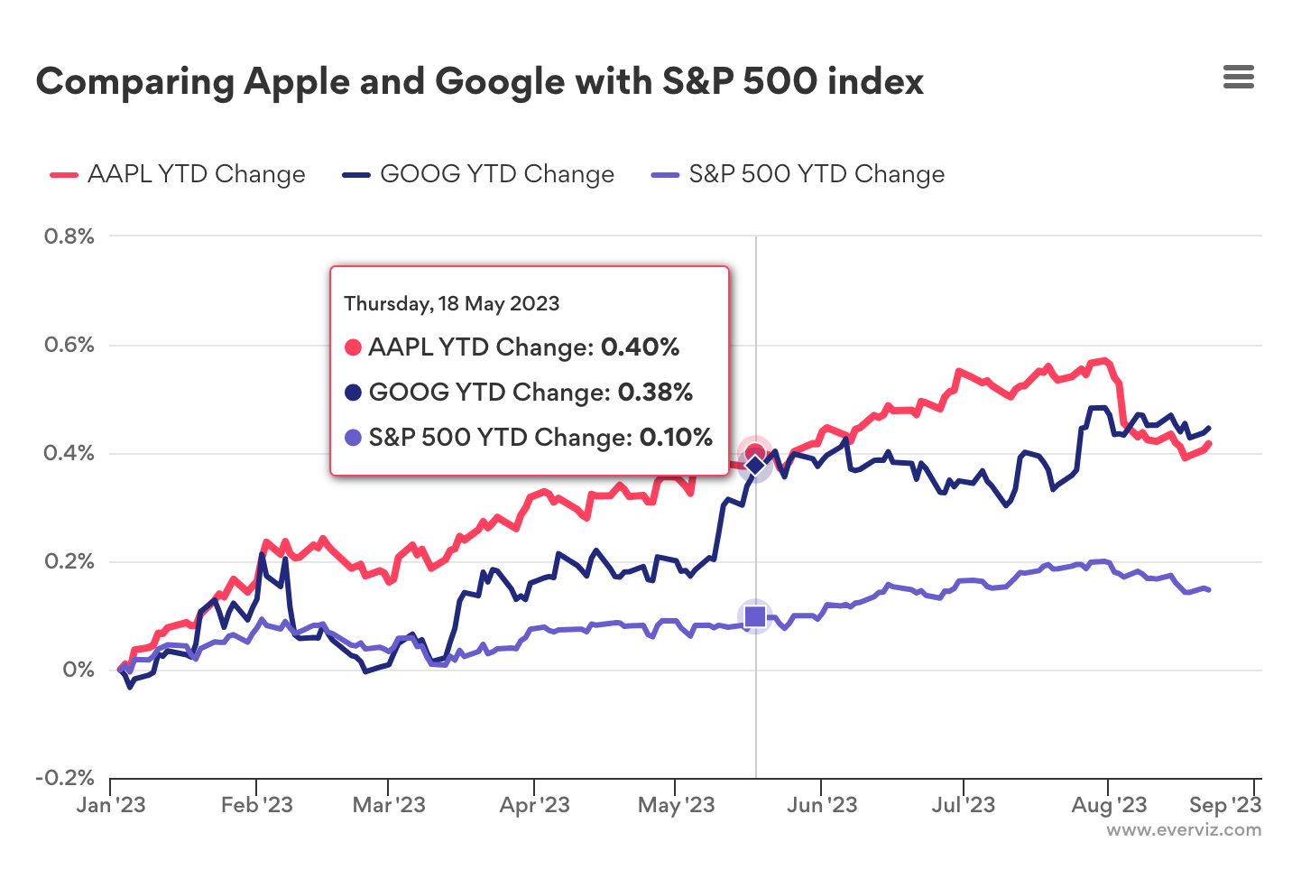
Introduction In this post, we’ll show you how to use the GOOGLEFINANCE function with everviz to create interactive charts and visualizations, and make the most
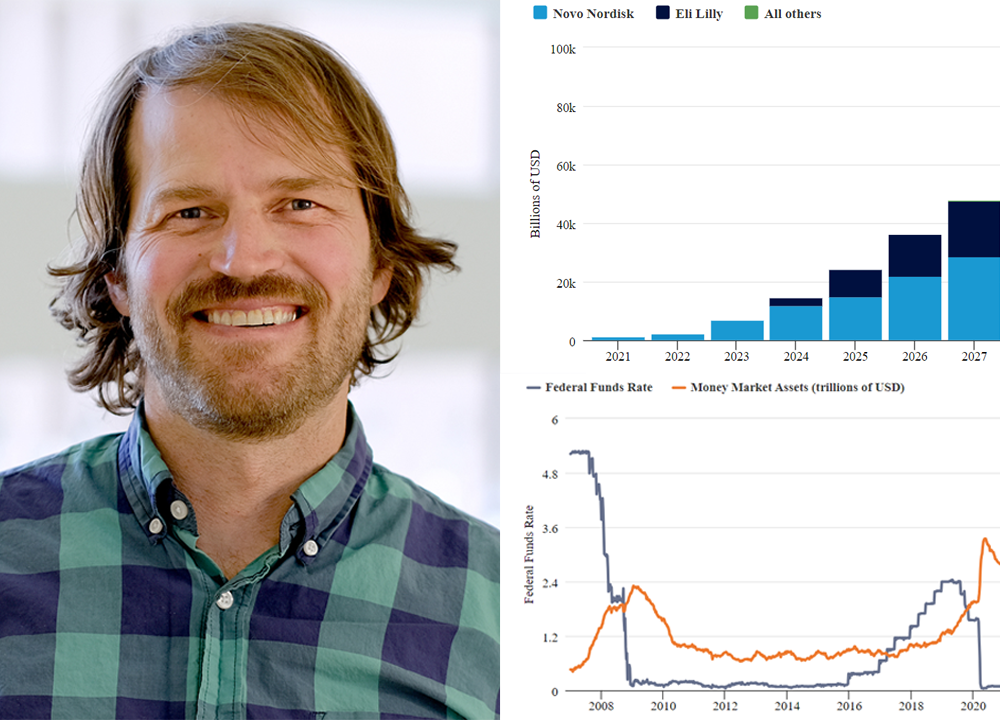
Charts are key to marketing efforts at Thornburg, a US-based Investment firm. Their thought leadership content is found on multiple platforms, including their website, social
This is a featured blog post by Amy Cesal, Product Evangelist at everviz. A three-time winner of the Information is Beautiful awards, Amy is an

Based in São Paulo, Riza specializes in asset management services. Riza helps clients achieve their financial objectives while managing risk effectively. In this post, Riza

Introduction Morning Consult analysts work with millions of data points that reflect public sentiment on various topics. Their reports are packed with data, posing the

Sunnmørsposten newspaper (SMP) is located in Ålesund, a city of 67,000 nestled in the beautiful fjord landscape of Western Norway. The newspaper has 2.5 million

Data expert Diana Guerrero offers tips and tricks on how to mine data sets for insights and outliers.
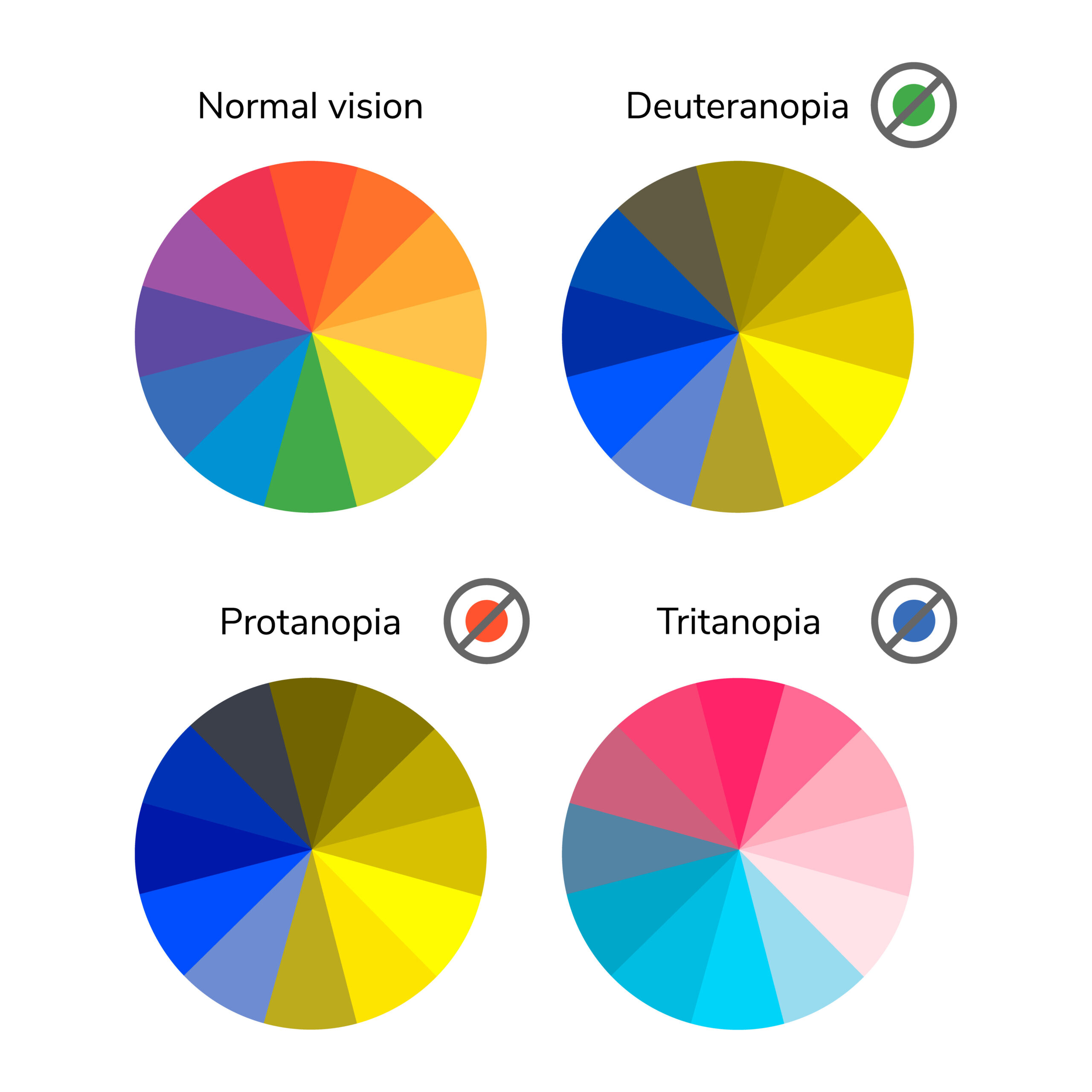
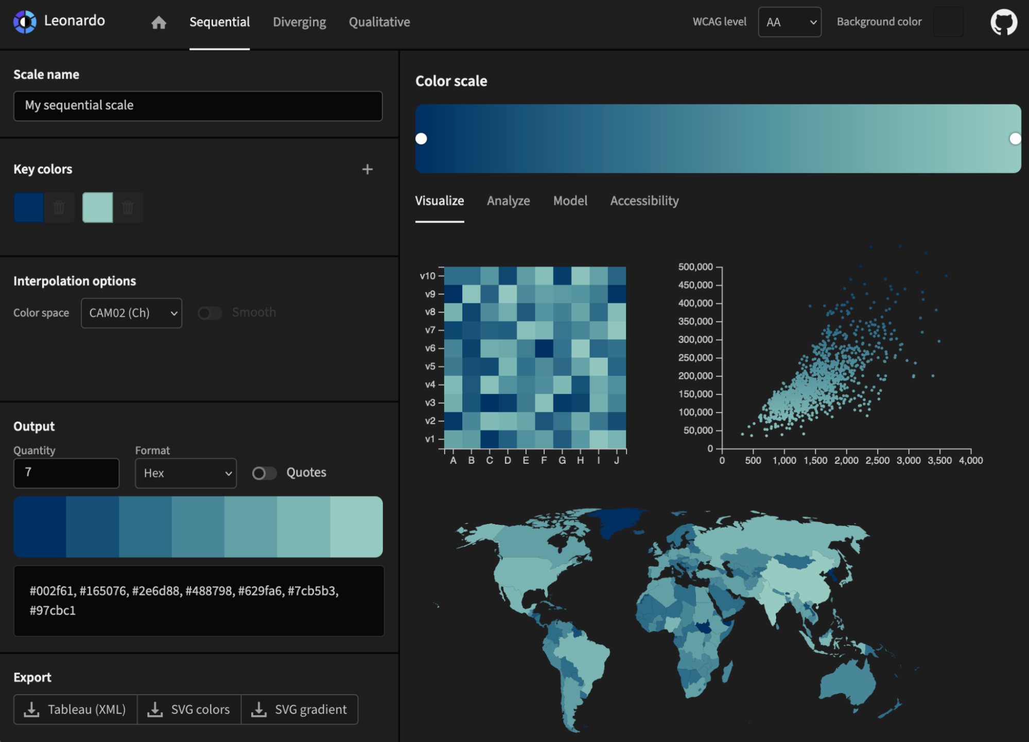
In this post we’ll take a closer look at low vision and how it relates to visualizations with everviz.
“Low vision” refers to visual impairments other than blindness. Other terms, like “partially sighted” and “sight impaired,” have different meanings depending on the context.

The FIFA World Cup Cup is one of the greatest sporting events in existence. That’s why we decided to to put together some world cup
Climate change and global warming is a hot topic and on everyone’s mind these days. Still, communicating the crisis that is upon us is not
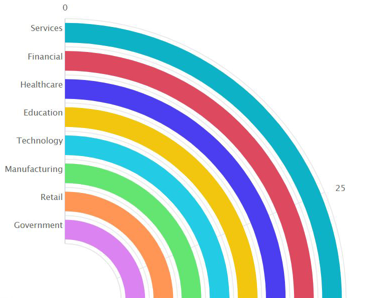
While I am not arguing that you should forget altogether about pie charts, bar charts, and line charts, there are situations in which a more innovative chart type could work better.
It can be difficult to communicate financial information to different audiences, but a well-designed graph or chart can help you to get your message across.

Pick the right color, make thoughtful chart choices, consider color-blindness, avoid clutter – you dive deep into each of these topics, master them, and, done! You are ready to start creating informative and effective data visualizations.
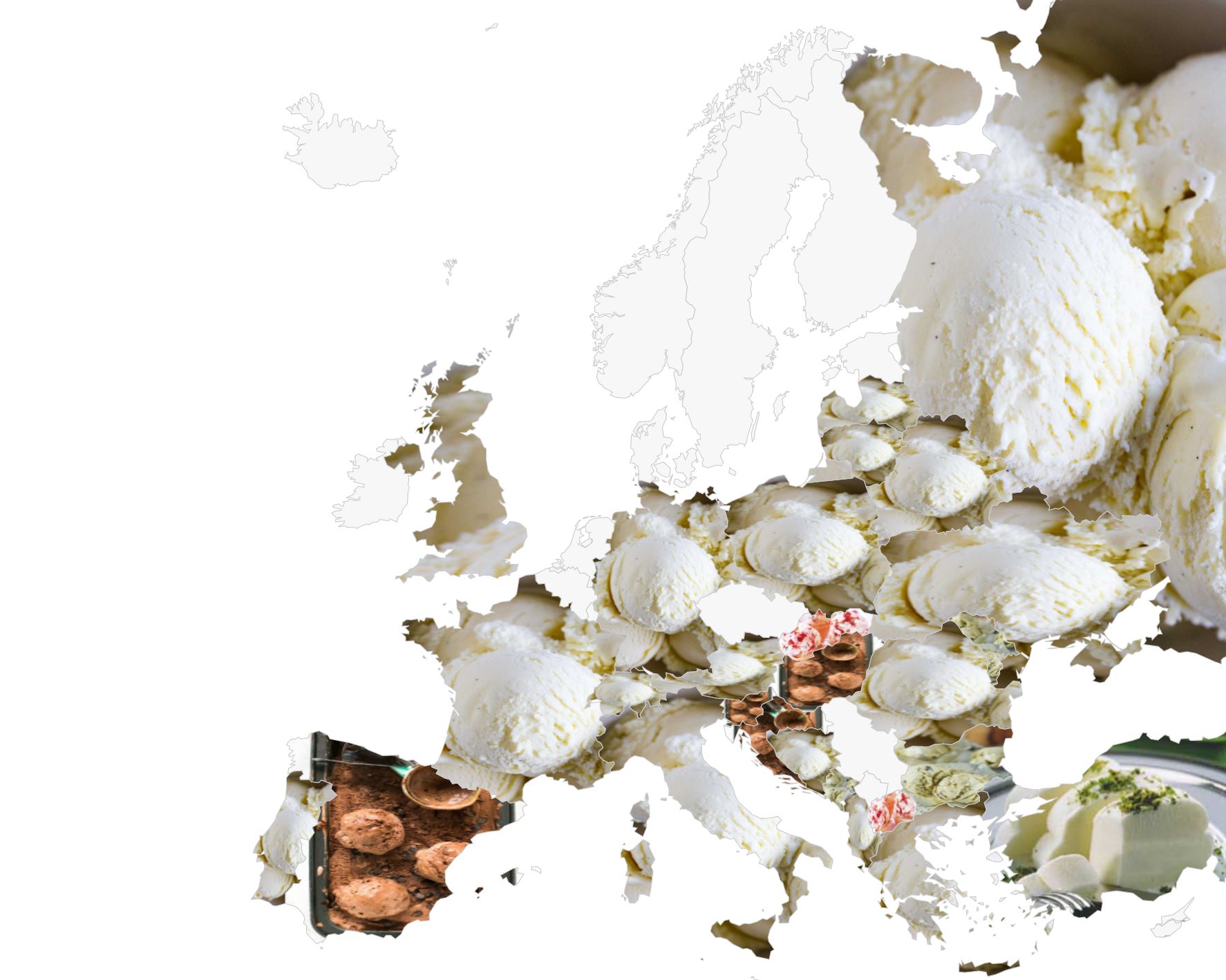
Jessica, our contributer from Cape Town, South Africa, has been playing around with the map features of everviz. Read her entertaining ice cream adventure! People
If you are a researcher or academic, the growth of the internet has brought many opportunities for sharing your achievements with the world! However, journal
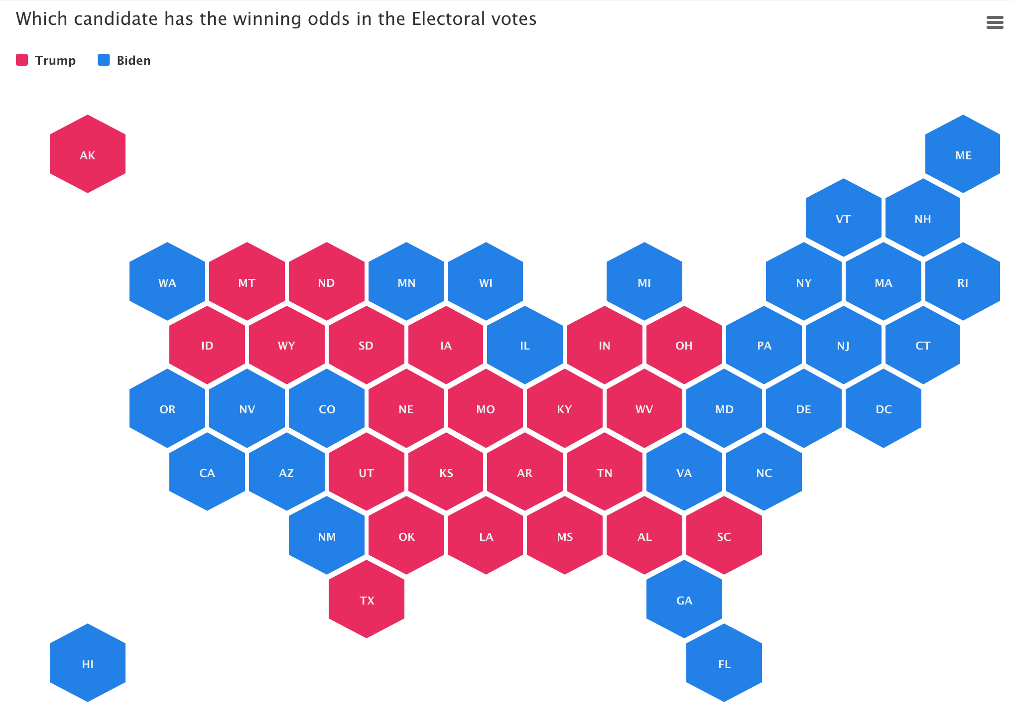
During election times, readers want more than just good writing, they want great graphics and interactive charts and maps. We believe the time is ripe

We strongly believe that telling stories with visuals makes the message easier to understand and act upon. Visuals created with everviz are Interactive, responsive and
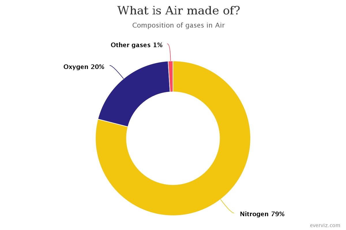
A donut chart is a variation of a Pie Chart with a round hole in the center which makes it look like a donut. This
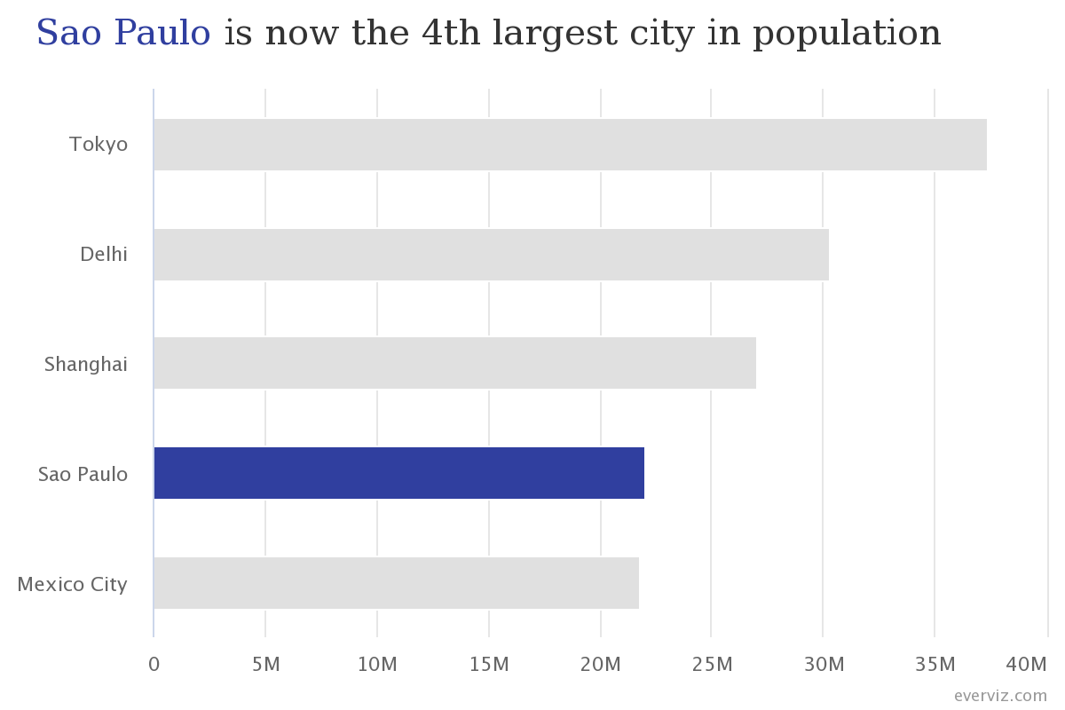
Bar charts are one of the most commonly used visualization types because they are simple to create and easy to understand.
In this article you will learn how to create a Bar chart in everviz and some good practices.
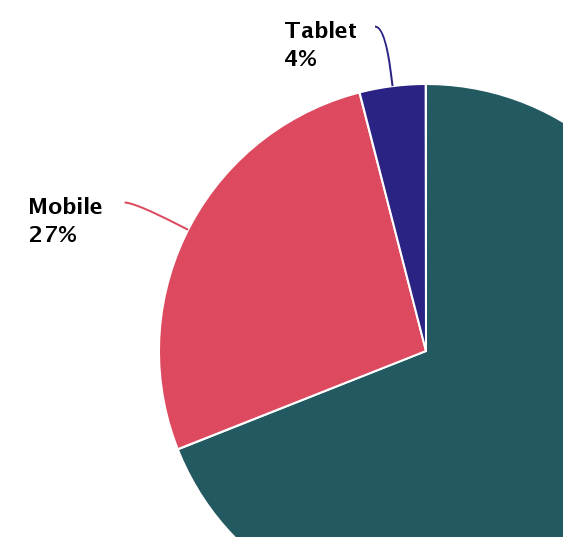
Pie charts have been under assault, probably as long as they have existed. Even though, they remain as a very commonly seen chart type. In
