This is a featured blog post by Amy Cesal, Product Evangelist at everviz. A three-time winner of the Information is Beautiful awards, Amy is an instructor at Maryland Institute College of Art and co-founder of the Data Visualization Society
Picking colors for visualizations can be paralyzing. However, if you follow a few simple rules it’s much less hard.
1. Make color meaningful. It should align with your data. For example, more of a variable, increased color. When possible rely on existing associations in your audience’s mind, e.g. Red = USA Republican, Blue = USA Democrat, or Green = increase/positive.
However, do be aware about how some existing associations can reinforce harmful stereotypes that you might want to avoid. Relatedly, it is best to avoid color schemes with existing associations in outside applications where that association is relevant. Do not have your colors unnecessarily fight against what color will naturally evoke in your audience’s mind.
2. Be consistent. One color should mean the same thing across your entire project.
3. Do not just rely on color for accessibility purposes, like colorblind issues. Make sure your information is dual encoded or directly labeled where possible and people can access the information another way like tooltips.
Selecting colors for charts and graphs is always tricky. Fortunately there are specific tools to help and I’ll walk you through my process of selecting color for a chart.
Here we have a wind rose map with random colors applied. This does not work well, because the color should have meaning and here they are applied randomly. The default is a categorical color scale. All variables are treated equally, and there is no natural ordering. Instead, it should be a sequential color scale. The sequential palette makes natural sense here because the variable we are coloring by, wind speed, has a natural ordering. We should use a sequential color palette in which a small amount of wind has a small saturation of color and more wind is a more saturated, darker color.
But how do we get there? You might not have any idea of what colors you want to use or you might have a style guide for your organization or even a data viz style guide with specific shades and tints for visuals. You can use those style guides and still not have the exact right colors for a chart.
Welcome to adding Leonardo to your toolkit. Leonardo is a one-of-a-kind tool for creating, managing, and sharing accessible color systems for user interface design and data visualization. It is an Adobe open source project.
Pop 2 colors into Leonardo and it can produce the variety of shades, tints and tones you need for your graph. You can adjust the amount of key colors to create diverging color scales and see them visualized in several chart formats.
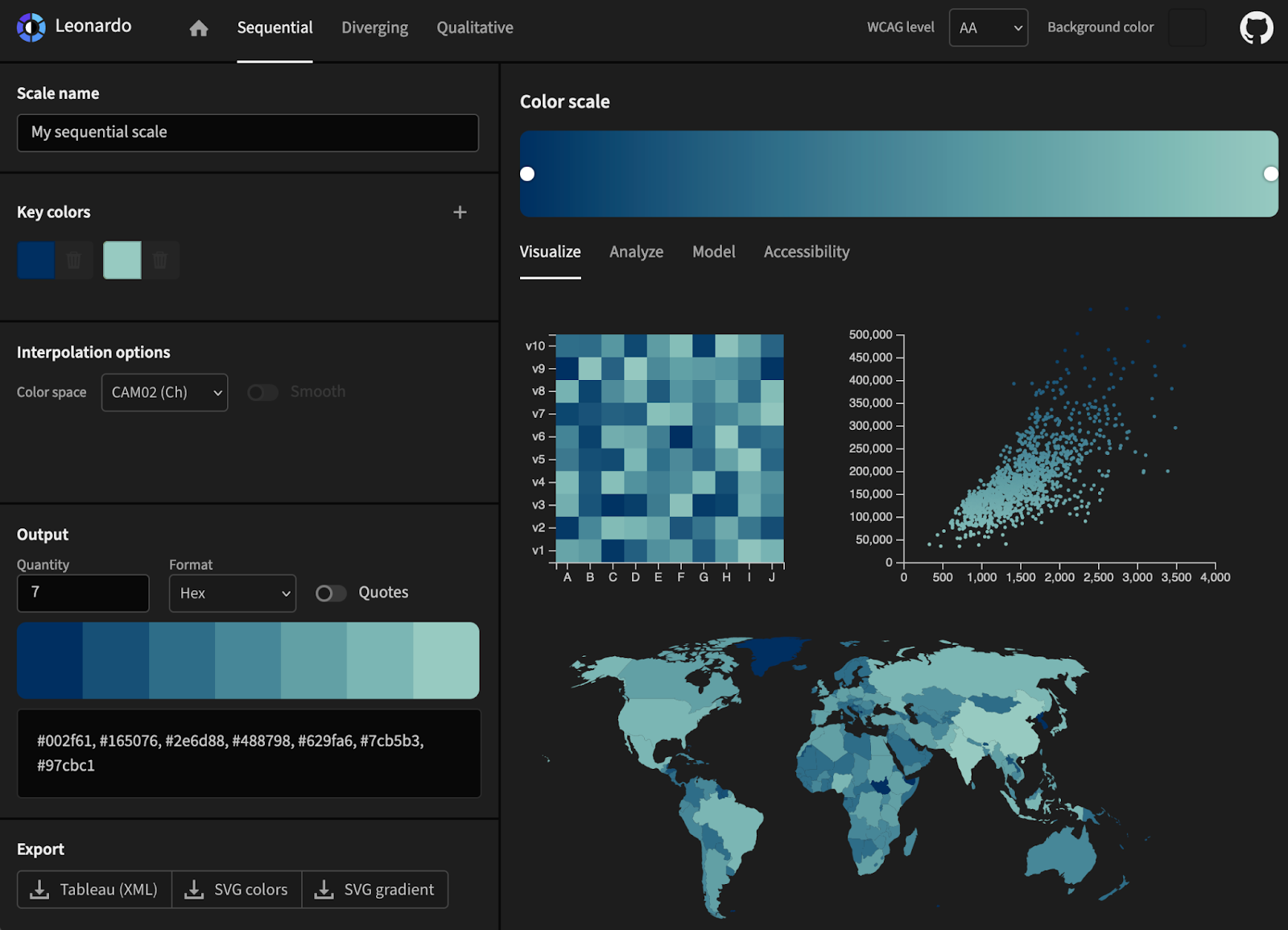
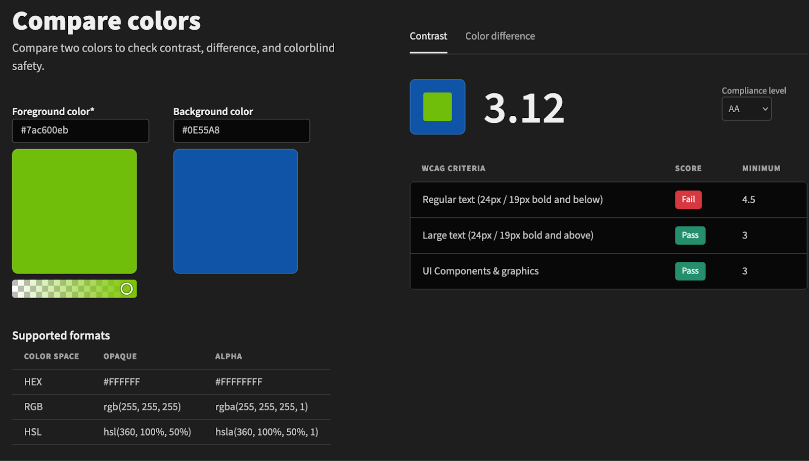
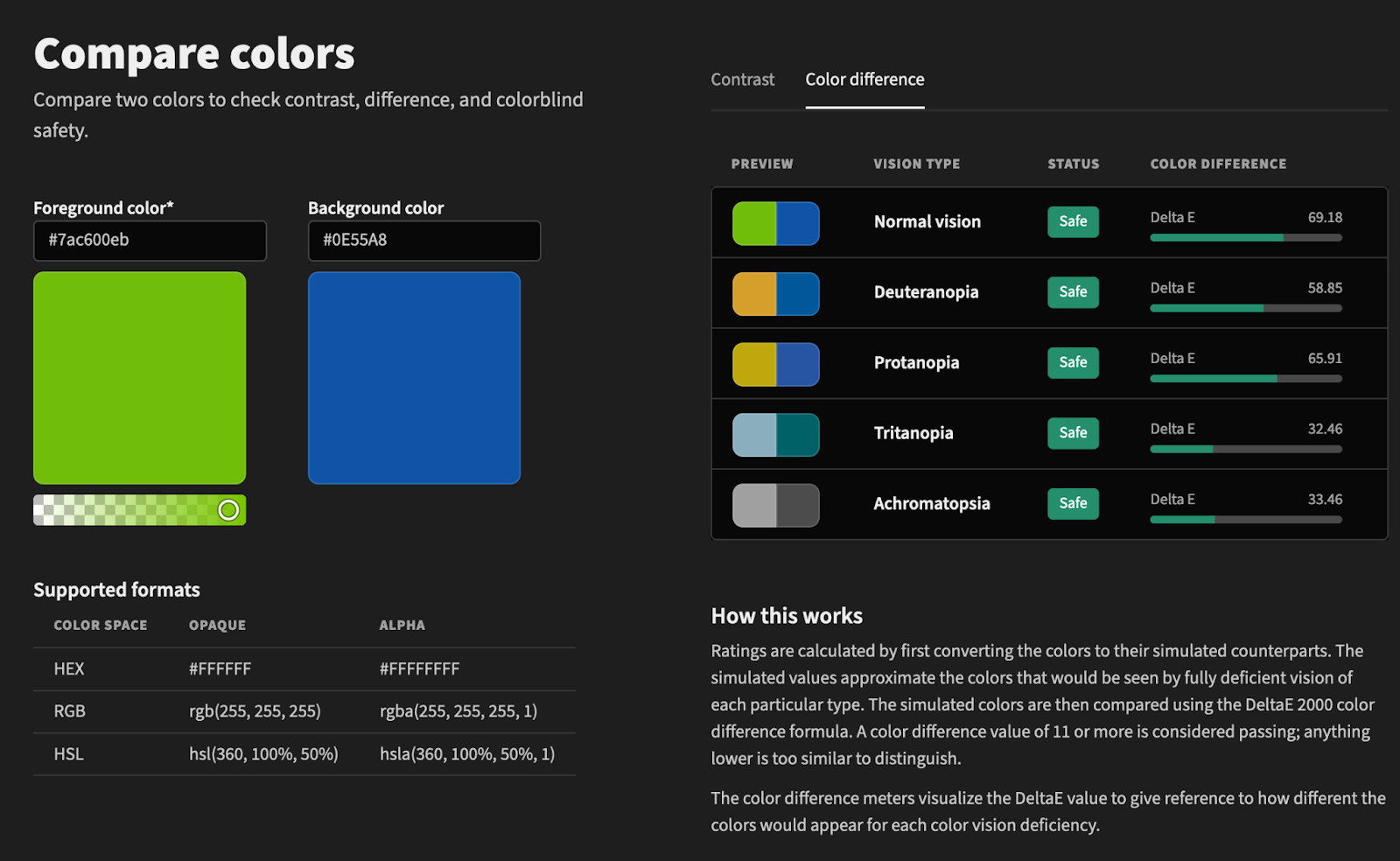
It also has accessibility tools to make sure that you have enough color contrast and will display colors with colorblindness filters applied. Checking these things when choosing your colors is important accessibility practice.
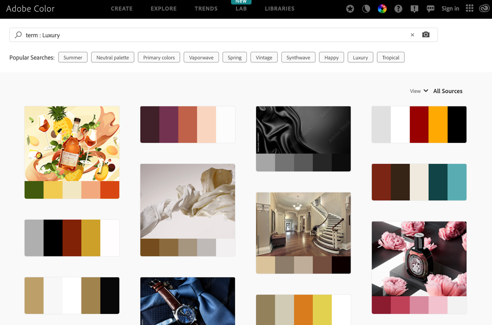
If you do not have colors that you want to start with, look to Adobe’s color explorer tool where you can explore palette options and even search color palettes by keywords like “Luxury” or “happy”.
Ok, now back to our wind rose chart. Just pop the hex codes from Leonardo into everviz and your graphic will update with more meaningful colors.

Color does not have to be overwhelming, just follow these simple rules:
1) make color meaningful, 2) maintain consistency, and 3) don’t rely just on color.
With these guideposts and tools like Leonardo, you can take your everviz charts to the next level with meaningful, consistent, accessible colors.


