Introduction
Morning Consult analysts work with millions of data points that reflect public sentiment on various topics. Their reports are packed with data, posing the challenge of presenting these insights understandably and engagingly. Since 2020, Morning Consult, a decision intelligence company, has used everviz for the development of interactive data visualizations. In this case study, we interviewed Ricky Zipp, a health analyst at Morning Consult, and Sam Elbouez and Jes Standefer from the Morning Consult data visualisation design team.
“There is a fine balance to strike when writing about data. Add too much complex data and the readers can turn off and skip it. This is where data visualisations are key for us. Readers may stop reading but before leaving the page, they will stop and analyse a data visualisation.”

Jes Standefer, Information Designer

Sam Elbouez, Senior Designer, Data Visualization

Ricky Zipp, Health Analyst
The challenge
What challenges were you facing prior to using interactive data visualisations?
We aim to present extensive data and reports on public sentiment in a way that captivates readers and fosters understanding. Our goal is to strike a balance between providing meaningful insights and preventing data overload. To address this, we wanted to strategically employ data visualisations throughout articles, breaking down complexity and maintaining reader engagement.
How do you use data visualizations?
We try to put ourselves in the readers’ shoes. Think about if you are a basketball fan reading team or league data. You can drown in the numbers. Similarly with data-heavy stories, the reader can quickly feel overwhelmed. Normally when that happens they stop reading the article, but they might stop to analyse a data visualisation.
When do you consider a data visualisation a success?
You want to show complex information but you do not want to show too much. If you present number after number in an article, eventually the reader will just stop reading and start scrolling. You want to present the data in an easily digestible way, and that’s where data visualisations come in.
Results of a Morning Consult poll visualised with an everviz stacked bar chart.
The solution
Why everviz?
everviz is a super user-friendly tool, and it is especially helpful to use when working with data-heavy content. Charts free up analysts’ time. Including all the numbers in a chart saves our analysts from writing about them in narrative form.
Much of what we do at Morning Consult is around comparing demographic groups against each other. It’s much more effective to show the results in a data visualisation rather than write about these comparisons.
How do you handle chart branding?
In everviz, themes are created with all of the desired design specifications, including a custom font and specific margins between chart elements. End-users, our data analysts, apply these themes when creating charts. This ensures each chart has a consistent look and feel, complete with Morning Consult branding.
How was the experience creating accessible data visualisations?
everviz has a huge amount of chart customization options. This allows us to fine tune our charts to bring them in line with accessibility standards.
Morning Consult charts do not contain vibrating colors, as they are known to cause migraines. Contrast is used to help the visually-impaired view key data. Charts that are too light coloured can trigger vertigo among viewers. Charts have alt text that is read aloud by a screen reader to visually impaired readers.
We want everyone to be able to understand our charts. At some point in our lives we will all develop a limitation that will cause a disability. But there are many people who deal with disabilities on a constant basis. We aim to design our charts so these readers can also glean understanding from the chart.
The results
What have been the results?
We have been able to simplify the message. Visualisations help you fill in the blanks and see, for example, more clearly the point differential that is often missed by readers if the information is only available in text form. Reading that something increased from 50% to 70% does not convey a 20% increase right away. But by illustrating a 20% increase as a peak in a line chart, it becomes far more obvious and clear what is happening. It makes the numbers a reality.
Has the goal been achieved?
Yes. Our goal when using data visualisations in our reports is to use them to propel readers through our stories. They help break up an article, and give the reader a break from reading. And at the same time, they help the reader understand sentiment around key societal issues.
How have people reacted?
Charts allow people who are intimidated by numbers and maths to figure out what is going on. The chart is a bridge between expert communities working with data in Fortune 500 companies and the everyday newsreader. Charts simplify complex data in a way that allows everyone to understand it. That is why we value everviz charts at Morning Consult.
What tips do you have for other chart designers?
Good chart design is when a chart is clean-looking, straightforward and clear. If the chart makes one strong point clearly, then it’s a good chart.
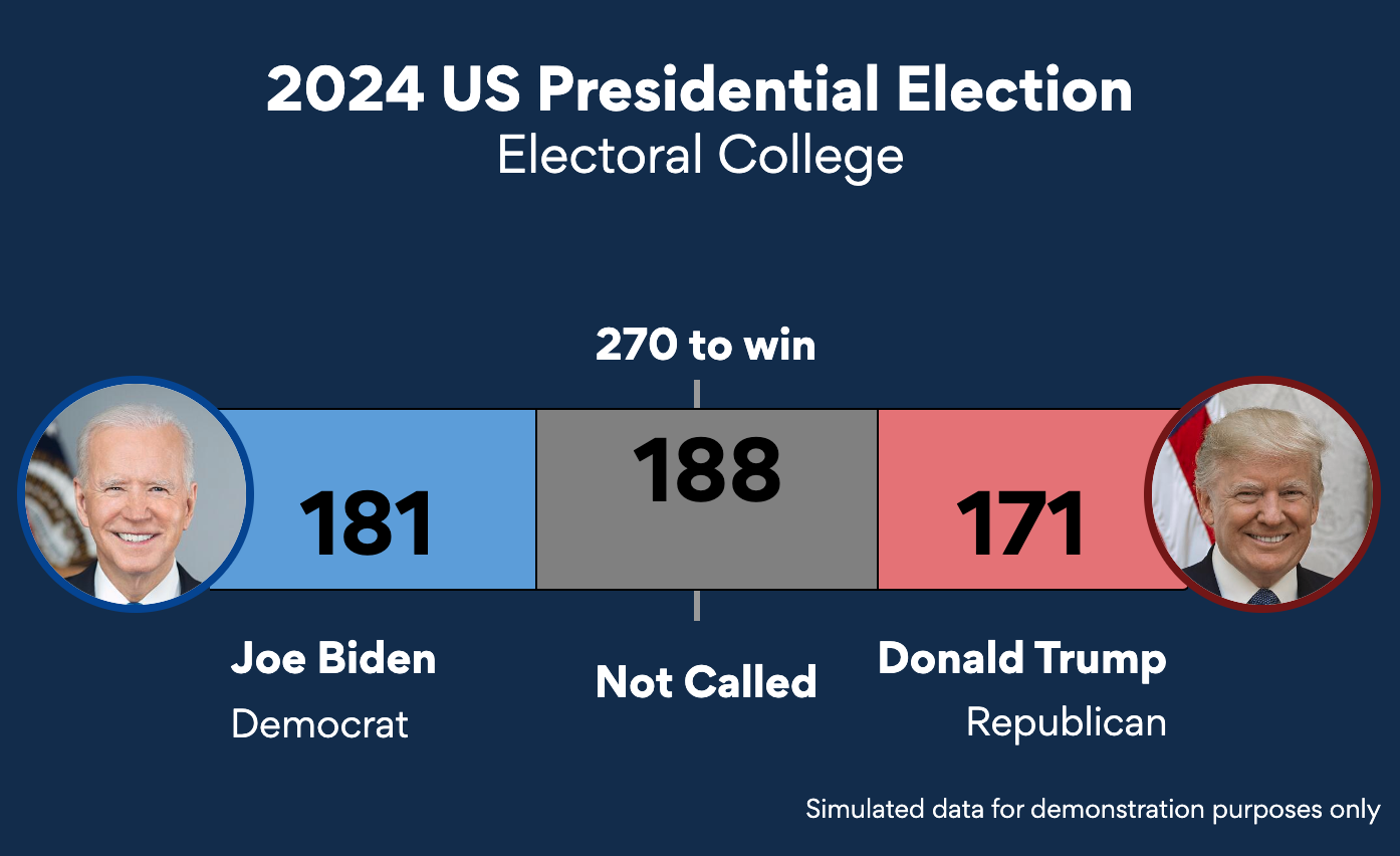
Color is used to increase the readability of the charts. Positive sentiment is always illustrated in green, negative in red. Democrats are blue, Republicans are red. Most charts also feature shades of color. Shades of the same color can be assigned to survey replies from different generations or different income brackets.
A pie chart in a Morning Consult report on how often US adults use their health apps or wearables.
A guiding principle in chart design is considering the balance of the information in the chart, to ensure essential information is not grouped unevenly on the right or left side of the chart. We also have a huge focus on getting the contrast just right. Light color trendline colors are difficult to see and therefore not recommended.
The shape of the chart must also be considered. A pie chart for example fits better in a square element in a CMS, rather than a rectangular element. Text on the left side of the chart is always right-aligned to eliminate whitespace called ‘rivers’ in the chart where y-axis labels hug closer to the y-axis.


