The Telegraph’s inclusive approach to visualizing the news
Simplifying complex information in news stories is key to reader engagement at The Telegraph. Charts and maps from everviz help readers understand at a glance
Introducing the everviz election package.
Charts and maps showing 2024 U.S presidential and congressional election results in real-time on all platforms.
Our data graphics help your audience understand all the angles of an election.
See some examples below, and note packages are available for any election.
Our plug-and-play election graphics empower your team
to visualize election data effortlessly and in real-time.
We handle chart creation and data configuration.
Incorporate company fonts, colors, layout and more to ensure
your brand’s consistency across platforms.
Engage your audience wherever they are.
Export the same responsive, interactive chart to all platforms, including:
Accessibility-compliant charts ensure legibility for disabled viewers.
Simplifying complex information in news stories is key to reader engagement at The Telegraph. Charts and maps from everviz help readers understand at a glance
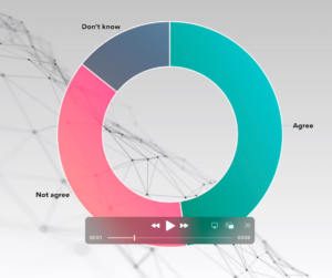
Video as an increasingly popular medium for conveying information. Our customers want to know – how do we make engaging videos with beautiful and relevant
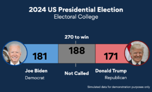
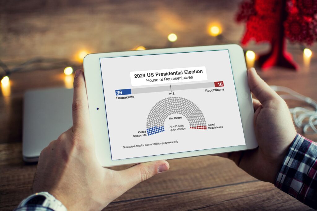
The US election this November promises to be one of the biggest stories of the year. A data-driven event, where visualization of vote tallies stands
Lars Hilles gate 39, 5008 Bergen, Norway
everviz © All rights reserved
everviz is a service by Visual Elements of Norway