Something extraordinary marked this year’s election coverage at Sunnmørsposten (SMP) newspaper. For the very first time, data graphics enriched the live election night stream.
Liv-Jorunn Håker, Head of Digital Development at SMP, shares insights: “We brought polling data to life using everviz charts and seamlessly embedding them into Viz Flowics, our HTML graphics system which we also employed for playout.”
As the pundits engaged in discussions about potential election outcomes, these dynamic data graphics illuminated the screen, providing a fresh perspective on the electoral landscape.

Liv-Jorunn elaborates on the impact of these charts: “They offer an additional layer of information for viewers seeking to grasp the potential political constellations.”
SMP, based in Ålesund on Norway’s west coast, operates a dedicated broadcasting arm, housed in the same building. During significant events like elections, they live stream coverage to their website and other platforms.
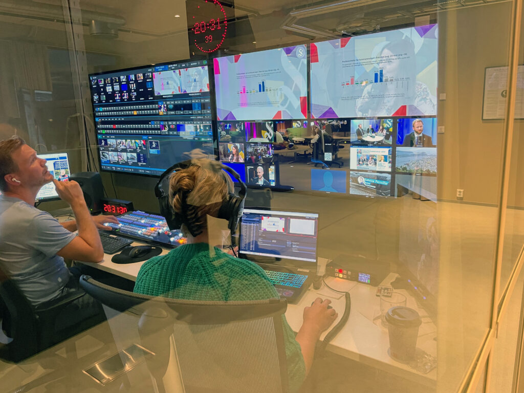
While large media houses typically invest months in crafting election data graphics, these everviz charts were created on the fly. “These charts were a very nice addition to our general election coverage, and they were really easy to make”, Liv-Jorunn says. “And the same charts featured in our live stream seamlessly find their way into online articles on our website”
Learn more about everviz’s integration with Viz Flowics here, enabling easy-to-create, beautiful charts for live video.


