Last week, everviz participated in the International Broadcasting Convention (IBC) for the first time. It was a whirlwind ride where we learned a ton and connected with some great people. We also showed off our advancements for easily inserting charts in live video.
What is IBC
IBC is a major trade show for the broadcasting and media industry that takes place annually in Amsterdam.
Each year, tens of thousands of people flock to the Dutch capital to get a sneak peak at the latest and greatest in media tech. A wonderful aspect of the show – and Amsterdam – is we were able to bike to and from the conference centre every day.
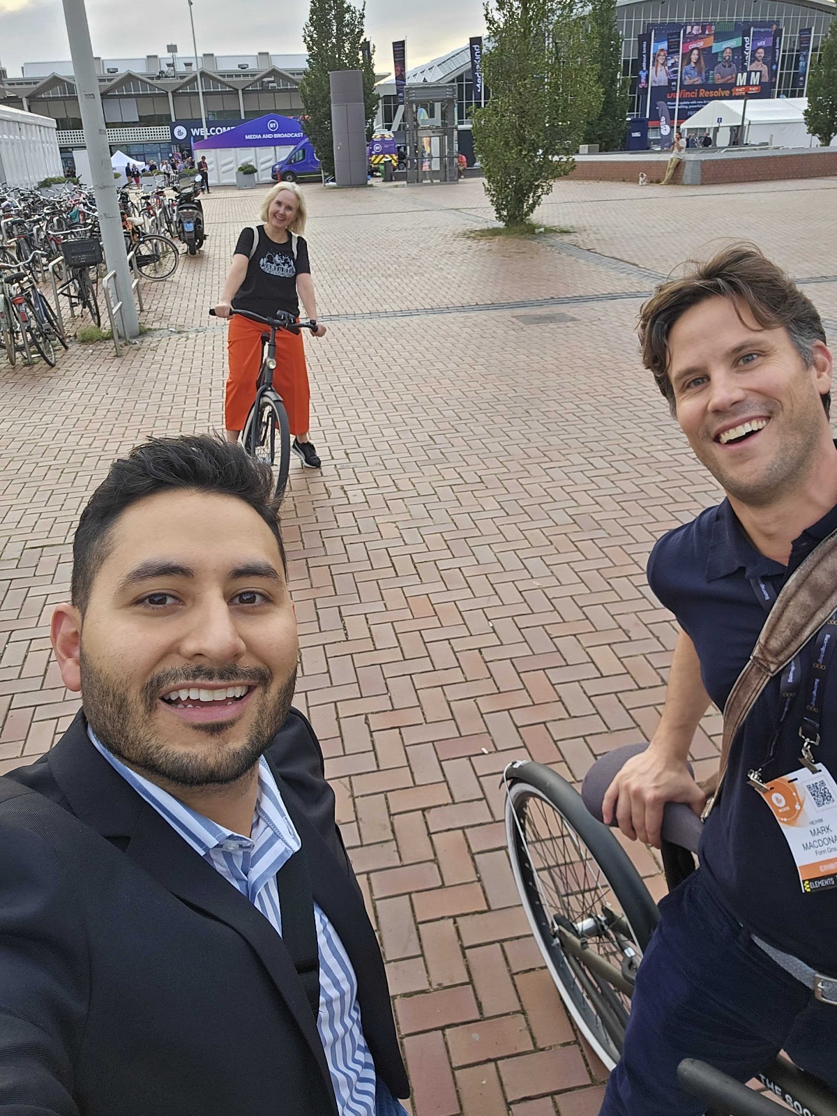
Mauricio Romero (left), VP of Sales Operations at Fonn Group, Ingrid Agasøster, CEO of Synas, and Mark Macdonald, Customer Success Manager at everviz adopting the traditional Dutch two-wheeled transport method.
Our parent company, Fonn Group, has exhibited at IBC for many years. This year, our colleagues from our sister companies Dina, the digital-first story-centric newsroom, and Mimir, a cloud video collaboration and production tool, invited us to join them. So for the first time, we demoed everviz at the beautiful Fonn Group stand.
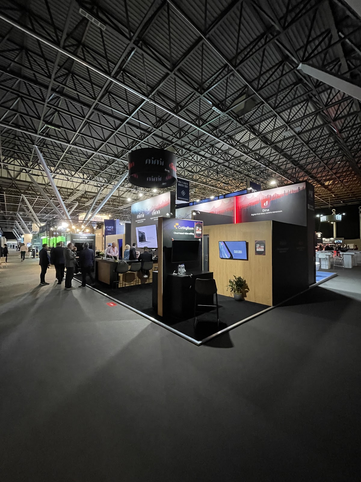
The Fonn Group stand at IBC.
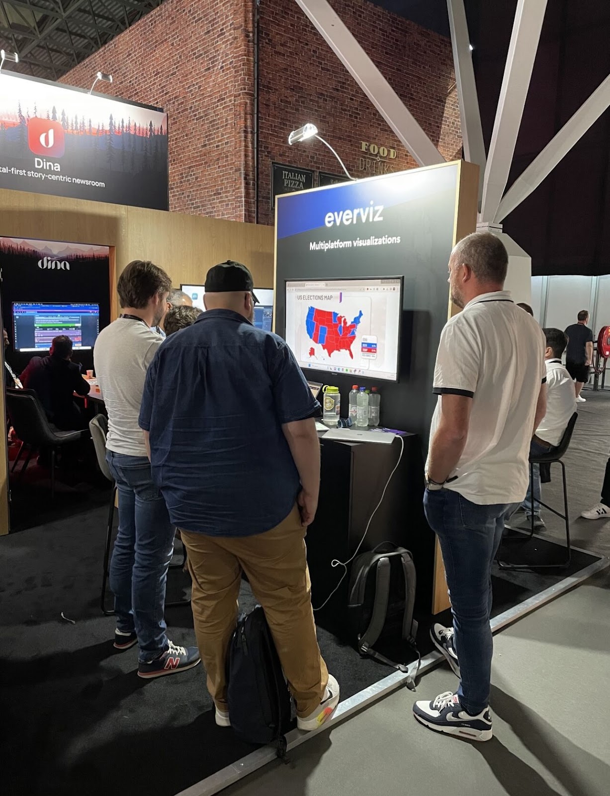
After Fonn Group invested in everviz last year, we have started integrating with their tools. everviz charts can be easily accessed in the Dina interface, allowing journalists to drop beautiful charts into their stories. We have also enabled sending charts to live video. It was a pleasure showing this functionality to the visitors at IBC, and we were pleased to register great interest in our data visualisation workflows for TV.
IBC trends
Companies exhibit their latest and greatest advancements at IBC. Multiplatform publishing was certainly a focus for many vendors. everviz is no exception. Our charts can be repurposed on multiple platforms, ensuring the audience sees them wherever they consume media. There were other trends as well.
Partner integrations
Integrating partner tools into your own software seemed to be a trend at IBC this year. We took note here as well. The everviz panel in Dina allows journalists to access their charts without leaving the Dina interface. We also integrate with Viz Flowics to embed charts in live video. Embedding a small part of the user interface of a partner app in your app means journalists can create content more easily.
Easy-to-use tools
The software on display at the Fonn Group stand is powerful but also user friendly. In a few clicks, anyone can send content to air using Dina, create a chart in everviz or manage media in Mimir. Anyone in the newsroom can use these tools with minimal training.
There is a big focus on user-friendliness in general at IBC. In a stressful, dynamic news environment, software must contribute to getting the news out as efficiently and fast as possible. Dina, the cloud-based newsroom system, is designed for everyone in the newsroom to collaborate around a story. An intuitive user interface means any editorial staff can publish more stories and achieve their digital-first goals painlessly. The same goes for the project wizard in everviz. Editors, journalists and producers can click through our wizard to create a beautiful, branded chart in a matter of seconds.
So, what did we demo at IBC?
We were proud to present charts for live video at IBC. Traditionally, creating data graphics for live video has required extensive design work by specialists. No longer. Now anyone in the editorial team can create on-brand charts.
Many broadcasters are increasingly moving over to creating their TV graphics with HTML-based tools such as Viz Flowics or Singular Live. Because everviz graphs are built with JavaScript, they can easily be embedded in the HTML graphics built with these tools. Our integration with Viz Flowics means that everviz data graphics can be inserted into a Viz Flowics template.
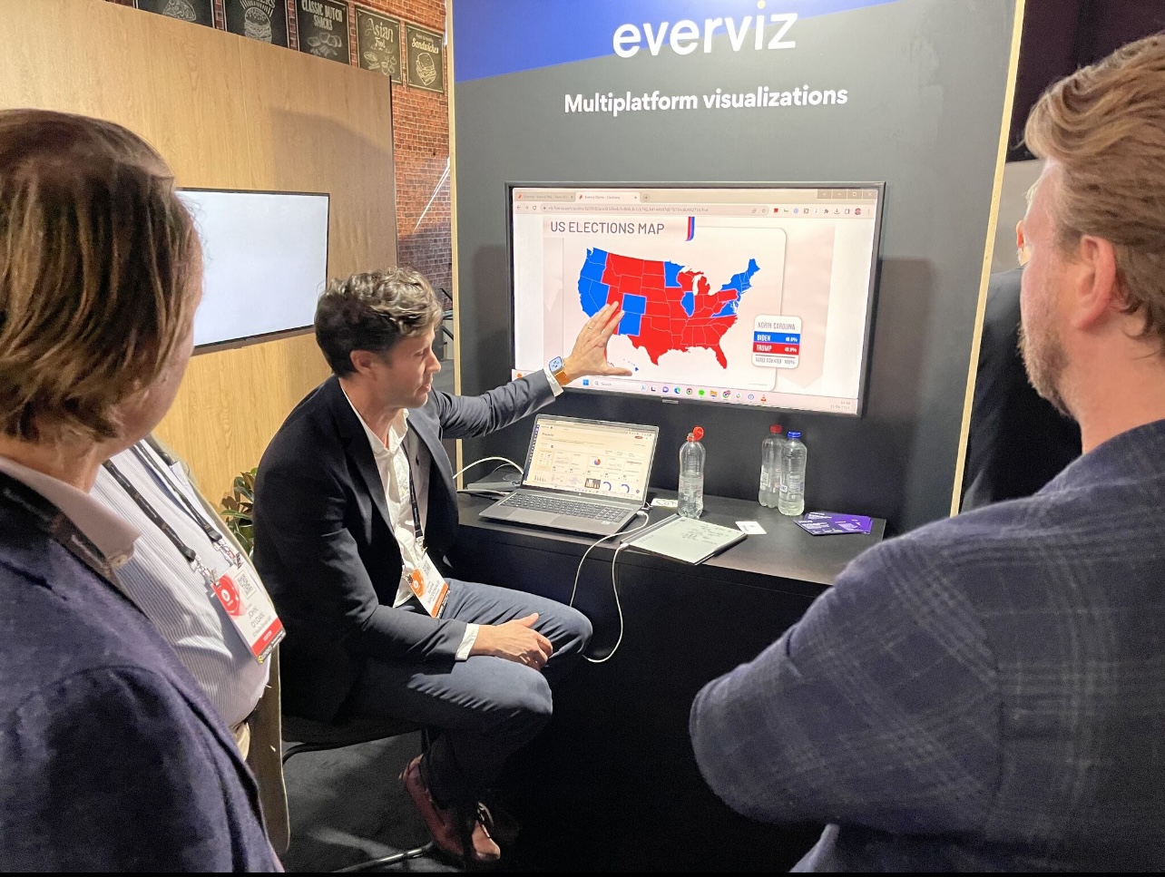
Data graphics are great for visualizing election data but also financial and sports data.
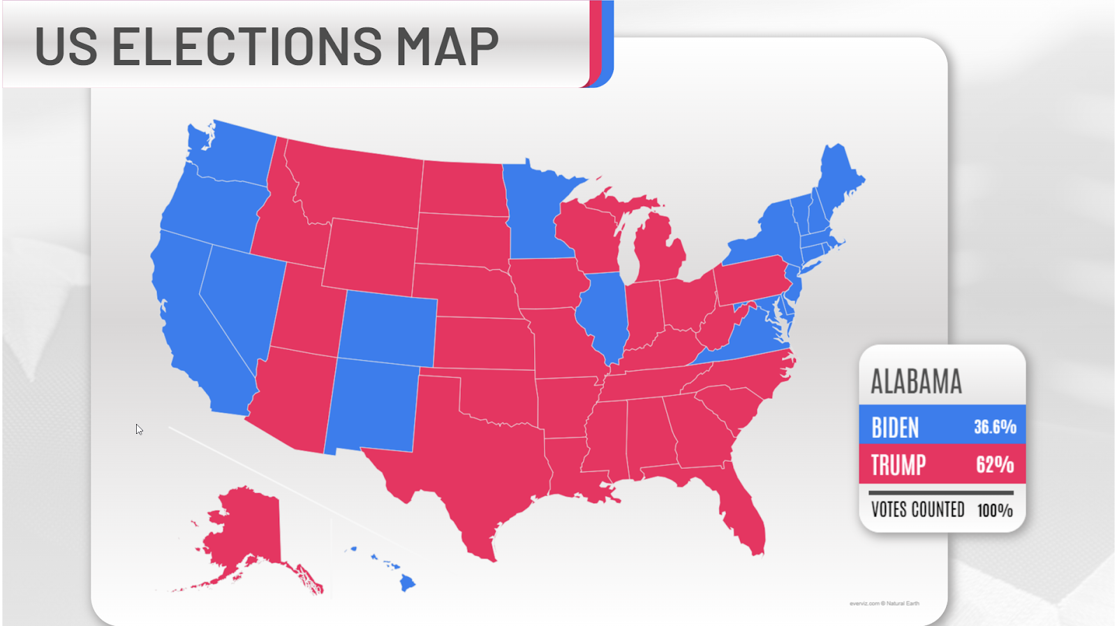
An everviz map inserted into a Viz Flowics template. Both elements are HTML based and can be surfaced anywhere online or inserted into a linear TV stream.
So now, staff can create a chart, paste a chart link in a Viz Flowics template and send everything to air. There was much interest in the democratisation of producing data graphics for TV to cover elections, sports or financial news.
Thanks for having us
It was wonderful to participate at IBC this year. Making new ties in the broadcasting industry was particularly enjoyable and fruitful. We look forward to further enhancing everviz to support media production workflows. Congratulations to everyone involved in the show.

Mark meets a friendly dragon at IBC.


