You may not be a web designer, but if your bread and butter is offering services to your audience through a website, “responsive” versus “static” design are two terms you need to know!
Static versus responsive design
A fixed or static width layout is designed for a specific predetermined width and does not change, no matter the display aspect ratio or the screen size that the viewer has.
Responsive design, on the other hand, is a web design technique that allows the content to adjust to various screen and window sizes on a number of devices. With responsive design, you can make sure your website looks its best on cell phones, tablets, laptops, and desktop screens.
Responsive design is your friend
If you need just one version of the design, static design is the easiest and quickest layout strategy to use. However, Since static formats do not change, your reader’s browsing experiences may be disrupted by unsightly horizontal scroll bars, cropped content, under- or oversized content, and other annoyances.
It’s no longer enough to design websites that only look good on a computer screen, particularly as the internet is increasingly accessed via mobile devices – So responsive design is your friend if you want to meet your audience where they are.
Problems with Static visual content
Think of last time you saw an static image of a chart. This image may have communicated the data in a coherent and clear way when it was projected on a big screen in a meeting room or when you read it in a PDF document on your desktop monitor. However, this does not mean that it is a good idea to include it on your website.
A few major issues involved when using static charts:
- The image does not translate well to small screens. The screen size makes it difficult to see the entire chart and interpret important information
- Second, being an image, there is no way for a for a screen reader to explore it or operate within accessibility standards such as keyboard or voice commands
- Third, static images are not interactive, social and not very engaging.
To Illustrate problems with static charts, here’s a newly created chart shared on Channel News Asia. It plots 2 data series, daily new cases and daily patients discharged, over three months.
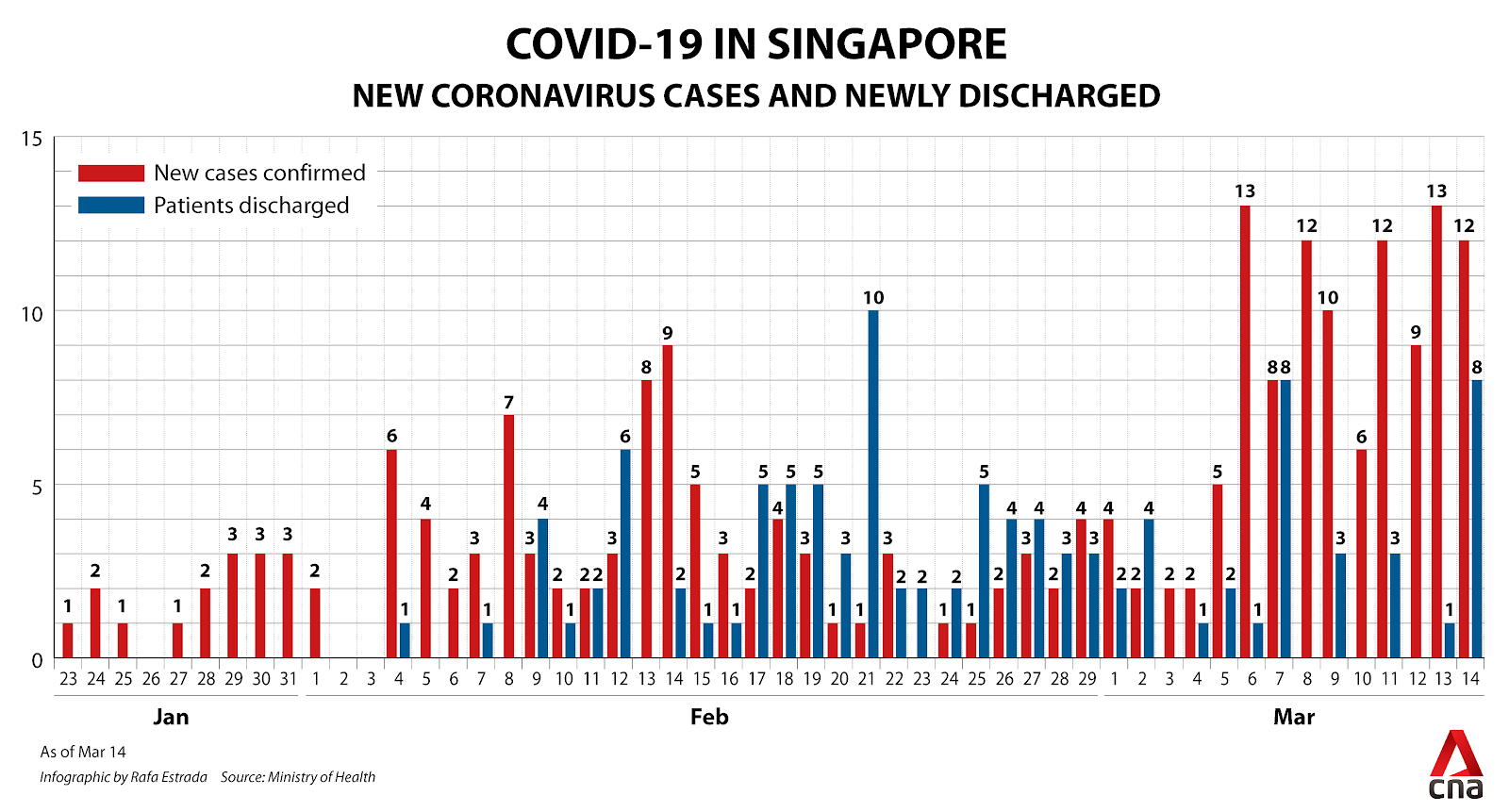
If you are reading this article on a mobile device, you have probably noticed already that this chart is really hard to read.
In case you are reading on a big monitor, we have made this quick screen recording to demonstrate the lack of responsiveness when going from a laptop resolution to tablet to a mobile device.
Transformation to responsive charts
Today, many large private and public website owners have realized the problems with static content, and have invested in tools to simplify the creation of engaging responsive and engaging visual content.
Using responsive design helps communicate the story behind the data in a coherent and clear way so that the audience understands the data at a glance
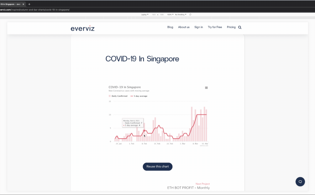
As an example, we have used everviz to transform the COVID-19 Singapore example above into a interactive and responsive chart, and here is the result:
Even though the whole point of this exercise is to show the difference between a static image chart and a responsive chart, we took the liberty to remove some clutter and added a moving average to make the data speak more clearly.
If you resize the browser window you will see that the chart will resize and justify information to make it readable on small mobile devices to large TV screens. Here is a quick screencast to show the effect:
Start the transformation
All visualizations created with everviz comes with responsiveness features out of the box and the user does not have to face the challenge of designing for desktops, laptops, tablets, reading devices, watches and, of course, mobile phones of all shapes and sizes.
On top of this, everviz comes with loads of built-in accessibility and interactivity support.
Ready to start the transformation from static to responsive charts, graphs, tables and maps?