If you’re trying to distinguish your brand and get readers to easily retain information and take action, one of the best things you can do is make your visual content interactive.
The more time people spend reading and engaging with your content, the higher is the chance that your audience will take desired action, return to your page and share your work with others.
In this post, we will show you 10 built-in interactivity features to make your visual content more engaging without creating a single line of code.
Let’s start with the most common interactivity feature for charting tools; Tooltips
1. Tooltips
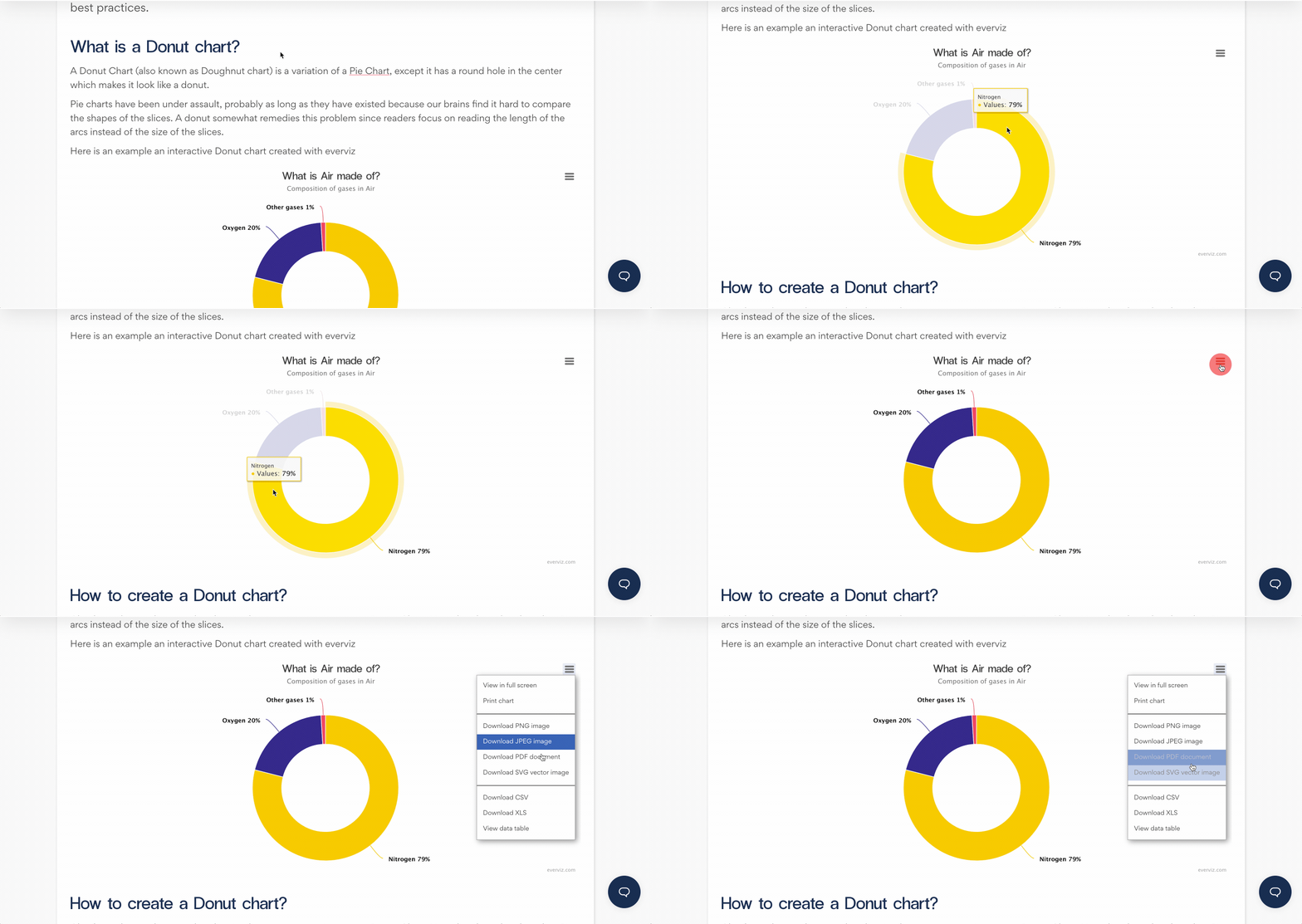
Tooltips are the labels that appear when users hover over data points on your chart to get more information.
Tooltips in everviz are enabled by default, and you can choose preferred styling and information you would like to include.
2. Choose time range
The everviz Stock template comes with built-in support, allowing your reader to choose their desired time period.
The below example shows the close values for the S&P 500 index.
Click on the Zoom buttons to switch date range, insert dates manually or use the slider below the chart to zoom to desired period:
3. Zoom and pan
The easiest way to zoom in or out on a map is to double click in the map or use the scroll wheel of your mouse. Alternatively you can click on the plus and minus icons on the map.
Panning works by clicking and dragging in the map.
4. Before and after effect
The slider feature is a simple and engaging way to show two visualizations or images in the same frame.
The below sample uses satellite images to show the impact of the explosion in Beirut in 2020:
5. Filters
Sometimes your chart may contain a lot of information, and presenting everything by default could make it very hard to read and interpret.
The below chart contains a lot of data, but a limited set is shown by default. Your reader can now click the countries in the legend to show and hide desired information:
6. Carousels, dropdowns and tabs
You can also combine multiple visuals in a Layout. Your reader can browse and navigate in your data by clicking next and previous in a carousel, or switching between your slides using tabs or dropdowns.
Carousel view
Click the Next and previous buttons on the sides.
Dropdown
Use the dropdown to select your desired visual
Tabs
Click on the tabs to select your desired visual:
7. Interactive tables
You can also easily create interactive tables using everviz.
A search field can easily be added, and your reader can click the column headers to sort the rows or paginate the table.
8. Animations
Animations engage your readers and viewers in ways passive charts are not capable of. Animations help people track changes in an engaging way.
Let’s take some random fund data as an example. In this chart the animation speed is set quite low, to maintain our viewers’ curiosity about the development.
9. Highlighting
The ability to display and hide certain data will allow users to concentrate only on the information they are looking for. The visualization can therefore provide a quick grasp of the key points.
Use your mouse to hover over the data in the following chart, and you will see that it is easier to keep track
10. Download and share
When you have created and published your branded interactive visual, you may also allow your audience to download your chart to use in a presentation or share in Social Media.
The screencast below shows how your reader can download your chart to her own computer:

Final notes
Interactive visual content keeps your readers more engaged and will stay longer on your page. Google and other search engines notice the engagement and the longer your readers stay, the higher you will rank in their algorithms. On top of this, if you get your readers to share your content you will get an additional boost in the search engines.
Hope this information was useful, and please try everviz for free if you are interested in creating engaging visual content


