Here at everviz our mission is to enable our customers to reach out with content, news and insights to the largest possible audience. This means accessibility is crucial to our platform and business. You may have seen the term “a11y” floating around the Internet as a hashtag or popping up in tech discussions. “a11y” is an abbreviation for “accessibility”, that is more compact for the character limits on social media.
Disabilities in the digital age
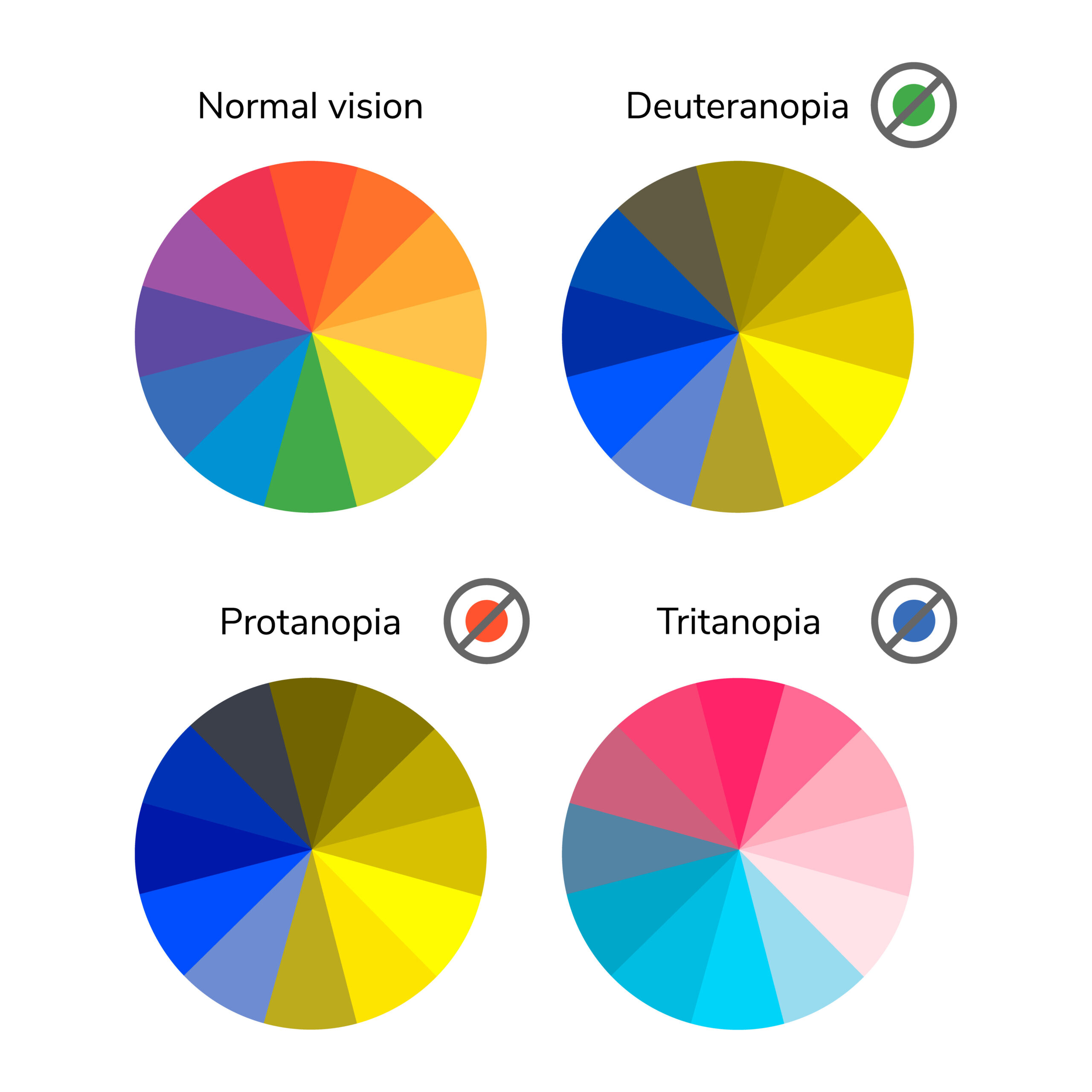
Over 2 billion people in the world population have a disability, according to the World Health Organization. Of those affected, 1.3 billion have some form of blindness or visual impairment. That’s 17 percent of the world ‘s population. In addition, around 200 million individuals have a cognitive impairment and need content and applications customized to their content consumption methods.
And let’s not forget that many of us will experience some kind of age-related impairment as we age (loss of mobility, hearing , vision, memory loss, learning disability). Therefore, accessibility is not just for people with disabilities, it is for everyone. Many of us may even find ourselves in temporary or situational limitations – on how we access and interact with web content.
So, what’s the problem, exactly?
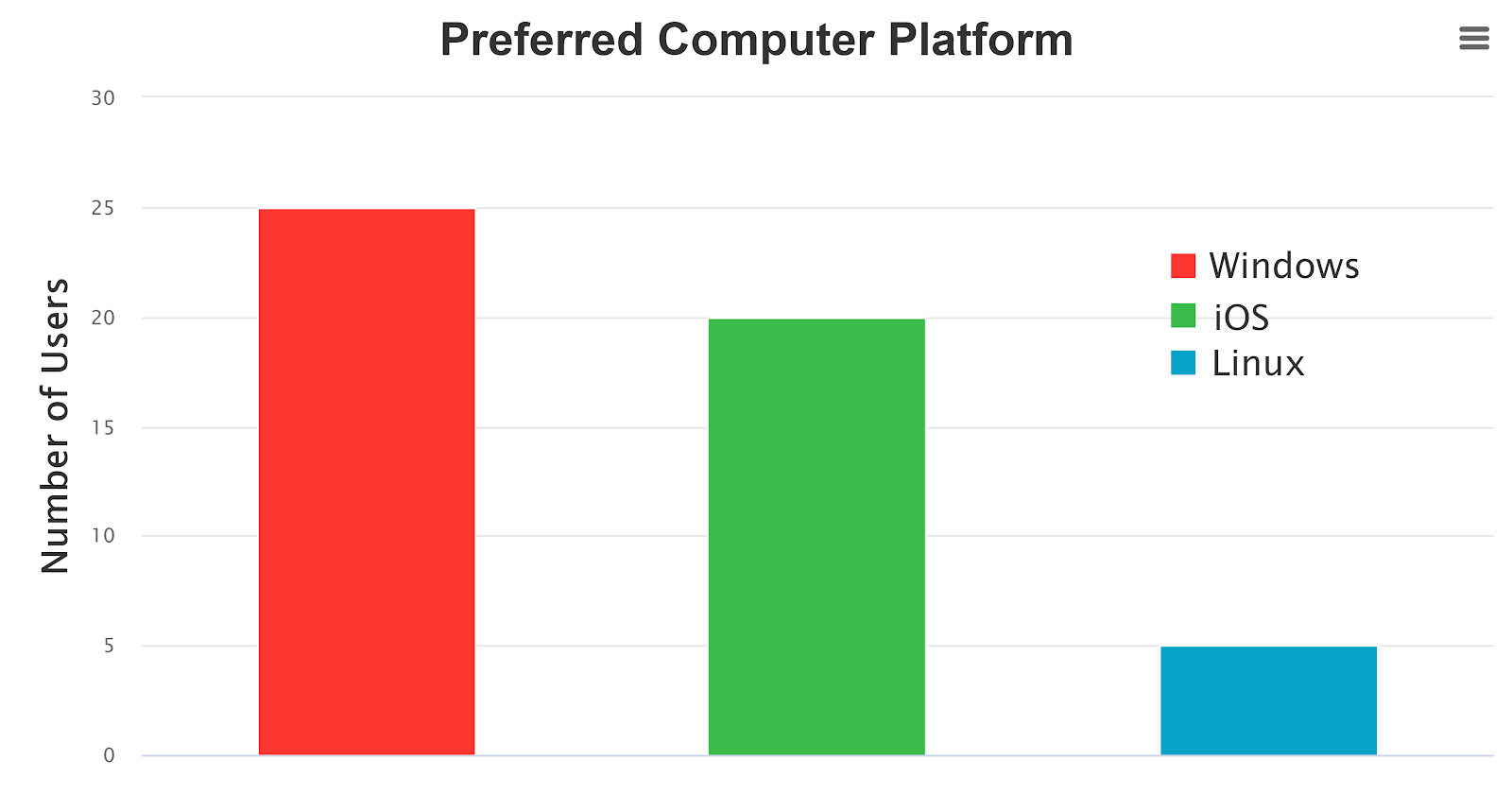
Below is an image of an inaccessible bar chart for distribution of operating platforms. Solid sections of red and green are used, both of similar brightness, and therefore may not be distinguishable for colorblind users.
In addition, the only key to the chart refers to the colors, thus information is only conveyed by color.
Obviously, it being an image, there is no way for a browser to render the data in the chart, or for a screen reader to explore it.
The same graph in grayscale, to illustrate the reliance on color.

Solving accessibility
Correctly implemented accessibility helps the users take part in society, gather information, make up their own opinions about data sets, and in general use internet applications.
Below is the same bar chart, but this time fully interactive, perceivable and operable within accessibility standards.
As you can see, we have picked one color for all bars in the chart. This might not be intuitive, but research shows that one unique color per bar may distract the reader, and give an impression that there is an additional meaning to the data – which there isn’t, in this case.
everviz and accessibility
Thanks to the relentless efforts of our mothership in Highcharts, all charts created with everviz are now rendered to be accessible to people with disabilities. This encompasses disabilities such as cognitive, neurological, physical, and visual impairments.
These features also places everviz far ahead in terms of accessibility, compared to our competitors.
“ Making your software products usable for everyone, including people with disabilities, just makes sense. First of all, inclusive design and accessibility drives innovation, which will benefit all users and not just those who happen to have a disability.
Diversity and inclusion efforts from a well-integrated accessibility commitment are also crucial to brand and customer loyalty.
From a pure business point of view, the global market of people with disabilities is a group with spending power of more than $6 trillion. When making your product accessible, it will not only benefit customers who rely on assistive technologies, but your product will be more usable in a wide array of use cases. You will enjoy increased consumption of your content and increased usage of your services.
Also, you or your customer might be facing a lawsuit if your digital content is not accessible. So far, legal action has been taken mostly in Europe, Australia, and the USA, but the rest of the world will follow as global markets adapt to compete.
Finally, digital accessibility best practices lead to web pages that are highly structured, organized, and annotated, resulting in the highest possible organic search rankings. Conversely, digital products that are not accessible will get penalized, resulting in suboptimal organic search engine rankings.”
Øystein Moseng
Head of Accessibility – Highsoft AS
So, more specifically, what exactly does it mean to make a chart accessible
The W3C Web Accessibility Initiative has defined a set of standardized principles for determining if web content is accessible.
To make your platform or content accessible you should consider these 4 principles (POUR):
- Perceivable – Information and ways of interacting with it must be presented in a way that users can perceive
- Operable- users can find and use your content, regardless of how they choose to access it (for example, using a keyboard or voice commands)
- Understandable- users can understand your content and how the service works
- Robust – you must make sure your content can be interpreted reliably by a wide variety of user agents (including reasonably outdated, current and anticipated browsers and assistive technologies).
For charts that are visual and interactive, this means there are several things to keep in mind. The information in the chart needs to be accessible to assistive technologies, such as screen readers. The interactive features of the chart need to be accessible to keyboard-only users, or users that have other methods of interacting with the web. The design of the chart needs to take into consideration the accessibility of colors, fonts, and other visual elements. And finally, the chart needs to be implemented in a robust fashion, so that its features are compatible and accessible across browsers and assistive technologies.
What accessibility functionality does everviz include out of the box?
All projects created with everviz include accessibility functionality in the three most relevant disability categories for visual charts: vision impairment, motor impairment and cognitive impairment.
Here’s a quick overview of the most important functionality.
Vision impairment
Navigating and reading with a screen reader
A screen reader is a type of software program most often used by visually impaired and blind users. It typically runs in the background, reading out loud what is seen on the screen. The software allows the user to interact with the computer without using sight.
Screen readers benefit both productivity and accuracy for the visually imparied. Significant performance increase of school children using a screen reader shows evidence that screen readers notably help children who have a visual disability.
Take a look at this demonstration on how a screen reader works:
While most other solutions just read out all the meta tags of the chart, everviz supports reading actual content. This allows the user to navigate and explore the dataset, and draw their own conclusions from the information.
Data table support
Alternative presentations such as data tables can be important for users that have difficulties understanding or navigating a chart for various reasons, such as cognitive impairments. Some users find charts confusing and distracting, and in these cases a data table can be easier to explore.
Some screen reader users are also highly proficient in navigating data tables, and for these users it can be a preferred way to consume the core information in a chart.
everviz also supports downloading the data in common formats, which enables users to import the data into other software for manipulation or further exploration.

Windows high contrast mode
Text with low contrast can be difficult to read for people with low vision. Strongly contrasting colors can make it quicker and easier for visually impaired to read from their computer or other device. For this reason, Windows comes with a High Contrast feature that limits the number of system colors to a predefined set. Charts created in everviz supports Windows high contrast mode, and will automatically change to a high contrast theme when High Contrast mode is enabled
Tactile printing
Tactile printing means charts can be printed and turned into a tactile graphic.
As long as the exporting option is activated in the everviz projects, users can download an SVG version of the chart. This SVG can be printed and turned into a tactile graphic using embossing printers or similar technology.
For users with visual impairments, tactile graphics can be a great way to get an overview of the data. Trends, patterns, shapes and outliers are more easily discovered this way than through navigating a chart with a screen reader.
Cognitive accessibility features
Cognitive and learning disorders influence how information is interpreted by individuals. They can influence the vision, memory, language, focus, problem solving, and comprehension of people for instance. Intellectual disorders, learning disabilities, attention deficit hyperactivity disorder (ADHD), autism, dementia, dyslexia, and more vary in terms for groups and conditions.
There are multiple features included out of the box in everviz to allow the reader to focus on important parts of the visualization and avoid distractions:
Full screen view – Open the chart in full screen view

Dim on hover – When the reader interacts with the chart, active parts of the visualization will stand out by dimming out other series.
Tooltips – Provide detailed information about specific parts of the visualization when the reader interacts.
Series labels – Apply labels directly to elements inside of a visualization to show the value of a datapoint or the category of the data
Custom markers – Choose individual markers or shapes on the series to make it easier for the reader to follow certain plots.
Motor impairment
Keyboard navigation and voice input
One of the most significant facets of online accessibility is keyboard accessibility. Most motor-disabled users rely on a keyboard. Usually, blind people use a keyboard for navigation as well. Some may have tremors that don’t allow for regulation of fine muscles. Others have no use of their hands or little use of them. Whether due to a birth defect, an injury, or amputation, certain persons actually do not have hands. Some users can use adapted keyboards or other hardware in addition to standard keyboards.
By enabling keyboard navigation in everviz, users are able to navigate and interact with the data points, chart menu, and other chart controls using the keyboard only. Because most assistive technology for users with motor impairment works by emulating a keyboard, this ensures access to interactive features for all users.
everviz also supports voice input navigation with common software such as Nuance Dragon and Windows Speech Input.
More accessibility demos, examples and further reading
If you want to try it out some of these yourself, the easiest way is to have a look at these demos and examples:
- Voice input demo 1: https://www.youtube.com/watch?v=kt-paZYOKA8
- Voice input demo 2: https://www.youtube.com/watch?v=jGQ4HYSYUZ8
- Screen reader demo: https://www.youtube.com/watch?v=8Sew47xr-EU
- Sonification demo: https://www.highcharts.com/demo/sonification
- Several other demos: https://www.highcharts.com/demo#accessible-charts
- Further reading: https://www.highcharts.com/docs/accessibility/accessibility-module
The future of everviz accessibility
Our goal is to provide the most accessible charts possible, and we are constantly updating our features to be on the cutting edge of web accessibility.
We would love to get feedback if you have suggestions for improving our accessibility features.