
Introducing our US election visualization package
The US election this November promises to be one of the biggest stories of the year. A data-driven event, where visualization of vote tallies stands
The US election this November promises to be one of the biggest stories of the year. A data-driven event, where visualization of vote tallies stands
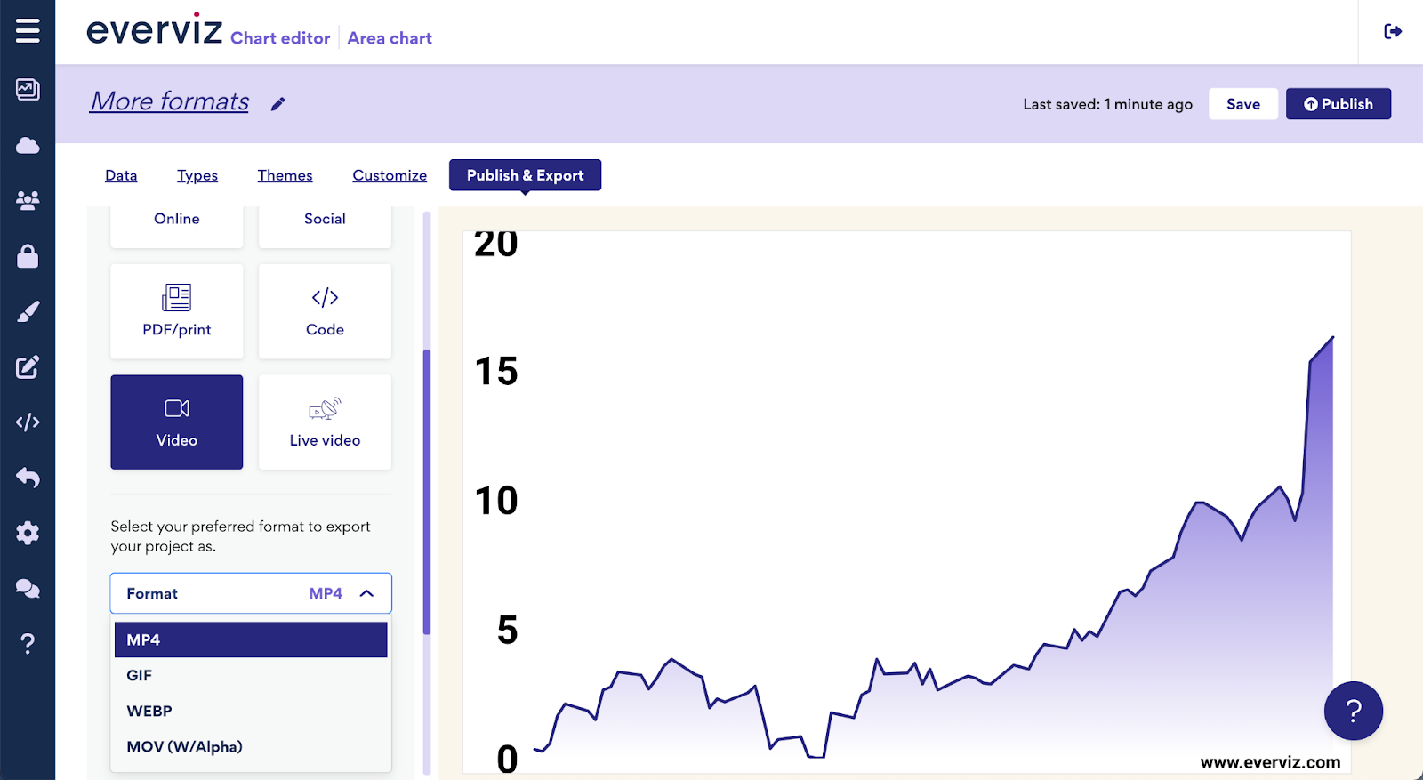
Expanding upon our recent announcement of multi-platform visualizations, we’re thrilled to introduce even more versatile formats to enhance your content. Enhance your visual content with
Let’s start with a few key statistics. Healthcare takes more than 10% of the GDP of most developed countries. In fact, in 2020, 21% of the US GDP was spent on healthcare. That is more than any other US program. Healthcare amounted to 12.8% of the GDP in the UK and 11.3% of the GDP in Norway.
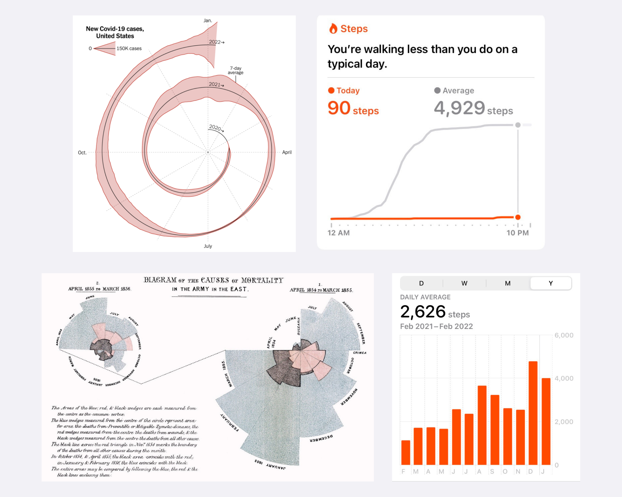
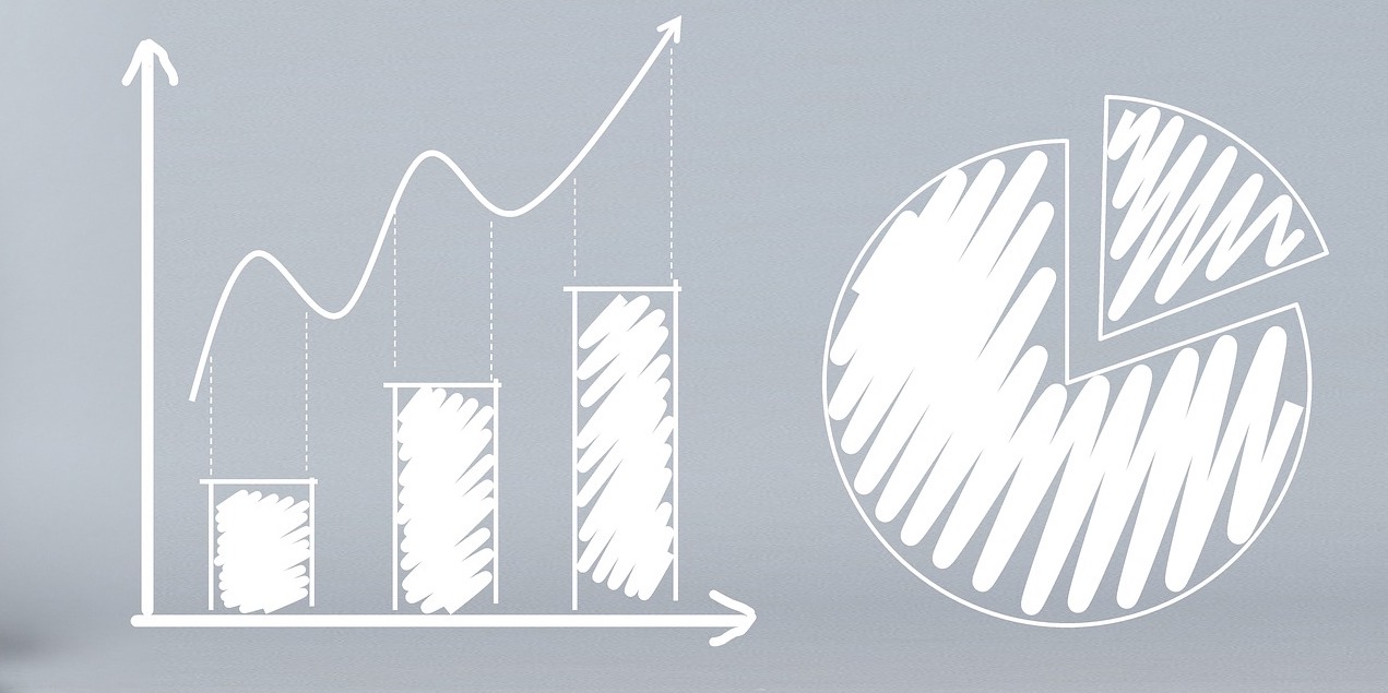
Graphs can be a wonderful tool to make data clear, engaging, and accessible to your audience. However, picking the right data visualization to communicate your story can be hard.
This is a guest blog post by Rebeca Pop, founder of Vizlogue, a Data Visualization and Storytelling Lab that offers workshops and consulting services. You
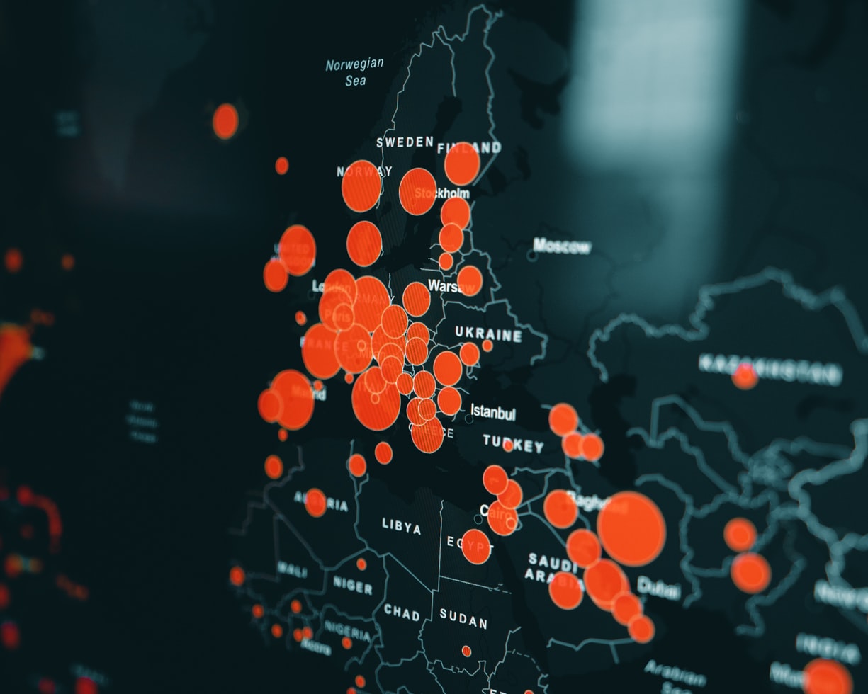
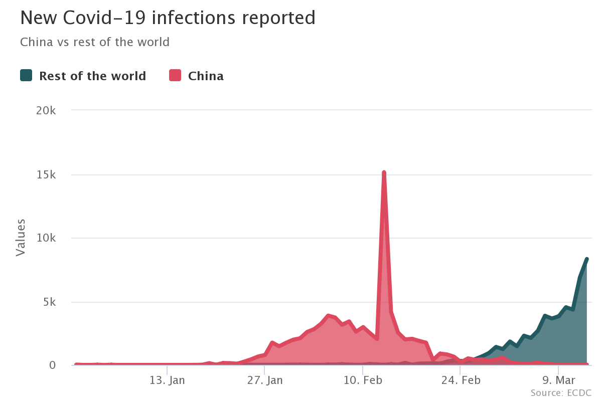
The COVID-19 pandemic triggered a funding crisis for non-government organizations (NGOs) and advocacies worldwide — right when they are needed the most. The World Economic
Imagine this scenario. Alex is an analyst working for a biotech company. He joined the organization two weeks ago. His manager calls him into her office and asks him to prepare a presentation for a few executives.
Visualizations play an important part in making data digestible and turned into actionable insights. We are working day and night to enhance our service to
This post was originally published on the Highcharts blog, and was transferred as part of the rebrand from Highcharts Cloud to everviz. More than 3,000
This post was originally published on the Highcharts blog, and was transferred as part of the rebrand from Highcharts Cloud to everviz. Our brains process
