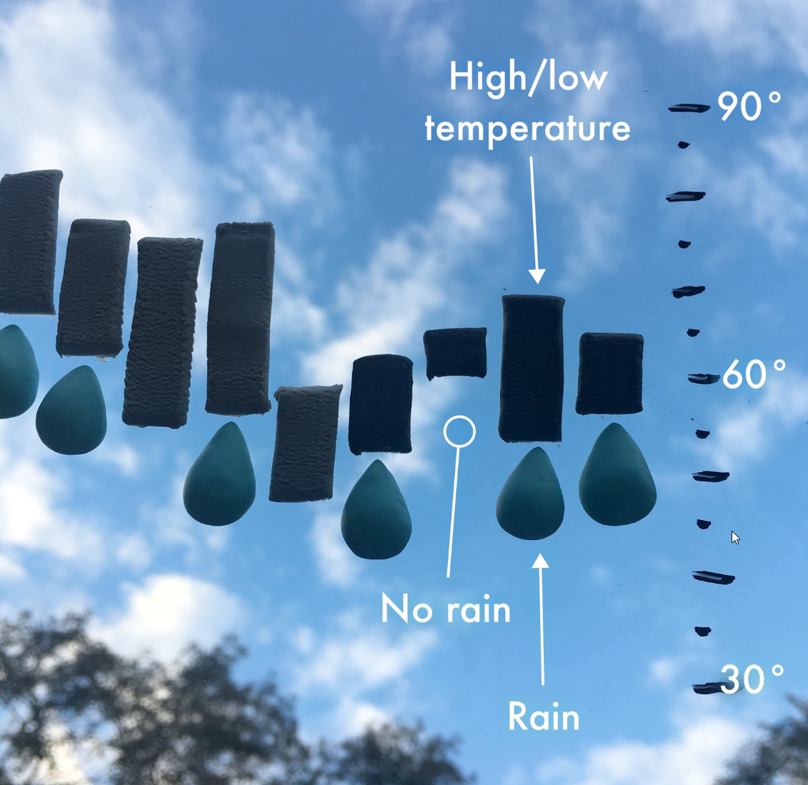
This post was originally published on the Highcharts blog, and was transferred as part of the rebrand from Highcharts Cloud to everviz.
More than 3,000 years ago, storytelling helped build one of the most famous civilizations on the planet.
When the Dorians invaded the Greek peninsula, the people of the region did not have a common language. Divided by vast lands and uncommon words, they were relatively easy to conquer. But under Dorian rule, storytellers began traveling from village to village using the Greek language to spin their tales. People wanted to listen, so they began to learn the language. Slowly, it spread. United with one language, the Greek became stronger and defeated the invaders, and became one of the most influential civilizations the world has known.
That is the power of stories.
Storytelling as a science
Stories are such a universal and ancient means of communication that researchers began to study what makes them so powerful. What they found was pretty remarkable. When stories are told, audience members’ brains do two interesting things.
- First, they release cortisol. That’s the same hormone our body releases when we’re threatened or scared. It sharpens our focus and makes us pay attention.
- Second, they release oxytocin — a neurochemical that helps us feel empathy. It’s this chemical that makes us the social creatures we are.
Stories, in other words, are scientifically proven to both force us to listen and to feel. Two things that are essential to any persuasive effort.
So, what makes a story a story?
What sets a story apart from a jumble of language is simple — the dramatic arc.
- Setting the scene (Who are the characters? What’s their conflict?)
- Rising actions (Things get more complicated.)
- Climax (We hit a turning point.)
- Falling action (Thing start to resolve.)
- Resolution (How to things end up? How did the action change the characters?)
You know a story when you hear it, or even, when you see it. Ballet, for example, can move an audience to tears or laughter just by building a narrative through movement.
Storytelling with data
Numbers, though perhaps less elegant than ballet, can do the same thing — tell a story without words. Doing so requires careful planning. A group of ballet dancers can get on stage and start twirling around without ever spinning a story. And a spreadsheet of numbers could be presented to your executive team only to elicit blank stares and a chorus of “We’ll think it over.”
If you want your business intelligence to have true persuasive powers — the kind that gets you project approvals, strategic buy-in, and budget allocation, your numbers must tell a story.
Numbers, pictures, and stories: a powerful trifecta
Data is critical to effective and persuasive communication today. The onslaught of information and opinions into everything we see and hear is at an all-time high. Numbers provide us with validity and credibility that makes us believers.
On their own, numbers aren’t very compelling. Many people either think they’re boring or fear them, assuming they’ll be difficult to understand. That’s where visuals come in to help. Our brains process images faster and remember them longer than words.
By combining data and pictures (two communication powerhouses) to form a story, you have a highly persuasive tool. Data visualization stories present the evidence (the numbers) needed to reach a certain conclusion, the imagery to make them memorable, and the scientific impact which to understand them.
Bonus points
To take data from a simple chart to a story, you should aim for the following:
- The visualization must stand on its own. While it’s certainly acceptable to combine a data visualization with a blog post or other text, true data visualization storytelling can tell its story without any additional context.
- The data should be interactive. What’s better than hearing or watching a story? Being part of it. Interactive data visualizations have the added impact of allowing the audience to choose their own adventure and become even more involved.
If you need any more convincing, consider this our story’s resolution — while only 5 percent of people remember a statistic they’ve heard, 63 percent remember a story.


