Image source: undraw.co.
This is a guest blog post by Rebeca Pop, founder of Vizlogue, a Data Visualization and Storytelling Lab that offers workshops and consulting services. You can find Rebeca on YouTube, where she posts data visualization videos. Rebeca has been providing insights and creating data visualizations for almost 10 years. She has worked as a digital analytics leader for top media and analytics companies, and is teaching Data Visualization and Storytelling at the University of Chicago and at Northwestern University. Read more about Rebeca in her bio below.
Imagine this scenario. Alex is an analyst working for a biotech company. He joined the organization two weeks ago. His manager calls him into her office and asks him to prepare a presentation for a few executives. He receives three different data sets and is told that his main priority till the following week should be this high-visibility presentation. He goes back to his desk and spends two out of the total five days that he has understanding, cleansing, and mapping the data. He then dedicates two days to exploring and analyzing the data. And so, he is left with only one day to create graphs and put together a presentation. Because of the limited time that he has available, he creates mostly common, template-based charts (pie charts and bar charts) and then organizes them in an order that would make sense.
This scenario might sound familiar to you. I know it does to me. Often, we spend so much time managing and analyzing the data, that data visualization is left to the last minute. The problem? Your audience will rarely ask how data cleansing or data mapping went. Your audience will rarely wonder how much time you spent analyzing the data. Instead, they will try to dive deeper into the insights. They will try to uncover the why behind the results. In other words, your audience will try to figure out the action points. Don’t get me wrong. I am not arguing that data managing and data analysis are not critical to any analyst’s job. They absolutely are. But I have seen dozens of data presentations fail because analysts didn’t spend sufficient time outlining the data story they were trying to tell.
In this article, I’m going to answer and discuss two questions, both equally important to anyone working with data:
1. Does data visualization need data storytelling?
2. Does data storytelling need data visualization?
Does data visualization need data storytelling?
Let’s start off with the first question: “Does data visualization need data storytelling?” I believe it does. One data set can tell many different stories. It is up to each of us to uncover what story we should tell and then use tools that can help us communicate that story. I recommend considering three specific strategies: Highlight, Order, and Visuals.
Highlighting key data points helps your audience focus on what truly matters. If you have a graph that includes multiple data points, your audience won’t know which one to pay more attention to. If you don’t control the message you’re planning to deliver, you risk letting your audience do so. Different groups of people in your audience might see the same graphs but find different takeaways. By highlighting key points, you can control where your audience is looking and the actions that they are likely to take based on your results.
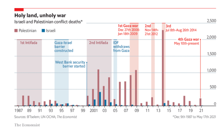
An example of highlighting key data points to tell a data story comes from The Economist. The graph below shows the numbers of Israeli and Palestinian deaths from 1987 to 2021. Key bars in this chart that tell a story (typically bars that depict a higher number of fatalities) are highlighted by using background color and adding annotations. Regardless of how many people are exposed to this graph and their backgrounds, they will all likely focus their attention on the highlighted bars. By highlighting key data points, The Economist is in control of the message.

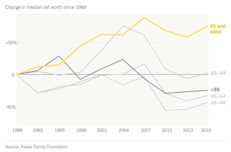
Another example of using highlighting as a tool to tell a story with data comes from The New York Times. The line graph below shows changes in median net worth from 1989 till 2016. The graph includes different age groups: <35, 35 – 44, 45 – 54, 55 – 64, and 64 and older. The groups <35 and 64 and older are highlighted using a different color and/or a combination of bold text and thicker lines. The data journalists guided the readers’ attention to specific data points that they thought were relevant by highlighting these two age segments.
Order is another valuable approach to incorporate storytelling into your data visualizations. The order in which your visual information is presented will influence how well your audience understands the information and how engaged your audience is with the content you are presenting. Whether you are presenting PowerPoint slides, a dashboard, or interactive data visualizations, order is a core component that should be carefully considered.
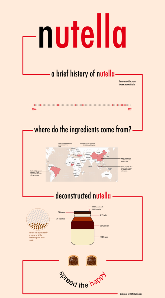
In the example below, the history of Nutella is unfolding step-by-step as we scroll down. The dashboard makes good use of white space and connection lines to guide the audience’s attention. We are guided to start off at the top, where the Nutella logo is prominently displayed. Then, the first line is directing us to the title of the visualization: “a brief history of Nutella.” Under the headline, we see a bubble for every year from 1946 (when the product that was later called Nutella was initially invented) to 2021. The red bubbles represent years that were important in Nutella’s history. The rest of the dashboard follows the same structure, grouping information into sections that combine connecting lines, headlines, and graphs. The dashboard ends with a call to action: “spread the happy.” Similar to highlighting, ordering your graphs in an intuitive sequence helps you control the data story.
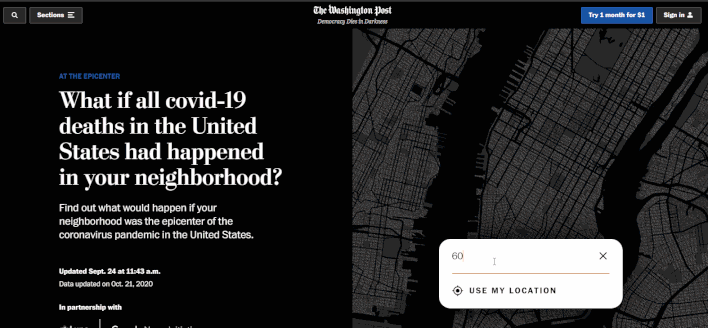
Another example of how Order can be used as a tool to tell a story with data comes from the Washington Post. The visualization starts off with a critical question: “What if all COVID‑19 deaths in the United States had happened in your neighborhood?” The readers are asked to input their zip code, and the data story starts unfolding from micro to macro. First, we are presented with a hypothetical scenario in which one of our neighbors died due to COVID-19. This neighbor represents one dot on the map. Then, we are guided to slowly zoom out, step-by-step, as we start seeing the growing deaths around us. In this hypothetical scenario, everyone within a radius of 1.3 miles dies (based on my zip code). In the end, the story comes full circle, reiterating the idea that all the 202,329 US deaths could have happened close to home, in my zip code. Just like the previous dashboard, the Washington Post data story ends with a call to action: “Since these people were not around you, it may be hard for you to see the scale of these losses in your own daily life. But each one was a tragedy for those in their circle.”
If used thoughtfully, Order can be a powerful tool in data visualization. You might want to build your story from micro to macro (like in the Washington Post example) or, alternatively, from macro to micro. Or, you might want to present your data story chronologically. No matter the approach that you decide to take, Order is a tool that can help your data visualization shine.
Finally, Visuals are the third element that you can leverage to tell a story with data. Visuals can take the form of symbols that are used to communicate a category or a topic. Alternatively, visuals can be large, impactful pictures that are displayed prominently to direct readers’ attention towards the main topic.
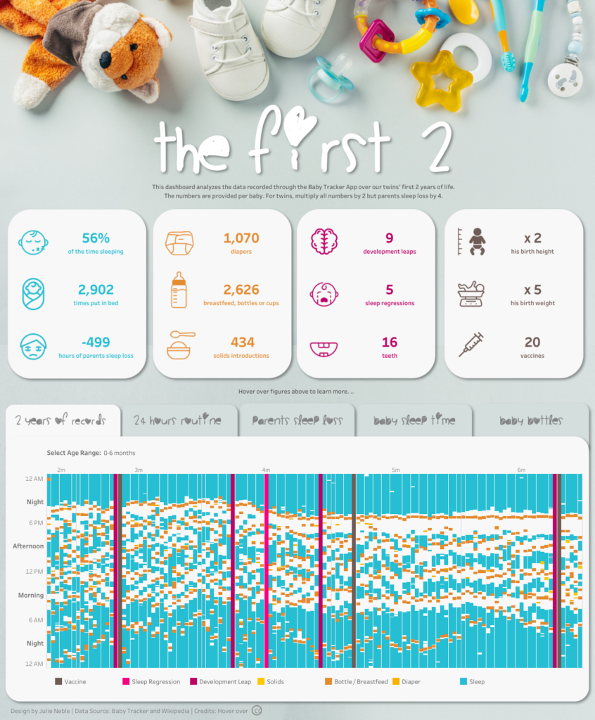
In the example below, icons are added throughout the dashboard to tell a story. Instead of using large font size to specify the name of each category, Julie chose icons to represent each category. The name of each category is still displayed, but in a smaller font size, under each number. The icons are very well chosen. They communicate the nuances of each category. “Sleep regressions” and “hours of parents sleep loss” stood out in particular for how well the icons represent them.
At the top of the dashboard, pictures of baby-specific objects are prominently displayed. Toys, shoes, toothbrushes, and pacifiers all make us immediately realize that this dashboard (and story) is about babies.
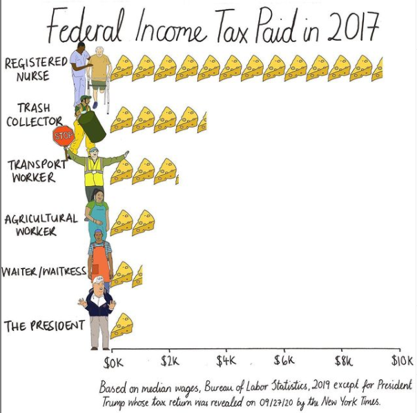
Mona Chalabi is known in the data visualization field for being a highly visual communicator. She typically publishes work that has a social or political impact and hand draws her graphs. In the example below, Mona tells a story about the federal income tax paid in 2017 by people in different professions. It turns out that registered nurses paid the most in federal tax, while the president (Donald Trump) paid the least. To communicate the insight in a visual manner, Mona used drawing of people that represent their professions (including an image of the president). Instead of using the more traditional bar charts, she chose blocks of cheese to represent the money paid in federal tax.
Does data storytelling need data visualization?
Now that we discussed how to leverage tools such as Highlight, Order, and Visuals to incorporate storytelling into your data visualizations, it’s time to focus on our second question: “Does data storytelling need data visualization?” Personally, I believe that data storytelling needs data visualization just as much as data visualization needs data storytelling.
Let’s imagine that you have a meeting with your manager. You’ve been in your role for over two years now, you’ve done a great job, and you think that it’s time to discuss a possible promotion. You write down some of your top accomplishments and schedule a meeting with your manager. You have your arguments ready, you put some thought into the flow of the conversation, and you included some metrics that prove your success. But should you incorporate some graphs? While I don’t necessarily advocate for creating graphs for every single meeting, I think that a few graphs could be helpful in this scenario if you have a few metrics and results that you want to highlight.
For example, you might want to show how much budget you saved by optimizing processes. You could include a graph showing the processes you optimized and the total budget that each process saved. Data visualization, in this case, could add credibility to your storytelling and help your manager better see your achievements.
A great example of how data storytelling needs data visualization comes from a Netflix and Vox documentary series called “Explained.” This docuseries features short episodes (15 – 20 minutes in length) and digs deeper into a diverse range of topics that impact people’s lives. I’ve watched almost all episodes, and they covered subjects such as the stock market, K-pop music, the world’s water crisis, and the racial wealth gap. While typical documentaries don’t incorporate data visualization, the “Explained” series does. Every episode starts with a few key statistics that are meant to pique the audience’s curiosity. These statistics are accompanied by interactive graphs.
Below is an excerpt from the “Explained” episode “Why Women Are Paid Less.” The narration incorporates interviews with famous people, such as Hillary Clinton, as well as statistics. For example, survey results showing that only a fraction of the US population thinks that women should work full-time after becoming mothers are displayed in the form of a graph. Other “Explained” episodes follow a similar pattern, where statistics and graphs are used to build a foundation for the topics covered and add credibility.
Now, let’s go back to Alex, our analyst who works for a biotech company and is asked to analyze data and create a presentation for executives. If you resonated with Alex’s story, I hope that this blog post provided you with some tips that you can apply right away. While it’s ideal to allocate sufficient time to visualizing data and crafting a data story, even limited time can be strategically used if you have a toolkit that you can leverage.
Next time when you find yourself in a position similar to the one Alex was in, pause for a few minutes before creating any explanatory graphs. Use these few minutes to draft your approach. Ask yourself questions such as: Is there an opportunity to incorporate Highlight, Order, and Visuals to help tell your data story? Or, can you add graphs to a story that you are trying to convey, similar to how it was done in the “Explained” docuseries? Above all, I encourage you to constantly bridge the gap between data, graphs, and the story you are crafting.
About the author

Years ago, Rebeca fell in love with data visualization and storytelling. And there was no way back.
That was the point when she realized how underrepresented these skills are, despite being core to most business professionals.
Rebeca, Vizlogue’s founder, has been providing insights and creating data visualizations for almost 10 years. She has worked as a digital analytics leader for top media and analytics companies, across a diverse set of industries, such as Fast Food Restaurants, Consumer Packaged Goods (CPG) and Automotive.
For nearly 3 years, she has been teaching Data Visualization and Storytelling at the University of Chicago and at DePaul University in Chicago.
Rebeca holds a MA from the University of Oklahoma and a BA from the University of Bucharest, Romania. When she’s not reading, practicing or talking about data visualization and storytelling, Rebeca enjoys hiking and cycling.


