This is a guest blog post by Rebeca Pop, founder of Vizlogue, a Data Visualization and Storytelling Lab that offers workshops and consulting services. You can find Rebeca on YouTube, where she posts data visualization videos. Rebeca has been providing insights and creating data visualizations for almost 10 years. She has worked as a digital analytics leader for top media and analytics companies, and is teaching Data Visualization and Storytelling at the University of Chicago and at Northwestern University. Read more about Rebeca in her bio below.
Let’s start with a few key statistics. Healthcare takes more than 10% of the GDP of most developed countries. In fact, in 2020, 21% of the US GDP was spent on healthcare. That is more than any other US program. Healthcare amounted to 12.8% of the GDP in the UK and 11.3% of the GDP in Norway.
What’s more, according to RBC Capital Markets, “approximately 30% of the world’s data volume is being generated by the healthcare industry. By 2025, the compound annual growth rate of data for healthcare will reach 36%. That’s 6% faster than manufacturing, 10% faster than financial services, and 11% faster than media & entertainment.” In other words, healthcare is one of the largest and fastest-growing industries in the world.
Given the large budget allocated to healthcare, the amount of data generated, and the rapid digitalization of the industry, data visualization is critical to understanding patterns, supporting healthcare practitioners, communicating with patients, and tracking digital personal data. In this blog post, I will present notable historical data visualizations, discuss a recent graph from the New York Times, review graphs used in my health apps, and talk about how the future of healthcare data visualization might look like.
Early public healthcare data visualizations
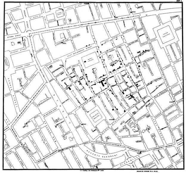
When I think of historical public healthcare data visualizations, the first one that comes to mind is John Snow’s map of the 1854 outbreak of cholera in London. Cholera was one of the deadliest diseases to affect Britain in the 19th century and at that time the belief was that the disease was transmitted by ‘bad air’ or ‘bad smells’ from rotting organic matter. John Snow’s map represented a major contribution to the fight against cholera, as he was able to identify the source of the outbreak as the contaminated public water pump on Broad Street. Snow’s findings literally changed lives. His work and map persuaded the local council to disable the water pump and led to changes in public health policies.
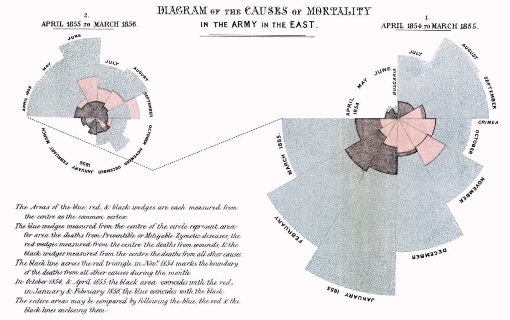
Another major early example of healthcare data visualization is Florence Nightingale’s Rose Diagram. Nightingale was a nurse and statistician who, in 1858, was treating soldiers wounded in the Crimean War. She recorded the data manually and created a graph that illustrated how more soldiers were dying from infections and diseases than in fight. To date, Nightingale is remembered as a pioneer in visualizing health data. She revolutionized nursing and showed that presenting data in a clean, clear, and beautiful way can positively impact health policies and persuade governments.
In more recent history, health data visualization has revolved around COVID-19 data. The majority of the pandemic graphs show trends over time in the form of line graphs or geographical data in the form of maps. The topic of COVID-19 data visualizations is broad and many articles and blog posts have been published. One recent graph that led to intense controversy and that will most likely remain in the history of data visualization as revolutionary was a spiral graph published in the New York Times. The graphic was created by Gus Wezerek and Sara Chodosh, and sparked discussions on whether a spiral graph was the best way to communicate data over time. The post below by Zach Freed went viral on Twitter, with almost 7,000 retweets and over 79k likes.
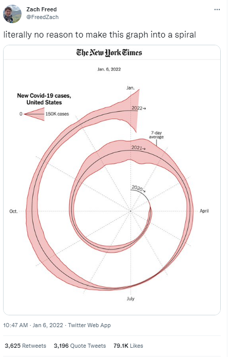
The polarized opinions were not just among the general public, but also among experts in data visualization. Some thought that the spiral was unique and a persuasive approach to communicating with data, while others expressed strong disapproval.
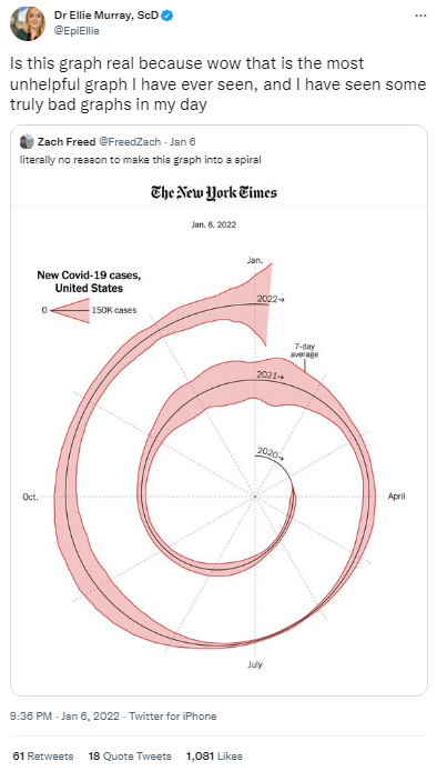
For example, Dr. Ellie Murray, ScD, an epidemiology assistant professor at the Boston University School of Public Health with over 107K Twitter followers retweeted the spiral graph saying that it was “the most unhelpful graph” she’s ever seen.
Other retweets were sarcastic, such as the one posted by Randall Koutnik, asking “can you make it more intestinal?”
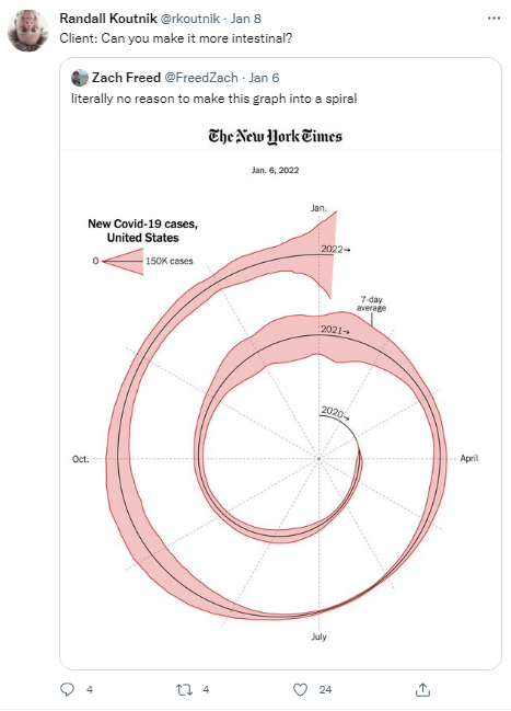

Positive remarks noted that the NYT spiral graph was attention-grabbing, helped highlight seasonality, and challenged strict, long-held data visualization rules.
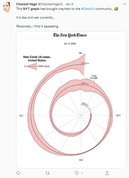
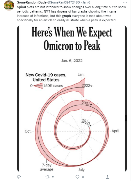
All in all, the NYT spiral graph became so discussed, that several people recreated it, some even enhanced it, and a few data visualization experts blogged about it. Personally, I am not one to express extreme perspectives on graphs. You’ll rarely hear me use words such as “never” or “hate” in data visualization. Also, I don’t tend to fall in love with a graph just because it’s new and shiny. Instead, I prefer to take a step back, understand the context, and assess the pros and cons. In the case of the NYT spiral graph, I think that a line graph would have allowed us to compare the trends more accurately. However, a spiral graph implies seasonality and grabs attention. Ultimately, the right chart choice is dependent on the data at hand, as well as on what the author intends to communicate.
Present healthcare data visualizations – apps
I don’t know about you, but I use health apps regularly to track my physical activity, eating habits, sleep cycles, and water consumption. Given that I was already familiar with some notable historical data visualizations that changed lives, I decided to take a closer look at present data visualizations. In this case, I was curious to explore how data is visualized in my health apps.
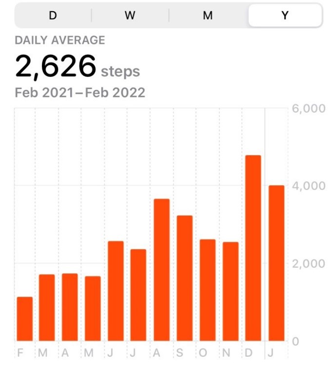
First, I use the iOS Health app on a regular basis. It’s an app that came with my phone and that I take a look at daily to check how many steps I took and how many miles I walked. The app includes a few different views:
1. Bar charts that show the number of steps or miles by day, week, month, and year
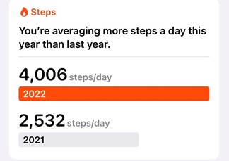
2. Progress bars comparing progress made recently versus previous time periods, such as the total number of steps that I’ve averaged in 2022 versus 2021
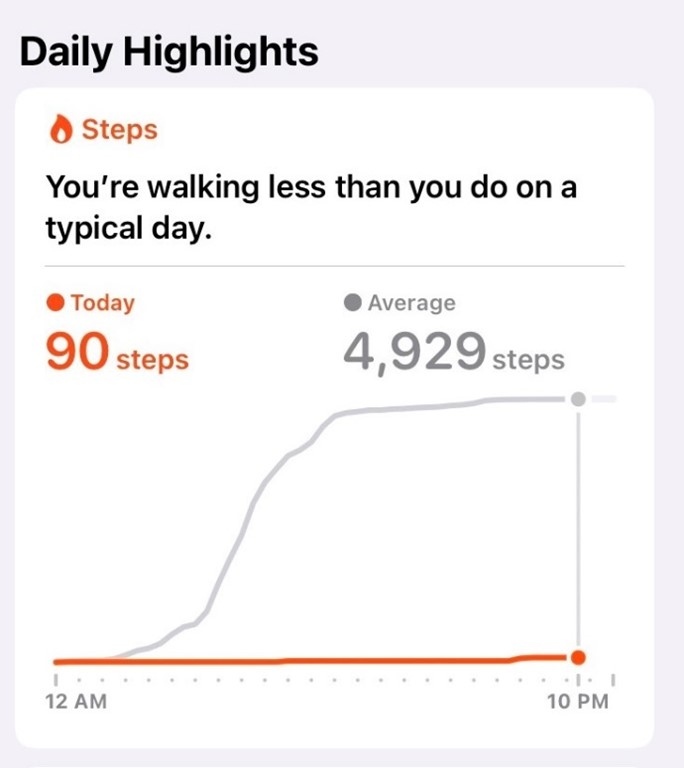
3. Trend lines illustrating current trends versus average, such as the number of steps that I took today versus the average number of steps that I take on a typical day
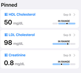
I should point out that the iOS Health app also includes other health categories, which I don’t check or use on a regular basis (e.g., hearing, mindfulness, heart, mobility, respiratory, vitals). The app also enables users to upload data (including health records and lab results) and share them with their families and healthcare providers.
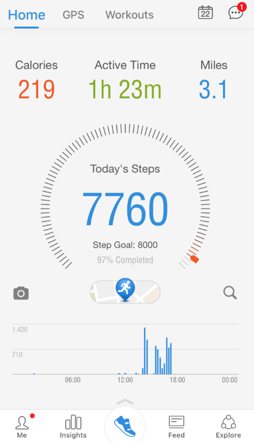
All in all, the chart types in the iOS Health app are common, such as bar graphs and line charts. While more innovative graph types might be attention-grabbing and more memorable, the goal is to ensure that the general public is able to read and understand results and trends. Thus, the graph types should enable understanding as opposed to pushing the boundaries of graphicacy.
The design elements are also carefully selected, making the data more engaging. For example, the line graph in the screenshot below shows the most recent data in orange, while older data appears in grey. Thus, the emphasis falls on recent data, which is likely to be more relevant to most users. Furthermore, the total number of steps is highlighted above the graph, using a large font size. There is also a lighter and thin grey line connecting the endpoints of each line graph. The X-axis doesn’t display every single number; instead, the start and end times are displayed. Finally, there is a headline that summarizes very well where the user stands. In my case, I walked less today than on a typical day – 90 steps versus almost 5,000 steps.
More recently, I’ve also been using the Productive – Habit Tracker app. This app aims to help users build “positive life-changing habits.” In the app, users can set up goals and monitor progress.
The app incorporates a speedometer-type graph, icons to indicate weekly or monthly averages, and dotted lines to highlight specific days when users completed activities. In terms of graph types, I’m not a fan of the speedometer as it makes it hard to understand the results accurately. In the example below, I can approximate that the green portion of the graph is about a quarter, but I need to look at the number to get a more exact understanding of the results. Instead of the speedometer, I’d recommend using a 100% bar chart.
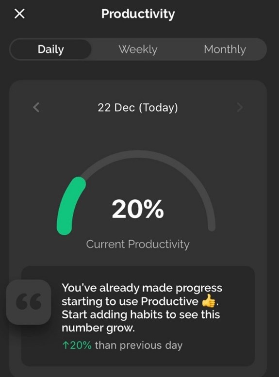
As for design choices, the green color is easy to see and the contrast against the black background makes it stand out more. The icons for weekly average and monthly average are helpful, but I’d recommend adding icons to the metrics above as well (best streak, total times done) to ensure consistency and increase readability.
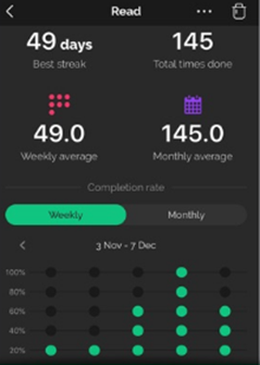
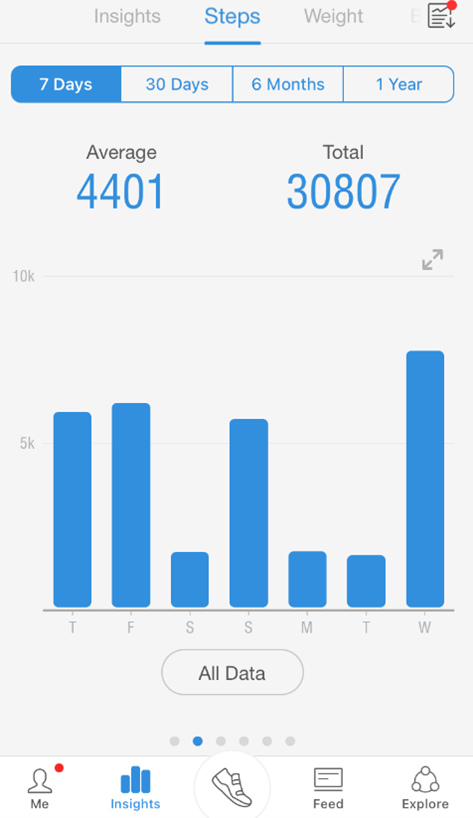
A third health app that I’ve been using recently is Pacer, an app that helps users track their steps and fitness activity. The app prides itself on providing “amazing data insights” so I decided to try it out and see if the graphs are more intuitive and insightful than what the iOS Health app provides.
The Pacer app incorporates a few different types of visualizations: bar charts, plain numbers, a donut or speedometer-type chart, maps, and icons. In the first screenshot below, the statistics at the top are easy to read, large, and each category uses a specific color. In the example below, the blue color is consistent with the graphs under the key statistics, which ensures clarity. Personally, I’m not a fan of the donut or speedometer-looking chart, but I believe that the small lines make this graph more readable than the one in the Productive app.
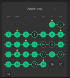
In the second screenshot below, the bar charts are a safe and intuitive choice. Given that this app is meant to be used by a large number of people, with varying degrees of data literacy, a bar chart is an effective choice. However, the key statistics above the bar chart could be better summarized. For example, 308807 could be summarized as 308K to improve readability.
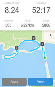
In the third screenshot, the map is clean and clear. The colors are consistent with what we’d expect for water and green spaces, for example, and the trajectory marked in blue is easy to follow. The key statistics above the map are also helpful.
Among the three apps that I reviewed above (iOS Health, Productive, Pacer), my favorite one remains the iOS Health app. The graph types used in this app are intuitive, and the design is clean and minimalistic. Although Productive and Pacer push for more novelty in terms of data visualizations, I believe that the data could be better visualized in a simpler way.
The future of healthcare data visualizations
Now that I covered the past and present of healthcare data visualization, you might be wondering what the future holds. While I am not a clairvoyant or fortune teller, I can definitely make assumptions. I believe that the number of health apps will continue to grow and, with them, the importance of visualizing personal data. I hope that more health apps will choose a clean, clear, and minimalist style to visualize data. The historical data visualizations that I reviewed here, as well as the NYT spiral graph, will likely also inspire future healthcare data visualizations.
As a next step, I encourage you to explore more historical data visualizations, as there are a lot of learnings and best practices that we can still apply today. Also, take a look at the health apps that you have on your phone. What types of graphs do they use? How would you evaluate the design? Graphs are everywhere and there are plenty of opportunities to explore and learn.
About the author

Years ago, Rebeca fell in love with data visualization and storytelling. And there was no way back.
That was the point when she realized how underrepresented these skills are, despite being core to most business professionals.
Rebeca, Vizlogue’s founder, has been providing insights and creating data visualizations for almost 10 years. She has worked as a digital analytics leader for top media and analytics companies, across a diverse set of industries, such as Fast Food Restaurants, Consumer Packaged Goods (CPG) and Automotive.
For nearly 3 years, she has been teaching Data Visualization and Storytelling at the University of Chicago and at DePaul University in Chicago.
Rebeca holds a MA from the University of Oklahoma and a BA from the University of Bucharest, Romania. When she’s not reading, practicing or talking about data visualization and storytelling, Rebeca enjoys hiking and cycling.


