This is a guest blog post by Rebeca Pop, founder of Vizlogue, a Data Visualization and Storytelling Lab that offers workshops and consulting services. You can find Rebeca on YouTube, where she posts data visualization videos. Rebeca has been providing insights and creating data visualizations for almost 10 years. She has worked as a digital analytics leader for top media and analytics companies, and is teaching Data Visualization and Storytelling at the University of Chicago and at Northwestern University. Read more about Rebeca in her bio below.
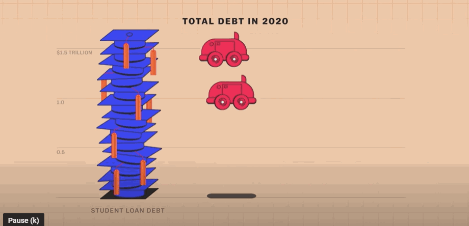
Explained is one of my favorite Netflix shows. It’s a docuseries created in partnership with Vox that brings attention to critical issues that impact people’s lives. The episodes are short, ranging from 15 to 20 minutes in length. To date, some of my favorite episodes have covered topics such as Money, The Mind, and The Racial Wealth Gap. You might be wondering what data visualization has to do with a Netflix show. Well, a lot…Each Explained episode includes simple, animated graphs that are key to explaining topics in an accessible manner. For example, the episode on Money starts with a unit chart showing how student loan debt compares to auto loan and credit card debt. By incorporating an animated and engaging graph, the producers truly drive the point home.
The Explain docuseries is an example of interactive data visualization done well, but it’s definitely not the only one. There are countless other examples, as the adoption of interactive data visualization has been quickly growing and is likely here to stay.
How interactive data visualization came to be
While there are many resources (ranging from books to videos and online articles) that cover the history of data visualization, there are much fewer resources that specifically address the history of interactive data visualization.
The book A Brief History of Data Visualization by Michael Friendly provides a thorough overview of the history of data visualization and touches on the history of interactive data visualizations as well. Friendly mentions that interactive graphs were created in the late 1960s, when university computers first provided the means to use programming to re-create previously hand-drawn graphs. Around the same time, GIS, as well as 2D and 3D graphs, were developed. One important example of an early interactive graph was “a system for interacting with probability plots in real time, choosing a shape parameter of a reference distribution and power transformations by adjusting a control.” A decade later, in the 1970s, Fishkeller, Friedman, and Tukey developed an interactive program that generated rotating 3D charts and real-time graphics for analyzing multivariate data.
Despite these groundbreaking early developments, the use of interactive charts remained limited to a few fortunate researchers and was not widely available to the general public till the mid-1980s and early 1990s, when technology became cheaper and more powerful.
In the 2000s, Hans Rosling’s TED talk The best stats you’ve ever seen received a lot of media attention. Around the same time, Rosling, together with Ola Rosling and Anna Rosling Rönnlund, founded Gapminder, a Swedish foundation that aims to make global data and trends, as well as built-in interactive graphs readily available. Hans Rosling was a Swedish physician and academic who was passionate about visualizing publicly available data and statistics to reveal trends and educate the larger population. In his TED talk (which has over 3.5MM views on YouTube!), Rosling used interactive bubble charts to debunk the myth that there’s “we” versus “them” in the world and that the “developing world” was still behind the Western world.
In fact, Rosling’s approach to explaining statistics using storytelling and interactive graphs was so impactful, that in the years that followed he produced a series of documentaries in partnership with BBC (The Joy of Stats, Don’t Panic — The Truth about Population, Don’t Panic: How to End Poverty in 15 Years). In these documentaries, Rosling used interactive graphs to take viewers on a journey through how statistics can be eye-opening and change our view of the world.
Fun fact: the bubble chart software called Trendalyzer, which Rosling used to create the bubble graphs in his famous TED presentation and which was developed by the Gapminder team, was acquired by Google in 2007. The bubble chart is still available and you can still use it for free on the Gapminder website.
It’s undeniable that Hans Rosling’s work has had an enormous impact on the use and development of interactive data visualization. Fast forward to 2021, interactive graphs are everywhere. I asked a few friends if they recalled seeing an interactive graph in the last few months. Not surprisingly, they all remembered seeing an interactive chart, whether that was at their workplace or in the media.
Some of my favorite examples of interactive graphs
When it comes to choosing a few examples of interactive data visualizations, the selection is tough and maybe even somewhat unfair. I’ve seen many well-designed, impactful interactive graphs in the last year or so. With the goal of providing some diversity, I chose three examples from different industries that covered unrelated topics.
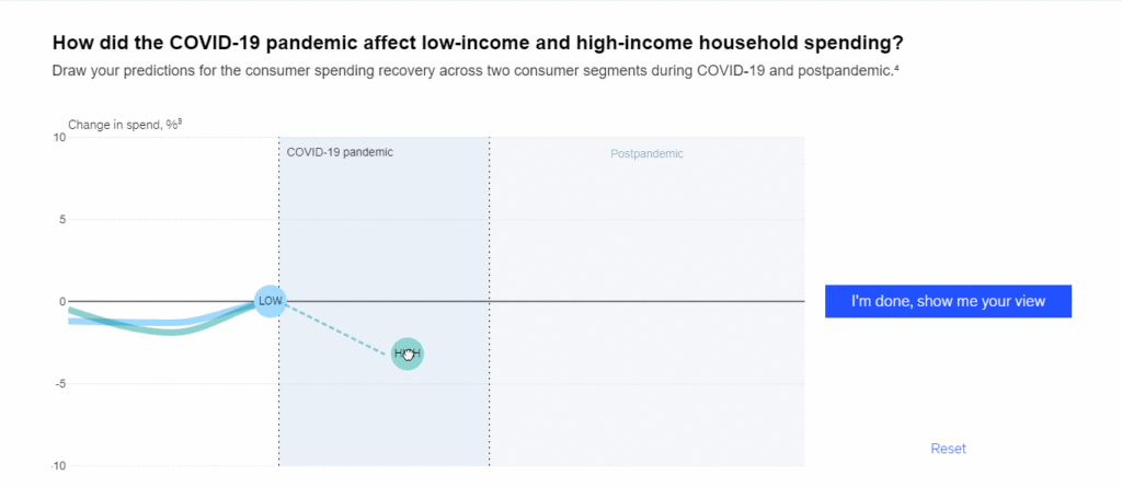
My first example comes from McKinsey & Company. The management consulting firm has published several highly engaging, memorable interactive graphs in the last year. One that stood out the most for me was an interactive called Test your ideas on how postpandemic consumers may behave.
For this project, the McKinsey & Company team explored how COVID-19 affected consumer spending and how the impact was felt unevenly across various industries. The interactive starts by asking us to draw our predictions on a line graph for how consumer spending changed during COVID-19 and will change postpandemic. I gave it a try and proceeded to draw my predictions. Then the actual results, based on McKinsey & Company’s analysis, were displayed. My predictions were slightly off, but not by a lot.
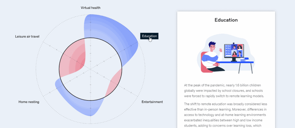
Next, we are asked to explore what aspects of consumption were affected by COVID-19 the most across six categories (leisure air travel, home nesting, virtual health, education, entertainment, and e-grocery). Even before clicking on a specific category, we see from the graph that leisure air travel and entertainment were most affected in terms of consumer spending.
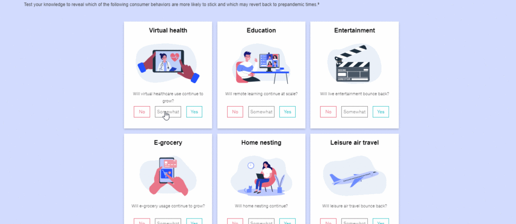
Finally, the interactive engages users further by asking them to test their knowledge on which consumer behaviors are more likely to stick and which may revert to prepandemic times. As you can see in the video below, out of the six categories displayed, I was only right about the home nesting and leisure air travel trends.
Most interactive data visualizations that I’ve personally seen came from the media. A few publications that I follow and that create engaging and impactful interactive graphs include Reuters, The New York Times, Bloomberg, and The Wall Street Journal. The second data visualization that we’ll explore comes from Reuters and it’s part of the article When the right wing rallies. The piece examines data on the political protests across the United States in 2020. It shows how the concept of stolen elections “brought together a disparate collection of anti-government militias, conspiracy theorists, white nationalist and ordinary Americans, and how those protests continue into 2021.”
The first graph is a view of all protests that took place in 2020, each encoded in a circle. The size of the circle represents the crowd size. Then, in green, 300 protests that were far-right groups, anti-government militias, or white nationalists are highlighted. One of my favorite elements in this graph is when we continue to scroll down and the circles take the form of beeswarm graphs to show the protests by month. Annotations continue to be displayed as we scroll through the months.
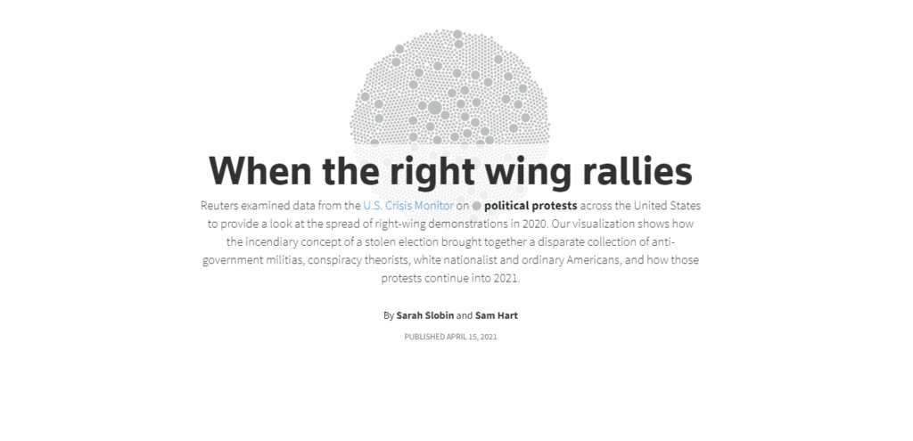
As we advance towards the end of the piece, we are introduced to a new graph type, which looks similar to a radar chart or a Nightingale chart. This graph is quite complex and shows the distribution of the far-right groups, such as Proud Boys, QAnon, and Oath Keepers. While this last chart type is intriguing and stands out, I found it quite challenging to read. A clearly labeled legend (explaining all data encodings, including order, width, and length) could have helped ensure all readers understand the graph correctly.
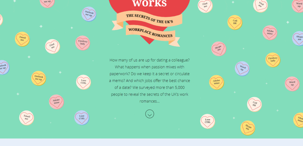
While interactive graphs are popular in the media, it’s important to note that organizations and companies can also leverage them. A recent example came from the Beyond Words Studio and was created for Total Jobs. How Love Works is an interactive data visualization that aims to explore the secrets of the UK’s workplace romances. The first graph encodes various places where people are likely to meet their better half, showing that 22% meet their partner at work.
As we scroll down, we explore how easy it is to work with the one you love, and some other opinions on workplace romances, based on a survey of 5,795 UK workers. Workers are thoughtfully encoded in the shape of a heart, using a unit chart. Each chart represents one respondent. The results of the survey are displayed by highlighting the number of hearts that represent a specific answer.
Some fun statistics:
- It turns out that 2 in 3 UK workers are open to dating a coworker
- 76% of respondents said that dating colleagues tend to keep their relationship a secret
- 1 in 3 people who date at work said that they feel judged by their coworkers
After the quantitative results are presented, some quotes on various reasons survey respondents said they got out of a workplace romance are displayed. Each quote is, as expected, in the shape of a heart. My favorite quote: “Disconnect of ambition”.
So, are interactive data visualizations here to stay?
Given that personal computers are accessible and software to create interactive graphs are widely available, there are no technological barriers for those who want to present visual information interactively.
The benefits are many. When using exploratory graphs, interactivity provides more effortless, more hands-on access to the data. For explanatory charts, interactivity makes the message clearer, more digestible. Whether used for exploratory or explanatory purposes, interactivity has the potential to engage your audience and leads to better decision-making.
Have you ever created an interactive data visualization? Whether your answer is yes or no, I hope that this blog post inspired you to either create your first interactive graph or continue exploring the fascinating world of interactive data visualizations.
About the author

Years ago, Rebeca fell in love with data visualization and storytelling. And there was no way back.
That was the point when she realized how underrepresented these skills are, despite being core to most business professionals.
Rebeca, Vizlogue’s founder, has been providing insights and creating data visualizations for almost 10 years. She has worked as a digital analytics leader for top media and analytics companies, across a diverse set of industries, such as Fast Food Restaurants, Consumer Packaged Goods (CPG) and Automotive.
For nearly 3 years, she has been teaching Data Visualization and Storytelling at the University of Chicago and at DePaul University in Chicago.
Rebeca holds a MA from the University of Oklahoma and a BA from the University of Bucharest, Romania. When she’s not reading, practicing or talking about data visualization and storytelling, Rebeca enjoys hiking and cycling.


