This is a guest blog post by Rebeca Pop, founder of Vizlogue, a Data Visualization and Storytelling Lab that offers workshops and consulting services. You can find Rebeca on YouTube, where she posts data visualization videos. Rebeca has been providing insights and creating data visualizations for almost 10 years. She has worked as a digital analytics leader for top media and analytics companies, and is teaching Data Visualization and Storytelling at the University of Chicago and at Northwestern University. Read more about Rebeca in her bio below.
Graphs can be a wonderful tool to make data clear, engaging, and accessible to your audience. However, picking the right data visualization to communicate your story can be hard. To begin with, there are dozens of graph types to choose from. How do you know if a pie chart or a bar chart, for example, is your best option? Or, should you potentially disaggregate your data and choose a chart type that displays every data, such as a beeswarm plot? Choose the wrong chart type, and you end up not just not communicating clearly with data, but also misleading your audience.
And…that’s not all. Assuming that you selected the correct graph type, the next step would be to edit the design elements of the graph. At this point, you’d ask yourself questions such as:
- How many colors should I use? What colors should I use?
- Should I truncate the axis?
- How many data points should I display?
- How much context should I provide?
If you don’t think carefully about such questions, you might end up, again, with a misleading graph.
In this blog post, I’ll walk you through how to avoid misleading with graphs from two perspectives: 1) when not selecting the right graph type and 2) when not considering key design elements.
Misleading graph types
While nearly every graph type could be built in a misleading way, in this section I’ll highlight a few examples of graphs that are more commonly an issue. I’ll also provide an alternative to each misleading graph type. Let’s get started!
3D graphs
3D graphs can look fun, maybe even engaging. Tools like Excel are partially responsible for making them popular. But should you use 3D graphs? Before I give you the answer, let’s take a step back and understand how the data is encoded.
In the example below, you have data that shows the percentage of passengers on the Titanic, by class. Looking at the graph, it is quite hard to tell what percentage the 3rd class pie slice represents, for example. The slices at the back tend to look smaller than the slices at the front, which distorts reality. The 3rd dimension adds no value to the graph, other than embellishing it. Embellishing without a strategic communication goal is not recommended in data visualization.
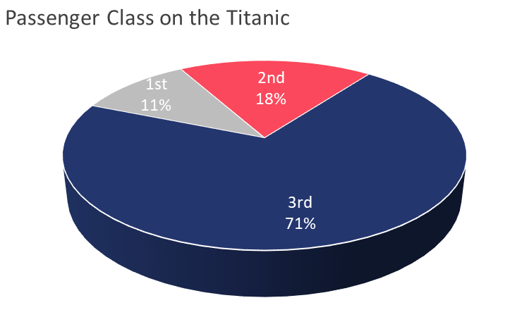

Now, let’s take a look at the 2D version of the same graph, recreated in Everviz. While pie charts overall are highly controversial, you can still more accurately compare the size of the slices in a 2D version.
I won’t transition to the next example without saying that there are situations when it might make sense to use a 3D graph. If you truly have a 3rd dimension in your data, believe that it is relevant to display it, and the graph can be explored in a 3D fashion (interactively on your computer or physically), then you might want to consider using a 3D graph.
A few weeks ago, I rented a lake cottage in Michigan. By the front door, the host had a 3D-printed map of the lake. In this case, not only did the data include a 3rd dimension, but the map brought to life the terrain and the beautiful location in a way that a 2D map couldn’t have.

Pictographs
3D charts are not the only graph type that tends to be misleading. Pictographs often fall in the same category. A pictograph is a type of graph that uses pictures, symbols, or icons to represent quantities. For example, we could use apples to represent data on apples sold by day of the week. Or, data on household income could use a dollar symbol or a picture of a dollar bill. Pictographs can be engaging, but they can also easily mislead your audience when they are not drawn to scale.
The pictograph below was included in a Costco ad. The retailer ran a poll on its Facebook page asking users what their favorite ice cream was. Can you spot what is wrong with this graph? The lengths of the ice creams are not proportional to the values they represent. Chocolate (22%) appears to be almost as high as Other (53%). Moreover, Rocky Road (5%) does not seem to represent less than 10% of the length of the Other ice cream. Finally, not necessarily misleading but hard to read is the fact that the ice creams are not sorted in any intuitive order (e.g., ascendingly or descendingly).
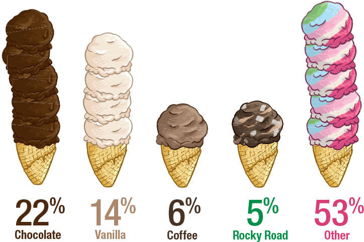
I transformed the ice cream pictograph above into a bar chart. Now, you can see the difference in bar lengths, which corresponds to each value. While bar charts might not be as engaging as symbols, pictures or icons, they are a tried-and-true graph type to compare categories effectively.
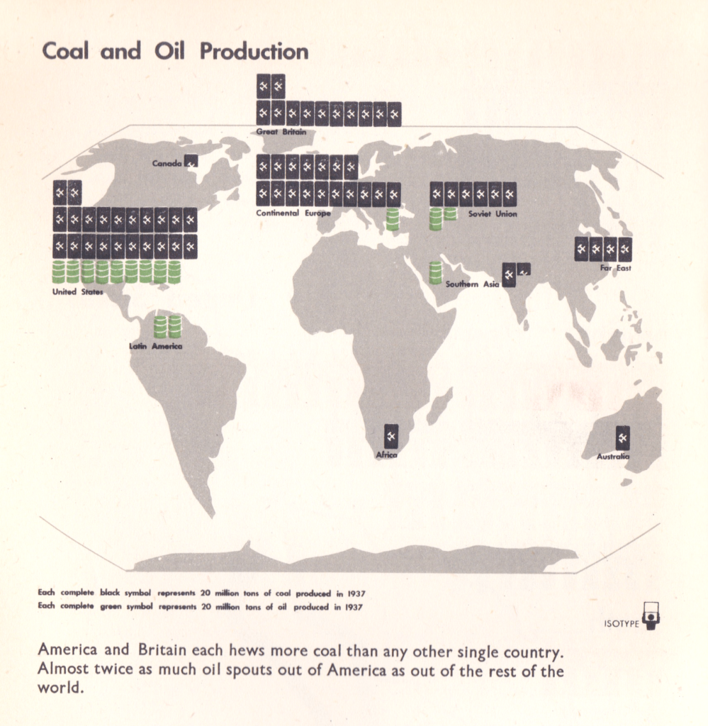
Alternatively, if your goal is to attract attention while also being truthful, you could use a graph such as isotypes to communicate the results. Isotypes (International System of Typographic Picture Education) typically rely on stacks of individual items to encode values, unlike in the Costco example above, where the symbol was stretched vertically or horizontally. Otto Neurath invented the Isotype in collaboration with his wife Marie Neurath and Gerd Arntz back in the 1920s. In the example below, coal and oil production in the US is displayed using symbols that are stacked horizontally.
Maps
Finally, maps are one of the most commonly used and also one of the oldest types of graphs. I came across the map below in 2020, which was an election year in the US. Karim Douïeb, the co-founder of Jetpack.ai (a full-stack data science company), created the data visualization below in response to a wide-spread approach to representing electoral maps: a filled (or choropleth) map. A filled map has the advantage of being geographically accurate but it is ultimately misleading, as “acres don’t vote, people do.”
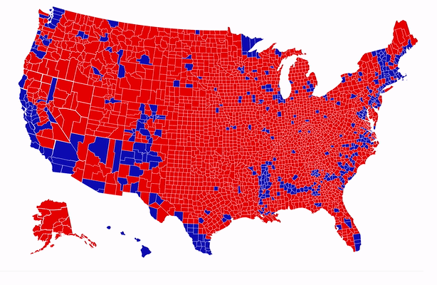
In the filled (choropleth) map, we see an abundance of red (Republican counties). Blue (Democratic counties) appear to be far and few. The second version of the map represents each county by a dot which is sized proportionally to the numbers of voters. Although the data is identical, the story that each of the two maps tells is contrasting. The choropleth map tells the story of a country that appears to be largely Republican. The second map tells the story of a country where blue is quite prominent. In fact, most large bubbles are blue. The second map paints a much more accurate picture of how Americans voted.
To summarize, it’s easy to lie with graphs. Nearly any graph type could be used in a way that misrepresents the data and misleads. In this section, I covered three common graph types that are often misused: 3D graphs, pictographs, and maps. However, as I mentioned at the beginning of this blog post, choosing the right graph type is not sufficient to ensure that you don’t lie with data. Making thoughtful design choices is equally important.
Misleading design choices
In this section, I’ll cover a few common design mistakes that tend to lead to misleading data visualizations: data overload, manipulating the Y-axis, and faulty correlations.
Data overload
I am often asked: “How can I avoid data overload when I have a lot of data points?” My answer is and has always been that you can have beautiful, effective graphs while also having hundreds, even thousands of data points. Reversely, you could have only a few data points and still end up with a cluttered graph. It all depends on how you present your data.
I took the picture below in April 2020, during a press conference of the US Presidential Coronavirus Task Force. President Trump and Deborah Birx, White House Coronavirus Response Coordinator, were discussing the pandemic and referencing the line graph below. While showing this graph, the team also pointed out different lines and the metro areas that these lines represent. For example, Deborah Birx said at one point “You can look at the yellow line. That is Detroit.”
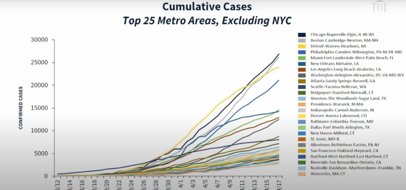
To begin with, it is almost impossible to find Detroit in the line graph, as there are multiple yellow lines. Secondly, even if one were to locate Detroit, the lines overlap so much, that it would be close to impossible to follow the Detroit line.
Overall, this graph represents an example of data overload not because of the number of data points displayed but because of how the data is presented – overlapping and not in a readable format. The graph can easily mislead because, for example, two people could both assume that they finally located Detroit on the graph, while they might be looking at two different yellow lines (or two different metro areas) altogether.
Manipulating the Y-axis
If you are designing a line graph and decide to adjust the Y-axis so that it doesn’t start at 0, that might be acceptable. There’s a fine line between zooming in too much and misrepresenting the trends versus zooming out so much that the trends are not visible.
However, if you’re designing a bar chart, you have to start your Y-axis at 0. If you don’t, you’re not only overstating the difference between bar lengths but also removing part of the data in the process.
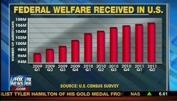
As one example, the bar chart below comes from Fox News and it is manipulating statistics. The Y-axis starts at 94M, although the number of Americans who received federal welfare in the US actually starts at 0. In reality, the difference between Q1 2009 and Q2 2011 is much more subtle than this graph leads us to believe.
Faulty correlations
You might recall this from your statistics class: “Correlation is not causation.” But, when we see two-line graphs moving in the same direction, we are likely to forget this truism and assume that there must be causation.
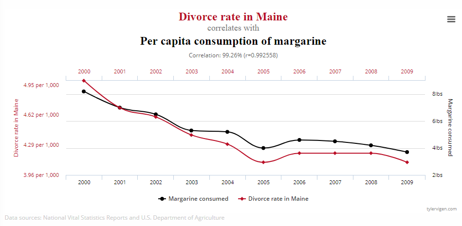
Tyler Vigen manages a blog called Spurious Correlations, where he publishes graphs on data points that appear to be correlated and imply causation, although there’s in fact no relationship between the variables displayed. One of Vigen’s recent graphs plots divorce rates in Maine alongside margarine consumption. This is, of course, a random correlation so the graph paints a misleading picture.
Next time when you see a graph that implies correlation, pause and think twice. Evaluate whether it makes sense for the two variables to have a correlation or if you’re potentially looking at a faulty correlation.
Final thoughts
While the graph and design choices that I covered in this blog post are common ways to lie with data, there are of course many other types of graphs and design elements that could lead to misleading graphs.
If you’re a consumer of data and data visualizations, I encourage you to always question what you see. Without being cynical, a healthy dose of doubt can help you avoid trusting misleading data visualizations. In instances when you are the one creating graphs, always pause and think carefully if you’re truthful in the way that you represent the data. Even experienced, highly data literate individuals can sometimes inadvertently create misleading graphs.
About the author

Years ago, Rebeca fell in love with data visualization and storytelling. And there was no way back.
That was the point when she realized how underrepresented these skills are, despite being core to most business professionals.
Rebeca, Vizlogue’s founder, has been providing insights and creating data visualizations for almost 10 years. She has worked as a digital analytics leader for top media and analytics companies, across a diverse set of industries, such as Fast Food Restaurants, Consumer Packaged Goods (CPG) and Automotive.
For nearly 3 years, she has been teaching Data Visualization and Storytelling at the University of Chicago and at DePaul University in Chicago.
Rebeca holds a MA from the University of Oklahoma and a BA from the University of Bucharest, Romania. When she’s not reading, practicing or talking about data visualization and storytelling, Rebeca enjoys hiking and cycling.


