We are pleased to welcome Amy Cesal to the team as our Product Evangelist.
Amy will liaise with our chart designers to create charts and themes based on brandbooks. She will also contribute to our blog. Amy is a leading light in the data viz community. A three-time winner of the Information is Beautiful awards, Amy is an instructor at Maryland Institute College of Art and co-founder of the Data Visualization Society.
We sat down with Amy, who is based in Chicago, USA, to learn more about her.
Hi Amy, Can you please introduce yourself?
Hello!
I’m a data visualisation designer, instructor, and speaker. I have a background in graphic design, a masters degree in information visualisation, and have also worked as a UX designer.
I live in Chicago with my husband, toddler, and our wolf-like dog. When I’m not busy visualising data, I enjoy baking challenges, throwing off-center pottery and organising neighbourhood events.
Can you tell us about your previous work experience and how it has prepared you for this role?
Previously, I was the Design Director of Data Visualization at Morning Consult. I lead a team of designers, and one of the main tools we used for creating charts was everviz. It’s a great tool for designers, because it’s so customizable, and we really pushed it to its limits with some of the things we wanted to do. In that role I was privileged to work closely with the everviz team, and when I transitioned away from Morning Consult this collaboration felt like a natural fit.
I’m also an instructor and subject matter expert at the Maryland Institute and College of Art for their Data Analytics and Visualization Graduate program. I really enjoy teaching people and sharing my passion for data visualisation with others, which I hope to bring to everviz!
What do you hope to achieve in your new role, and what are you most excited about?
I’m really excited to continue to push everviz. I have also been a UX designer in my career and usability has really stuck with me. I’m excited to dive deep into everviz, make some new things, and walk customers through the process with me. I hope in doing that I find opportunities to help everviz grow, and evolve to help serve its clients needs. I am particularly interested in engaging with the accessibility aspects of visualising data with everviz.
What motivated you to join everviz?
I really enjoy working with everviz. As a designer, you can really create unique looking charts without any or much custom code. With theming, there’s the potential to have custom branded charts that look like the organisation, but with a fraction of the design lift on each chart. I’m excited to dig more into the accessibility features too, since HighCharts, upon which everviz is based, is one of the standards for accessibility in the industry.
Any advice for data viz designers who want to stay up-to-date with industry trends and best practices in the field of data visualisation?
Join the Data Visualization Society! I’m a bit biassed because I’m a cofounder of the organisation, but it’s really a great community of people. There’s a huge slack channel, an annual conference (Outlier), and lots of virtual smaller events.
Sign up for newsletters. I’m a big fan of information coming to me in my inbox. I love when Flowing Data, quantum of sollazzo, Sidebar or Accessibility Weekly arrive and I get the highlights of what’s happening and information that I might have missed otherwise.
What is a fun fact about you?
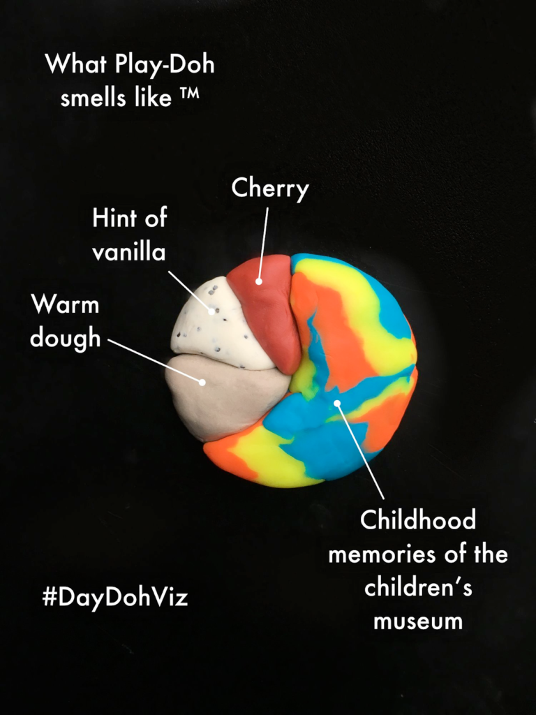
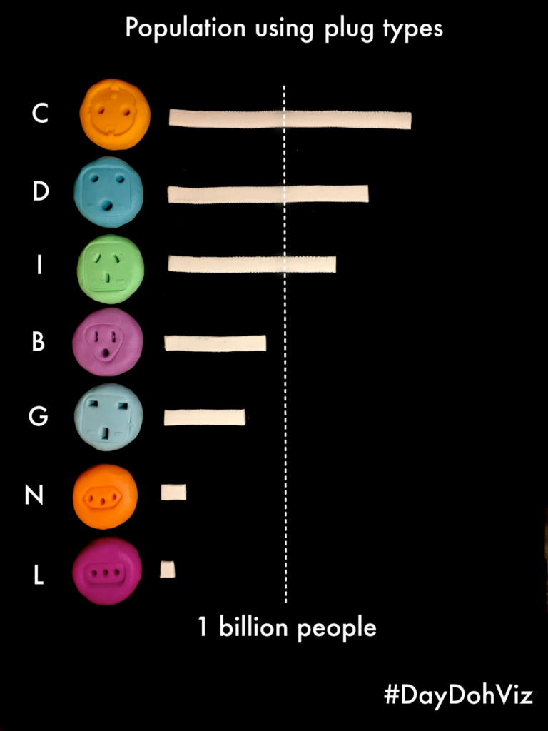
I made a whole series of visualisations using Play-Doh!
Can you talk about the power of data visualisations to convey complex ideas and information? Why do they appeal to such a wide audience?
I’m a visual learner, so seeing things always helps me understand them better. I love bringing a design eye to charts to help simplify them and make things more clear. I think the appeal is being able to understand complex topics in a new way. One thing I am always thinking about when developing a data visualisation for a complex topic is the cognitive load that my visualisation places on the viewer. A good visualisation can express a complex idea in a simple, accessible, and approachable way.
Welcome to the everviz team, Amy!
Follow Amy on Twitter/X @AmyCesal or learn more about her on her website.