The world’s most accessible data visualisations are likely created in Norway by the Authority for Universal Design of IT (the Authority). In Norway, all public and private websites must adhere to Web Content Accessibility Guidelines (WCAG) 2.0 – recommendations for making web content more accessible.
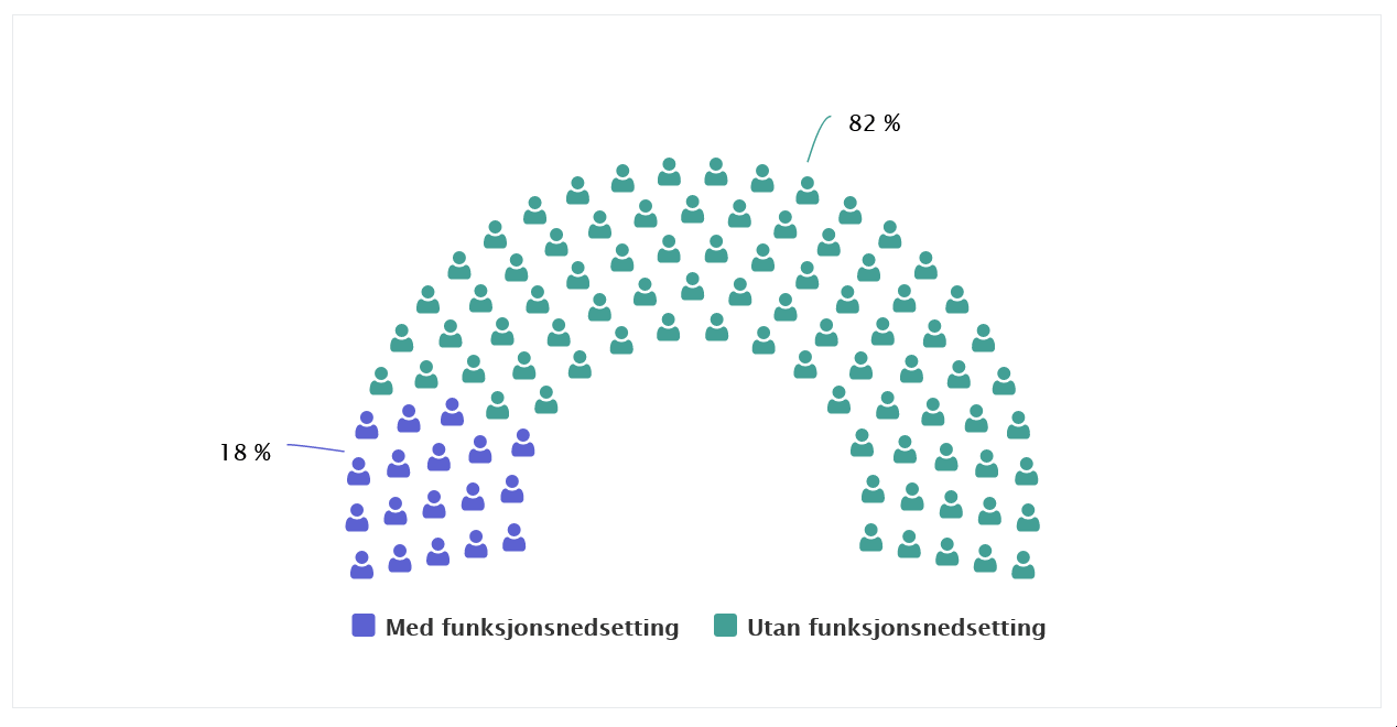
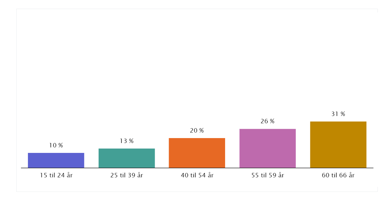
“In Norway, 18% of the population lives with a disability,” says Quinn Coffey, Senior Advisor at the Authority. “That number jumps to 35% for the age group 55 to 66 years old. So there is both a societal and business argument for embracing accessibility. Why wouldn’t you design your product or website so that it reaches 100% of the population?”
Chart customization key to accessibility
The Authority conducts accessibility testing on websites and apps serving users in Norway. Additionally, organisations must post an accessibility declaration on their website so disabled site visitors can determine the accessibility of the site.
“People look to us for guidance on universal design. Therefore, they are studying our pages to make sure we are following our own advice. Our content is closely scrutinised, and our data visualisations are no exception,” says Coffey.
“The ability to customise charts and other data visualisations is key to universal design because there are many default chart elements that are not accessible ‘out of the box’. When using everviz, we liked the ability to go into advanced settings for charts so that we could design charts that fulfil WCAG accessibility requirements.”
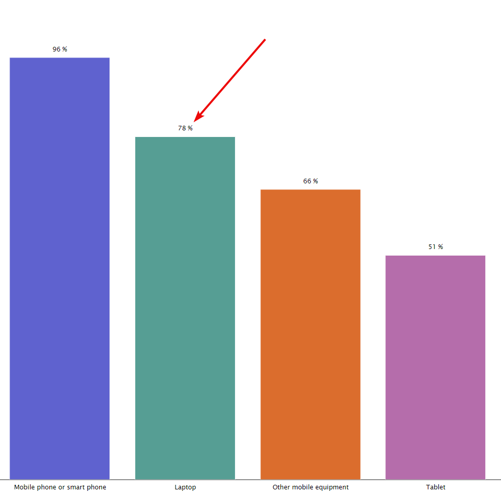
This accessible data visualization on the Authority’s statistics page shows equipment people use to access the internet.
Conveying knowledge with accessible data visualizations
Data analysts at the Authority fine tuned things like chart contrast, colours, font and font size. All unnecessary information is removed from the chart, benefiting end users with ADHD who may have trouble focusing. Major accessibility features in Authority data visualizations are data labels, interactive legends, tooltips and descriptive text.
Data labels
Data labels are values plotted along a series, saving users from looking at a scale along the x or y axis.
Interactive legend
Disabled users can click legend items to highlight relevant information, increasing readability and understanding.
Tooltips
Tooltips allow users to hover over a series and receive information in plain text.
Describe the chart
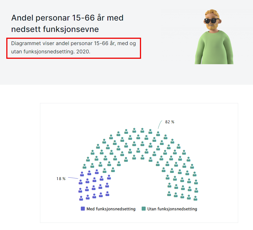
Describe charts on your site with a short paragraph. The text highlighted in red reads ‘The diagram shows the share of people aged 15-66 years old with and without disabilities. 2020.”
Chiefly, these options increase data visualization accessibility, because they allow the user to tweak their viewing experience, says Jan Beniamin Kwiek, a WCAG expert at the Norwegian Digitalisation Agency.
“Adding interactive options to data visualisations gives content creators the freedom to make charts accessible. The user may look at a chart and wonder ‘where should I look? What should I do now?’ Beniamin says.
“Things like data labels and interactive legends really help people with concentration, cognitive and learning disabilities by cutting away the white noise in a chart. Every element in our charts is added with accessibility in mind. everviz provides that flexibility.”
“When using everviz, we liked the ability to go into advanced settings for charts so that we could design charts that fulfil WCAG accessibility requirements.”
-Quinn Coffey, Senior Advisor at the Authority
The Authority’s statistics pages feature everviz charts. Accessible data visualizations illustrate data related to disabled internet users in Norway from the national bureau of statistics. Data visualisations have a larger impact on reader engagement versus presenting the numbers in narrative form, says Coffey.
“Charts grab people’s attention and make it easier for people to conceptualise complex concepts if visualisations are used. Firstly, charts take up less space on a page than if the numbers were explained with text. Additionally, they are more interactive and require less of a learning curve. Understanding things like statistics and probability is not necessarily required to understand a well-designed chart,” he says.
The accessible data visualization from the Authority’s statistics page shows activities on the Internet in the past three months by percent in the age groups 16-79 years old in 2021.
Accessible data visualizations part of editorial strategy
Today, more and more services are moving online. Everything from applying for mortgages and enrolling in daycare to filing taxes and applying for parental grants. In the physical world, wheelchair users rely on ramps for access to buildings. The digital equivalent of those ramps are the WCAG standards and guidelines.
“Every element in our charts is added with accessibility in mind. everviz provides that flexibility.“
-Jan Beniamin Kwiek, a WCAG expert at the Norwegian Digitalisation Agency
Ensuring everyone can use online services should be a tenant of a modern democratic society, says Adrian Husabø Bjørseth, a senior advisor at the Norwegian Digitalisation Agency.
“In Norway, 600,000 people have some kind of disability. We must remove barriers to them participating in society. Visually impaired people who cannot access information online cannot fully participate in societal debates. They should be able to exercise their independence and have equal access to online information.
“everviz helps us put this into practice when we develop content for our own website. Using charts and not just text on our webpages is a deliberate choice. A good data visualisation can provide a considerable amount of information. It’s like the old saying ‘a picture is worth a thousand words’ only, with accessible data visualizations, that statement is amplified.’
A graph from the Authority’s statistics page showing the share of the population that submitted an online form to the public authorities has increased steadily, from 46% in 2009 to 75% in 2021.
Color and contrast improves accessibility
The agency distinguishes between three types of disabilities – permanent, for example losing a limb; temporary, for example a broken arm; or situational, for example hampered movement due to holding a baby in your arms.
WCAG exists to reduce the gap between the disabled and the able-bodied, says Kwiek. “The intent is to minimise the ability gap. However, what it really does is help everyone. Many businesses do not realise this, they often only view accessibility practices as a cost,” he says.
Examples abound of universal design principles aiding both groups. Firstly, websites with good contrast can help people with poor eyesight read the content but also normal sighted readers reading on phones outside in the sun. Additionally, keyboard navigation helps both the woman holding the baby and the person who cannot operate a mouse. Finally, texting in videos helps deaf people but also those who, for example, are watching videos on a loud train.
“In a bar chart with 75% and 25% values – it is very easy to understand what that means, even if you do not understand statistical analysis.”
-Quinn Coffey, Senior Advisor at the Authority
Tips for making your site more accessible
Here are three simple tips for improving accessibility on your website.
Use headings
Content creators and website developers must collaborate to ensure the website uses headings in the code.
“Using H1, H2 etc. allows screen reader users to jump from heading to heading. Screen readers cannot read headings coded as paragraphs and styled with CSS. Headings allow you to navigate the article. It’s all about providing the same efficiency as for people without disabilities,” Kwiek says.
Use alt text
Alt text is text that describes an image or its function. “Try to write without any preconceived notions. It is not up to you what the blind person should be able to perceive,” Kwiek explains. “It’s up to us to describe the actual reality in the picture. I am in my 30s and have grey hair. Albeit, it may hurt my feelings that someone would describe me that way but that’s OK, because that is the reality. However, when writing good alt text it is up to us to describe the actual reality of the picture. Try to stick to the facts. We should not cover up reality,” Kwiek says.
Adhere to HTML standards
“We sometimes see that people code a button as a link. This creates issues for people who use screen readers because button is read as a link instead of a button. So the blind user is not getting the option in the buttons list, because it’s in the links list. It’s a bit confusing and inefficient for them,” Kwiek says.
About ARIA labels
Accessible Rich Internet Applications (ARIA) labels are attributes that can improve accessibility of a chart if it deviates from HTML standards. “ARIA labels are like Band-Aids patching up accessibility wounds,” Kwiek says.
Accessible data visualizations a shortcut to understanding
At the Authority, including as many people as possible in the digitization of society involves removing complexity and barriers to understanding. Novel digital formats for presenting information, including accessible data visualisations, help a wider audience understand at times complicated data underpinning key society trends.
“In a bar chart with 75% and 25% values – it is very easy to understand what that means, even if you do not understand statistical analysis,” says Coffey. “It’s almost like a shortcut for people. From the reader’s perspective, it’s more pleasurable to interact with data visualisations. Additionally, instead of boring, black-and-white tables we can use contrast, text size and color to visualise data in real time.”