Here is a quick rundown of some of the features we have added to everviz recently.
Improved annotations
The annotations are now more reliable in regards to tackling different screen sizes.
On small screens, the annotation will be shown as a number, and the descriptive text will appear below the chart.
The animated gif below shows how the annotations will be transformed when reading on a desktop vs. mobile screen:
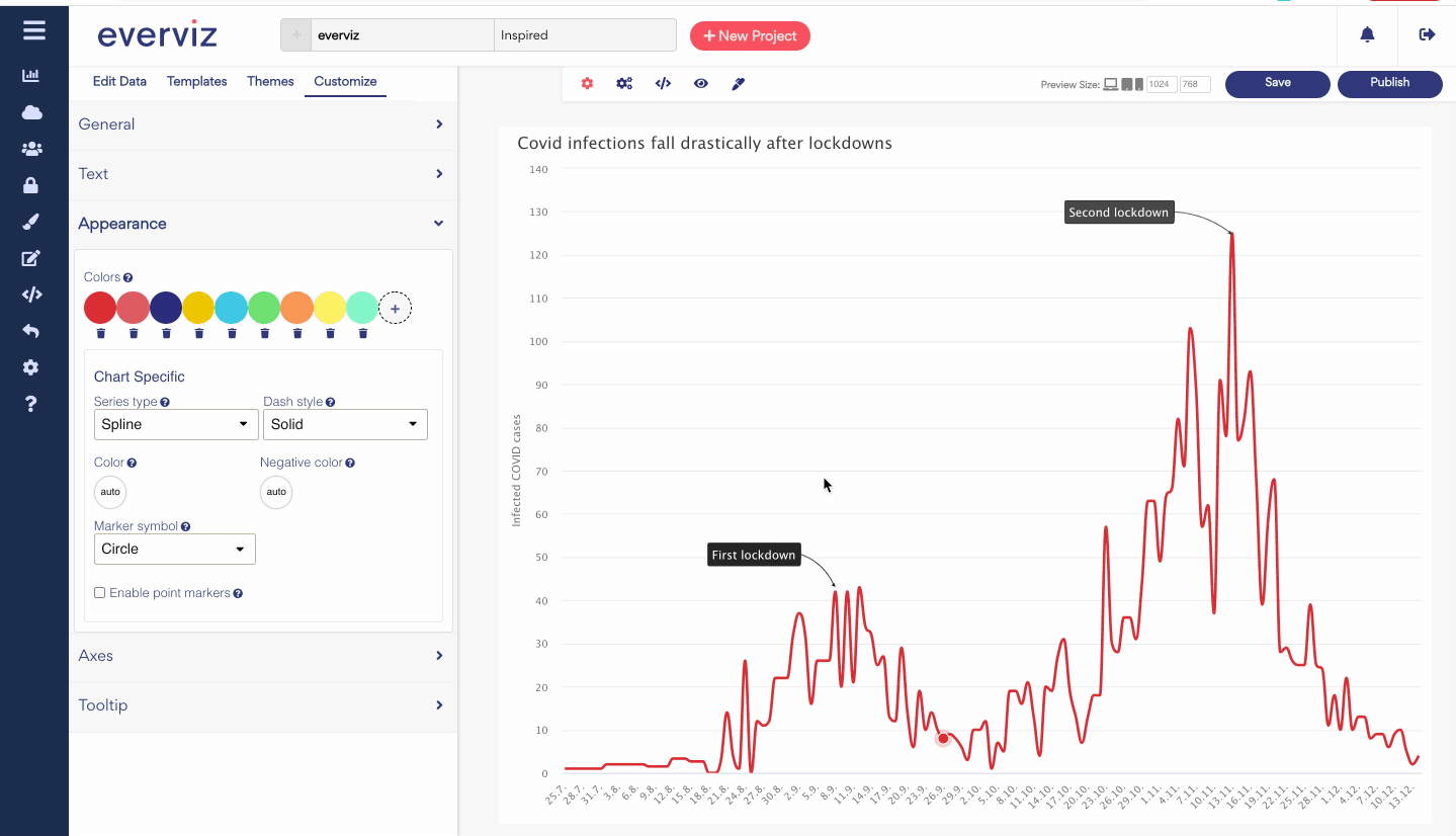
If you want to learn more about annotations, click here
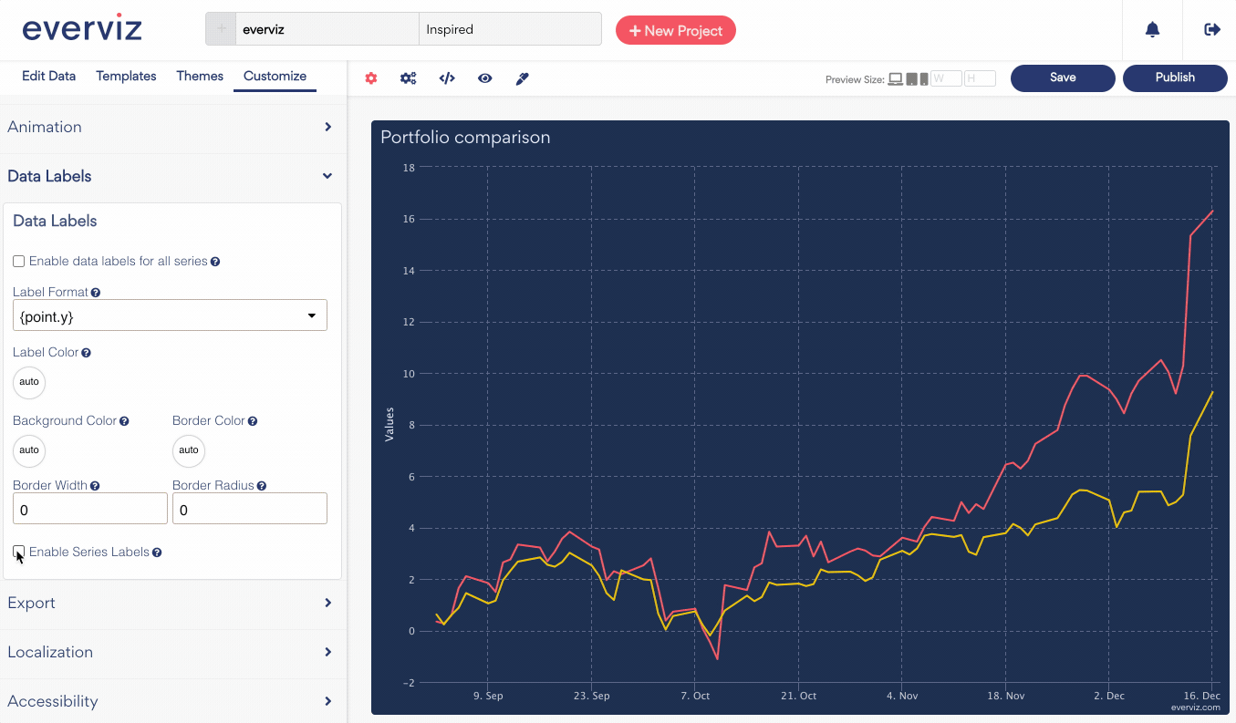
Data series labels
One question we receive quite often is how you can place the labels besides the corresponding lines instead of using the legend.
Take a look at the below samples. The charts present the same data, but the positioning of the data labels are different. The left chart shows labels as part of the legend, and the right shows the labels next to the series.
Sometimes it is easier for the viewers to read the chart when the labels are placed next to the series to avoid zig-zagging eyes between the lines and the legend.
It is now possible to use Series labels in everviz. Under Labels in the basic editor you can enable Data Series labels.
Dumbbell chart
The Dumbbell Chart (also known as Dumbbell plot) is very effective at visualizing two different values across the same dimension in a compact and straightforward way. As a bonus, it also lets us check the spread of values (distribution) and their ranges
Here is a sample: