This is a featured blog post by Amy Cesal, Product Evangelist at everviz. A three-time winner of the Information is Beautiful awards, Amy is an instructor at Maryland Institute College of Art and co-founder of the Data Visualization Society. In this post Amy, outlines considerations when defining the look and feel of your charts, using the Sunlight Foundation brandbook. Apply these data visualization style guidlines to your own branded chart templates in everviz.
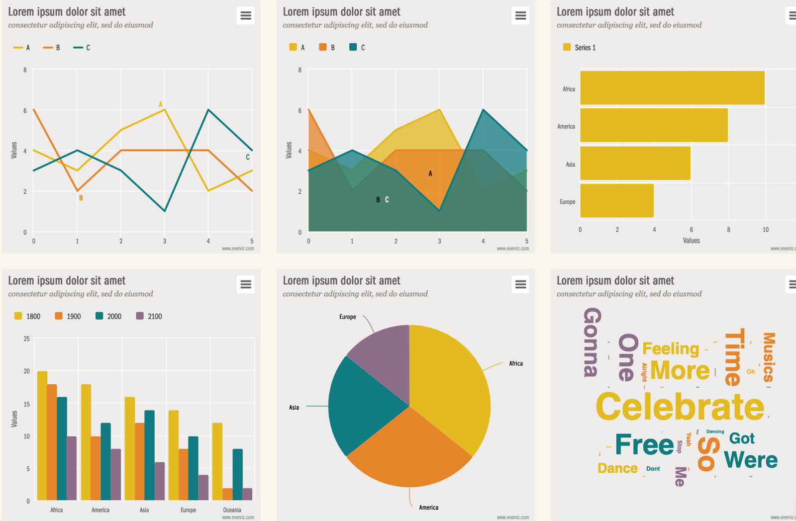
Everviz is a great tool for creating chart templates in the company themes tool from data visualization style guidelines.
Data visualization style guides are standards created by an organization or for a brand that provide guidance and rules for formatting and designing representations of information, like charts, graphs, tables, and diagrams. They extend a company’s brand guidelines for design look and feel but specifically for charts and other information visualization applications.
With a style guide in place, it’s easy to make chart templates that apply your brand’s style in Everviz. I’ll walk you through creating a template with company themes in everviz. I’m using the data visualization style guidelines from the Sunlight Foundation and note some things I considered when building the style guide for data visualization for the brand.
One of the best parts of everviz that makes it easy for organizations to use is the use of company themes. This allows you to create a brand template that then all your charts can start with that branding. There are a few themes built into everviz, but creating your own from your company style guidelines is useful and easy. It’s a great time saver too, because then you start creating a chart from your organizational style, rather than changing the default chart settings.
Chart Colors
Before/After


Things to consider
Often your brand colors won’t work for data visualization, because charts require more colors, including:
- Categorical colors for use when you have many different groups of data
- Sequential colors for when you have a range of data points you want to show
- Diverging colors for when you have positive and negative or data going in 2 different directions
- Colors for specific categories, like political parties or pro/con
Brands tend to use fewer colors or colors that don’t always pair nicely with each other. If your brand donsn’t have a secondary palette you will probably have to add colors, or tints and shades of the current colors to find enough distinct colors that work for charts. It can be a complex process to create brand colors for data visualization style guidelines.

Sunlight Foundation example
For instance, the Sunlight Foundation has a tint and a shade of each hue, as well as specific colors that work well together. It is good practice to color blindness and low vision contrast check the colors you select for commonly used data types. For the Sunlight Foundation, that meant custom sets of colors US political parties, pro/con and money. These are all used for charts with categorical data.

There are also diverging and sequential color schemes.

In Everviz
I like to add all my colors to the palette for my theme. This way, I don’t have to go searching for hex codes, they are all right there, and I can fiddle with different colors easily for my charts.
It’s also easy to just add the colors I need for that chart type to the chart theme. This way, I can easily have access to just the colors that are appropriate for that chart type, like sequential and diverging color schemes for maps.
I add the most frequently used colors that work well together first, then go from there.

Text
Before/After


Things to consider
Make sure the fonts your organization uses are appropriate for data visualization. You may need to adjust the sizing, or find a new font that works well with the existing brand. You want something that’s highly readable at small sizes so you can include the density of information that is often necessary for charts.
I like having a workhorse font that compliments my brand for the bulk of my charts. I prefer to work with Sans serif fonts that have many styles and weights including a bold and a condensed version.
Occasionally, I’ll use something with more personality for titles and subtitles, but these don’t work well for labels or numbers at smaller sizes.
Sunlight Foundation example
The Sunlight Foundation uses a combination of ITC Franklin Gothic Std and Georgia. Georgia is used for subtitles, callout text and sources, where there’s not a large density of next and relatively few numbers.

In Everviz
Neither of these fonts are built into everviz by default, but it’s easy to add custom fonts to your charts following this tutorial.
Background colors
Before/After


Things to consider
Charts that use a light background have different considerations than those that have a dark background. To provide enough contrast, you might need two different sets of colors, darker colors for use on a light background and lighter, brighter colors for use on a dark background.
Having a background that’s not white can set your graphics apart in an article and really be a highlight of your brand. The majority of charts that we see have a white background so something that’s not a white background is more unique and therefore memorable. Some examples of organizations that use a non-white background are: Financial times, the economist and beautiful news


Sunlight Foundation example
The Sunlight Foundation uses a tan background to help the charts stand out from the rest of the white post and to help brand them as part of the organization. This means light tones don’t have proper contrast on this background, so the color schemes are mostly muted tones and darker shades.


In Everviz
It’s quite simple to change the background color, just know that you might have to then tweak your guidelines and chart colors to stand out on your new background.

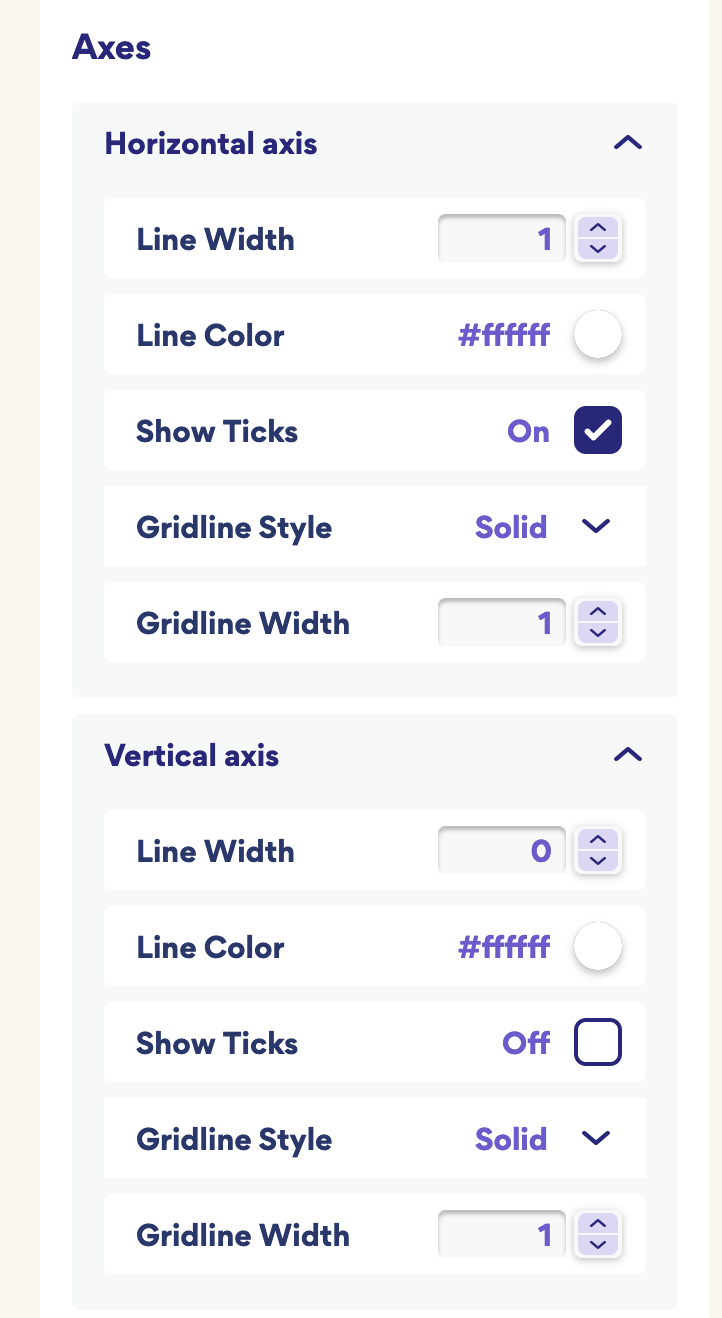
Gridline Style
Before/After


Things to consider
Your gridlines should stand out from your background, but be quite low in your visual hierarchy. If your gridlines stand out too much, they will distract and pull attention away from your data. You might want to push back your gridlines and make them stand out less. You can do this by making them thinner, or making them have less contrast with the background.
Sunlight Foundation example
The sunlight foundation gridlines are white on a light tan background. This allows data and labels to stand out as they are all darker than the background and the gridlines to fade to the back as the lightest thing on the chart.

In Everviz
In company themes under the “axis” menu you can change the gridline color and width, as well as the line width for the axis lines.
With company themes in everviz, it’s easy to create themes that match the foundation of your brand. Using these themes you can create chart specific templates that match your organization’s style. When your charts are consistent and cohesive it builds trust.


