Data visualizations are a great way of communicating anything numerical with your audience. Perhaps you want to share the results of a survey or maybe you want to illustrate the differences between two products?
Including a carefully designed chart allows you to deliver your key message and means the audience can easily compare values and understand differences.
Consider the following statement:
“Our new cleaning product lasts 3 times longer than the alternatives”
By adding a simple bar chart, we can illustrate this point, allowing the user to visualize the difference between the values:
However, it is important to choose the right type of visualization that effectively communicates your message to your target audience.
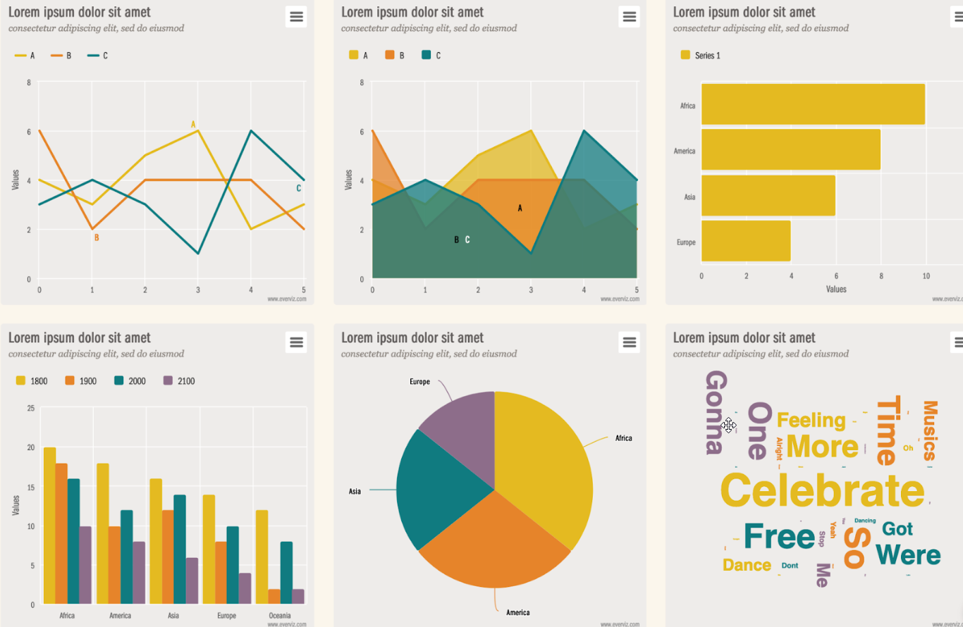
There is a wide range of different types of data visualizations, and different charts are good for different purposes. Simple visualizations (such as pie charts, bar charts, and line charts) are widely used and will be easily interpreted by most audiences. However, there are many other options and opportunities to get creative with how you display your data and maximize its impact.
Whatever your data type, your main priority should be to ensure your key message is delivered clearly and can be understood by your target audience.

How to choose the right visualization type for your data
Before you get started, ask yourself these questions:
1. What is your key message?
What do you want to communicate to your audience? Try to summarise this in a short sentence. Examples of a key message might be:
- “95% of users would recommend this product”
- “This product is 3 times more efficient than the alternative”
- “Profits have been steadily decreasing over the last 12 months”
2. What data is needed?
Identify the data that is needed to communicate this message. You might want to consider simplifying the data to make the message clear.
For example, you might group categories together. Rather than creating a chart showing every possible option in a survey, you might group positive and negative responses:
- “88% of users rated this product as ‘good’ or excellent’ in a recent survey”
3. What type of data is this?
To understand what type of data you have, consider what comparisons you are making. Possible examples might include:
Once you have worked out which category of data visualization you need, you also need to make some decisions on how to display the data effectively.
Ask yourself:
4. What will engage the audience?
Consider how you can display your data in a simple way that captures your audience’s attention.
- Simple is best (in most cases). Most readers will not spend a long time studying your chart so the message needs to be delivered clearly and concisely.
- Simple can still be eye-catching. You can make use of colors, fonts and formats to ensure your visualization is attractive and attention-grabbing.
- Use text (titles, labels, annotations) to ensure your key message is clear and easily understood.
- Unusual and more complex charts that take more interpretation can be used to engage readers who are keen to explore the data, but only if this suits your target audience.
5. Is the visualization accessible?
As with all web content, it is important to ensure your visualizations are accessible to all users. Be aware that some users may have color vision deficiencies, so you should not rely on color distinction as the only means of interpreting your graph. Others with visual impairments may use screen readers, so it is a good idea to include alternative text that also delivers the key message.
You should be aware that some interactive features may be missed or may work in different ways on different devices. Don’t rely solely on hidden data such as tooltips to deliver important details – your key message should be evident from the static image alone.
6. What else does the audience need to know?
Consider what information you need to provide so that the audience can understand and interpret your data. Some things to consider are listed below (not all will be applicable to all cases):
- What units are used? (does this need to be displayed on the chart axis?)
- Does the data have context? (e.g. is it appropriate to include comparative data?)
- How did you acquire the data? (Did you use external sources, what methods did you use to gather the data?)
- Is any background information required (e.g. how many people were surveyed? What is included or excluded in the data?)
- Is the vocabulary familiar to the audience or do you need to define any terms used?
Common visualization types & examples
1. Standalone data points
Even if you just have one two values to display, a visualization can be an effective way of getting this information across. A pie chart or gauge can be used to show a single percentage, or a bar chart can be a good way of showing how one value differs from a baseline figure.
Unit charts can also be an eye-catching way of delivering simple information. If the data points can be represented by relevant icons, then this can allow you to illustrate the data in a way that is easy to read and intuitive to understand.
2. Part to whole comparison
Part-to-whole visualizations are used to show proportions or how something is divided up into component parts. This might include showing how a percentage or other value compares to its whole total or showing how a total is made up of different categories.
For simple comparisons, you might use a pie chart or donut chart. These are widely understood and work well to illustrate how a whole sum is divided into a small number of components.
However, pie charts can become difficult to interpret when there are many components, particularly when it comes to distinguishing between small or similarly sized values. In these cases, a bar or column chart may be more appropriate.
If you wish to see how your key performance indicator compares, then a stacked bar or column chart might be a good option.
A waterfall chart can also be useful for showing part-to-whole relationships where some of the components are negative
3. Magnitude comparison
If you want to compare the magnitude of multiple values, then a simple way to do this is with a column or bar chart. These can be easily interpreted as it is much easier to compare the heights of adjacent columns than it is to visually determine which slice of a pie chart is larger.
Bar charts and column charts are very similar, they are just displayed in different orientations. The horizontal bar chart can usually accommodate more variables and longer variable names, so this might be preferred for larger data sets, but you can use whichever best fits your data and the available space.
The category axis is normally ordered in some way. You might choose to sort this by the magnitude of the value, or alphabetically, or in some other way that makes sense for your data.
4. Change over time
If you want to illustrate how a variable changes over time, then you might choose to use a line, area or column chart. Time is usually plotted on the x-axis with the variable on the y-axis. If required, multiple series can be plotted on the same chart, allowing the variation of different variables to be compared.
The above example could look as follows using an area chart
A useful tool for displaying the relationship between an amount (columns) and a rate over time (line) can be a combination chart
5. Patterns/trends
Sometimes you may have a larger data set and you want to display all data points. This can be useful if you want your users to be able to appreciate the full dataset so they can see the overall patterns and trends as well as any outlying points.
A scatter graph allows you to plot large amounts of data against two axes and a bubble chart introduces a third dimension, allowing you to plot an additional variable by varying the point size in proportion to the magnitude of the variable.
A Heatmap is a good approach to demonstrate patterns between two types of data
6. Distribution
Sometimes you might want to illustrate some statistical features of your data set. Perhaps you want to show the range of your data values from minimum to maximum, or perhaps you want to show the mean or median values.
A histogram is a common way of illustrating the frequency distribution of a data set which can give useful insights. If you want to compare distributions across different data sets, then a box plot is a useful way of summarising the range and statistical features for comparison.
Population pyramids and dumbbell charts are also effective to show values in a dataset and how often they occur
7. Flows & processes
If you want to show the relationship between data flows, then there are many different process diagrams to choose from. A Sankey diagram illustrates how data flows between nodes. For example, this might show how energy is used in a factory or how users move through a website. Dependency wheels are useful for showing multidirectional data flow, for example, import and export of goods between countries.
Simple processes can also be illustrated through funnel diagrams (which show data decrease through a process) or pyramids (used for hierarchical data). Time-based processes can also be shown on a timeline chart.
Sankey:
A chord diagram / dependency wheel effectively illustrates two way flows:
8. Geographical
If you have location-based data, you might choose to display this on a map. To simply mark locations (e.g. store addresses) you might use a point map. However, you can add an extra dimension by using a bubble map where the point size is adjusted in proportion to some variable (e.g. store revenue).
Choropleths are a type of map where a region is colored according to some variable (a rate or proportion). For example, a choropleth might be used to show crime rates in different states or the percentage of land use in different countries.
Summary
- Data visualizations are an excellent way of presenting data and allowing the audience to visualize the difference between different values.
- Different chart types are good for different purposes, you will need to select the right chart for your data type, according to the message you want to deliver.
- You should always consider how your target audience will receive and understand your visualizations.
- Keep it simple – consider using multiple charts rather than overcomplicating one.
- Ensure your visualizations will be accessible to all
everviz provides lots of features that will help you to design high-quality charts that meet the needs and accessibility requirements of your audience.