Covid graphs are all around us. In this article we show how you can create graphs like the Pros without help from programmers or designers.
The end result will be an interactive, accessible and responsive visualization showing new reported cases by day across the world including a seven day average:
The tutorial is divided into three simple steps
- Collect data from WHO into a Google Spreadsheet
- Design chart
- Publish
Each step is pretty straight forward. The Data collection part may look a bit techy, but we guarantee that you will save a lot of time if you automate this process.
We have focused on numbers for the world, but hopefully this will inspire you to visualize your desired countries or other variables.
Prerequisites
everviz account
If you don’t have an everviz account you can create a Free account here. No credit card needed.
Google Sheets addon
everviz comes with a handy free Google sheets addon. You can install it for Free in your browser from the Google Marketplace
Great! We are all set and can start creating COVID charts like the Pros
1. Collect data from WHO into a Google Spreadsheet
There are tons of great resources out there on how to find COVID sources for visualizations. As many of them refer to World Health Organization’s (WHO), we choose to go directly to the WHO data in this tutorial.
WHO collects and publishes the official number of confirmed COVID-19 cases and deaths on the following dashboard: https://covid19.who.int/
You can get more information about the data here.
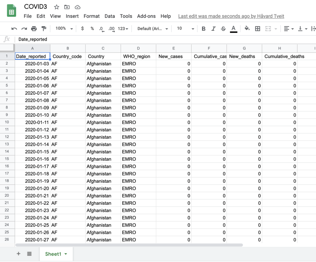
What we want to do next is to import the WHO official numbers into a Google Spreadsheet, and ensure that the Spreadsheet is updated automatically every day.
Fetch WHO data
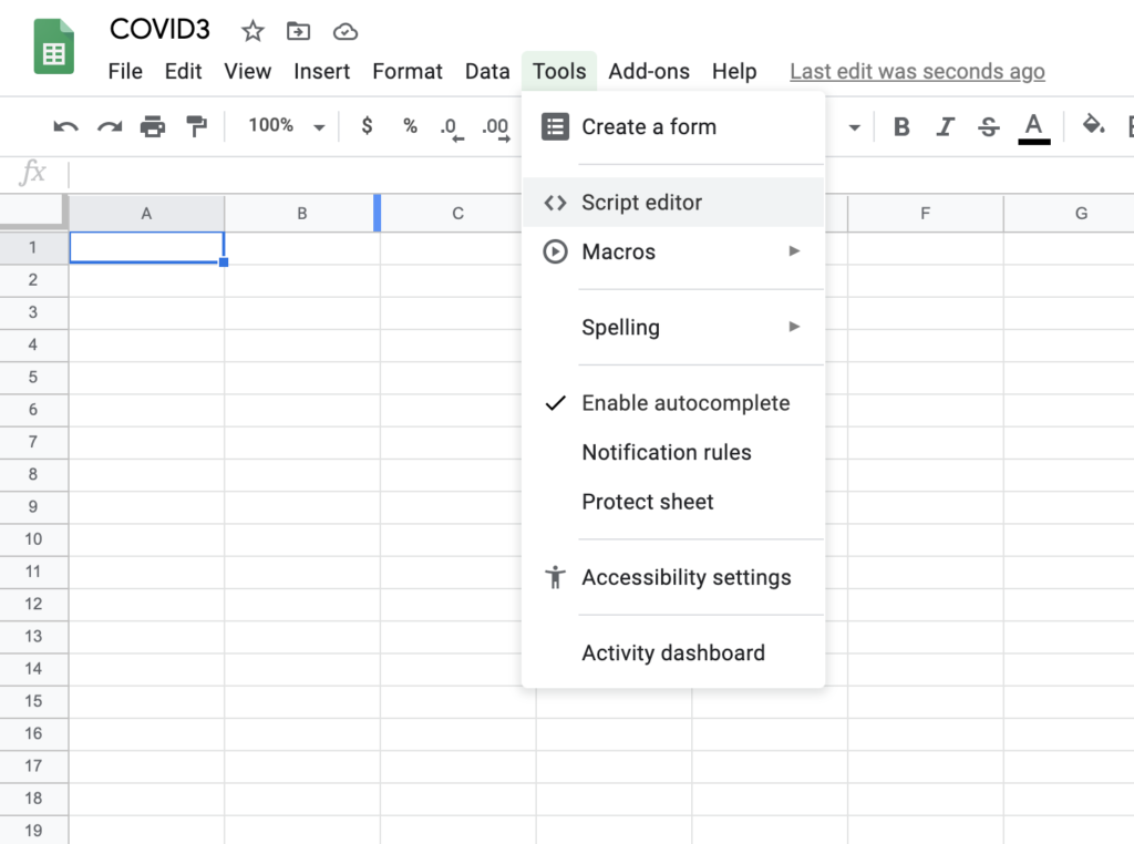
a. Create a new Google spreadsheet
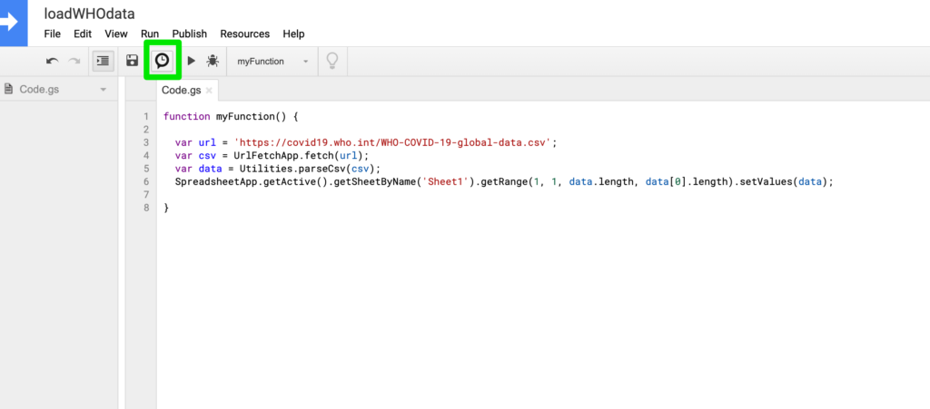
b. Inside the Google spreadsheet, choose Tools>Script Editor
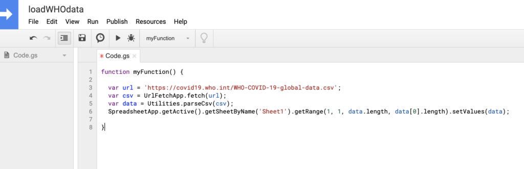
c. Replace the code with this snippet:
function myFunction() {

  var url = 'https://covid19.who.int/WHO-COVID-19-global-data.csv';
  var csv = UrlFetchApp.fetch(url);
  var data = Utilities.parseCsv(csv);
  SpreadsheetApp.getActive().getSheetByName('Sheet1').getRange(1, 1, data.length, data[0].length).setValues(data);

}
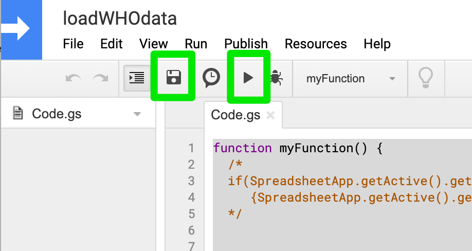
d. Save and execute the script. Expect around 30 seconds for the process to complete.
e. Go back to the spreadsheet and see that the spreadsheet is updated with information.
Automate data fetching process
Next step is to automate this process.
a. Go back to the script editor and click on the trigger icon (looks like a clock)
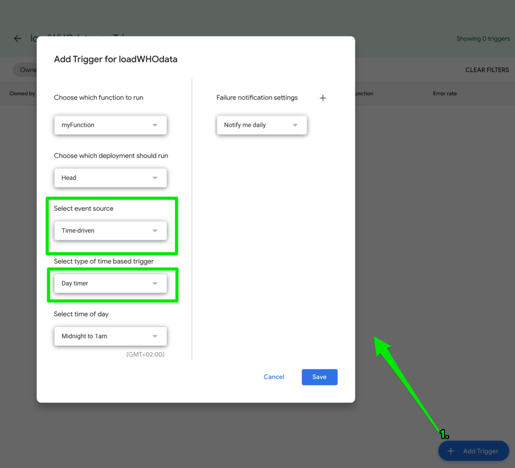
b. Add a new trigger. Choose Time driven event source, and daily updates and Save.
Prepare for visualization
As you might have noticed, your sheet now contain one record per country per day. Next step is prepare the visualization for the total numbers per day and calculate the seven day average.
a. Create a new sheet in the same Google Spreadsheet. I called mine “cases”
b. You can now use a formula to summarize cases per day. Paste the following formula into the first cell:
=query(Sheet1!A:H, "select A,SUM(E) where A is not null group by A label A 'Date', SUM(E) 'New cases'")c. Add a new column header. E.g. “7 day average”
d. In the cell below, insert the following formula
=AVERAGEIFS(B:B,A:A,"<="&A:A,A:A,">"&(A:A-7))
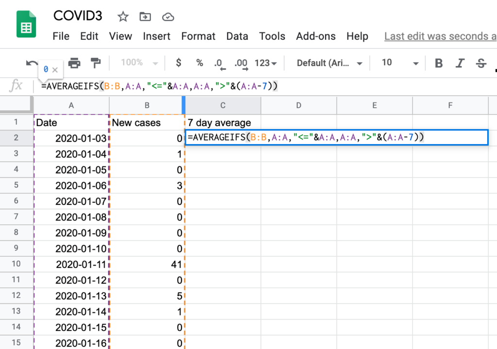
e. Copy and paste the formula to all rows in the sheet.
Note: It is recommended to paste the formula to empty rows to allow it to be automatically be updated whenever the data in the first sheet gets updated.
Create interactive chart
You have now prepared your data and you are ready to create an interactive, responsive and accessible chart.
a. Open the everviz plugin
In your Google Spreadsheet, goto Add-ons>everviz>open
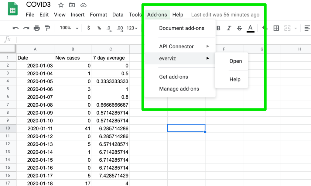
Note: If you don't see the everviz addon, please see the prerequisites at the top of this document.
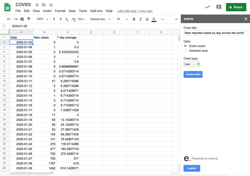
b. Create chart
- Insert a title for the chart. e.g. “New reported cases by day across the world”
- Choose ‘Entire sheet’ as source of data
- Choose Line as chart type
- Click Create chart
Note: If you see an error that the spreadsheet need to be published, this means that everviz (or any other 3rd party plugin cannot access the data). Follow the instructions, and try again.
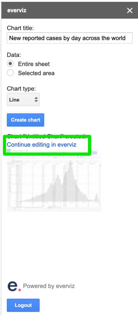
c. Click on the link, and open the chart in everviz.
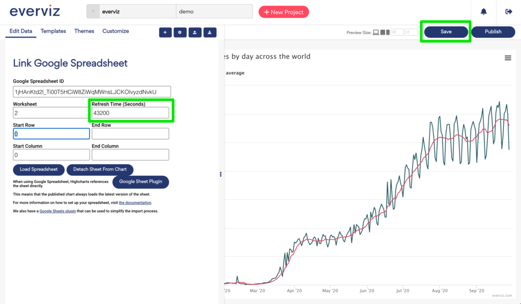
d. Set Refresh interval and save
By setting a refresh time, this means that the chart will fetch new data automatically given the refresh time.
- We chose 43200 (every 12 hours)
- click Save
2. Design chart
Nice! You are now ready to do some final tweaks on design before you go public with your chart.
There are loads of different things you can do to make your visualization look consistent with your brand, and we will show some capabilities.
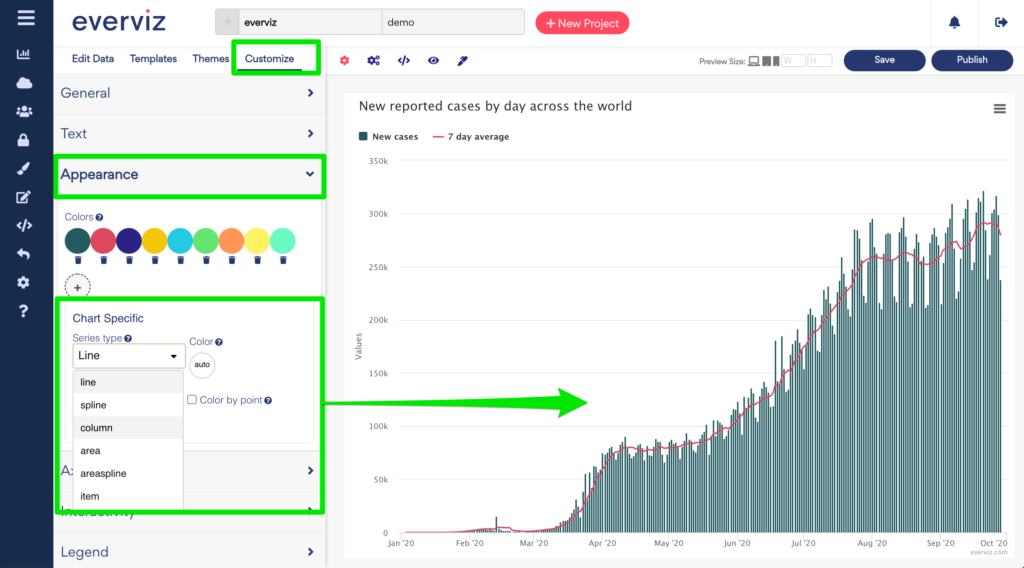
Show new COVID cases as columns
You probably noticed that both the new cases and the seven day average now show as lines. Now we want to change the new cases to show as columns
- Click the customize tab
- Choose appearance
- Under Series type, choose Column
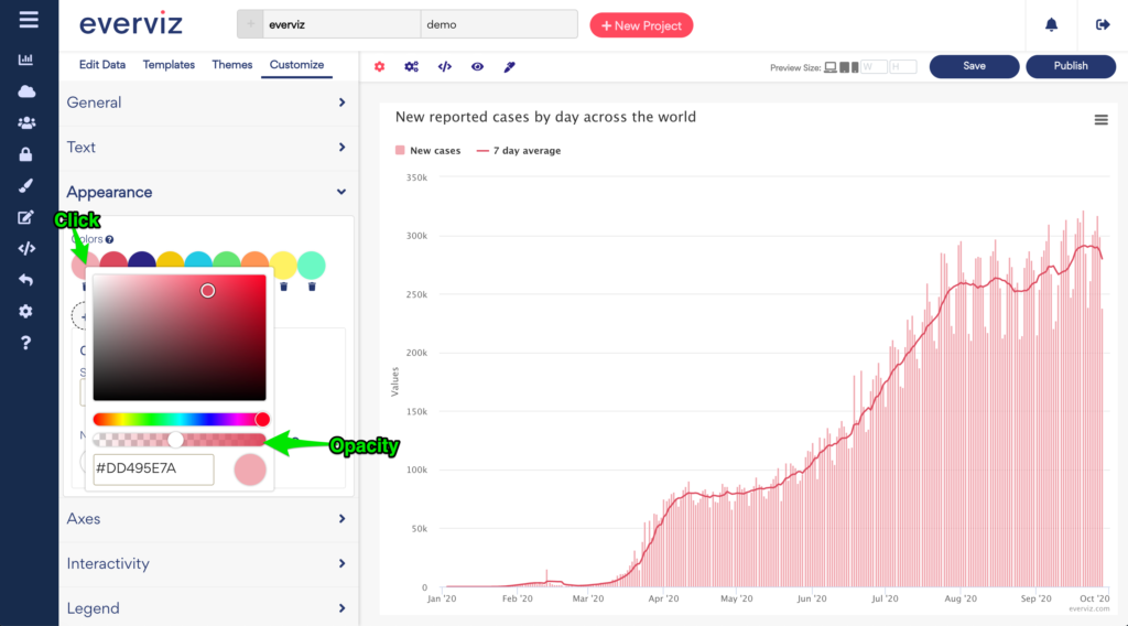
Change colors
If you want to change the columns from the default green color, you can select a different color by clicking on the circled green icon
This opens a color picker where you can choose your desired color and opacity.
Change Credits
Add WHO as source to your visualization.
Goto Customize>Text
Now you can choose to insert e.g. Source: WHO in the credits, subtitle or caption field
3. Publish
Last step before you can show your work to the world.
Click the publish button to open the publish dialog
Click publish to retrieve an embed code.
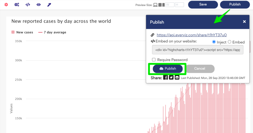
Paste your embed code into your publishing system (CMS) and publish to go live with your awesome work.
New challenge? COVID deaths per day
Congratulations. You have now a published a fully automated interactive COVID-19 chart.
Maybe you are up for a different challenge?
Would you be able to visualize a chart showing deaths per day such as this one?