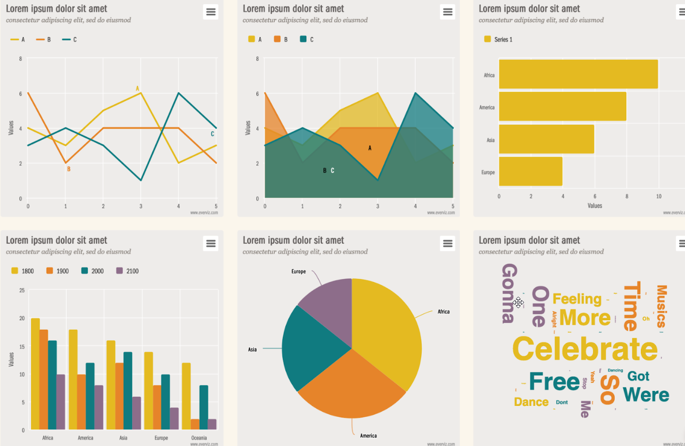
This post explains different ways you can get your data into everviz to bring your data to life through interactive diagrams
The following options will be described. Click on any of the links to jump to specific sections:
- Import a CSV file
- Copy and paste from a spreadsheet
- Insert data manually
- Connect to a Google Spreadsheet
- Connect to a live data source
Whichever way to upload your data you choose, be sure to follow these basic rules:
- Sort the first column (x-axis) in ascending order. i.e. the x-axis data should be arranged from the smallest to the largest number or from the old date to the new date.
- Valid date formats: Date values should have a consistent format using one of the following formats:
- YYYY/mm/dd
- dd/mm/YYYY
- mm/dd/YYYY
- dd/mm/YY
- mm/dd/YY
- Number (Unix epoch time in milliseconds)
1. Import a CSV file
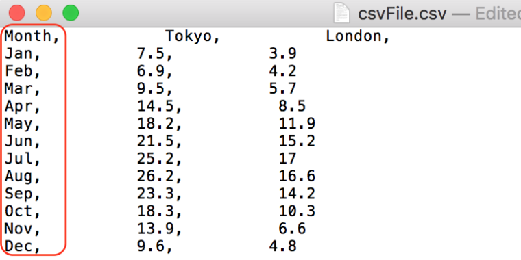
A CSV file is a plain text file that stores spreadsheet information as Comma Separated Values. You can export CSV files from almost any spreadsheet program, such as Microsoft Excel, OpenOffice Calc or Google Sheets.
To load a CSV file as the data for your chart, simply click the “Upload” button and select the file from your computer.
For a smooth data process, make sure that your CSV file respects these five rules:
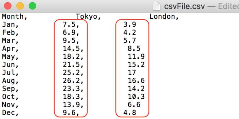
1. Separate by comma
Be sure that each element of the CSV file is separated by a comma. See the picture below:

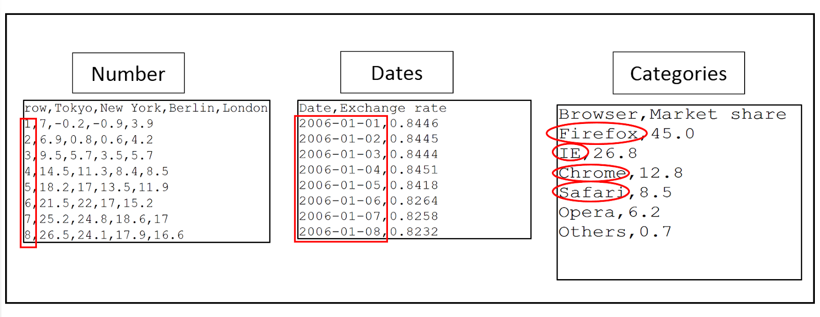
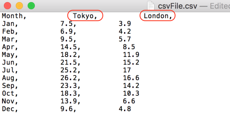
2. X values
The first column represents the x values. See the picture below:
The x values data could be numbers, dates, or categories. See the picture below:
3. Series name
The first line represents the name of the series. See the picture below:
4. The values of data series
Columns represent the values of the data series. See the picture below:
5. European CSV
everviz also supports the European CSV using the semicolon to separate data fields instead of the comma. See the picture below:
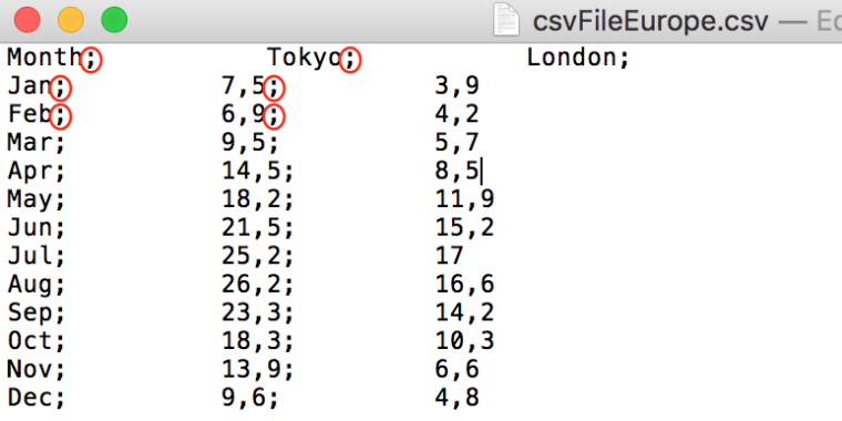
And the comma as a decimal mark:

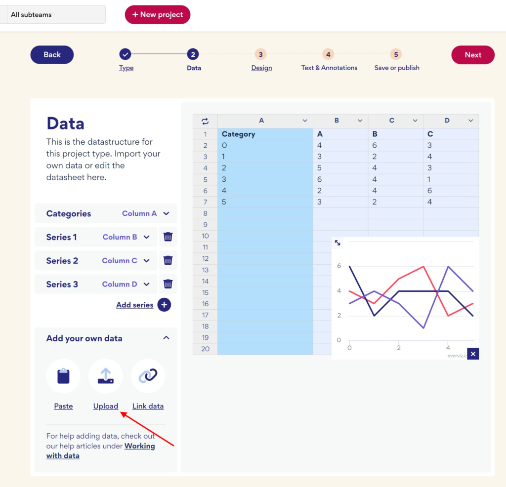
2. Copy and paste from a spreadsheet
If you have your data in a spreadsheet application, you can copy and paste the values into everviz.
Make sure you put your cursor in the top left cell in the editor before you paste in your data.
3. Insert data manually
If you want to insert data manually, you can do this directly in the editor.
You will get a live preview of your chart when changing your values.
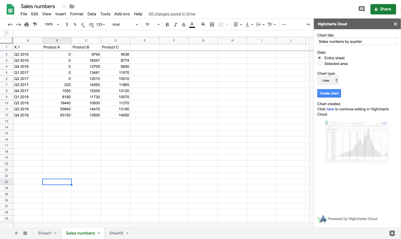
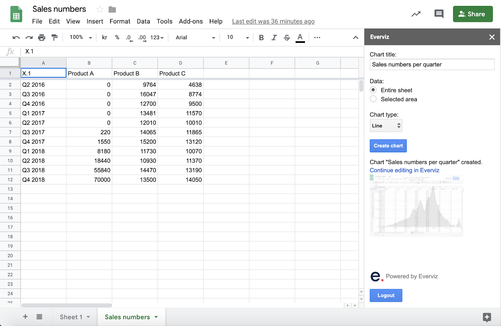
4. Connect to a Google Spreadsheet
The everviz Google Sheet Add-on makes it convenient to connect Google Spreadsheet data to your chart. Follow the steps below to learn how to install and use the Add-on.
Follow the steps below to learn how to install and use the Add-on.
Install the Add-on
- From a Google Sheet, Select the Add-ons menu, then click Get add-ons…
- Search for “everviz” then hover over the card and click +Free.
- Follow the prompts to give the add-on access to your Google spreadsheet.
- To open the everviz add-on, simply select the Add-ons menu -> everviz -> Open.
- Now you’ll see a panel on the right side of the page where you’ll be able to create a chart directly from your sheet.
Usage
- Sign in to everviz using your everviz credentials.
If you don’t have an everviz account, click on the Sign up here link and follow the prompts to create one. Currently, the add-on do not support sign in with Google account.
- Add a title to your chart in the Chart title field
- Specify whether you would like to use all data in the active sheet (Entire sheet), or your Selected area
- Choose Chart type. Note that the add-on is currently limited to Line, Area, Bar, Column, Pie and Stock chart. If you need a different type you can change the template in everviz after creation.
- Click the Create chart button. The chart will now be created and you can continue to customize the chart in everviz. Click on the thumbnail to open the chart in everviz
everviz cannot access private data. Ensure that your sheet is published by going to File > Publish to the web before you create a chart.
5. Connect to a live data source
With live data the chart obtains the data from an external resource data in JSON or CSV format. A refresh rate is set for updating the chart within a certain interval.
Check out this video tutorial or follow the steps below to get started
YouTube link: https://www.youtube.com/watch?v=Mox-I9TlrAE
How to set up Live Data?
To use the new live data option follow these steps:
- Click on the “Link data” button.
- Choose your format, paste the data source link and write down the refresh time in seconds.
- Click on the “Connect my data” button.
You can use JSON Column and JSON Row, the difference is the data order:
Examples:
JSON Columns
[
[‘Column 1’, 0, 1, 2, 3],
[‘Column 2’, 10, 20, 30]
]
JSON Rows
[
[‘Column 1’, ‘Column 2’],
[0, 10],
[1, 20],
[2, 30],
[3, 40]
]