Tile, Honeycomb and Bubble maps.
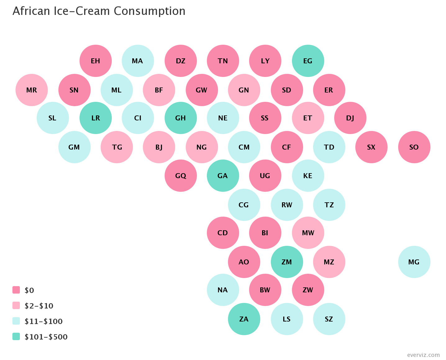
A tilemap circle chart displays regional data in a format that resembles the geographical layout of the locations but where each region is represented by an identically sized circle. This provides a visual representation that maintains the approximate location information allowing any geographical patterns to be displayed. The circles are colored according to category or range and the key is provided in the legend.
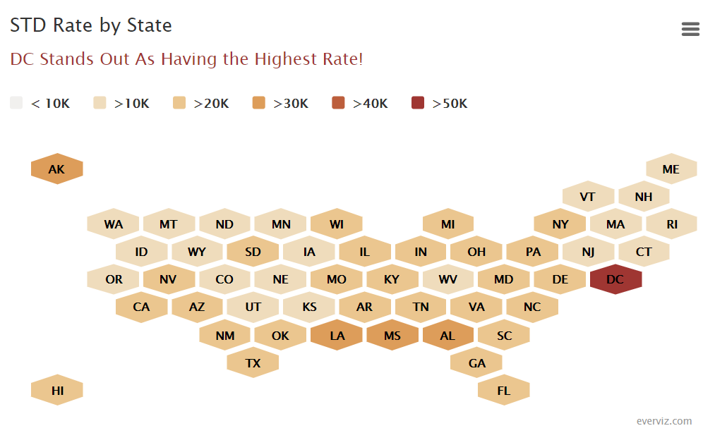
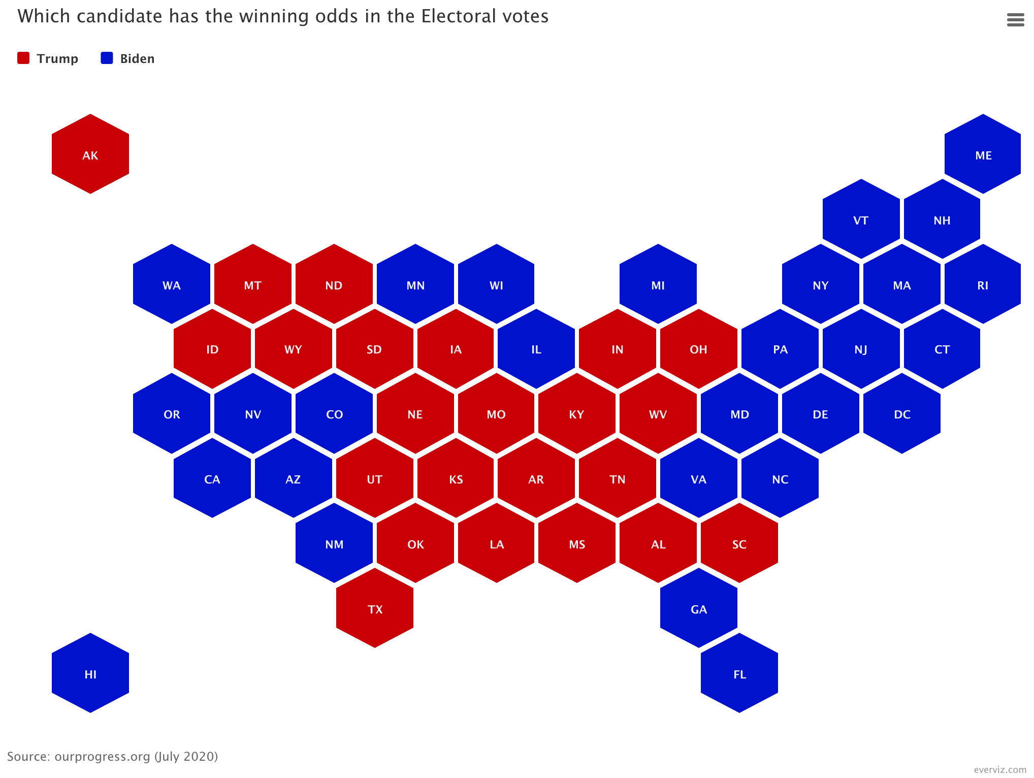
A honeycomb map is a visual representation of a geographic area where each region is assigned a hexagon-shaped tile. The hexagons are all identically sized and arranged in an approximation of the actual geographical shape, allowing the tile to be easily identified by its position on the map. The tiles are colored or shaded according to a data attribute which can be a category or numerical value.
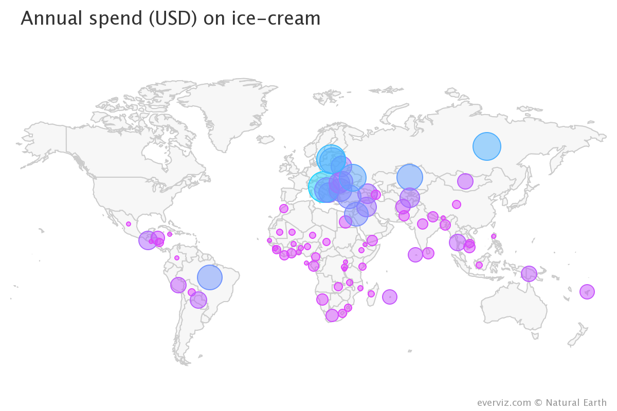
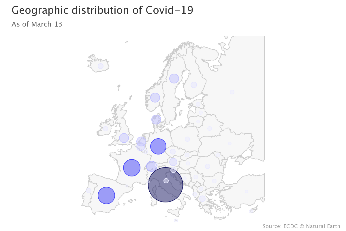
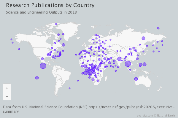
A bubble map displays data using circles placed on a geographical map. The size of the circle is proportional to some attribute value. This is a good method for comparing data values between different regions of different sizes, as it avoids the problem of large regions dominating the visual representation which occurs in choropleth maps.
Below are example of maps created in everviz.
Want to try out for yourself? Click here to get started with everviz for free.
