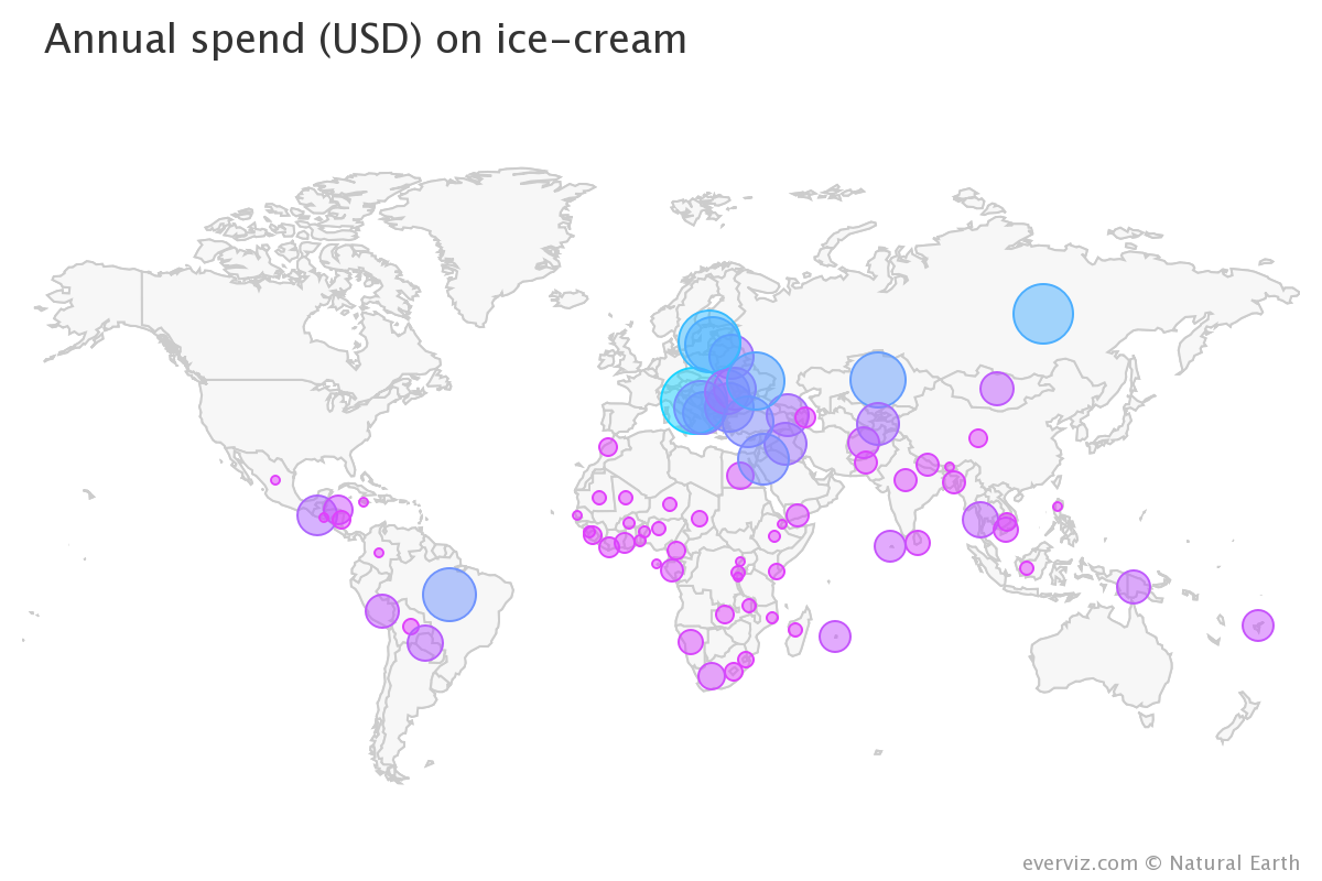
The bubble map uses circles of different size to represent a numeric value on a territory. It displays one bubble per region. The bubble is displayed in the baricentre of the region).
For two types of dataset, bubble maps are mostly used:
- A list of geographic (longitude and latitude) coordinates and a numeric variable that controls the size of the bubble. The number of tweets for each unique pair of coordinates was used in the preceding example.
- List of regions with allocated values and boundaries for knwon. In this case, the normal Choropleth map will be replaced by the bubble map. Notice that in choropleth maps, it enables to escape the bias induced by various geographical areas. (During observation, large regions appear to have more weight).
With bubble maps, interactivity is appreciated. This makes it possible to zoom in on a particular component, or to press bubbles for more detail.
As for bubble charts, it is important to map the bubble size to its area, not to its radius. If not, the variations are exaggerated.
Setting up a bit of transparency for each bubble is a great practice, enabling the map behind it to be seen.
To build the relation between bubble size and numeric value, don’t forget your legend.