Area charts.
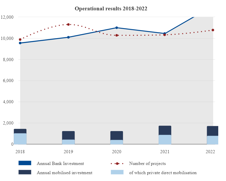
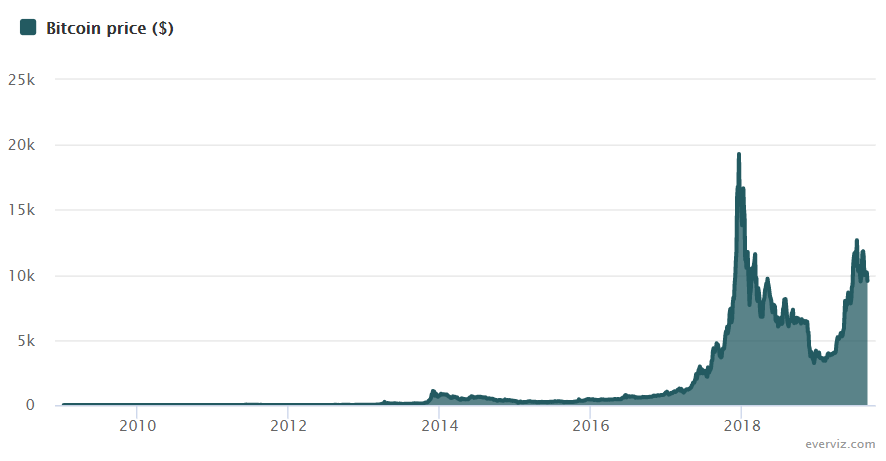
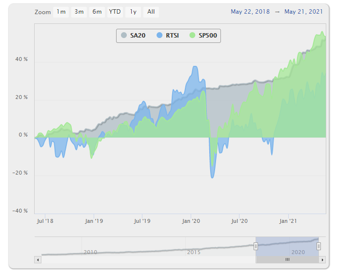
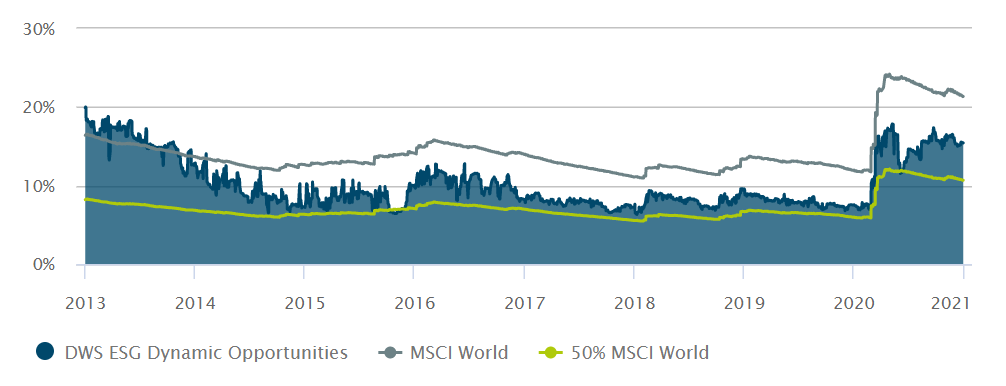
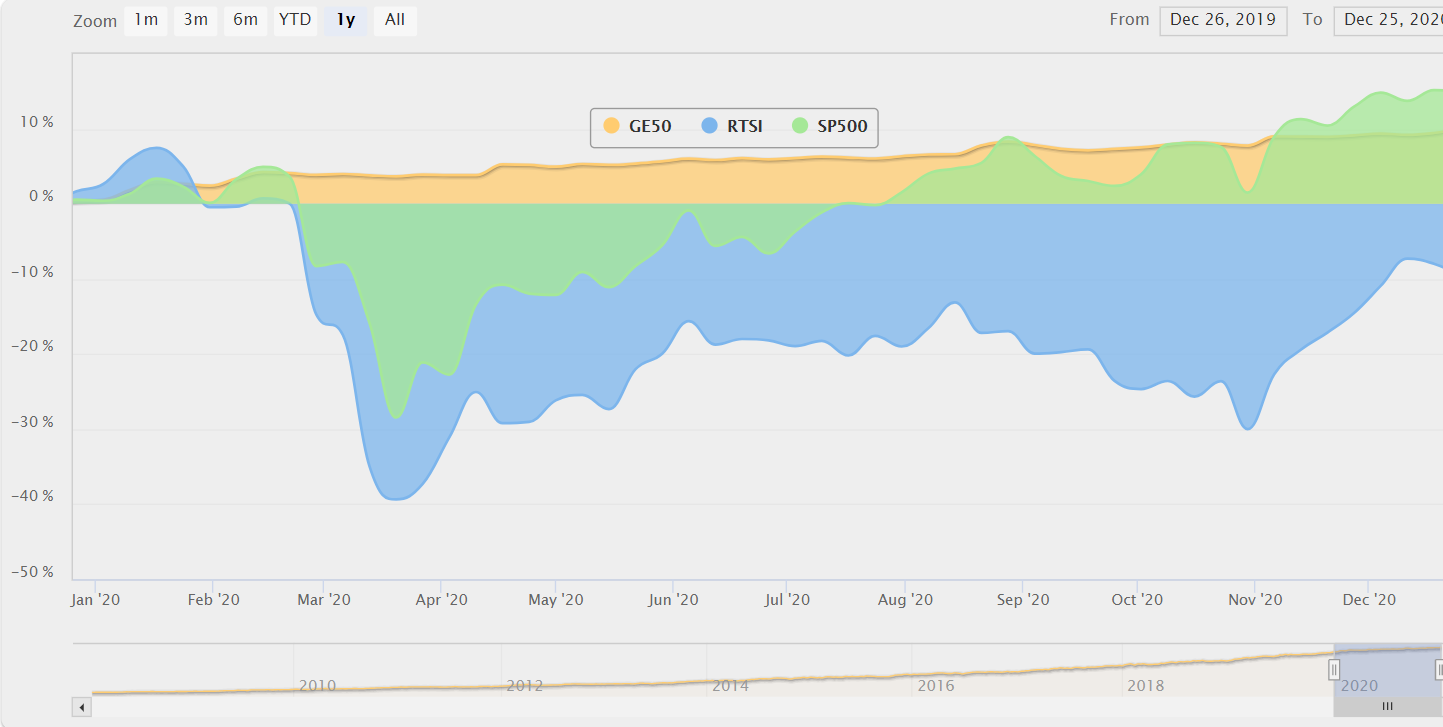
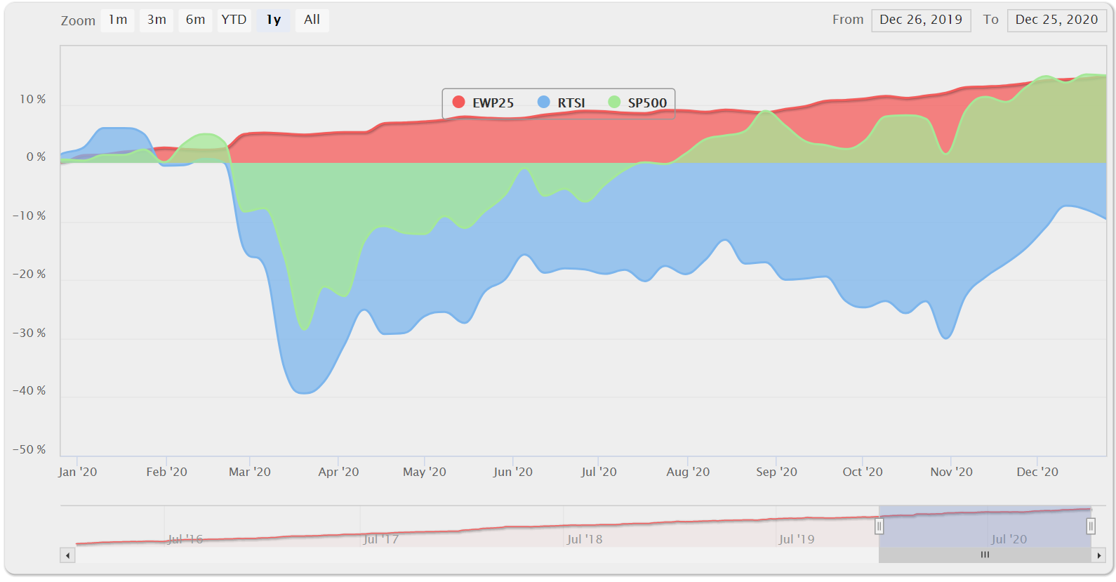
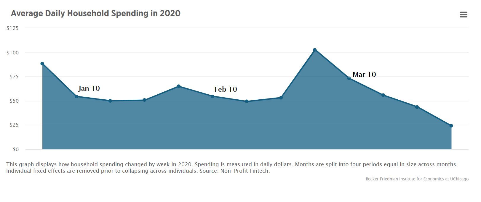
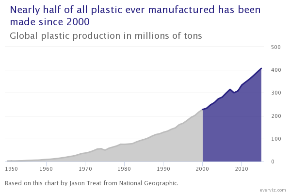
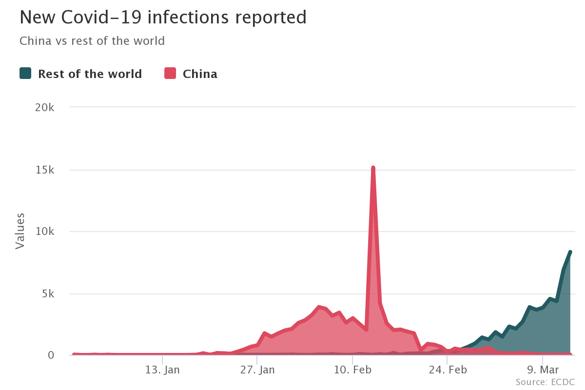
An area chart is similar to a line chart but with color or shading used to fill the area between the x-axis and the line. Data points are plotted against two variables on the x and y axes, and these are then connected by a line and the area below is filled or shaded.
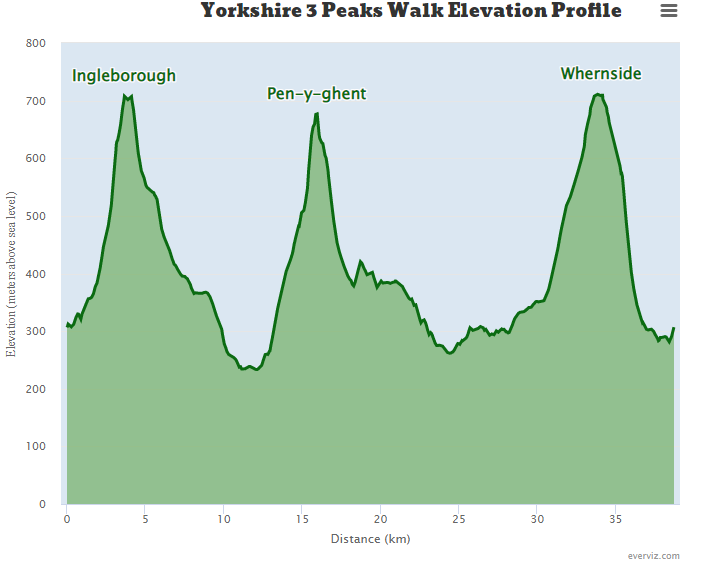
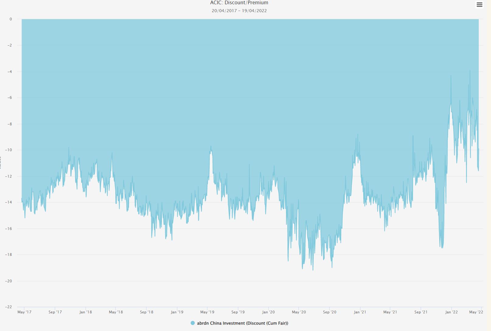
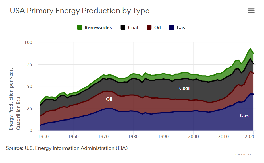
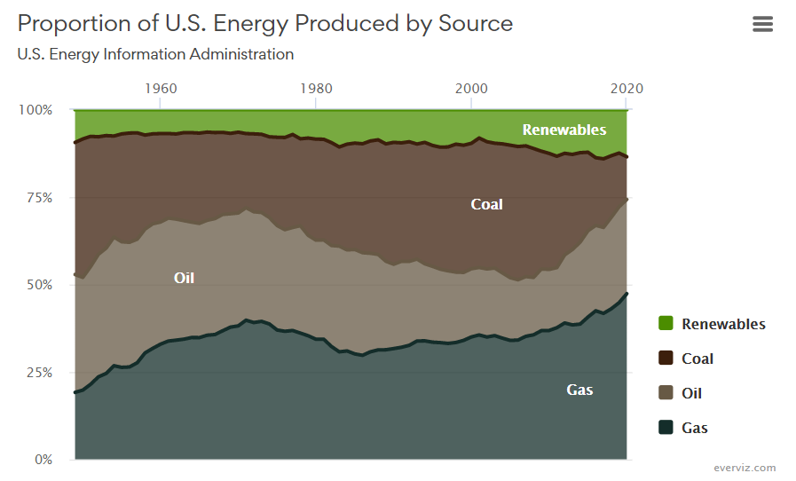
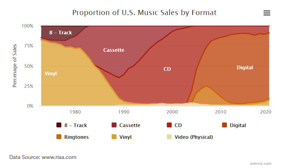
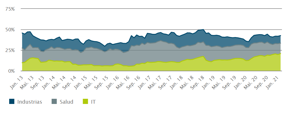
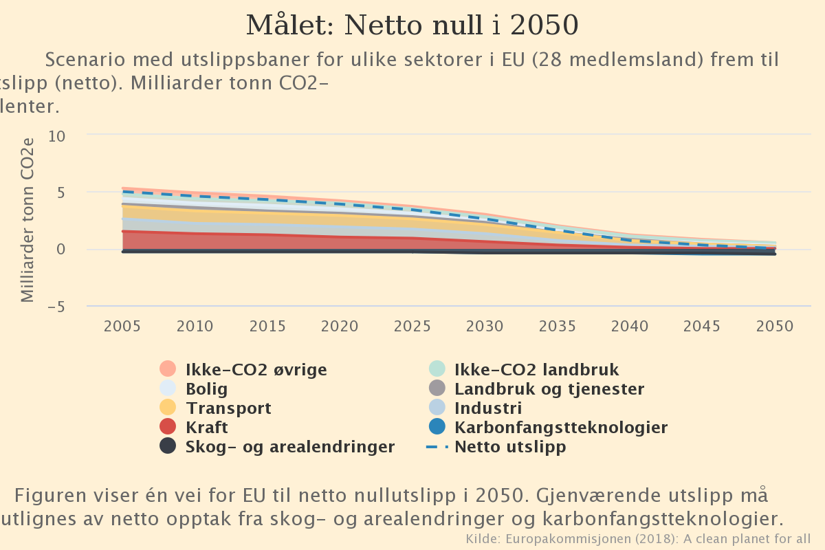
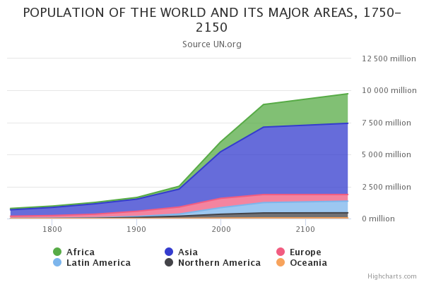
Area Charts are often used for showing how a variable changes over time, with time plotted on the x-axis. However, they can also be used for other variables, for example, showing how the elevation of a route changes over distance. Stacked area charts can also be used to show how the sum total is comprised of different categories or types.
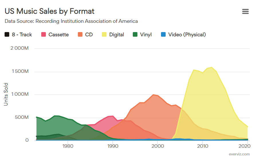
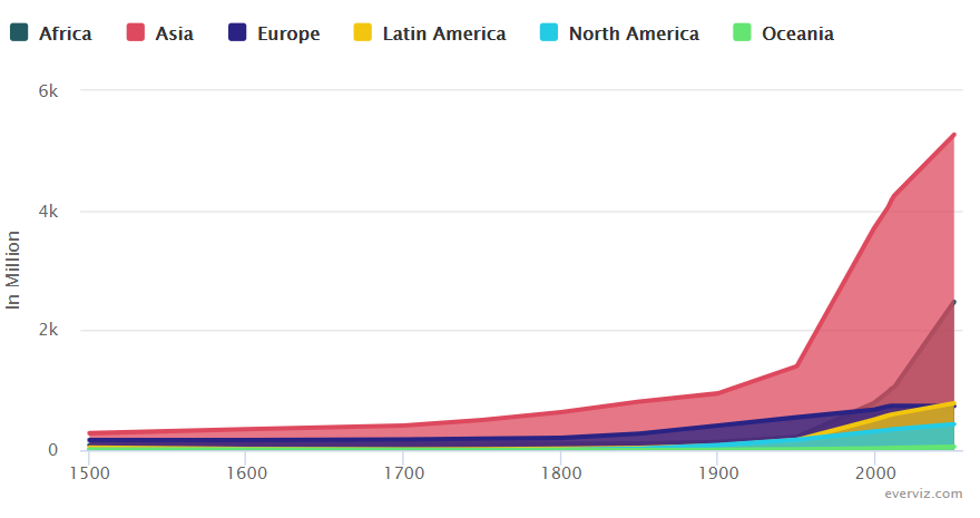
When you want to show a pattern over time, but aren’t as concerned about displaying exact values, area charts can be a good choice. Stacked area charts are a good option for showing how the total consists of different elements, but these graphs can get difficult to read if too many series are included. In some cases, a line chart might be clearer if more detail is needed.
Below are example of area charts created in everviz.
Want to try out for yourself? Click here to get started with everviz for free.
