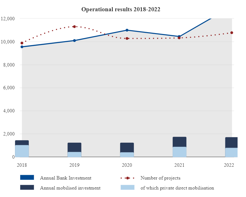
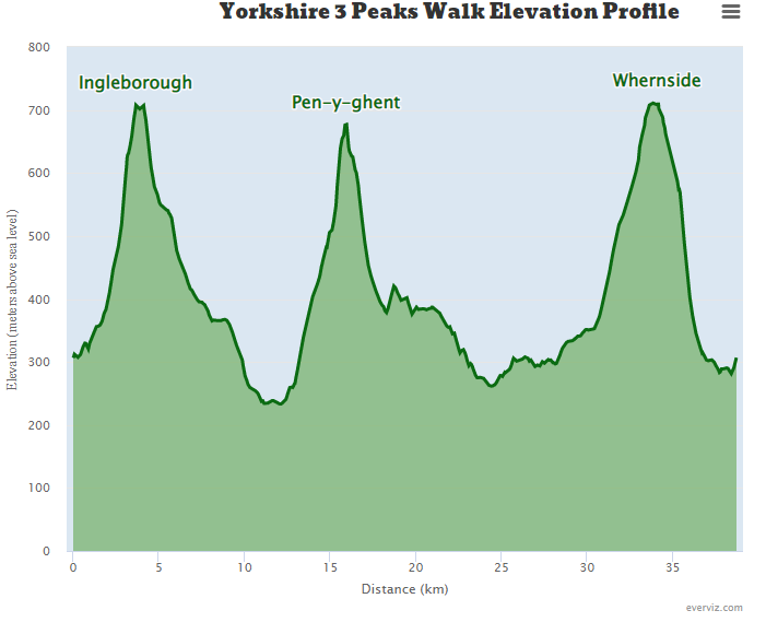
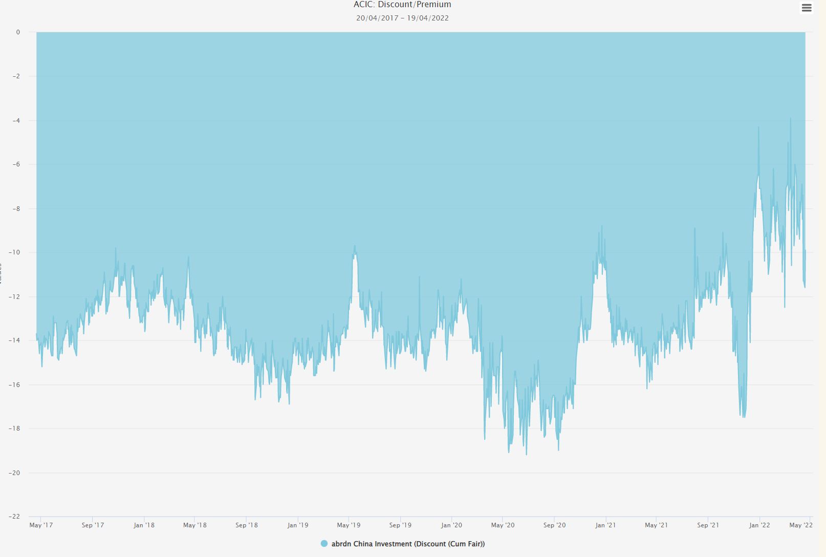
The Proportion of U.S. Energy Produced by Source area chart offers a comprehensive view of the energy sources that powered the United States.
This chart provides an insightful comparison of energy generation by source over a single year. We can see how different forms of energy made up the total output, including whether any experienced growth or decline.
The Proportion of U.S. Energy Produced by Source area chart helps us better understand our nation’s dependence on fossil fuels for its energy needs and gain insight into how other sources have grown or declined over time. It also highlights the importance of switching to renewable sources in order to reduce our reliance on non-renewable options in line with global environmental goals. By becoming more informed about what powers our country, we can gain a more detailed image of where improvement is needed so that future generations will benefit from a clean and sustainable energy supply system.


