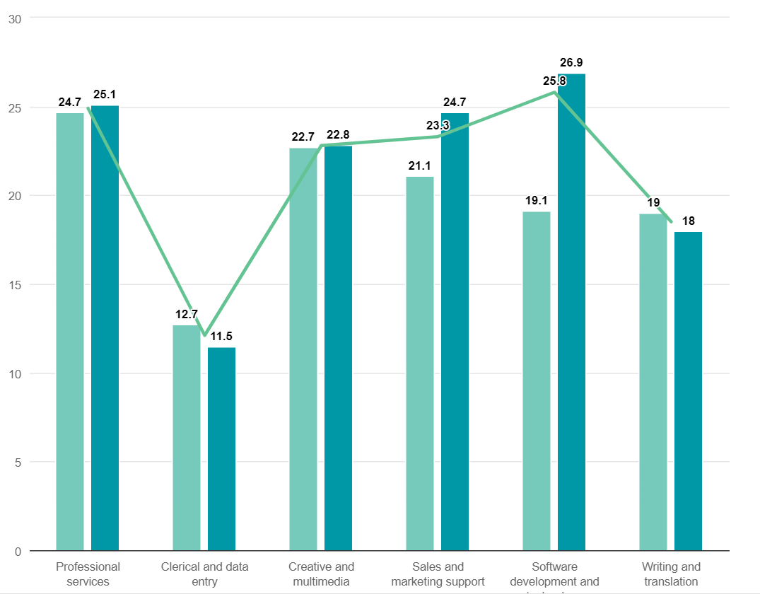
The following chart is using colors to illustrate the difference between two different data plots. It’s also using highlight lines to simulate an additional axis.
everviz is a multiplatform visualization solution that lets you create interactive charts and maps online for publishing on your website, social media or through your cloud-based newsroom system.
It only takes a minute to create your first visualization.