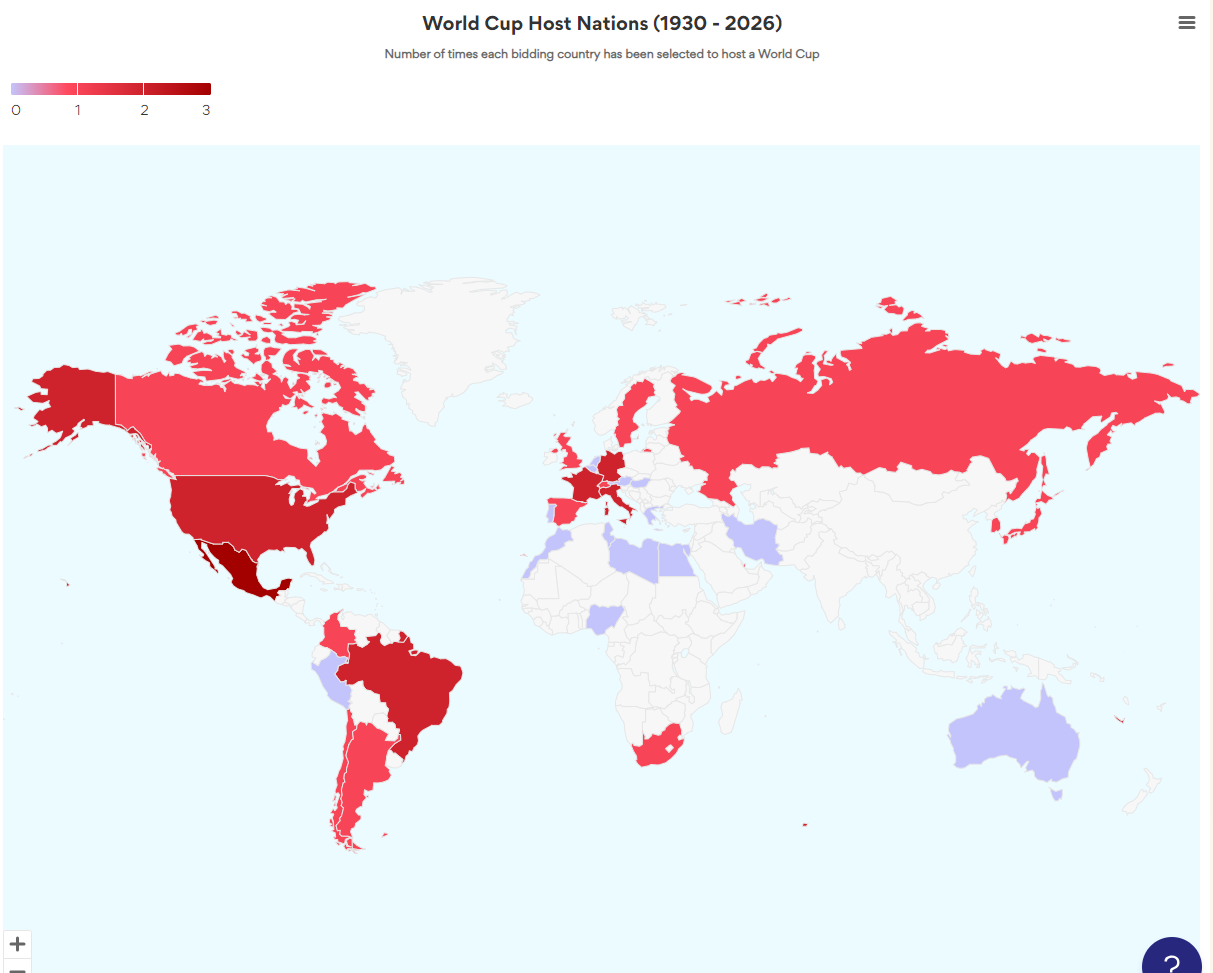
Choropleth Maps display divided geographical areas or regions that are coloured in relation to a data variable. This provides a way to visualise values over a geographical area, which can show variation across the displayed location. The Choropleth template displays a color axis represented by a gradient.
In each region of the chart, the data variable uses colour progression to represent itself. This can usually be a combination of one color to another, a single progression of hue, translucent to opaque, light to dark, or a whole range of colors.
Choropleth maps, possibly the most common thematic map in use today, are extremely popular. That’s nice because it means it’s possible your audience can comprehend them. One reason they’re common is that enumeration units, such as census data, report most of our geodata, and so we’re used to thinking of the world as divided into spatial units like census tracts, counties, and provinces. However, if the geographic phenomena being mapped are not intrinsically related to enumeration units, most cartographers would argue that choropleth maps are over-used and frequently misused.
Examples of datasets suitable for Choropleth maps:
- Global map of the rates of income tax by nation
- The U.S. county map displays the number of births per 100,000 in 2009.
- A map showing the percentage shift in skin cancer by Australian state from 1990 to 2010.
- World map of population percentage under 18 years of age, published by country
- A map showing the Canadian province’s percentage rise in home value from 1980 to 1990