This is a guest blog post by Rebeca Pop, founder of Vizlogue, a Data Visualization and Storytelling Lab that offers workshops and consulting services. You can find Rebeca on YouTube, where she posts data visualization videos every week. Rebeca has been providing insights and creating data visualizations for almost 10 years. She has worked as a digital analytics leader for top media and analytics companies, and is teaching Data Visualization and Storytelling at the University of Chicago. Read more about Rebeca in her bio below.
Pick the right color, make thoughtful chart choices, consider color-blindness, avoid clutter – you dive deep into each of these topics, master them, and, done! You are ready to start creating informative and effective data visualizations.
Well… not quite! As straightforward as these choices might sound, the reality is much more complex. In real life, “it depends”, and not “right” or “wrong” should be the more common words.
Let’s start from the beginning
Data in the 21st Century is like Oil in the 18th Century: ubiquitous, large in quantity, and of extreme value to any company. Decision making relies on data. But data in itself is nothing but an abstract series of numbers. Data needs a human touch to be understood, interpreted, and contextualized. In other words, we must bring the data to life and visualize it in order to enable decision-making.
Luckily, the 21st Century didn’t only bring tons and tons of data. It also brought a large number of easy to use and affordable data visualization tools. Everviz, for example, makes it effortless for users to create beautiful, interactive data visualizations.
Whether your team uses Everviz or a different software, you might have already noticed that every tool that doesn’t require coding was built with a starting point in mind. There are templates for graphs, a list of colors to select from, and other default design choices for axes, legends, etc. These tools provide you with a compass as you navigate the maize of design decisions that you need to make along the way.
And so, in the 21st Century, accessible and affordable tools popularized the use of data visualization across private and public institutions.
Next, learn the rules
Relying solely on data visualization tools to navigate through the maize mentioned earlier is not enough. Fortunately (or unfortunately), the data visualization maize is known for being quite complex. So, the next step in developing data visualization expertise is learning the rules.
To learn these rules, there’s a plethora of resources available across as many media types as you can imagine. There are dozens of data visualization books that you can read. Or, you can take a course online from the comfort of your home. Another option is to attend a course in-person at a bootcamp or a university. Other alternatives include listening to data visualization podcasts or watching videos on YouTube. The choices really are endless.
Here are a few core data visualization rules that these resources are likely to cover:
1. Use proximity
Place labels next to the data points they represent. Lack of proximity requires too much (unnecessary) mental processing for your audience. Instead, make your audience’s life easier by position the labels in close proximity to the categories that they are associated with.
In the example below found on Reddit, the categories are placed below the pie chart. This means that your audience would need to make four additional eye movements to pair up each category to its size and angle in the chart.
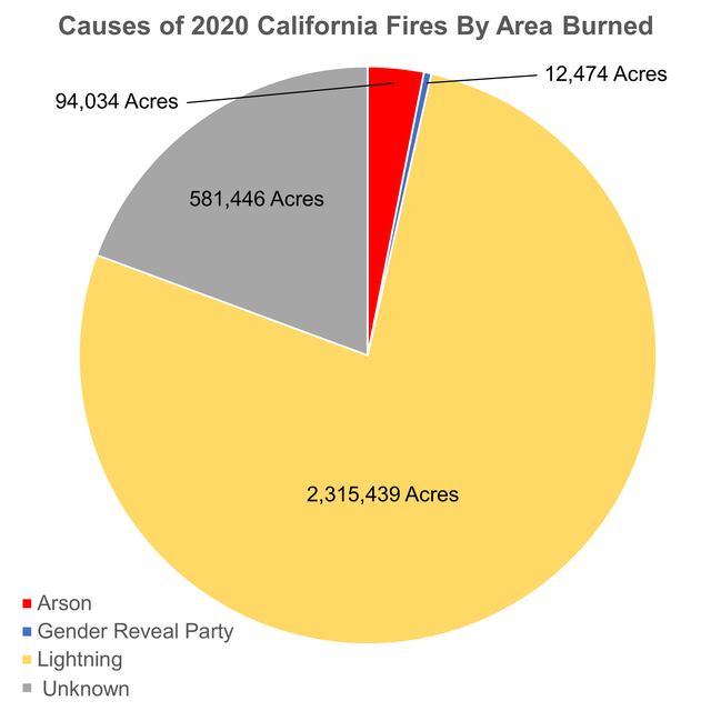
Original chart: https://www.reddit.com/r/dataisbeautiful/comments/iqa7d3/oc_despite_the_memes_the_gender_reveal_party_is/
2. Always start your Y-axis at 0
If you truncate the Y-axis, you are potentially removing part of the data, which is deceitful. Or, at the very least, you are magnifying the results and turning minor differences into massive changes. Darrell Huff, the author of the well-known book “How to Lie with Statistics” (originally published in 1954!) wrote that all charts of positive values should start at 0. Otherwise, in his view, the designer would make the results look more impressive than they actually are.
In the example below, the Y and X-axes are reversed, but the same principle applies. By starting the X-axis at 5.0, the difference in IMBD ratings by movie is magnified and deceiving.
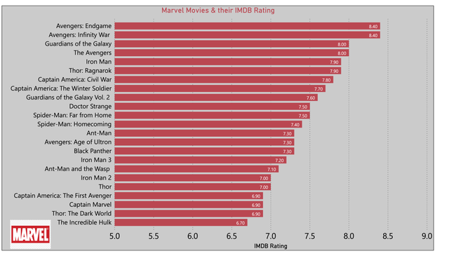
Original chart: https://www.reddit.com/r/dataisbeautiful/comments/isudql/oc_marvel_movies_their_current_imdb_rating/
3. Don’t use thick table borders
Thick table borders represent non data-ink, to use the terminology of the highly-influential data visualization writer and professor Edward Tufte. Tufte defined data-ink as the design elements that are non-erasable and essential for us to interpret the graph correctly. Non-data ink, on the other hand, consists of all elements that are erasable and redundant. The goal, in Tufte’s philosophy, is to keep the data to non-data ink ratio as high as possible and embrace minimalism. In the case of tables, thick borders are erasable.
In the table below, the borders are thick. Even if the designer used conditional formatting to highlight some of the trends, the thick borders are distracting and do not add any value to the data display. The borders should be thinner, lighter in color, and overall, more subtle.
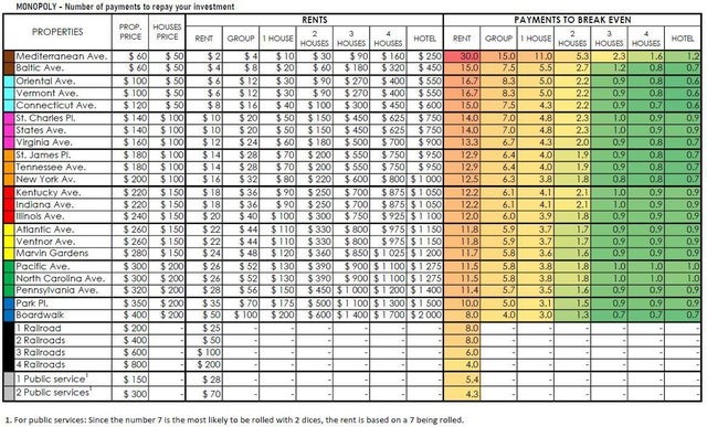
Original chart: https://www.reddit.com/r/dataisbeautiful/comments/itf42u/oc_number_of_payments_required_to_break_even_in/
4. Never use 3D
Pie charts and bar charts in 3D format used to be very popular. They also have a history of being poorly used. And so, 3D graphs gained a bad reputation. Let’s assume you want to show sales by category in a pie chart. Opting for a 3D graph would imply a third variable and dimension which, in this case, does not exist.
In the example below, the designer tried to create a third variable by adding “quarters” in addition to “sales in million” and “year.” However, quarters are not a true third dimension and so a 3D graph is not the best choice.
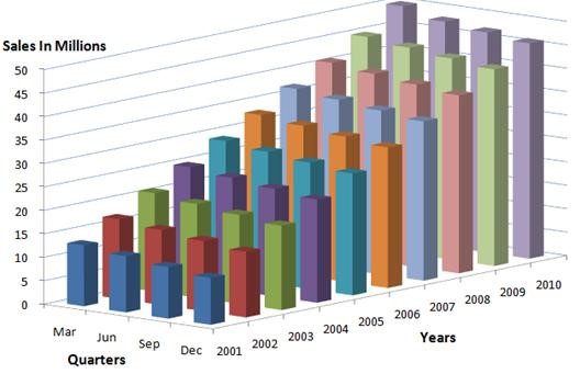
Original chart: https://best-excel-tutorial.com/56-charts/207-three-axis-chart
5. Avoid chartjunk
Besides coining the term “data-ink,” Edward Tufte is also widely known for popularizing what he calls “chartjunk.” Chartjunk is any type of cosmetic decoration that doesn’t provide additional information. Below is an example of chartjunk that Tufte highlights in one of his books.
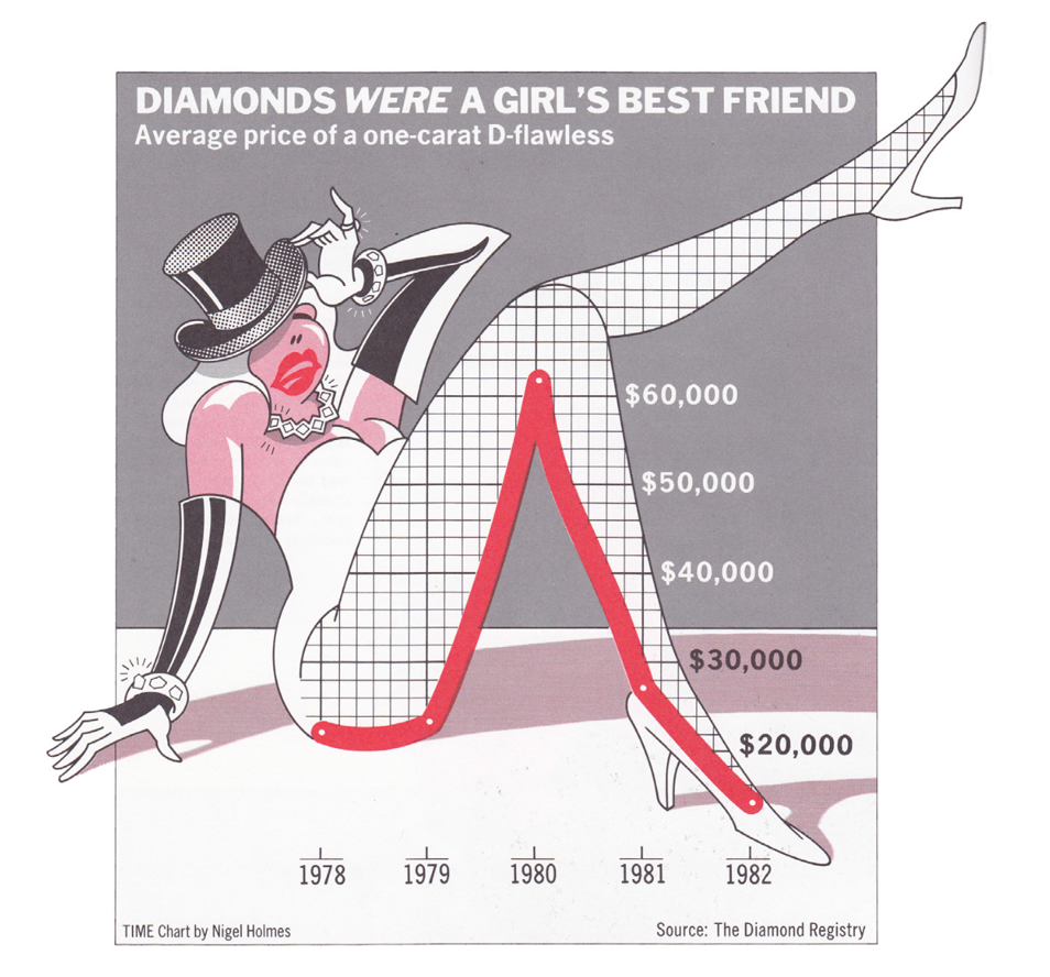
Original chart: Nigel Holmes, Time Magazine
6. Don’t use pie charts
While business professionals tend to love them, practitioners and data visualization experts have repeatedly expressed their strong dislike for pie charts. A quick Google search for “pie charts are…” reveals results such as “evil,” “bad,” “terrible,” and “the worst.”
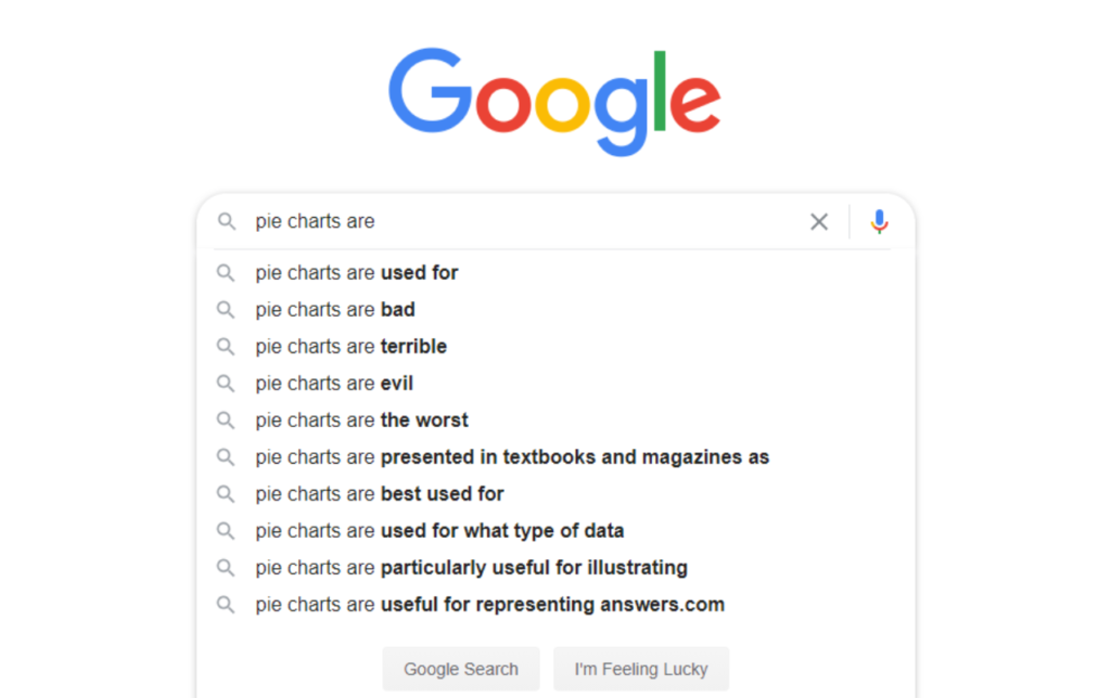
Source: Google search
The bad reputation that pie charts have is due to a long history of people creating incomprehensible designs. Too many pie slices and a rainbow of colors make any pie chart hard to interpret. In the graph below, there are over 15 categories displayed in a multitude of colors. Despite positioning the labels in close proximity to their respective categories, the graph is crowded and hard to interpret.
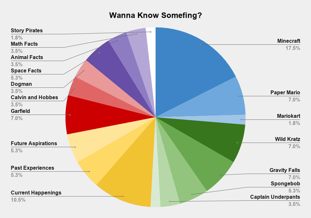
Original chart: https://www.reddit.com/r/dataisbeautiful/comments/ijs7s3/oc_what_im_about_to_learn_about_after_my_kid_says/
Now that you’ve learned the rules, it’s time to unlearn them
By now, you must be quite familiar with some of the core data visualization rules. Besides reading the section above, you might have read a few books, watched a couple of YouTube videos, or listened to some podcasts. Tomorrow, you’ll go back to the office and will make all the right data visualization choices.
Well, not so fast. Visual grammar is useful and very important. But it is just the foundation. Knowing all these rules is no guarantee that you’ll be creating impactful charts that will enable decision-making. In fact, now that you learned all these rules, it’s time to unlearn them. Yes, you read that right. Knowing the data visualization rules is like having a compass without knowing what your destination is.
Here’s how top publications and data visualization professionals broke the rules described above. And guess what? Their visualizations are well-crafted.
1. Use proximity
This rule applies more often than not. But not all the time. In the example below, The Economist doesn’t use proximity. The labels, “female driver” and “male driver” are not positioned in close proximity to the categories on the chart. In this scenario, the lack of proximity works. The categories are limited (only two), the colors are easily distinguishable, and the labels only need to be displayed once for all three charts. Thus, the chart avoids redundancy and repetition.
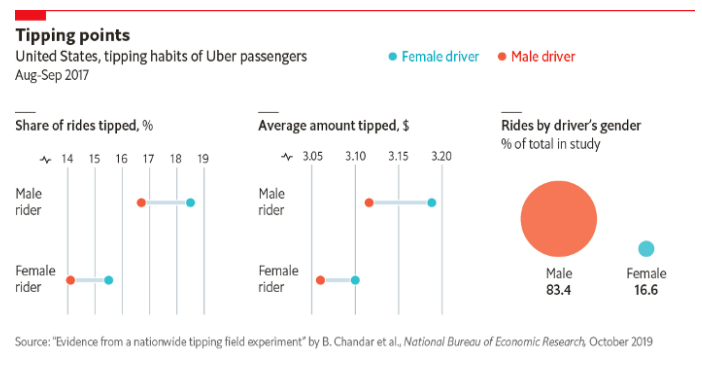
Original chart: https://www.economist.com/graphic-detail/2019/10/29/how-much-should-you-tip-an-uber-driver
2. Always start your Y-axis at 0
You should follow this rule most of the times. Especially when using bar charts, it is not advisable to truncate the Y-axis.
A recent study published by Michael Correll, Enrico Bertini, and Steven Franconeri entitled “Truncating the Y-Axis – Thread or Menace” showed that data visualization designers should first consider “the scale of the meaningful effect sizes and variation they intend to communicate,” regardless of the chart type. In the example below, the chart does not deceit. By truncating the Y-axis, the designer removed unnecessary space at the bottom of the chart and used the right effect size for the story being communicated.
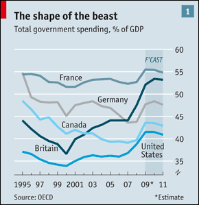
Original chart: https://www.economist.com/briefing/2010/01/21/leviathan-stirs-again
3. Don’t use thick table borders
This rule is mostly true. But there are exceptions. In the chart below captured from the book “Am I Overthinking This,” Michelle Rial depicts what goes through her head and what she “hears” when she thinks she might get fired. The thick borders are effective in this case. The table is hand-drawn, so the thickness of the borders reinforces the medium in which this visualization was created.
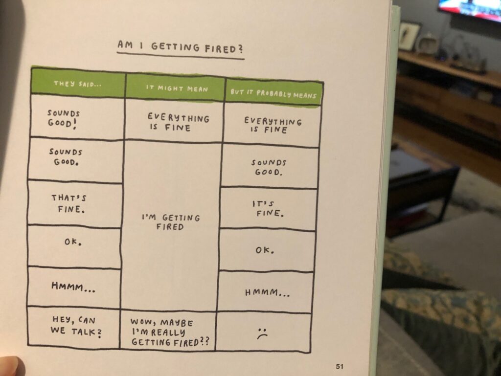
Original chart: Michelle Rial, “Am I Overthinking This”
4. Never use 3D charts
If you don’t have a third variable, using 3D makes the chart harder to interpret and is not justifiable. But 3D visualizations can be very effective in certain cases, when you want to represent data that is in fact three dimensional. Take the example below. The data used here is space data and it actually has a 3rd dimension.
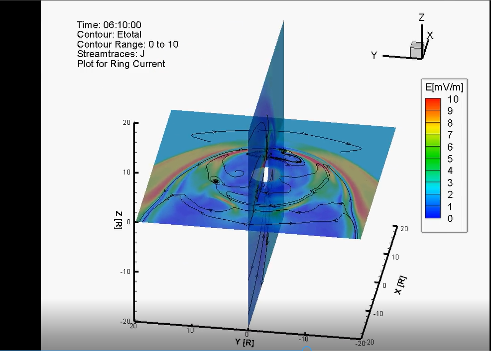
Original chart: Department of Electrical and Computer Engineering, University of Illinois at Urbana-Champaign
5. Avoid chartjunk
Although many current data visualization experts and designers have been influenced by Edward Tufte’s philosophy, there is a separate group that advocates for data visualizations that are beautiful. In fact, a recent study entitled “Useful Junk? The Effects of Visual Embellishment on Comprehension and Memorability of Charts” showed the results of two experiments, which measured both interpretation accuracy and long-term recall. The researchers concluded that “people’s accuracy in describing the embellished charts was no worse than for plain charts, and that their recall after a two-to-three-week gap was significantly better.”
Mona Chalabi, a British data journalist, is known for creating beautiful and memorable charts. In the chart below, Mona shows the percentage of people who can work from home, by industry. Instead of using a standard bar chart, she chose the image of a female.
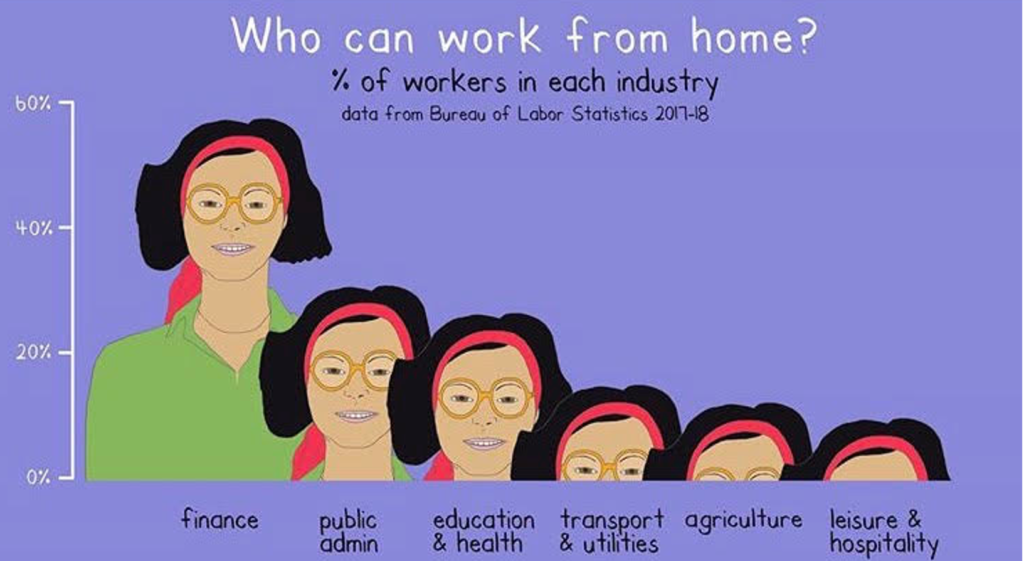
Original chart: Mona’s Instagram account: https://www.instagram.com/monachalabi/?hl=en
6. Don’t use pie charts
Pie charts can indeed be very ineffective. But, like with the other 5 rules discussed above, this rule can also be broken. If used correctly, after carefully evaluating the message and the audience, pie charts can be an effective way to visualize data. In the example below, the donut charts (which are the cousins of the pie chart) only have two categories so the data is easy to interpret and recall.
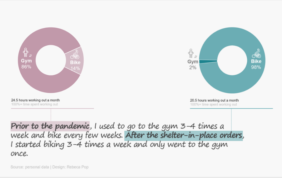
Original chart: Rebeca Pop’s personal collection
Conclusions
Easy to use and affordable tools revolutionized the field of data visualization. They made and still make our lives so much easier. They enable us to create or edit a report in a matter of minutes. But tools are not enough. We also need rules to guide us through the numerous design decisions that we need to make along the way. And once we learn the rules, we need to start unlearning them. Knowing when to follow these rules and when to break them will make our data visualizations more engaging and effective.
So, next time when someone asks you “How effective is my data visualization?” avoid offering an immediate answer. Instead, start by saying “it depends.” Pause, and ask questions such as:
- What is your project goal?
- Who is your audience?
- What is the problem that you are trying to solve?
- What is the story that you are trying to tell?
If you want to practice breaking the rules, I suggest the following exercise: start by creating a graph that follows the rules. Once that’s done, think what rules you could break. Would breaking these rules make your graph more engaging? Or, on the contrary, more confusing?
Practice, practice, practice. Eventually, you’ll look back with pride at how far you’ve come.
About the author

Years ago, Rebeca fell in love with data visualization and storytelling. And there was no way back.
That was the point when she realized how underrepresented these skills are, despite being core to most business professionals.
Rebeca, Vizlogue’s founder, has been providing insights and creating data visualizations for almost 10 years. She has worked as a digital analytics leader for top media and analytics companies, across a diverse set of industries, such as Fast Food Restaurants, Consumer Packaged Goods (CPG) and Automotive.
For nearly 3 years, she has been teaching Data Visualization and Storytelling at the University of Chicago and at DePaul University in Chicago.
Rebeca holds a MA from the University of Oklahoma and a BA from the University of Bucharest, Romania. When she’s not reading, practicing or talking about data visualization and storytelling, Rebeca enjoys hiking and cycling.


