The air is all around us, so it’s not visible to us. And what exactly is air? It’s a mixture of gases that are distinct. About 79% of nitrogen and 20% of oxygen make up the air in the Earth’s atmosphere. Air also has 1% of other small quantities, such as carbon dioxide, neon, and hydrogen, of many other gases.
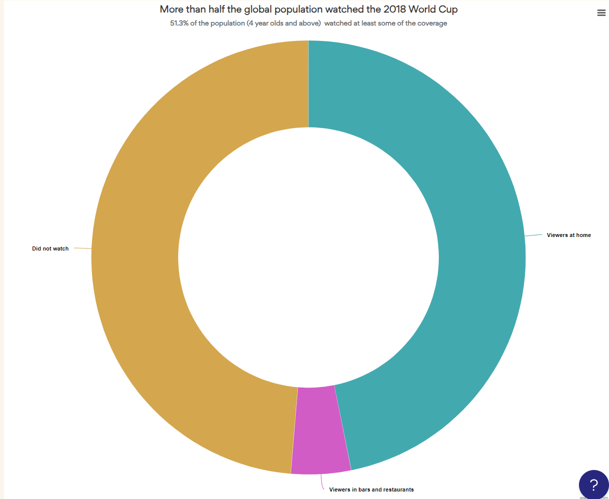
The air can be visualized using a donut chart (also known as Doughnut chart), a variation of a pie chart, except it has a round hole in the center which makes it look like a donut.
Pie charts have been under assault, probably as long as they have existed because our brains find it hard to compare the shapes of the slices. A donut somewhat remedies this problem since readers focus on reading the length of the arcs instead of the size of the slices.
Here is an example an interactive donut chart created with everviz:
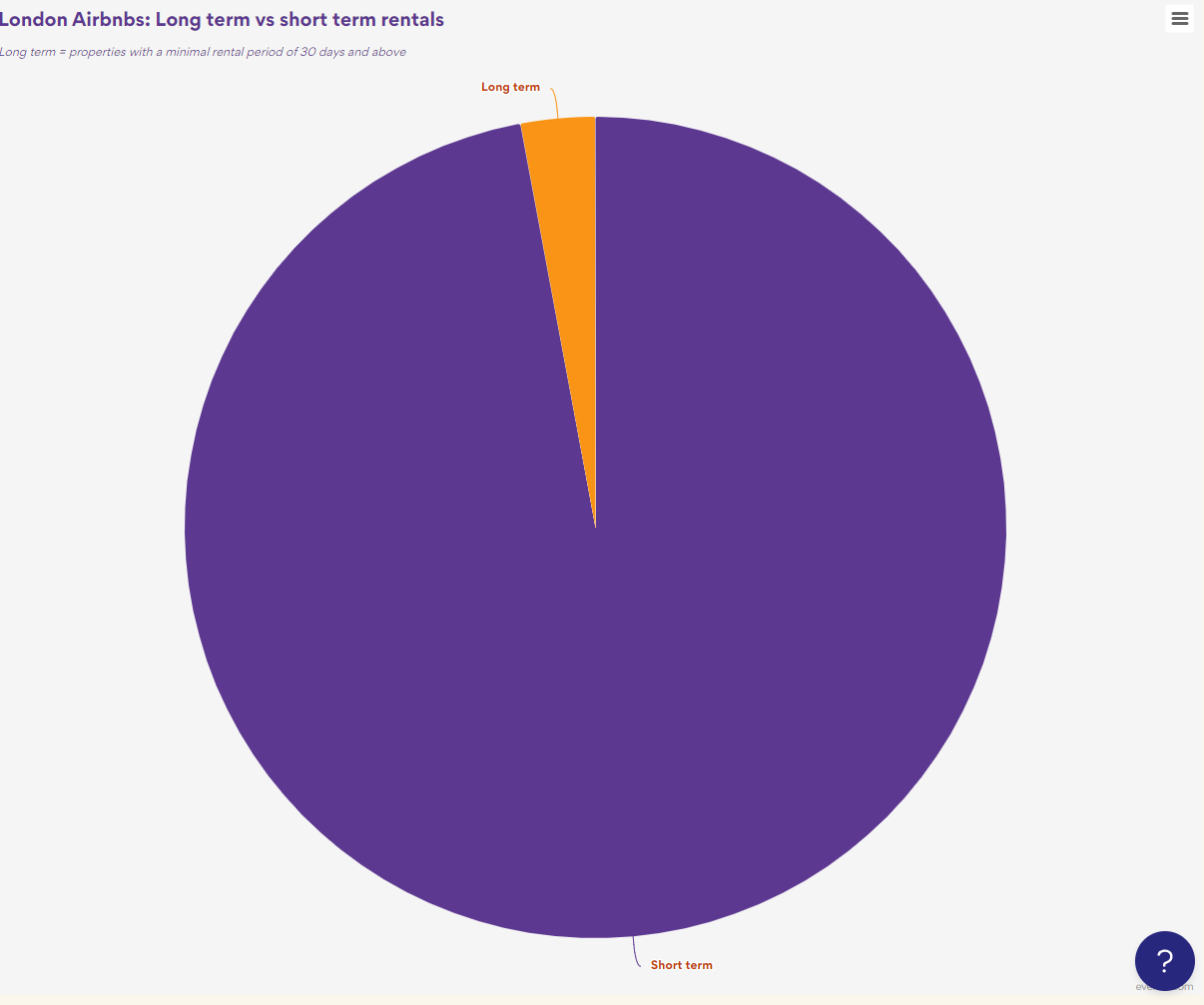