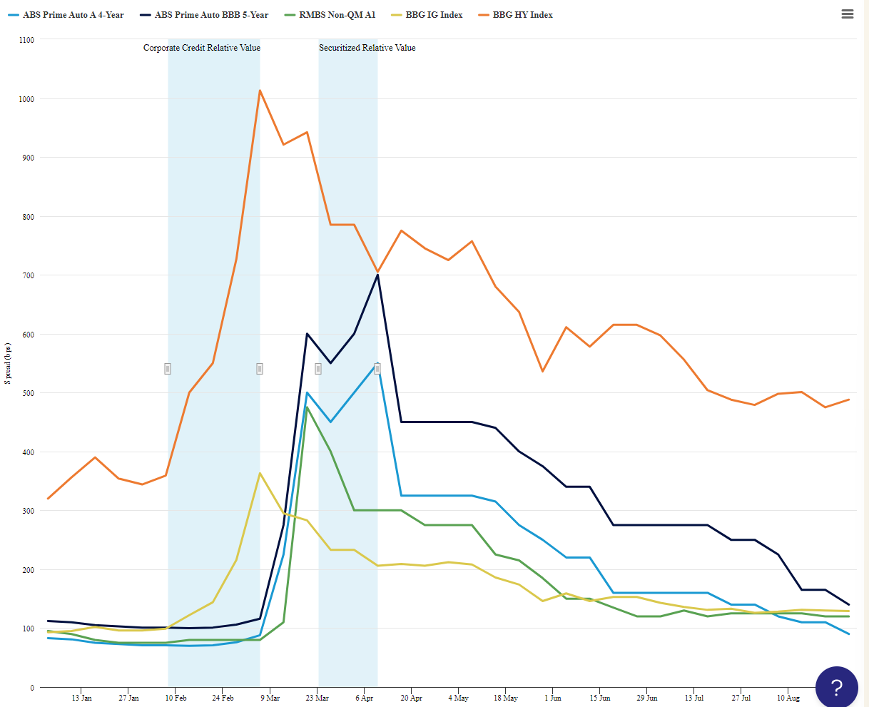
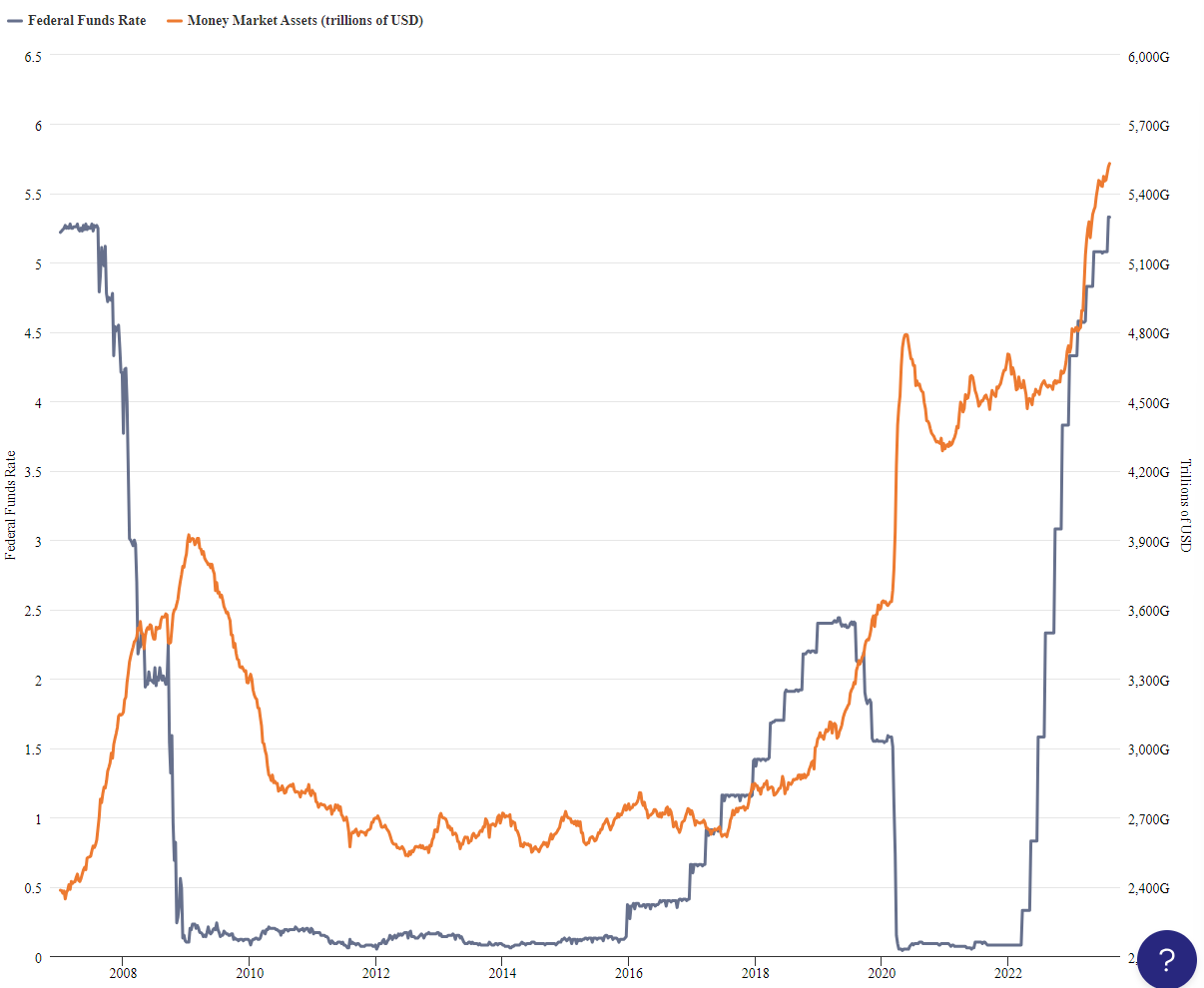
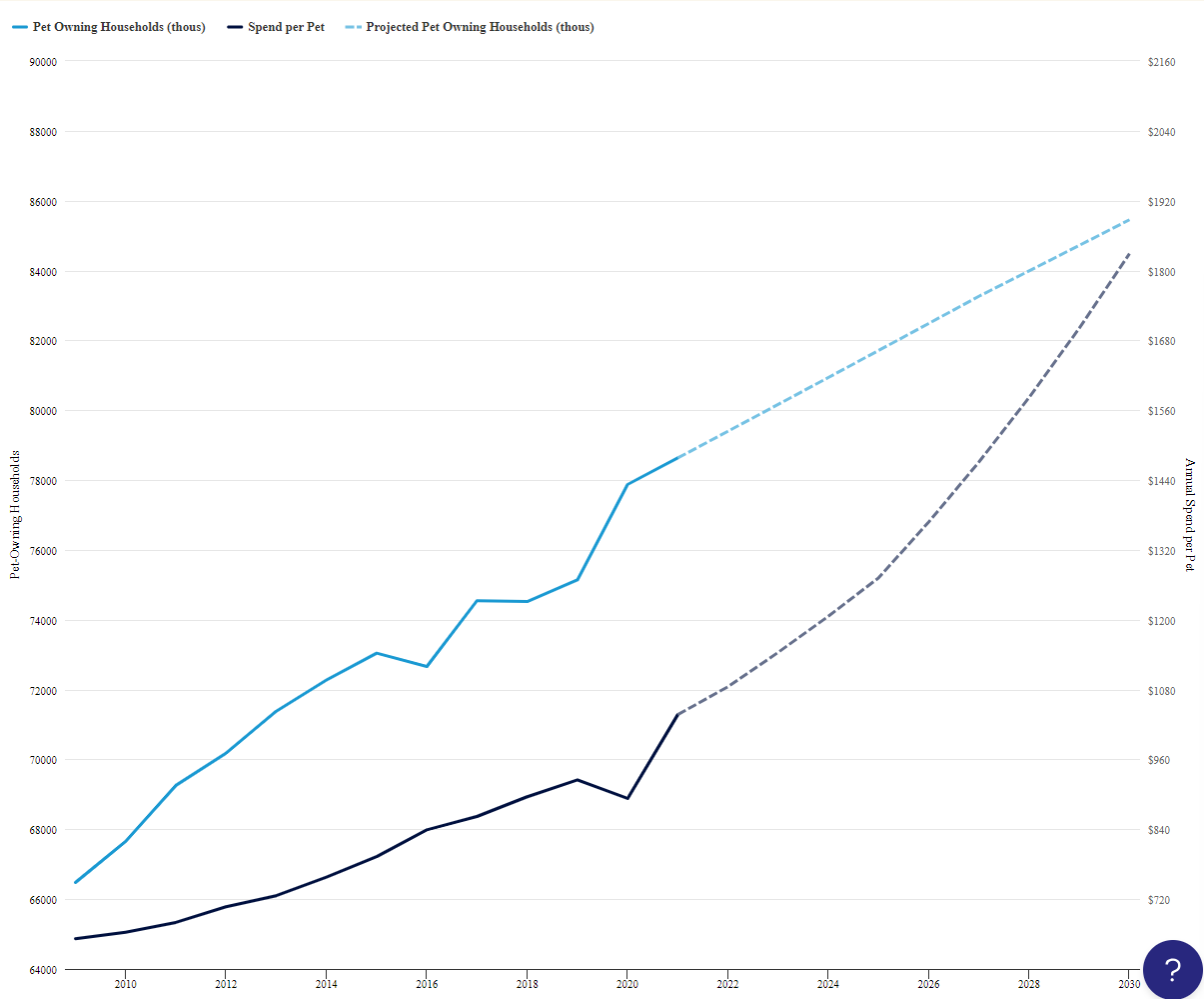
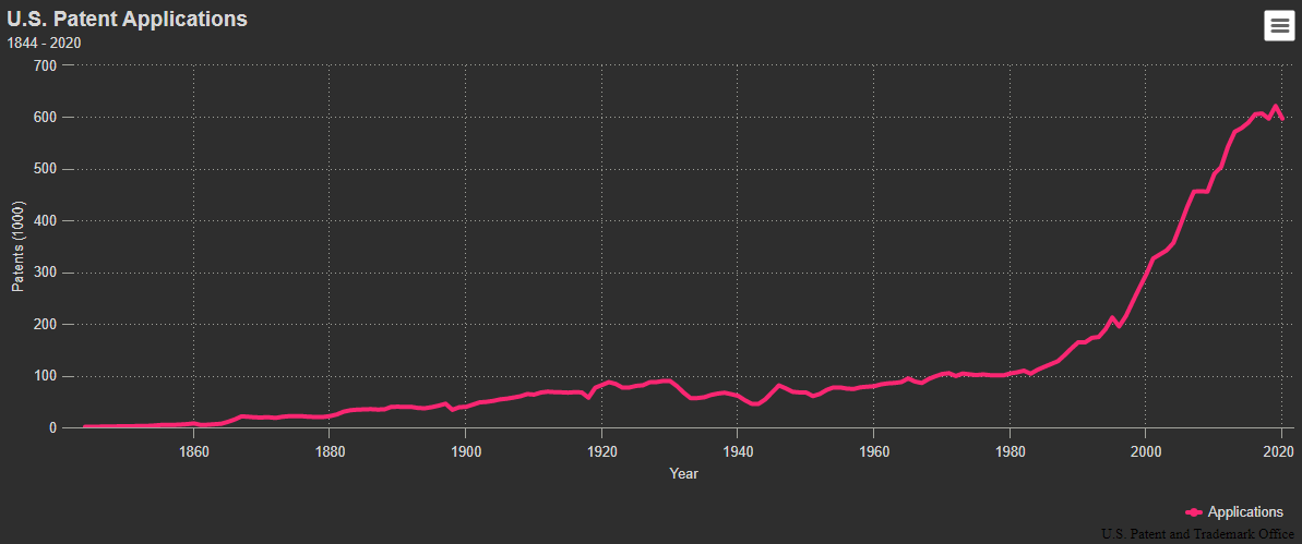
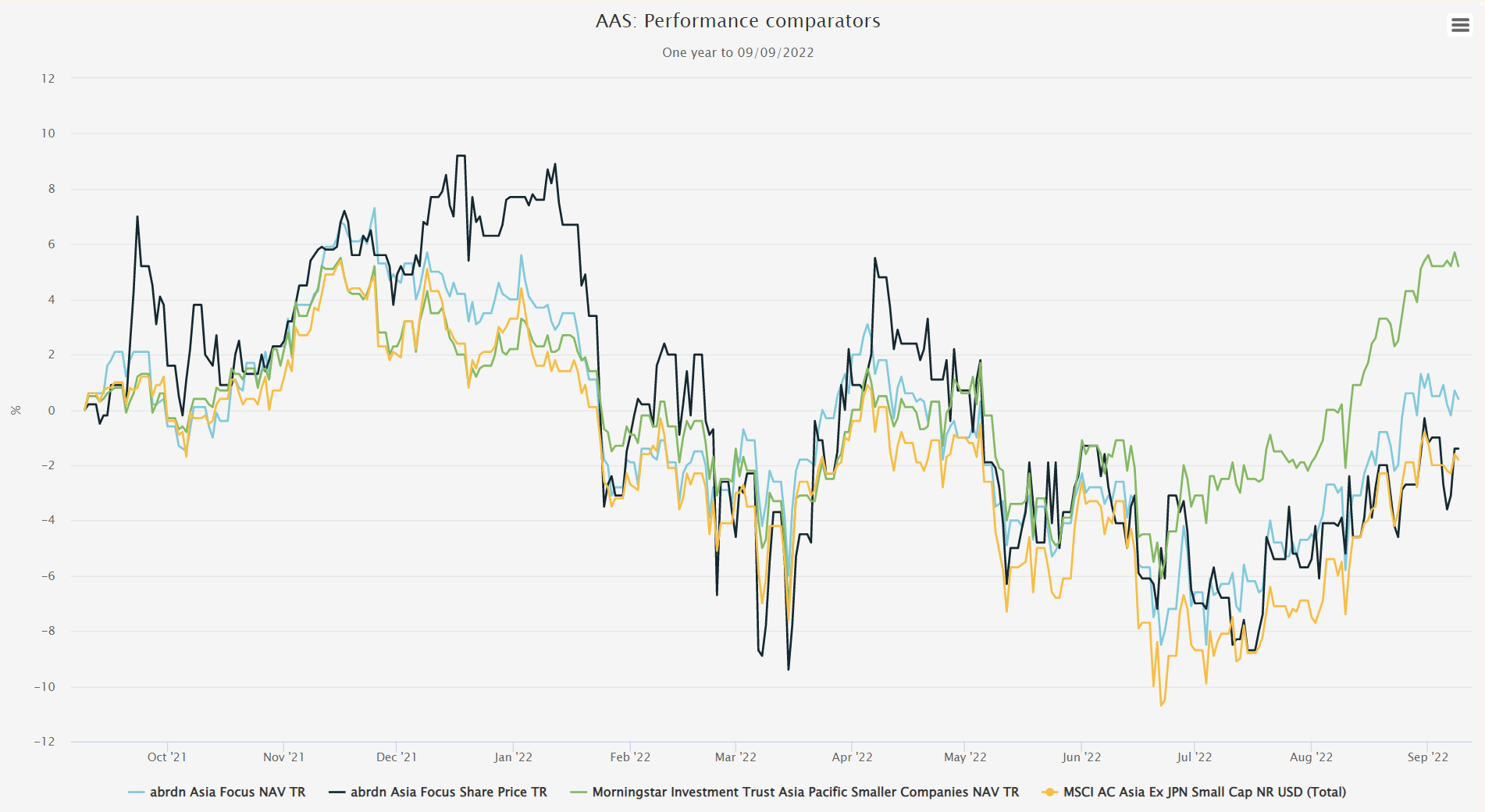
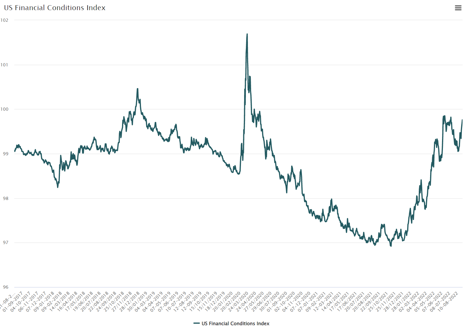
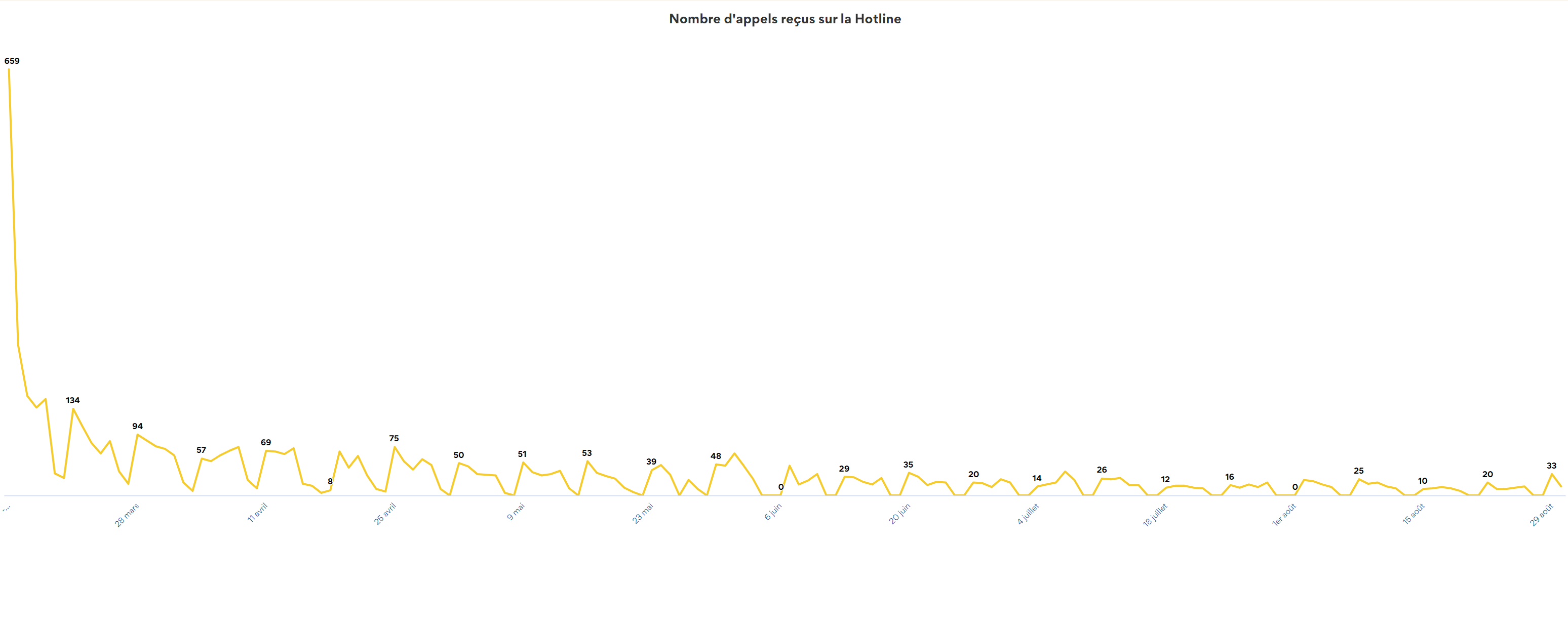
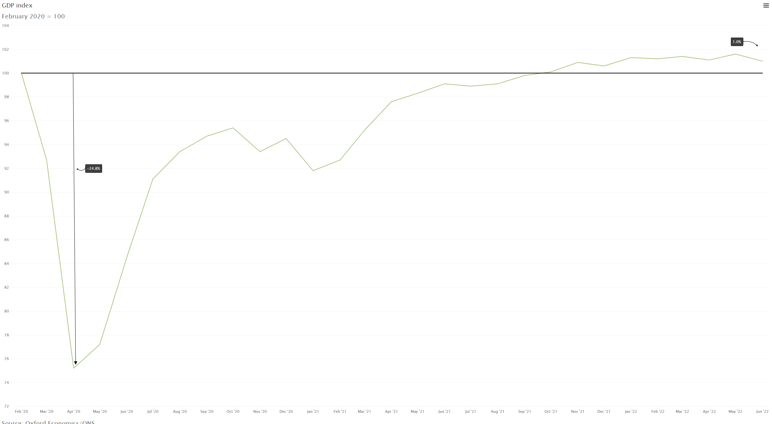
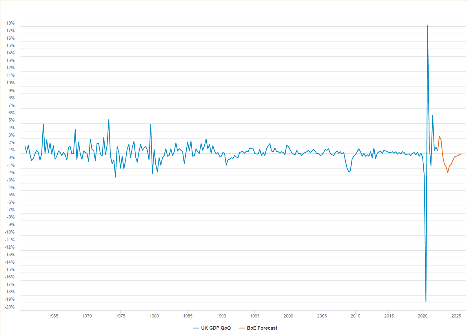
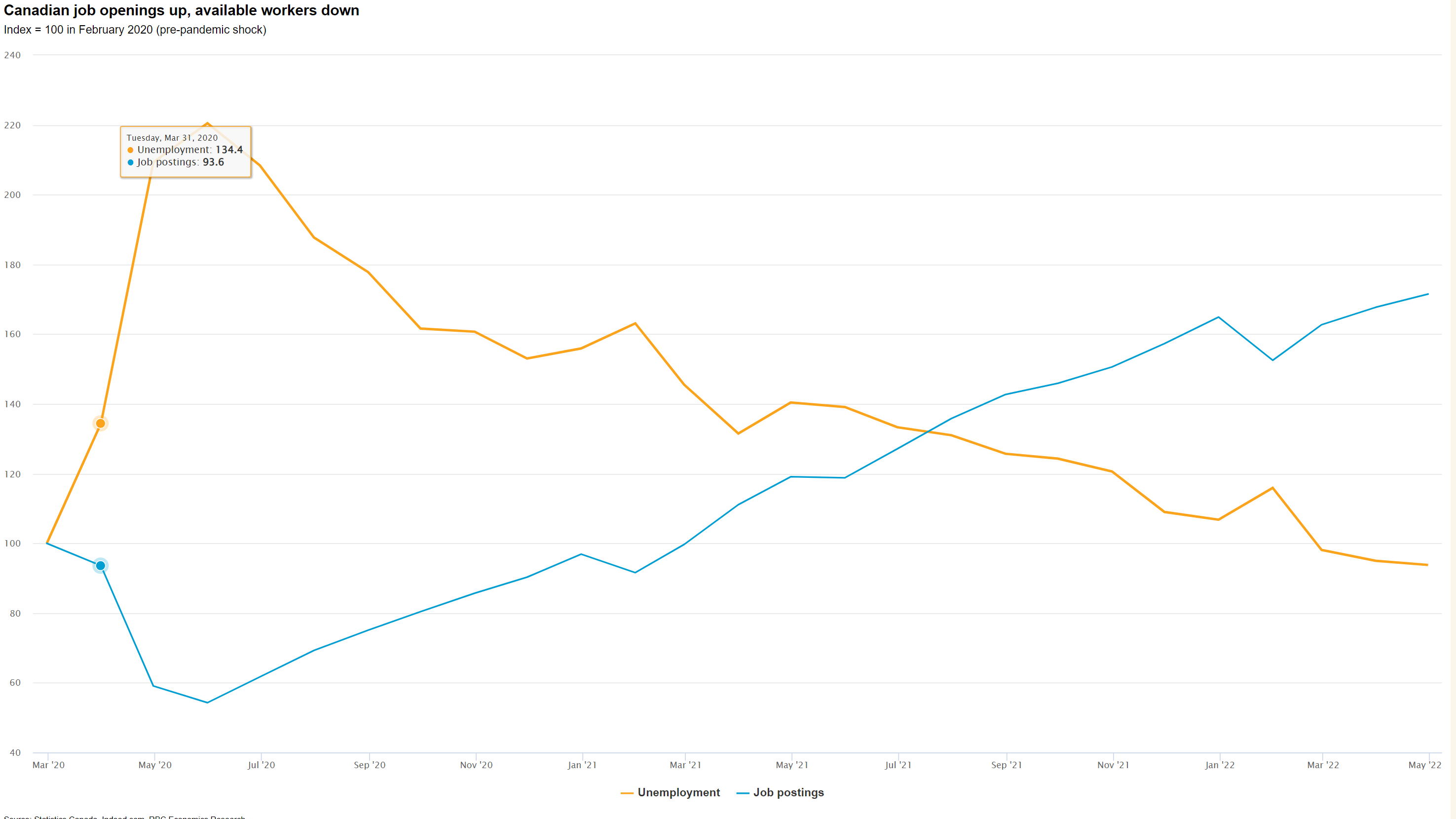
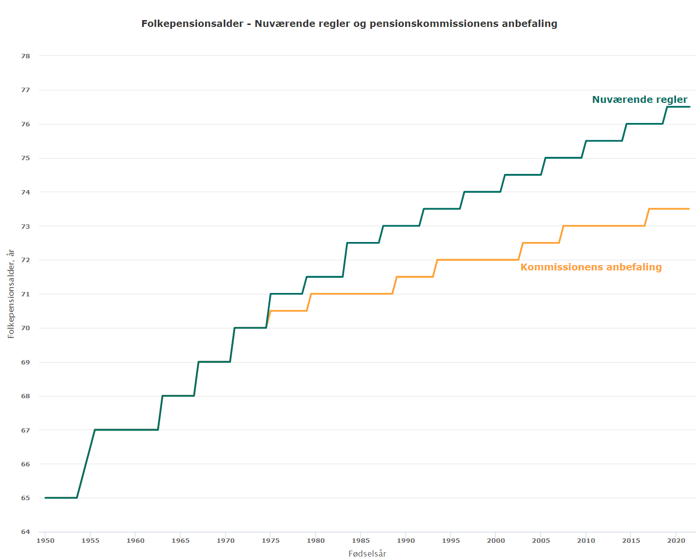
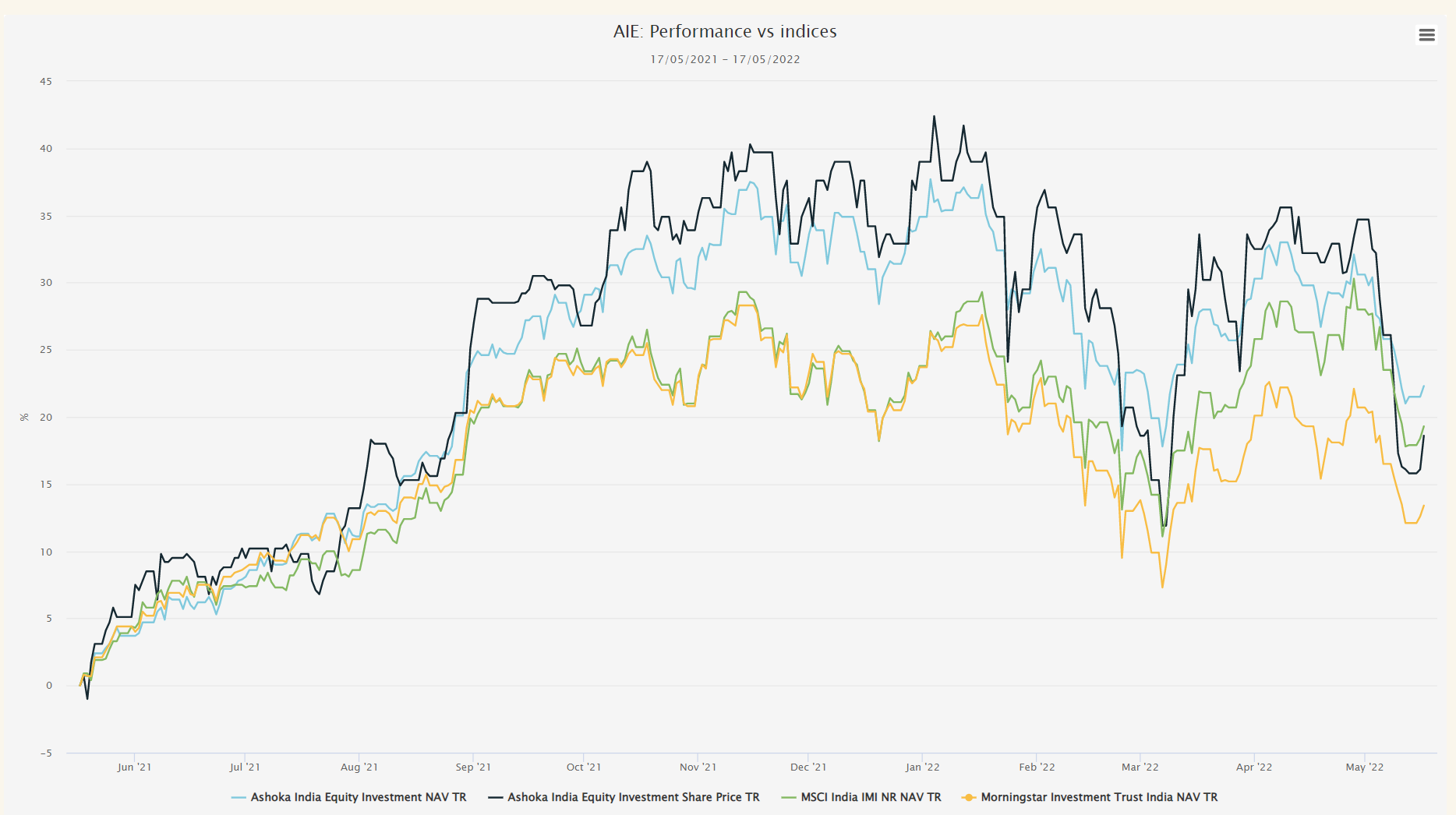
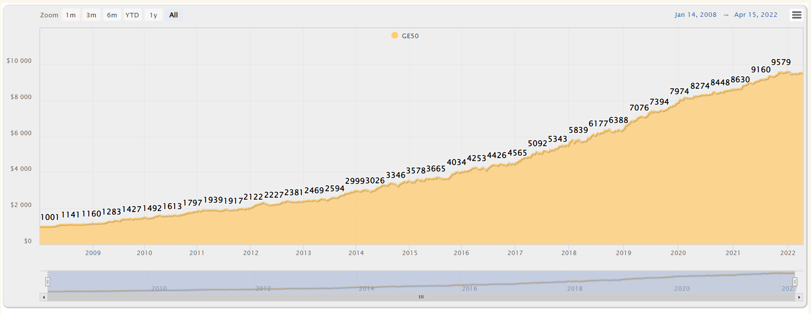
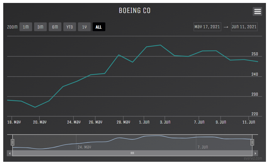
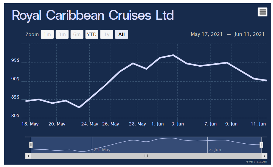
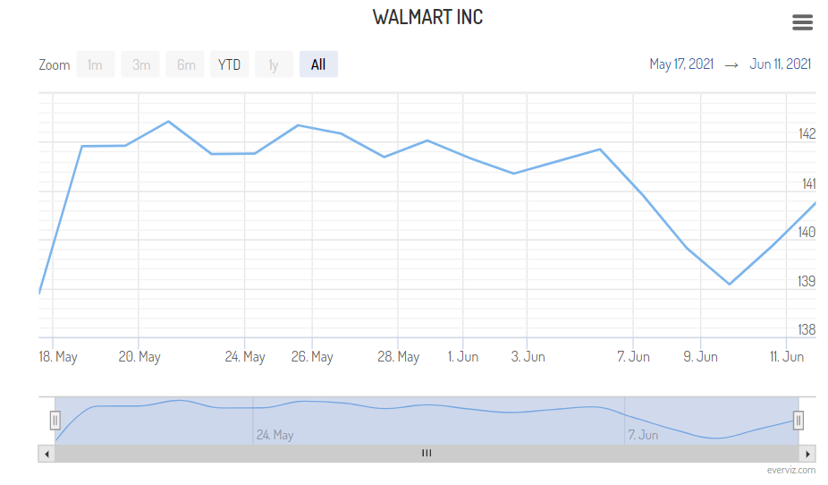
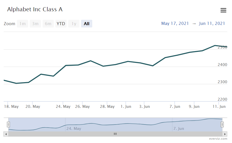
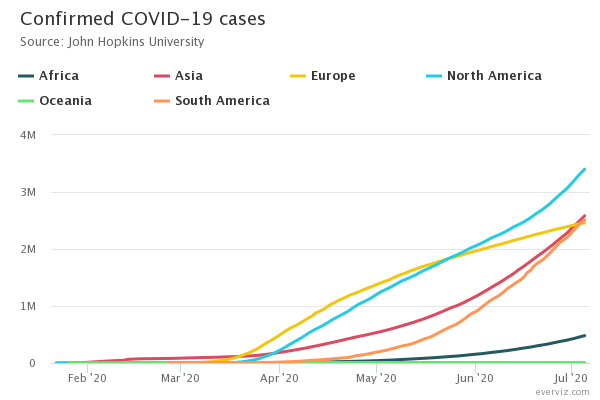
A line chart is a type of chart which shows how two variables are related. The data points are plotted (similar to a scatter chart) and then joined with a line. A continuous data variable such as time or distance is plotted on the x-axis and the measurement or value is plotted on the y-axis.
Most commonly, line charts are used to visualize some value over time. A finance department, for example, might plot the shift in the amount of cash that the organization has on hand over time. The x-axis may be days, weeks, quarters, or years, while the y-axis might display revenue in dollars. Line charts help to illustrate patterns and trends. They can also show anomalies or unusual events where the results deviate from the expected pattern.
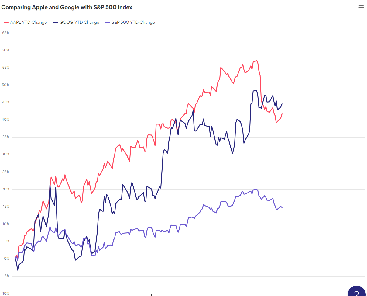
Line charts are a good choice for displaying large data sets and how a value changes over time or another variable. Multiple lines can also be plotted on the same chart, allowing comparison of different series. However, line charts should not be used for categorical data: if you don’t have a continuous variable to plot on the x-axis, then a bar or column chart is likely to be more suitable.